So I've made various improvements to the HUD over the past couple of months, making it look nicer, more readable, and less intrusive, but before I post about it I wanted to share some observations/insights about the evolution of Souls-game HUDs you might find interesting.
Thread:
Thread:
One of the most important things to consider when designing a menu/HUD of any kind is the Safe Title Area, which is a standard defining the region text elements can occupy on-screen without fear of cropping due to overscan. This region is 90% of the screen's area.
On computer monitors and newer TVs aggressive overscan is quite rare, so title safety may not seem that important, but many people still have, and actively use, older TVs; it's far from redundant. I myself have an old rear-projection TV in my living room with heavy overscan.
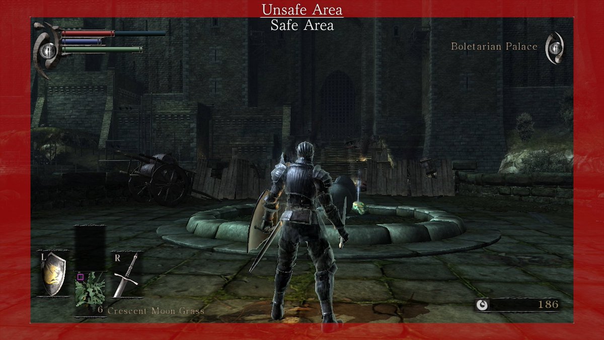
With that in mind, Demon's Souls is a perfect example of title-safe UI.
Every HUD element is pushed right out to the edge of the Safe Area, with a bit of extra buffer to keep things comfortable. It's title-safe without covering too much of the middle-screen, which is the ideal.
Every HUD element is pushed right out to the edge of the Safe Area, with a bit of extra buffer to keep things comfortable. It's title-safe without covering too much of the middle-screen, which is the ideal.
For an example of a HUD that isn't title-safe, we need look no further than... Demon's Souls.
The PS5 remake's HUD seems to have been designed with no regard for Safe Title Area. Depending on your TV, you could be missing your entire HP bar, and maybe even your MP bar. It sucks!
The PS5 remake's HUD seems to have been designed with no regard for Safe Title Area. Depending on your TV, you could be missing your entire HP bar, and maybe even your MP bar. It sucks!
Now, one of the criticisms most often leveled at the (original) Demon's Souls HUD is that the Key Menu (weapons-items-magic thing) is too big, covering too much of the screen while displaying redundant information like your weapons, which can be seen on your character just fine.
So of course moving forward into Dark Souls Fromsoft made it... even bigger?
DS1's Key Menu is massive. The item/spell counters now have their own dedicated space and the icon borders are much thicker, making the whole thing cover ~30% more screen space.
DS1's Key Menu is massive. The item/spell counters now have their own dedicated space and the icon borders are much thicker, making the whole thing cover ~30% more screen space.
Presumably this was intended to improve clarity, but coupled with the muddy backing textures this feels more like a misguided regression than anything.
Fromsoft themselves seem to agree, as we'll later see in DS3.
Also the status bars have worse contrast than before :V
Fromsoft themselves seem to agree, as we'll later see in DS3.
Also the status bars have worse contrast than before :V
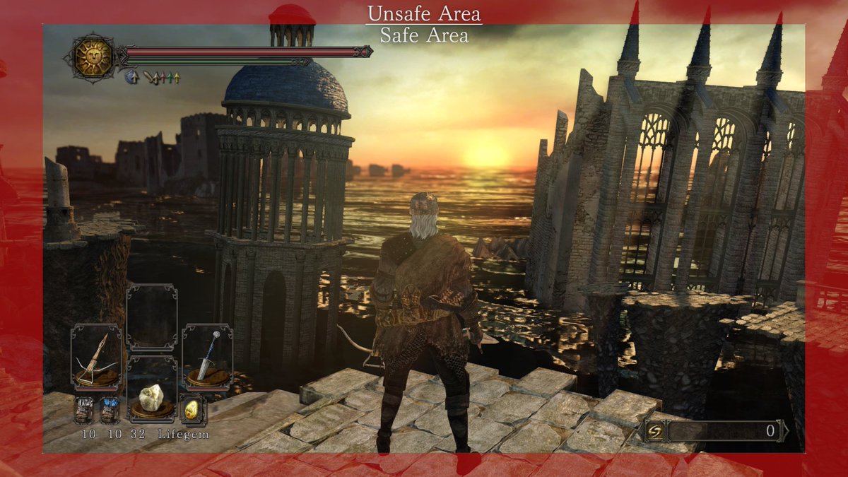
DS2 largely inherits all of DS1's HUD problems, while adding a few of its own. Item/spell counters no longer have backing, making them less readable, and are now left-justified, making the item count appear directly next to ammo count, which is really gross.
Icon frames are also over-designed, the added greebles detracting from the otherwise much cleaner backing/frame; the soul counter is now massive to accommodate DS2's inflated soul numbers; and the buffer space between elements and the Safe Area is grossly inconsistent.
Here it's also worth pointing out how the HUD elements seem to have "drifted" inward with each game, for no apparent reason. Look at all the space between the Key Menu and the Safe Area! Where did that all that space come from!
It's not all bad though! DS2 was the first to automatically hide the HUD when not in combat, the rolling item/spell preview is a nice addition, and the status bars have much better contrast than they did in DS1.
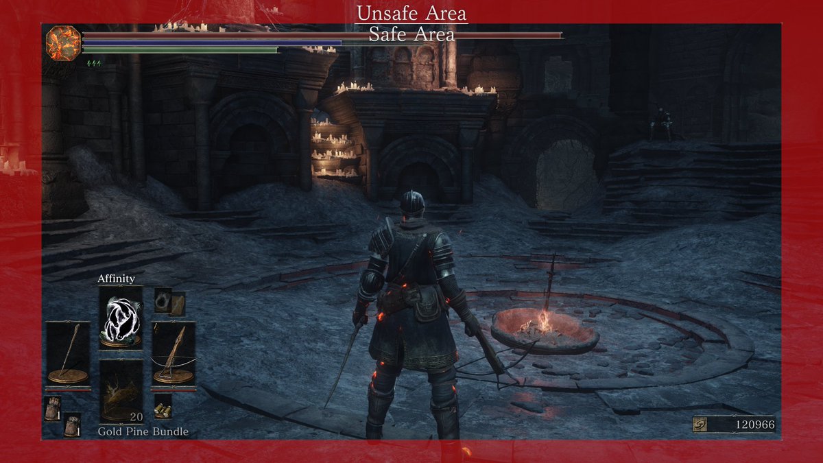
Finally we come to DS3, which I feel comfortable saying has the best HUD in the Souls series. Everything is clean, compact, and as close to the Safe Area as possible to minimize view-obstruction. The Key Menu is still taller than it was in Demon's, but it's not that intrusive.
They also finally scaled down the soul counter, which was always bigger than it needed to be but compared to DS2 this is a particularly welcome change. The item/spell previews are also more spread out, and the item counter is snug within the icon frame, like it was in Demon's.
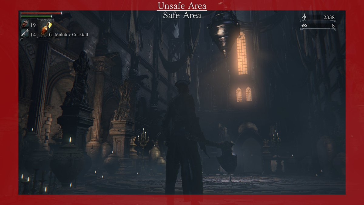
While not technically Souls, Bloodborne did finally address the Key Menu issue by removing the weapon display altogether and making spells into items, so that only one slot is needed. The status bars could be brighter, and there's no item preview, but overall this is a great HUD.
also note that even in Bloodborne, the game with the most compact, most minimal, and least intrusive HUD, From still respected the Safe Title Area because they understand how important it is :))))
Anyway, hopefully this was somewhat interesting, I could go on about more fine-detail stuff but I'll save that for the thread of improvements I've made to DS2's HUD, coming sometime whenever.

 Read on Twitter


