Why this graph doesn't tell you what you think it does (and why you should probably just ignore it).
A thread on EuroMOMO and excess mortality...
A thread on EuroMOMO and excess mortality...
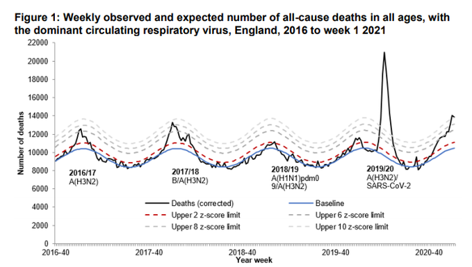
Earlier today @brodjustice asked me why the observed deaths line (in black) on this graph from @PHE_uk seems to exceed the baseline every winter (blue line). If that keeps happening, why don't we adjust the baseline?
Which seems like a reasonable question https://assets.publishing.service.gov.uk/government/uploads/system/uploads/attachment_data/file/952280/Weekly_report_mortality__w2.pdf
Which seems like a reasonable question https://assets.publishing.service.gov.uk/government/uploads/system/uploads/attachment_data/file/952280/Weekly_report_mortality__w2.pdf
It turns out the baseline in this graph comes from EuroMOMO, the dedicated project set up to monitor mortality across 27 European countries, with the specific aim of monitoring "serious public health risks and pandemic influenza".
https://www.euromomo.eu/
https://www.euromomo.eu/
So how do EuroMOMO estimate this baseline?
Well, since the specific aim is to identify 'unusual' levels of mortality. These tend to happen in the summer (heat waves) or winter (flu or cold snaps), so EuroMOMO *only* use data from the Spring and Autumn.
Well, since the specific aim is to identify 'unusual' levels of mortality. These tend to happen in the summer (heat waves) or winter (flu or cold snaps), so EuroMOMO *only* use data from the Spring and Autumn.
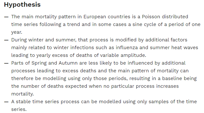
They also make some assumptions about the nature of the underlying 'shape' of this distribution, listed here.
What this means is that the 'baseline' in all EuroMOMO graphs is an estimate of what mortality rates would have been *in an ideal winter without any 'unusual' factors*.
i.e. a winter with no cold snaps and no flu.
i.e. a winter with no cold snaps and no flu.
But very few winters actually look like this. Which is why we see observed deaths deviate sharply from baseline in the winters of 2016/17 and 2017/18 when there was substantial levels of flu mortality in England.
This approach makes sense if your question is 'were there a significant number of deaths due to flu/a cold snap/whatever this winter?', since you are comparing with a hypothetical 'good' winter.
But if instead your question is 'were there significantly more deaths *than we would usually see at this time of year*' then this is the *wrong* approach.
To answer that question we need an approach to modelling a baseline which *includes* the fact that we usually have some level of fly mortality in winter in England.
There are many ways to do this.
You can use an average of recent years, as the ONS do.
You can adjust this for population growth.
You can fit a variety of more complex demographic models which adjust for multiple factors, as PHE do in their excess mortality reports.
You can use an average of recent years, as the ONS do.
You can adjust this for population growth.
You can fit a variety of more complex demographic models which adjust for multiple factors, as PHE do in their excess mortality reports.
Each of these has strengths and limitations. But they are *all* better than the EuroMOMO approach, if your interest is in comparing 2020/21 to what we might have expected it to look like without COVID.
A corollary of this is that this graph from EuroMOMO (which also has important reporting delay issues as @jburnmurdoch sets out nicely here https://twitter.com/FinancialTimes/status/1350042546089545730) actually *overestimates* excess deaths in 2020/21, because the baseline is (by design) lower than we would expect.
This isn't an error on EuroMOMO's part, it's just that this graph is designed to answer a fundamentally different question to the question that we are asking of it.
So we should probably just stop looking at it entirely and stick to the excellent analysis from ONS and PHE.
So we should probably just stop looking at it entirely and stick to the excellent analysis from ONS and PHE.
One final point - EuroMOMO should have been among the heroes of the pandemic. Their whole purpose is to monitor for public health issues that impact on mortality and try and improve public health responses to them.
But as far as I can see they have failed dismally.
Their methods are opaque. They don't share their data. They only report confusing z-scores, not actual numbers. They have basically no media presence. They don't even seem to have a Twitter account.
Their methods are opaque. They don't share their data. They only report confusing z-scores, not actual numbers. They have basically no media presence. They don't even seem to have a Twitter account.
I find this quite depressing and a huge missed opportunity.
Maybe I'm wrong and they've been quietly smashing it out the park without me noticing. I really hope I am.
Maybe I'm wrong and they've been quietly smashing it out the park without me noticing. I really hope I am.
Thanks to @JonMinton @badtakesbot1 @hggaddy @nmrqip and various others who helpfully responded to my original thread and helped me work out what on Earth was actually going on https://twitter.com/VictimOfMaths/status/1350058211886452736
Here are links to PHE's analysis of excess mortality https://fingertips.phe.org.uk/static-reports/mortality-surveillance/excess-mortality-in-england-latest.html
and ONS's https://www.ons.gov.uk/peoplepopulationandcommunity/birthsdeathsandmarriages/deaths/bulletins/deathsregisteredweeklyinenglandandwalesprovisional/latest
Both are excellent.
and ONS's https://www.ons.gov.uk/peoplepopulationandcommunity/birthsdeathsandmarriages/deaths/bulletins/deathsregisteredweeklyinenglandandwalesprovisional/latest
Both are excellent.

 Read on Twitter


