Fonts in Super Bowl LV commercials. An ongoing thread 
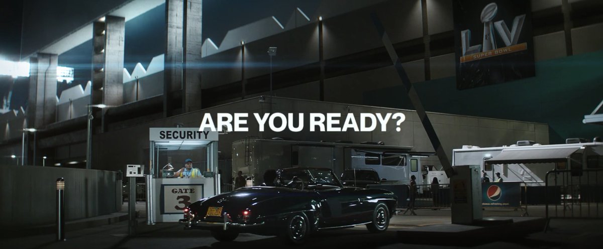
Starting with Pepsi. They’re not running a standalone spot in 2021, but ARE running a campaign in line with the big game. Helvetica? Nimbus? Not sure. The round tittle of the ‘?’ and kick of the ‘R’ are throwing me

Starting with Pepsi. They’re not running a standalone spot in 2021, but ARE running a campaign in line with the big game. Helvetica? Nimbus? Not sure. The round tittle of the ‘?’ and kick of the ‘R’ are throwing me

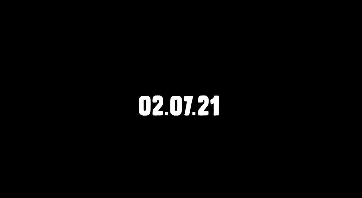
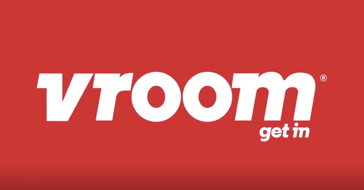
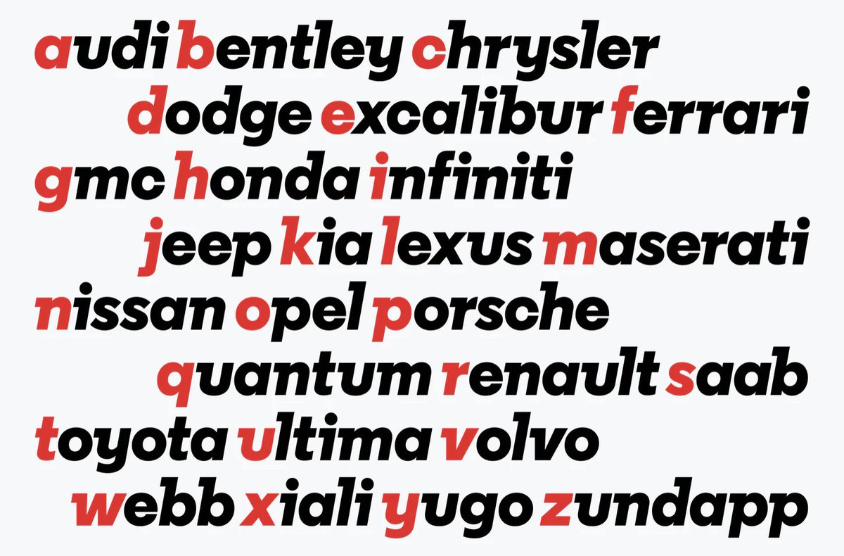
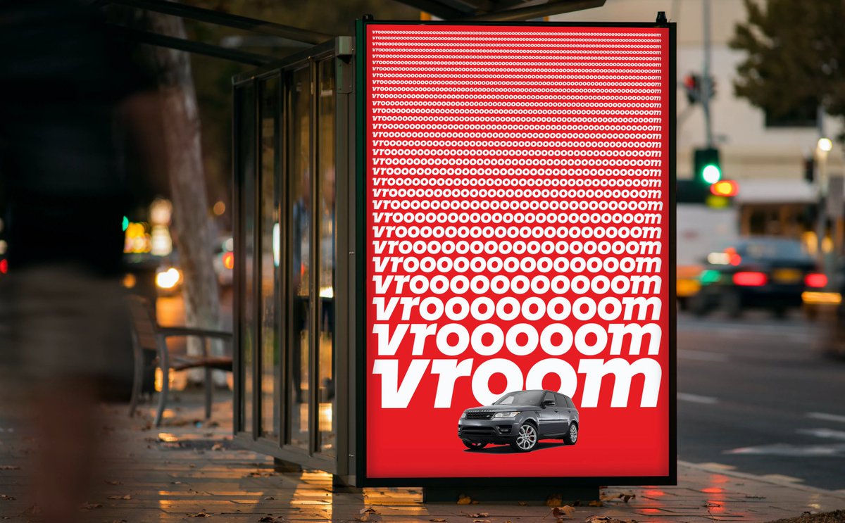
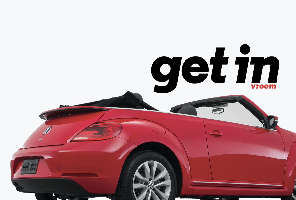
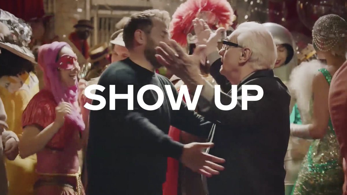
Vroom’s first spot uses ‘Vroom Sans’, a custom typeface by Pentagram that leans forwards and casts its thicc serifs backwards to elicit a sense of speed. It’s deliciously consistent across their ads (for now). First pic = Super Bowl ident. Other three = other ads.
Coca-Cola are joining Pepsi in sitting out the Super Bowl this year, so here’s a LIV ad.
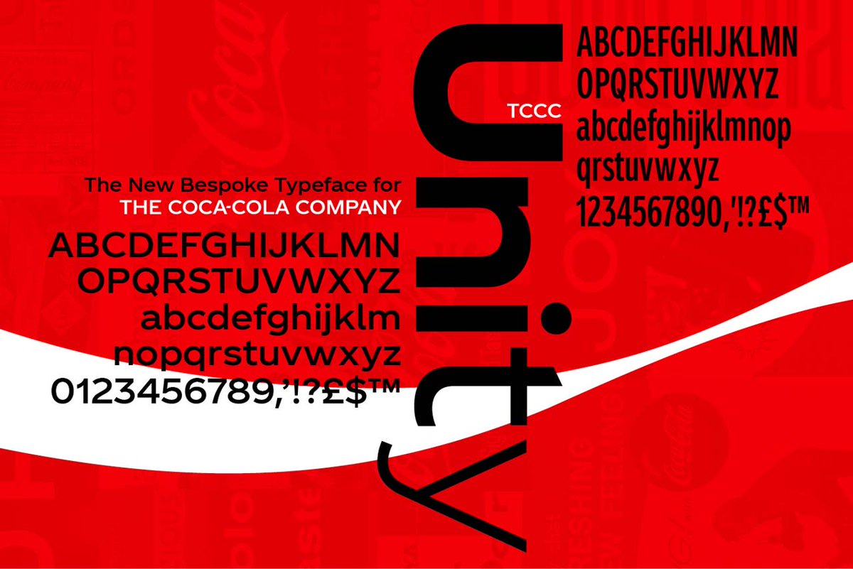
Until 2017, Coca-Cola didn’t have a consistent typeface! They used Gotham sometimes, Proxima Nova other times. Then they developed ‘TCCC Unity’ in-house. TCCC = ‘The Coca-Cola Company’.
Until 2017, Coca-Cola didn’t have a consistent typeface!
 They used Gotham sometimes, Proxima Nova other times. Then they developed ‘TCCC Unity’ in-house. TCCC = ‘The Coca-Cola Company’.
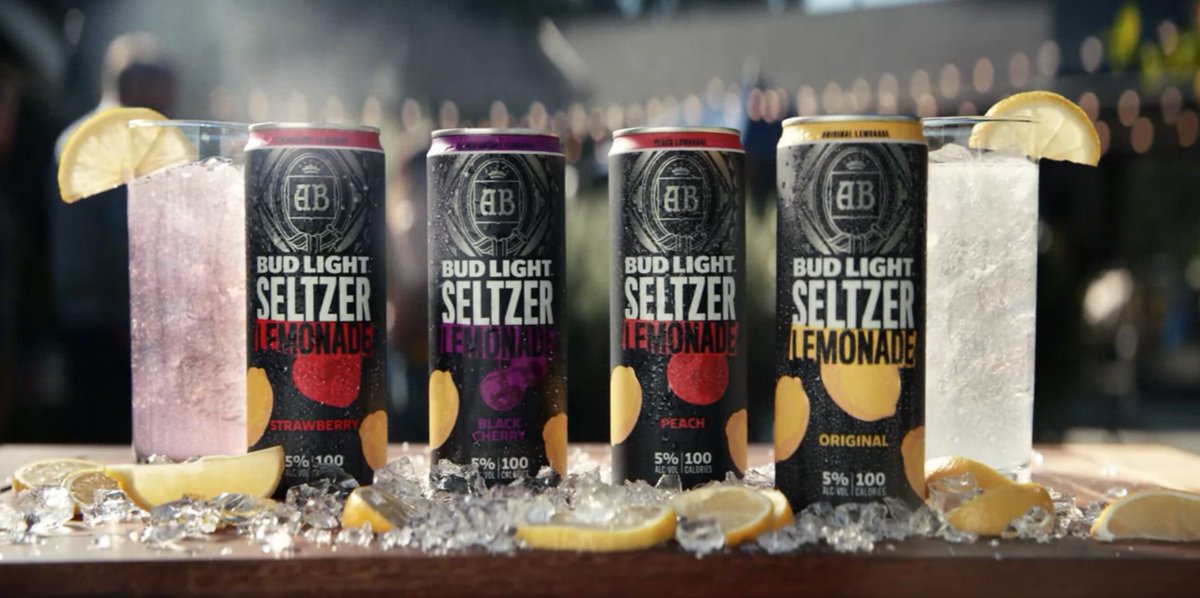
No ident typography in Bud Light’s ‘lemons’ ad, so... packaging! The word ‘Seltzer’ on the cans is set in Titling Gothic Skyline Medium.
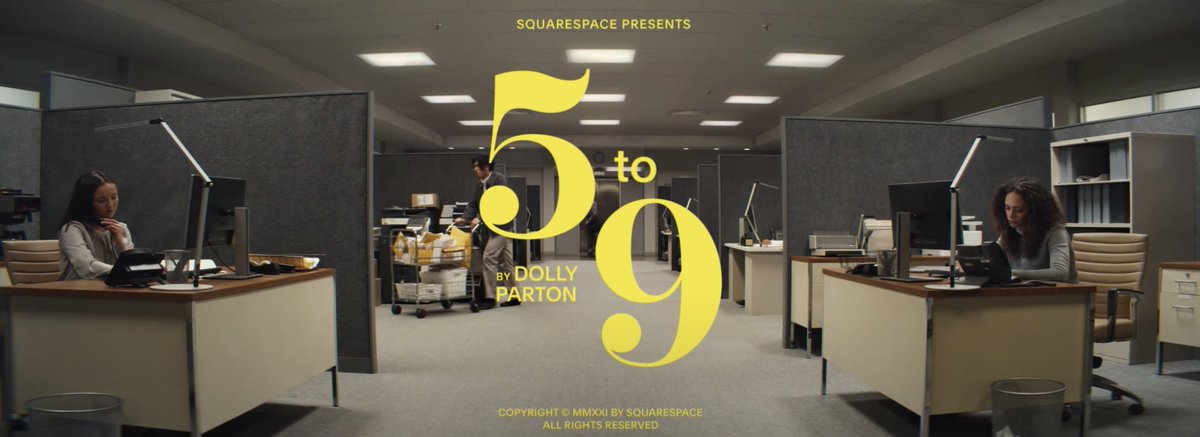
This was a tough one. So many ‘fancy’ numeric fonts with didone glyphs, ball serifs, and flag-like flourishes. I’m fairly certain this is a modified version of Vectory Semi Bold, for the ‘5’ and ‘9’.
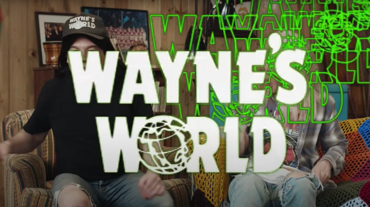
The ‘Wayne’s World’ logo, which features in a Super Bowl ad depicting Wayne and Garth bowing down to corporate sponsor Uber Eats and highlighting how the app supports local restaurants by taking 30% of each delivery order, uses Dynamo Bold Condensed, with a custom apostrophe.
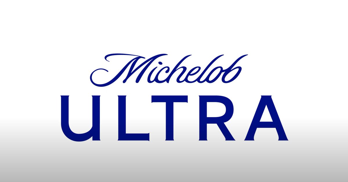
No interesting typography in the Michelob ULTRA ad, so, the Michelob ULTRA logo: Sloop Script for ‘Michelob’, and what looks like a custom face for ‘ULTRA’, with cute lil Copperplate-like spiky serifs.
DORITOS.
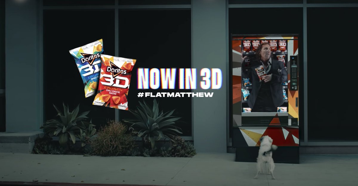
‘Now in 3D’ has gotta be Beni Bold. The cuts in the ‘N’ are a dead giveaway.
Struggling with ‘ #FlatMatthew’. An adjusted Aspire SmallCaps? Can’t think of a font that has parallel terminals in a sheered octothorpe, an indented ‘F’ glyph, AND flush ‘E’ terminals
‘Now in 3D’ has gotta be Beni Bold. The cuts in the ‘N’ are a dead giveaway.
Struggling with ‘ #FlatMatthew’. An adjusted Aspire SmallCaps? Can’t think of a font that has parallel terminals in a sheered octothorpe, an indented ‘F’ glyph, AND flush ‘E’ terminals

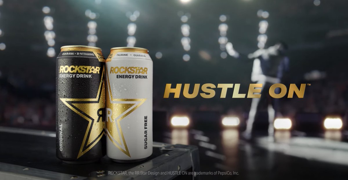
The new Rockstar logo + slogan gives me Moderna Sans vibes, but with some unique little tics: a small angular jut on the bottom horizontal glyphs of the ‘L’ and the ‘E’.

 Read on Twitter