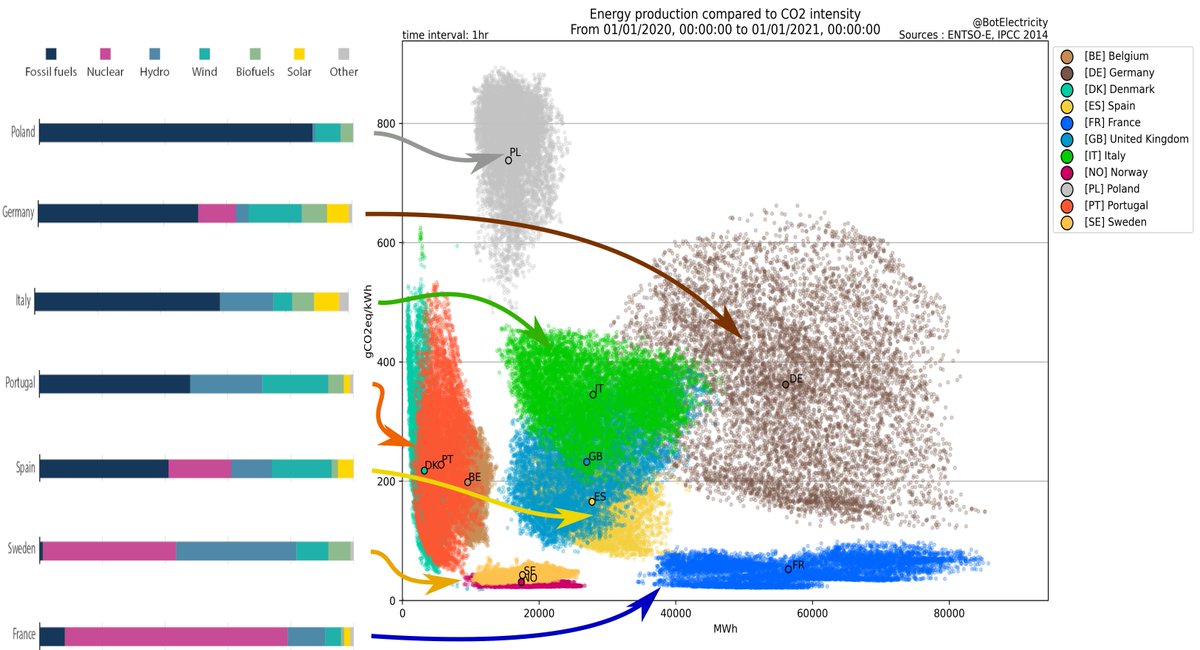
Electricity production in Europe in 2020.
Right:
Each colored point-cloud is a country
Each point (x,y) is 1 hour of electricity production with x=energy produced in kWh; y=CO2 emission in g/kWh.
Left:
bar graphs of the mix of production methods for select countries.
1/N
Right:
Each colored point-cloud is a country
Each point (x,y) is 1 hour of electricity production with x=energy produced in kWh; y=CO2 emission in g/kWh.
Left:
bar graphs of the mix of production methods for select countries.
1/N
France: low overall CO2 emissions, low variance on emissions, relying essentially on nuclear energy with a bit of hydro [reminder: nuclear produce essentially no CO2].
2/N
2/N
Germany: despite having a large proportion of renewables, has high emissions and a high variance of emissions: when there is no wind nor sun, it has to rely on fossil fuel, having abandoned and phased out nuclear production.
3/N
3/N
Poland has very high emissions, relying essentially on coal and other fossil fuels.
Sweden, like France has a high proportion of nuclear, and a favorable geography for hydro and wind power, and hence has low emissions.
4/N
Sweden, like France has a high proportion of nuclear, and a favorable geography for hydro and wind power, and hence has low emissions.
4/N
Portugal, like Sweden, relies heavily on hydro and wind, but unlike Sweden relies on fossil fuels instead of nuclear to pick up the slack when there is no wind nor sun. Hence their CO2 emission variance is huge, like Germany's.
5/N
5/N
I put the diagram together from the following sources:
- The scatter plot comes from this article in Le Monde yesterday: https://www.lemonde.fr/.../electricite-et-co2-le-constat.../
- The energy mix bar graphs (from 2018) come from the European Commission website: https://ec.europa.eu/.../infographs/energy/bloc-3b.html
6/N, N=6
- The scatter plot comes from this article in Le Monde yesterday: https://www.lemonde.fr/.../electricite-et-co2-le-constat.../
- The energy mix bar graphs (from 2018) come from the European Commission website: https://ec.europa.eu/.../infographs/energy/bloc-3b.html
6/N, N=6

 Read on Twitter


