Four points to make re: @SteiniBrown ’s presentation
1. This is a clear demonstration of how critical communication is to pandemic control.
1. This is a clear demonstration of how critical communication is to pandemic control.
2. We have a tsunami of deaths coming. I am so sorry. The “casedemic” rhetoric directly contributed to this tragedy, and I hope there are consequences for this who knowingly pushed disinformation.
3. @SteiniBrown is presenting near term epidemic curves that rise and rise. Their fall, if symmetrical, means that we can double the deaths on the way back down.
4. As I have noted previously, there is a *remarkable* degree of consensus on the modeling table around these projections. These projections come from modellers and groups across Ontario.
Everyone is getting the same answer and coming to the same conclusions.
Everyone is getting the same answer and coming to the same conclusions.
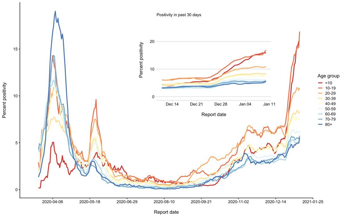
Lastly, I hadn’t wanted to share this prior to the presser but I think it simply reinforces the heat map in the now-public slides. This is test positivity by age in Ontario.
Red and orange are kids.
Red and orange are kids.

 Read on Twitter


