What a bizarrely distorted graph.
It leaves off Denmark, the EU country that has in 2 weeks vaccinated almost as much as UK in 5 weeks.
It conveniently sets threshold for any shade of red to start with best-performing EU countries.
And ignores context of a 3-week-earlier start https://twitter.com/Jeremy_Hunt/status/1348974365342359552
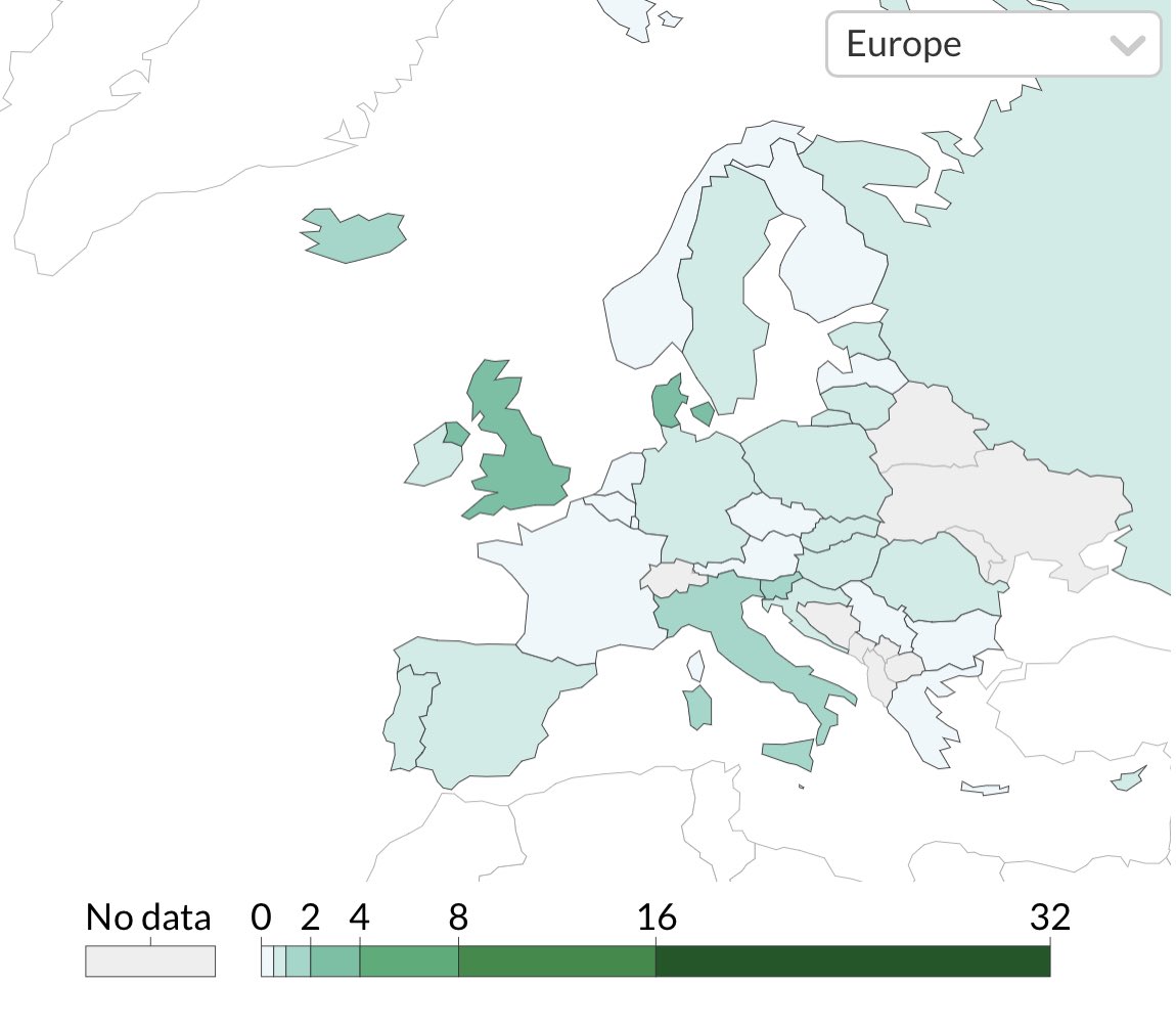
Here's another way of showing the data in a global context that shows the UK vaccinations relative to the rest of Europe.
The UK had a three-week head start compared to EU because it gave emergency authorisation rather than waiting to do a conditional authorisation.
The UK had a three-week head start compared to EU because it gave emergency authorisation rather than waiting to do a conditional authorisation.
Vaccination in the UK has been a success story so far.
I don't understand why so many British Conservatives right now feel the need to distort that success or exaggerate the EU's vaccination problems in order to try to justify #Brexit.
It's just bizarre.
I don't understand why so many British Conservatives right now feel the need to distort that success or exaggerate the EU's vaccination problems in order to try to justify #Brexit.
It's just bizarre.

 Read on Twitter
