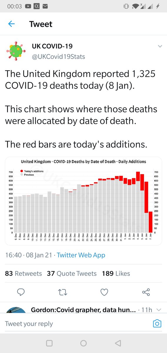
I've now had a long conversation with the person behind this account
I originally assumed it was inadvertent mis-information
It turns out, he is deliberately posting the misleading numbers, to try & downplay the seriousness of the current situation
A thread https://twitter.com/UKCovid19Stats/status/1347583854316580864
I originally assumed it was inadvertent mis-information
It turns out, he is deliberately posting the misleading numbers, to try & downplay the seriousness of the current situation
A thread https://twitter.com/UKCovid19Stats/status/1347583854316580864
The account profile is
"Helping the United Kingdom through the current COVID-19 crisis by delivering impartial, understandable & consistent official statistics from trusted sources."
Which sounds good
"Helping the United Kingdom through the current COVID-19 crisis by delivering impartial, understandable & consistent official statistics from trusted sources."
Which sounds good
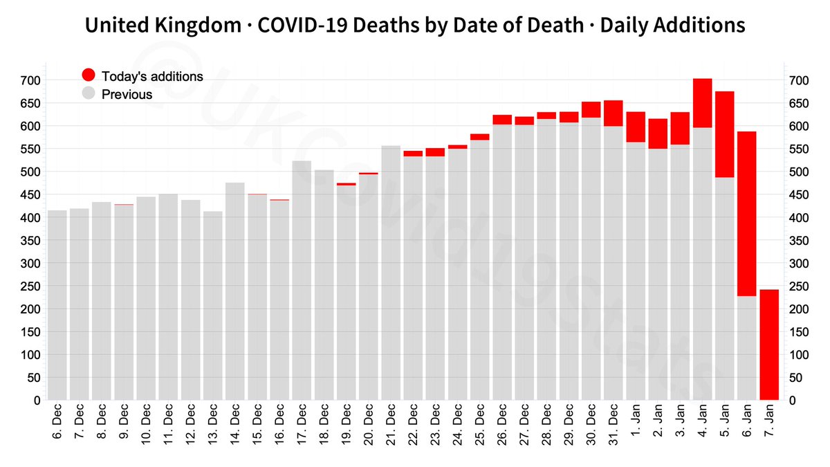
There is a problem with the graph,
It mixes compete data, and incomplete data
Which means that it misleads the viewer's eye into thinking there is a downward trend, when there is a rising trend
Ex:
The trend is rising, but every day looks like, this week, it's finally falling
It mixes compete data, and incomplete data
Which means that it misleads the viewer's eye into thinking there is a downward trend, when there is a rising trend
Ex:
The trend is rising, but every day looks like, this week, it's finally falling
Lots of people use this as a deliberate scam - very often to "prove" that Sweden does not have a Covid problem
Our World in Data felt the need to post about their graphs being misused to "prove" that point https://ourworldindata.org/covid-sweden-death-reporting
Our World in Data felt the need to post about their graphs being misused to "prove" that point
 https://ourworldindata.org/covid-sweden-death-reporting
There are ways to avoid misleading
The government dashboard, run by @Pouriaaa uses three methods
Method 1
Explicitly warn people that the data is incomplete
The government dashboard, run by @Pouriaaa uses three methods
Method 1
Explicitly warn people that the data is incomplete

Method 2
Highlight that the data is incomplete, in the graph itself
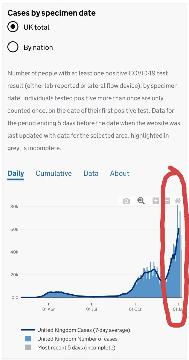
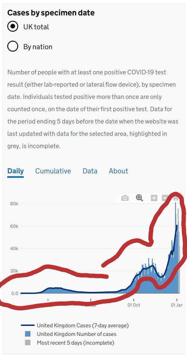
Here, the Government dashboard highlights the incomplete data by greying it out
Highlight that the data is incomplete, in the graph itself
Here, the Government dashboard highlights the incomplete data by greying it out
Method 3
Draw a trend line in, explicitly, & stop the trend line where the reliable data stops
Here, it's the dark line at the top of each bar
The Government dashboard uses all three methods to avoid misleading
Draw a trend line in, explicitly, & stop the trend line where the reliable data stops
Here, it's the dark line at the top of each bar
The Government dashboard uses all three methods to avoid misleading
You'd have to ignore
- the warning
- the greyed area on the graph &
- the visually imposing dark trend line
in order to misunderstand the data
- the warning
- the greyed area on the graph &
- the visually imposing dark trend line
in order to misunderstand the data
The Government dashboard goes to all this effort *and*, in addition,
publishes the data by
- date of death
&
- date of report
It goes to all this effort to make sure it is not publishing to mislead
Which, imo, is both laudable, & highly necessary for a Govt information source
publishes the data by
- date of death
&
- date of report
It goes to all this effort to make sure it is not publishing to mislead
Which, imo, is both laudable, & highly necessary for a Govt information source
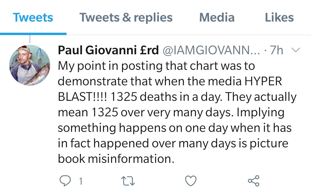
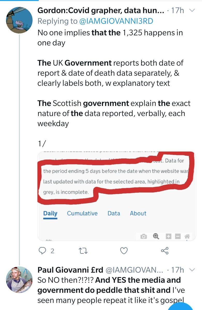
But @IAMGIOVANNI3RD is sure that "they" publish it as "picture book misinformation"
Surely he could not mean the Government?
So I checked
The answer was:
"YES the media and government do peddle that shit"
So I checked
The answer was:
"YES the media and government do peddle that shit"
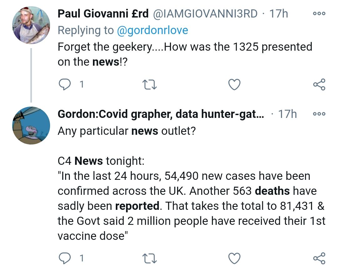
So, Channel 4 explicitly tell us that it's reports, not deaths on one day
The Govt uses 4 different additional methods to make it clear that deaths reported on one day is not the whole story
But, all that aside, how misleading is the official information, compared to Paul's?
The Govt uses 4 different additional methods to make it clear that deaths reported on one day is not the whole story
But, all that aside, how misleading is the official information, compared to Paul's?
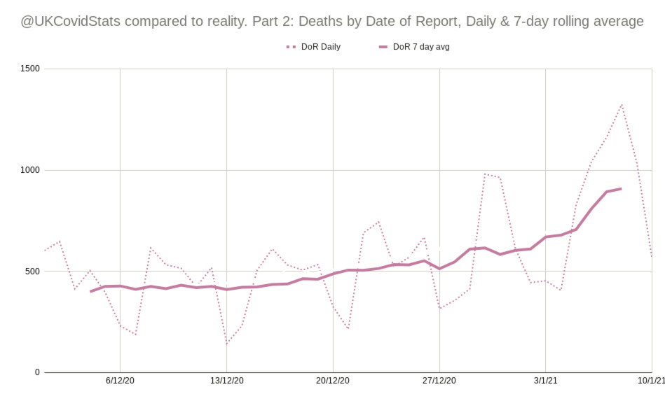
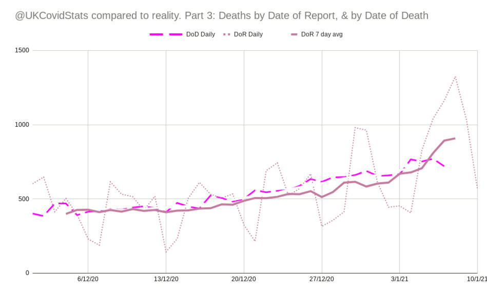
Going by the "date of report" does give big peaks and troughs
So we use the average of the most recent 7 days, or the total of the most recent 7 days, to smooth it out
Like this
(Ea point is drawn half-w between the 1st & last days in the average)
So we use the average of the most recent 7 days, or the total of the most recent 7 days, to smooth it out
Like this

(Ea point is drawn half-w between the 1st & last days in the average)
How does this compare with the Govt report by date of death?
Pretty well, it turns out
Up to the point when the date of death data is incomplete
So this is an excellent method for
showing where data is missing
&
predicting what will happen once the data is all out
Pretty well, it turns out
Up to the point when the date of death data is incomplete
So this is an excellent method for
showing where data is missing
&
predicting what will happen once the data is all out
With yesterday's data, the lines match fairly, closely, until 6 to 7 days ago
So we can easily see that more data will be coming in over the next 2 to 3 days
We can also rely on the date of death data, except just at the end of the run
So we can easily see that more data will be coming in over the next 2 to 3 days
We can also rely on the date of death data, except just at the end of the run

 Read on Twitter