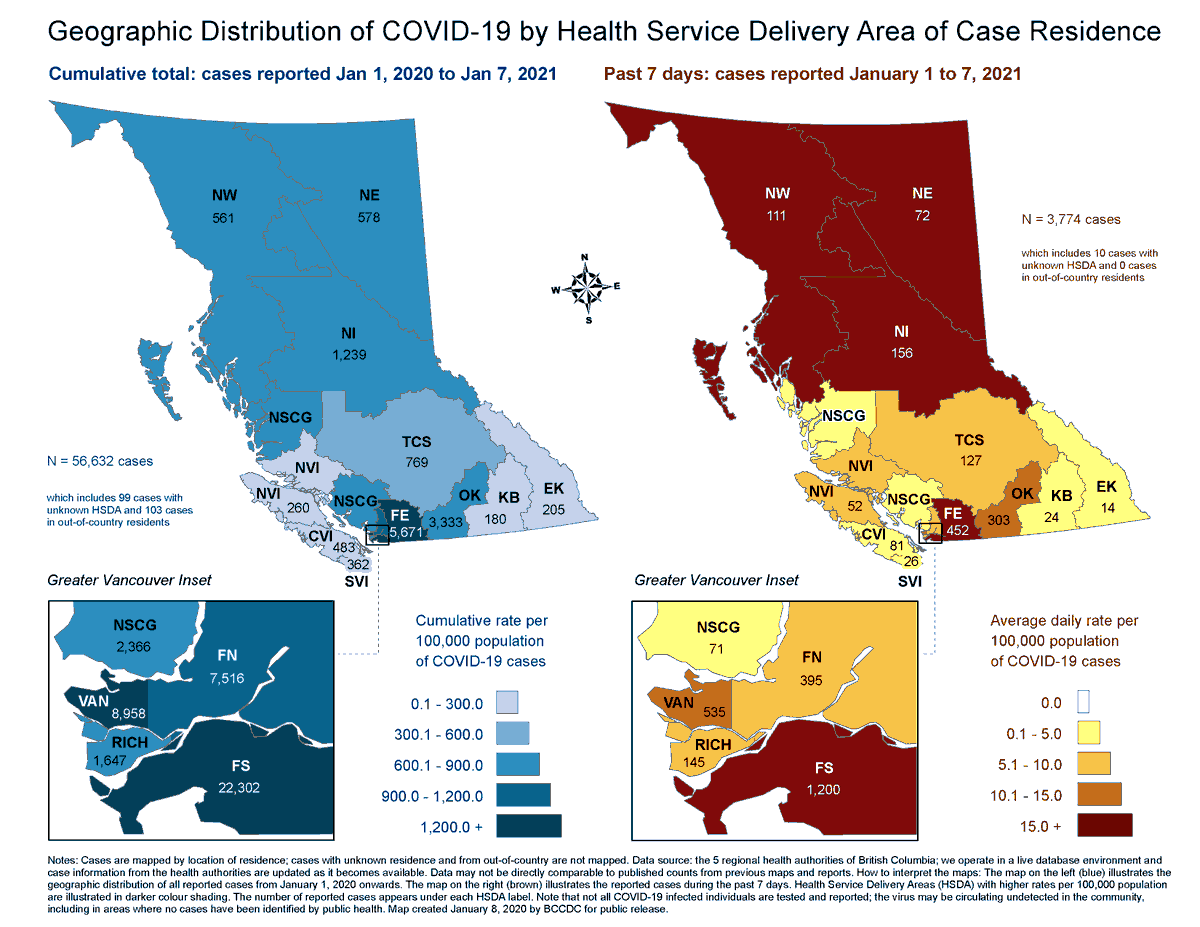
1. GOOD NEWS (or so I thought): North Shore Coast/Garibaldi recorded only 71 COVID-19 cases last week. That's a third of the cases from a couple months ago. This map shows the good news!
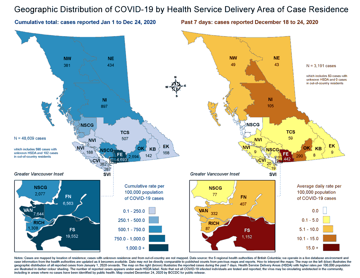
2. This map shows numbers from last week. Only 69 then.
A week before that, the number was 77. Good! But hold on. Look at those blue maps.
A week before that, the number was 77. Good! But hold on. Look at those blue maps.
3. At end of 2020, the North Coast had 2,169 cumulative cases. By Jan. 7, it had 2,366 cases. Nearly 200 new cases, and almost triple what that map on the right suggests. Which would be NOT GOOD!
4. So what is it? Well, now the BC CDC posts daily data for HSDAs, so we should be able to use that, right? Well, that data DOES show 71 cases in the last 7 days. Hurray. Mystery solved. Good news, right? RIGHT?!?
5. Well, those are the figures for "North Shore / Coast Garibaldi." That same spreadsheet has an ADDITIONAL category of "North Shore/Coast Garibaldi." This would seem to be a data error that has been created in the last week, and it shows another 26 cases.
6. And, look, that's probably just your average data error. BUT, there is still the mystery of all those additional cumulative cases that got added to the one map, while never appearing on the other map. What sort of quality control do we have on the data?
7. These sorts of errors are frequent. So how much are people actually using data, on a day-to-day basis, to make decisions? They *should* be looking at it closely enough to spot errors quickly. Or does the public just get the shareware version of our province's COVID-19 data?
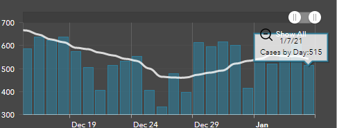
8. So back to the map. If I look at how the one map, it suggests, new cases rose 14 per cent last week. If I look at how the CUMULATIVE cases have changed over a single week, it suggests a 57% increase. Which is huge. So let's check the dashboard. THAT shows a 10% increase.
9. Of course, that dashboard's numbers themselves don't at all line up with daily announced numbers from the province. It says we had 611 cases on Jan. 6 and 515 cases on Jan. 7. But Dr. Bonnie Henry said we had 625 on Jan. 6 and 761 (200 more!) on Jan. 7.
https://twitter.com/Cycling_604/status/1347319955063066624
https://twitter.com/Cycling_604/status/1347319955063066624
10. ARE YOU CONFUSED YET BECAUSE I SURE THE HELL AM. No wonder the province is worried about people misusing data. The information they are providing to people is totally, irredeemably unclear, error-ridden and inconsistent.
11. At this point I *hope* the province is just giving us the dollar-store version of the data they are using, because if they're making decisions based on this same data, it's a problem. @vb_jens has his own list of data nightmares he's encountered.
Jens with some 'splaining: https://twitter.com/vb_jens/status/1348151550993076224?s=19

 Read on Twitter


