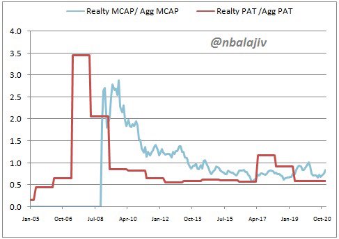
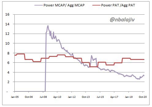
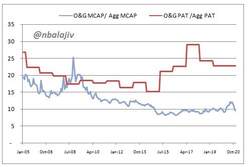
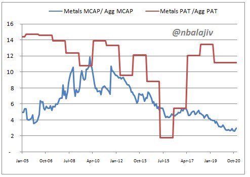
Graphical representation of individual sectors’ share of market cap in aggregate market cap versus share of PAT in aggregate PAT .

Realty (1/10):

De-rating justified? Things to pick up now?
Capital goods (2/10):

PAT share back to 2005 levels. Mcap share way below
Power sector (3/10):

Mcap share lagging PAT share
Autos (4/10):

One can’t say recovery isn’t priced in. Can we?
Banks (5/10):
FMCG (6/10):

Mcap share below PAT share now. A rarity.
IT (7/10):

Stand out so far. Check out the gap.
Pharma (8/10):

Neutral?
Oil & Gas (9/10): huge gap
Metals (10/10): 😳
You can follow @nbalajiv.
Tip: mention @twtextapp on a Twitter thread with the keyword “unroll” to get a link to it.

Latest Threads Unrolled:

By continuing to use the site, you are consenting to the use of cookies as explained in our Cookie Policy to improve your experience.