THREAD: After several months of lobbying and an FOI appeal, Public Health Scotland is now publishing #coronavirus case data by intermediate zone.
I took a gander at this for @BBCScotlandNews to find out which areas are the hardest-hit as case numbers soar.
I took a gander at this for @BBCScotlandNews to find out which areas are the hardest-hit as case numbers soar.
First off - what's an intermediate zone I hear you cry?
Well, there are 1,279 of them in Scotland and they each contain ~2500 - 6000 people.
So why does this matter?
This granularity of data allows us to pinpoint hotspots that are much smaller than councils or health boards.
Well, there are 1,279 of them in Scotland and they each contain ~2500 - 6000 people.
So why does this matter?
This granularity of data allows us to pinpoint hotspots that are much smaller than councils or health boards.
Now @P_H_S_Official does already publish this data on its interactive dashboard ( https://public.tableau.com/profile/phs.covid.19#!/vizhome/COVID-19DailyDashboard_15960160643010/Overview).
However, until recently, they had declined to publish the raw data behind the map due to concerns over patient confidentiality.
Low numbers are now shown as white.
However, until recently, they had declined to publish the raw data behind the map due to concerns over patient confidentiality.
Low numbers are now shown as white.
So why did I want the raw data?
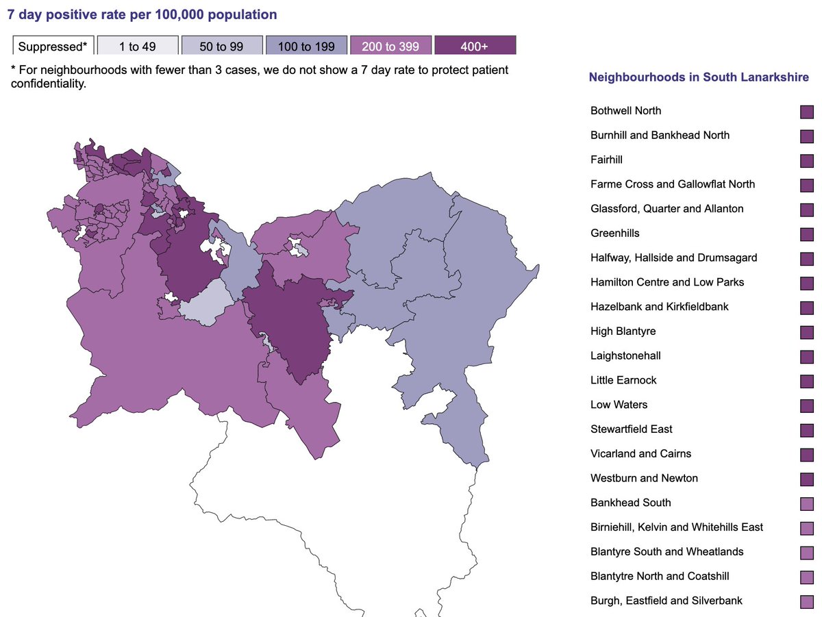
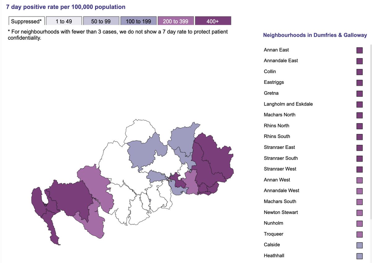
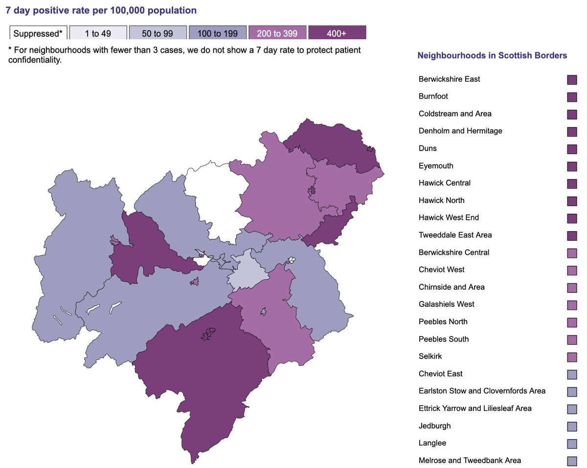
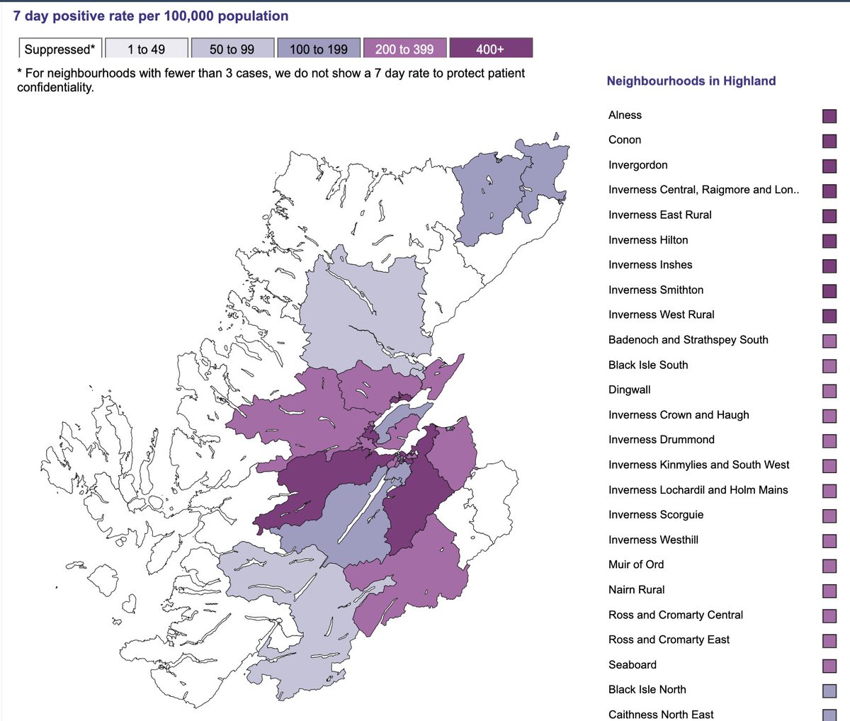
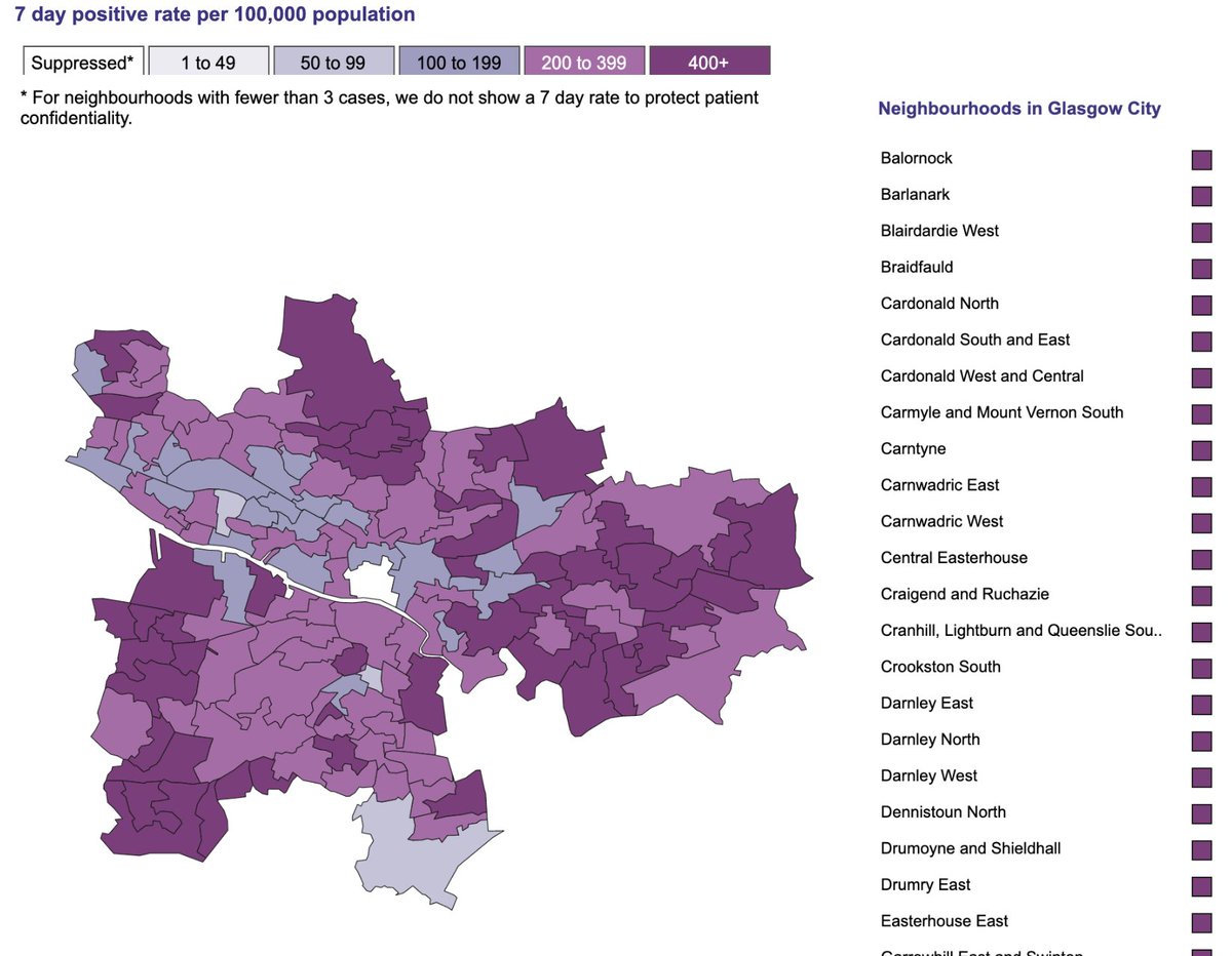
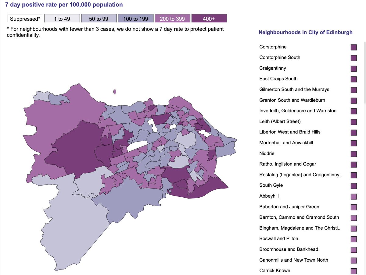
Well, as you can see, the ranges on the map are very broad.
And most importantly, the highest range is 400+ which gives us no idea of just how high the rates are in each zone.
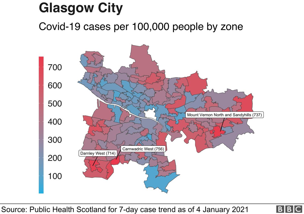
So I took their data and calculated the actual per 100,000 rate.
Well, as you can see, the ranges on the map are very broad.
And most importantly, the highest range is 400+ which gives us no idea of just how high the rates are in each zone.
So I took their data and calculated the actual per 100,000 rate.
This was done like so:
cases / (zone_population/100000)
I then checked that my rate corresponded with PHS' range.
E.g. the rate in Newmilns (East Ayrshire) is displayed as being in the 200-399 range. The actual rate I calculated is 398.695.
cases / (zone_population/100000)
I then checked that my rate corresponded with PHS' range.
E.g. the rate in Newmilns (East Ayrshire) is displayed as being in the 200-399 range. The actual rate I calculated is 398.695.
So what did I find?
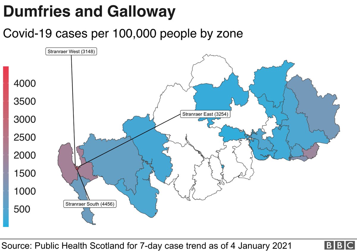
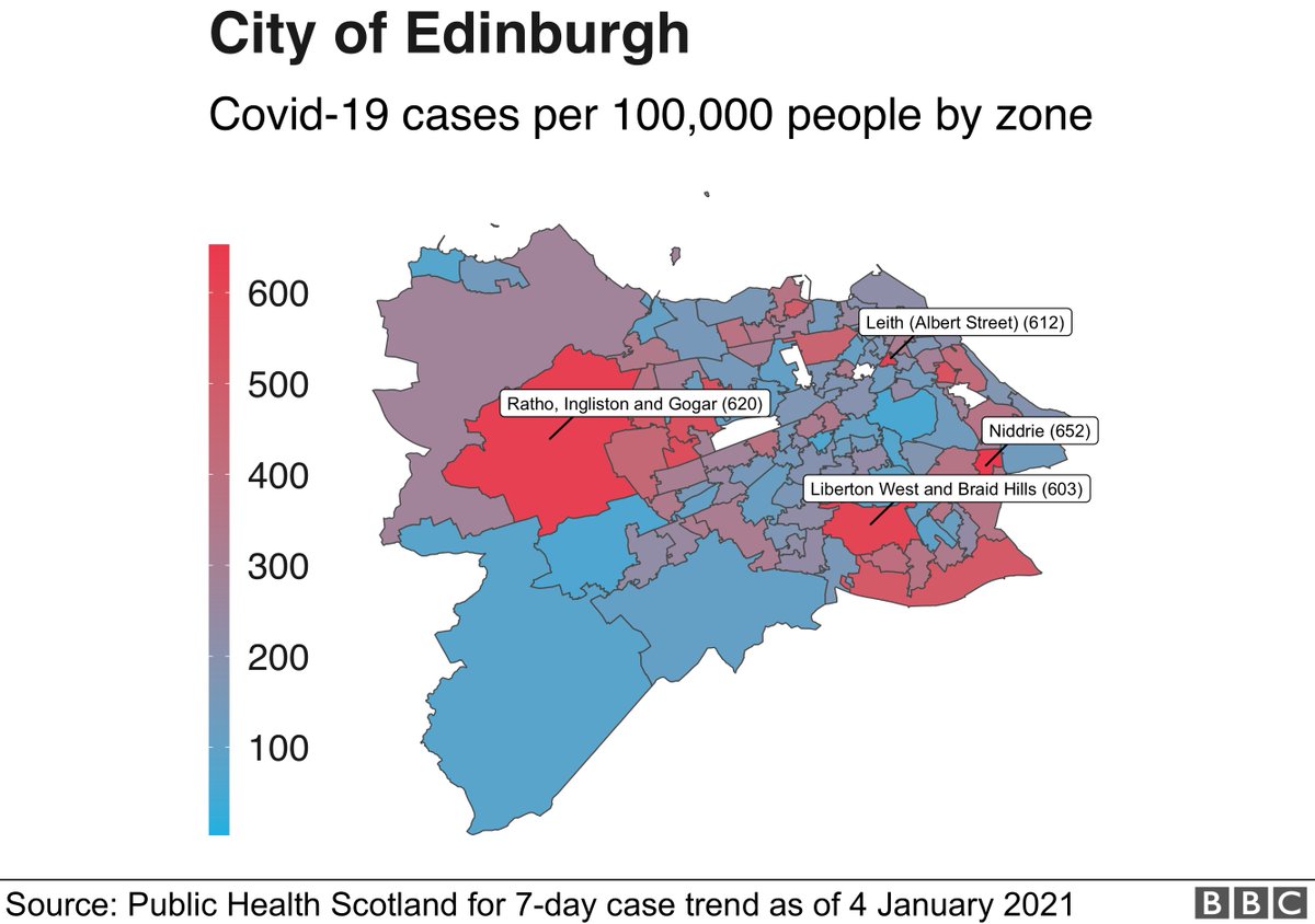
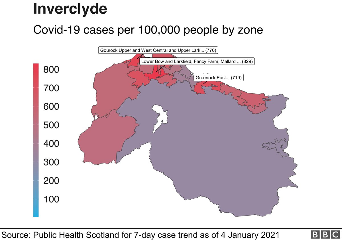
On the left are the PHS maps; mine are on the right.
In #Dumfries and #Galloway the highest rate was 4,456 per 100,000 people in Stranraer South.
That's 10 times the '400' minimum in the legend's highest range.
On the left are the PHS maps; mine are on the right.
In #Dumfries and #Galloway the highest rate was 4,456 per 100,000 people in Stranraer South.
That's 10 times the '400' minimum in the legend's highest range.
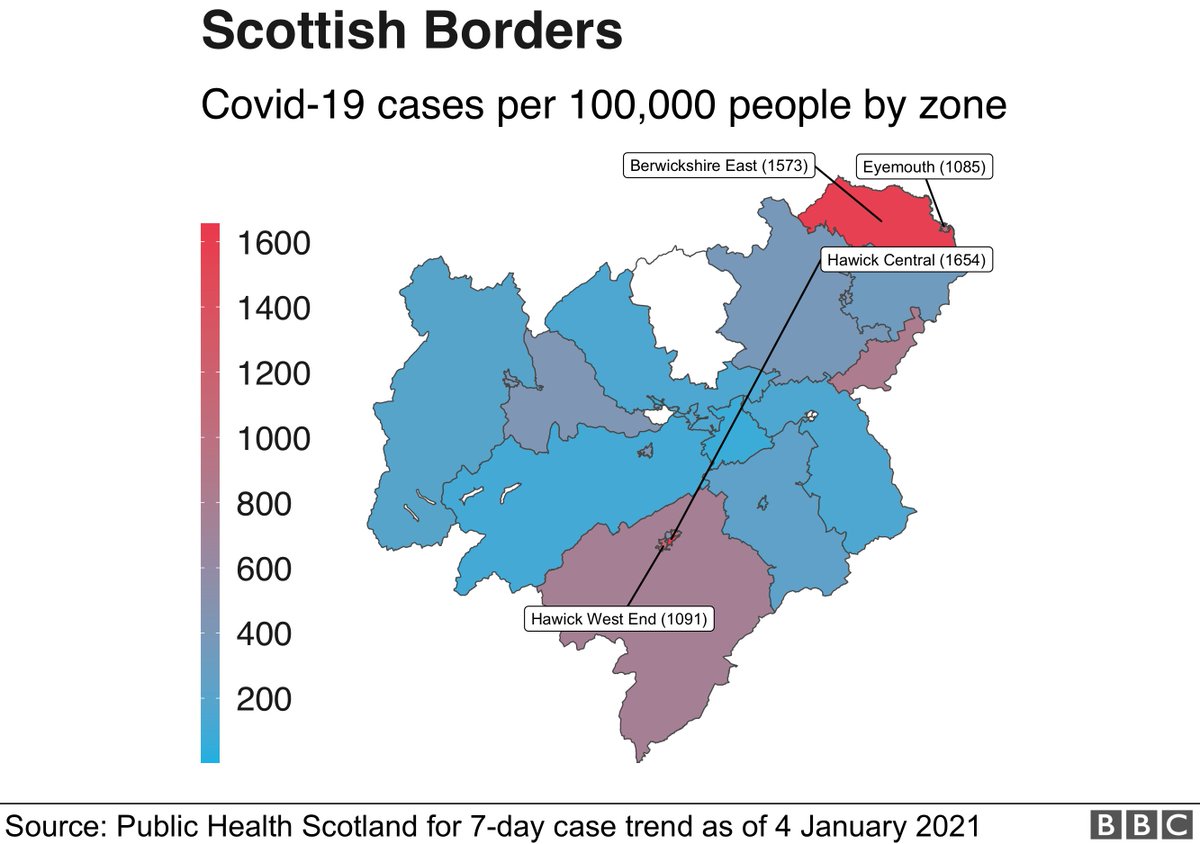
In #Highland the highest rate is 1,205 cases per 100,000 ppl in Inverness West Rural.
In #Glasgow - the highest rate is 756 cases per 100,000 ppl in Carnwadric West.
In #Edinburgh - the highest rate is 652 cases per 100,000 ppl in Niddrie.
In #Inverclyde - the highest rate is 829 cases per 100,000 ppl in Lower Bow.
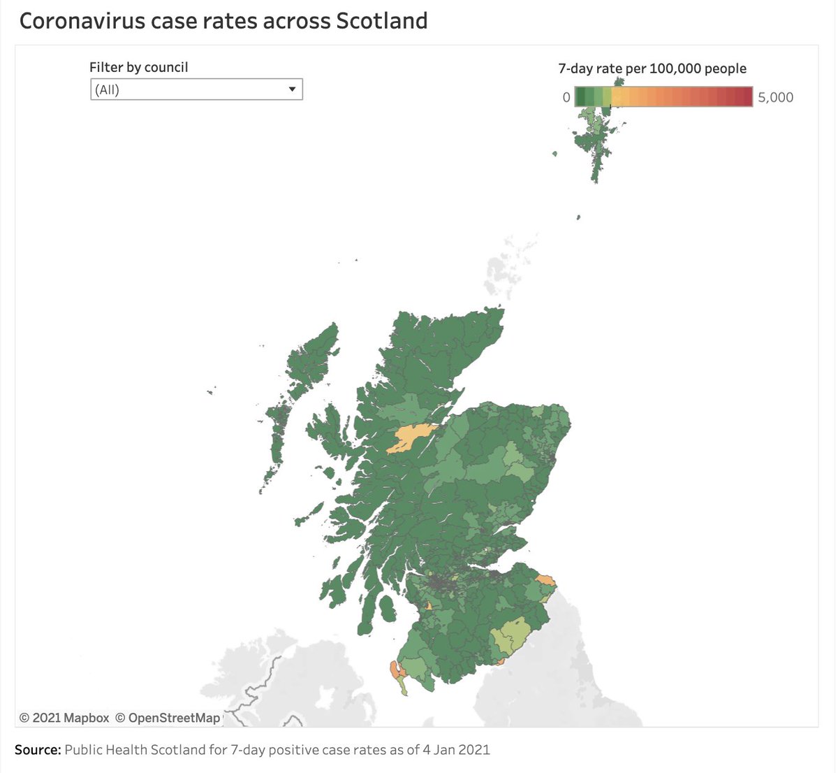
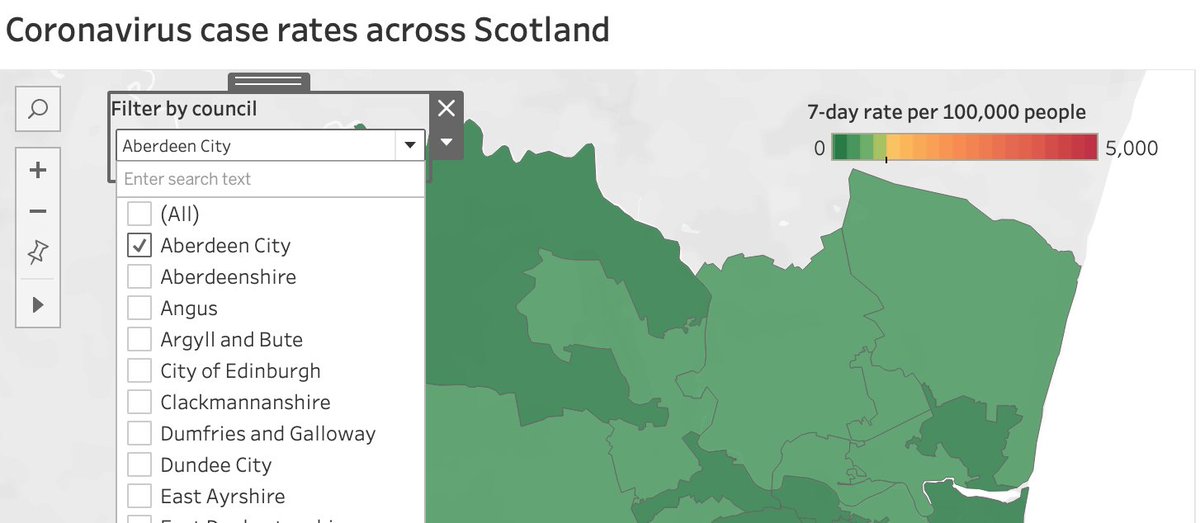
Folks have been asking me for the #coronavirus case rates for ALL of Scotland. So - seeing as I couldn't sleep and it's my day off(!) - I thought I'd create a quick @tableau interactive map showing all the 7-day trend data as of 4 Jan:
https://public.tableau.com/views/CoronaviruscaseratesacrossScotland/Dashboard1?:language=en&:display_count=y&publish=yes&:origin=viz_share_link
https://public.tableau.com/views/CoronaviruscaseratesacrossScotland/Dashboard1?:language=en&:display_count=y&publish=yes&:origin=viz_share_link
You can zoom in/out using the navigation tool in top left, or filter by council area.
Note: it's best to unselect the 'All' option and select an individual council. That'll then zoom you in automagically to that area.
Note: it's best to unselect the 'All' option and select an individual council. That'll then zoom you in automagically to that area.
NOTE: This is a personal project and more of a prototype - will try and build a better version down the line...

 Read on Twitter
