gonna start a little thread here of #coviddata #covidfacts tackling some of the more common conspiracy talking points i've encountered
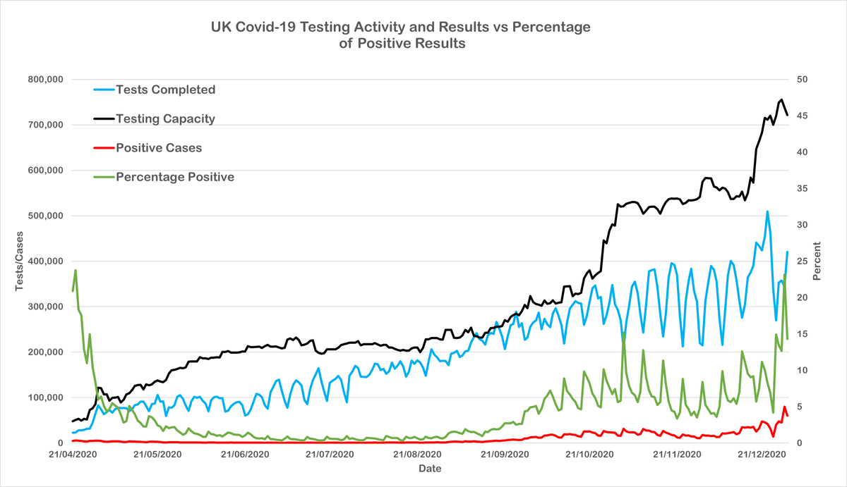
one that started popping up around the end of 2020 was that the historically high daily case numbers were due to a corresponding increase in tests administered. this is a fair point to make in terms of the significance of case numbers alone, but it isn't borne out by the data
what these two charts, compiled from official UK data show is an increase in the proportion of positive tests commensurate with an increase in testing and overall positive rates: ie the increased demand for tests is probably driven by an increased number of people getting sick
if the rate of spread was unchanged and the increased number of positives was due to more widespread testing then those green lines showing the proportion of results should be flat, but it's not.
you can actually see an increase in testing without a corresponding increase in the proportion of positive results occurring over the end of summer.
CLAIM: ONS data shows 2020 to have a lower number of overall deaths to 2019.
TRUTH: The exact opposite.
TRUTH: The exact opposite.
This one's a bit tricky because at time of writing the ONS data on UK Deaths in 2020 hasnt been published. The data for 2019 was published in July 2020 so while I dont know enough about how the ONS works to say for sure, I suspect this is the typical timescale for release of data

 Read on Twitter


