Do you wanna play around with CSS animations? If yes, this thread is for you
We will create border animation in this thread
THREAD
We will create border animation in this thread

THREAD

Animations in CSS are completely based on @keyframes Rule.
The @keyframes rule specifies the animation code
Using @keyframes, you can change the set of CSS styles many times.
So we will be using keyframes to rotate our border 360deg
The @keyframes rule specifies the animation code
Using @keyframes, you can change the set of CSS styles many times.
So we will be using keyframes to rotate our border 360deg
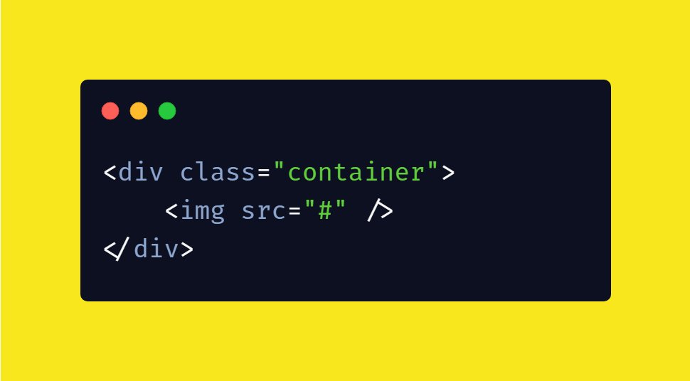
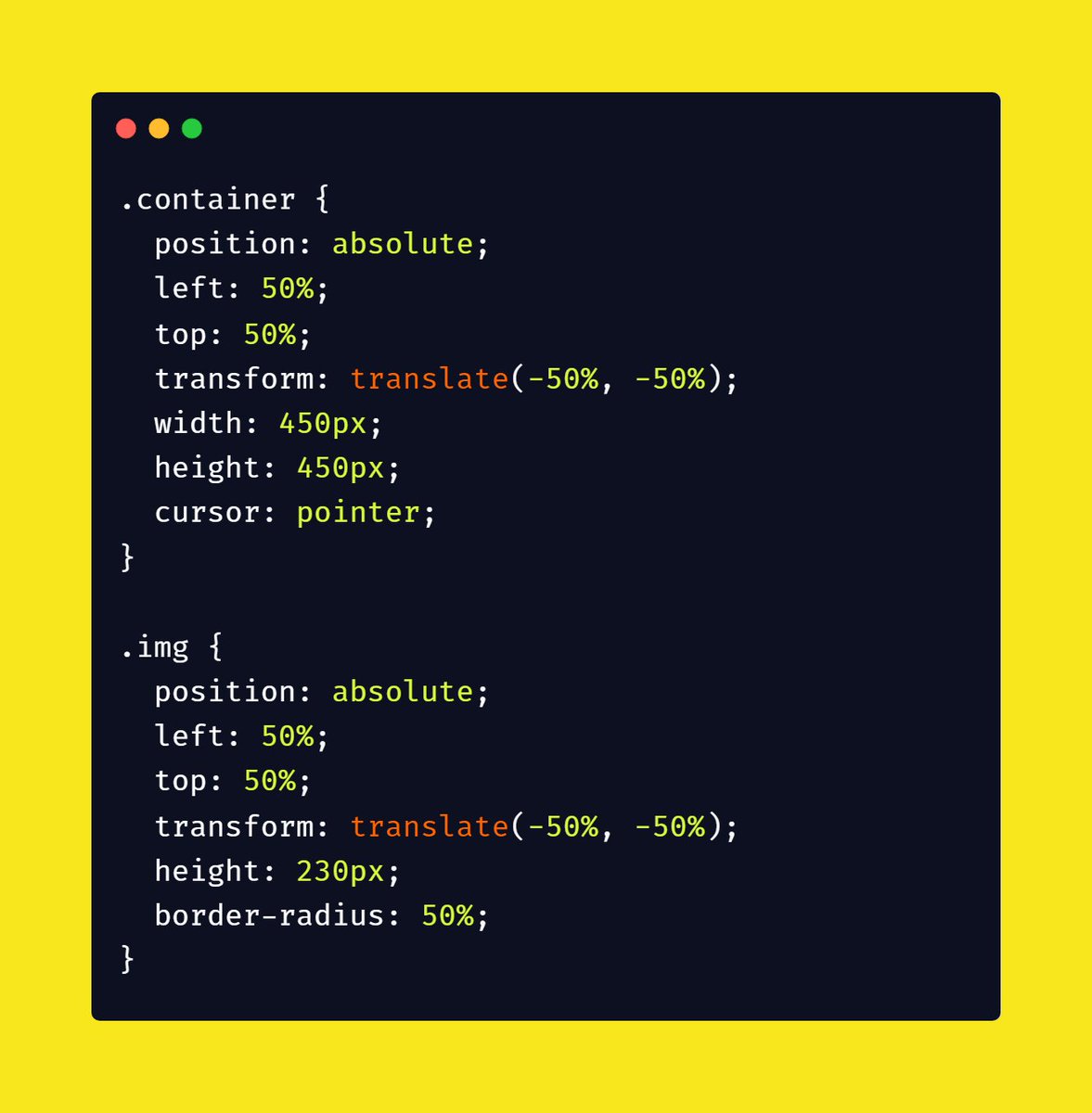
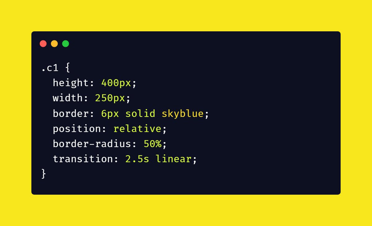
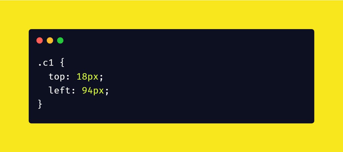
 Create a div with class "c1" (circle1) and set it width and height little bit larger than image
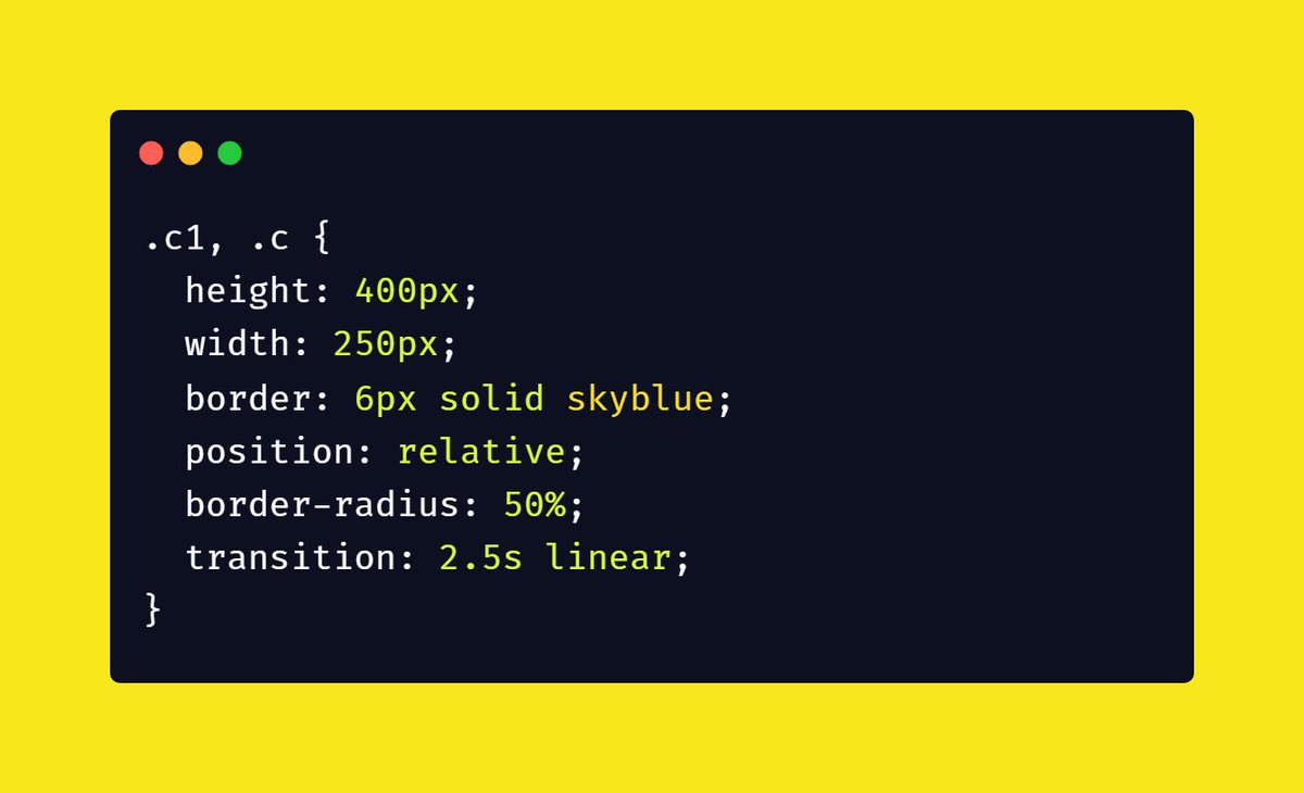
 Apply solid border
Now here comes a tricky part.
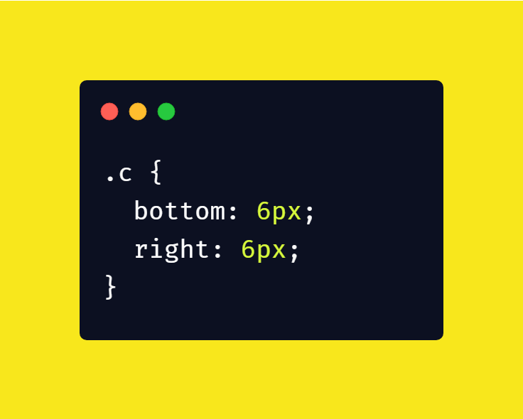
 Create 11 empty divs with class "c" (circle). I'll tell you why I created 11 divs at the end of this thread
 Apply same styling in all 11 divs as that of class c1
 Create 11 empty divs with class "c" (circle). I'll tell you why I created 11 divs at the end of this thread
 Apply same styling in all 11 divs as that of class c1
 Add hover selector on all the 11 divs and rotate them 15deg
CODE:
.c:hover {
transform: rotate(15deg);
}
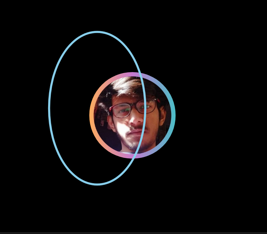
Now the animation will look like this

 Make a keyframe rule "spin" and add 360 deg rotation in it.
If you're not familiar with keyframes rule, this is the right time to give it a read
https://www.w3schools.com/cssref/css3_pr_animation-keyframes.asp
 Add animation "spin" on c1 hover selector. I specified infinite and linear because to make the animation continue for ever with the same speed from start to end.
That's pretty much it for this thread
Thanks for reading this
SOURCE CODE: https://codesandbox.io/s/border-animation-oy7wd

Thanks for reading this
SOURCE CODE: https://codesandbox.io/s/border-animation-oy7wd
Why I created 11 divs?
It's simple because I need to rotate the rings 360 deg entirely hence I created 11 divs and add 15 deg rotation in each div
It's simple because I need to rotate the rings 360 deg entirely hence I created 11 divs and add 15 deg rotation in each div


 Read on Twitter