I’m diving back into the #COVID19 data.
I’d rather hoped I wouldn’t have to but the stats are, once again, scary.
However, I hope I can provide some context, since I see there are still plenty claiming this is either the end of the world or nothing to fear at all.
I’d rather hoped I wouldn’t have to but the stats are, once again, scary.
However, I hope I can provide some context, since I see there are still plenty claiming this is either the end of the world or nothing to fear at all.
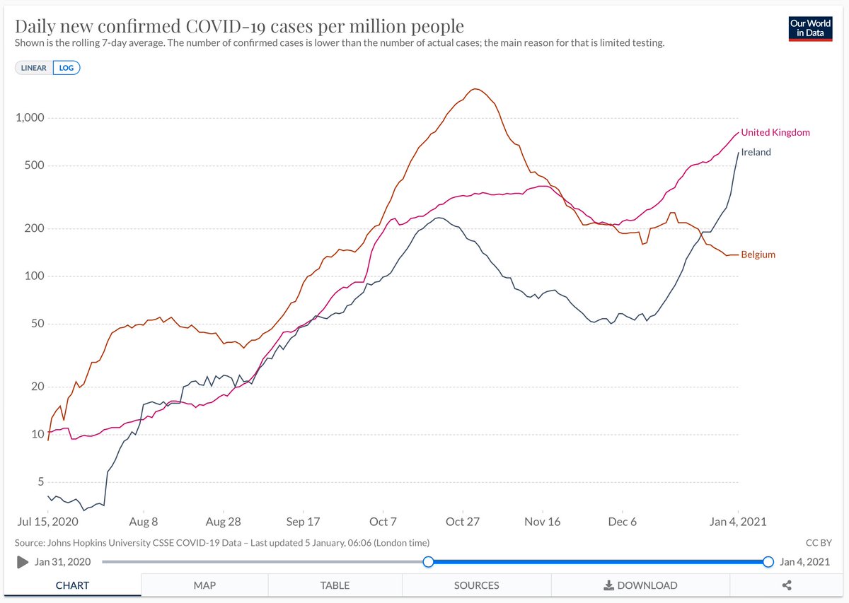
A case in point is tweets like this. George is right that the curve is almost vertical, but this is precisely why it makes sense to use logarithmic axes and provide some cross-country comparisons. You might, to look at this, have assumed the UK faces a unique crisis, but no: https://twitter.com/georgeeaton/status/1345839036393521154
Convert it to a log axis and add a couple of countries it’s a different story. Yes the UK rise recently is fast, but actually Ireland’s looks faster - though still at slightly lower levels than in UK. Compare UK to Belgium and you see it had a considerably worse outbreak in Oct
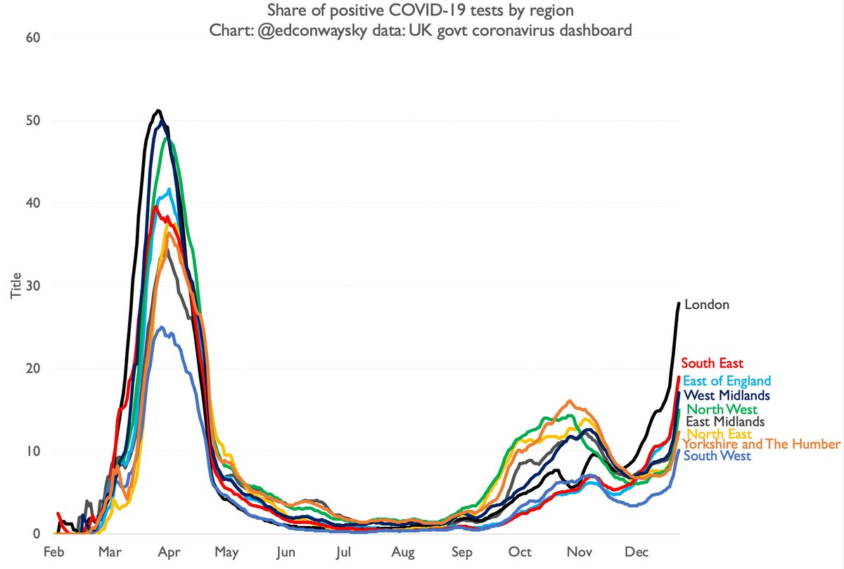
Anyway, case numbers are somewhat determined by the rate at which countries are testing. UK tests more than most, so tends to output higher numbers of absolute positive tests and tests per 100k. Better instead to look at % of tests coming back positive, as Neil does here https://twitter.com/neildotobrien/status/1345855126481862658
But even this chart misses some of the context, since we can look at positivity going all the way back to Feb. We are still a long way below those peaks. That said, it’s possible that the spring peak was skewed higher because testing was so limited & mostly in hospitals
My point here is not so much to be pedantic but to point out that sometimes context can make some scary data look a bit less scary. A further example: supposedly the 80k cases on 29 Dec is what helped persuade @BorisJohnson to trigger this latest lockdown. Scary number, right? https://twitter.com/peston/status/1346181861320613890
Except that the 29 Dec was the first day after a long Christmas break. For many it was the first chance to get tested. This is commonly known as the “bank holiday effect” and we’ll see a lot of it in the data on cases & deaths in the coming week or so. Figs will look bumpy.
Look through bumps and what do you see? Well, even bearing that context in mind, the rise in cases is indeed v worrying (and not much consolation to say it’s not quite as bad as the spring, which was very very bad).
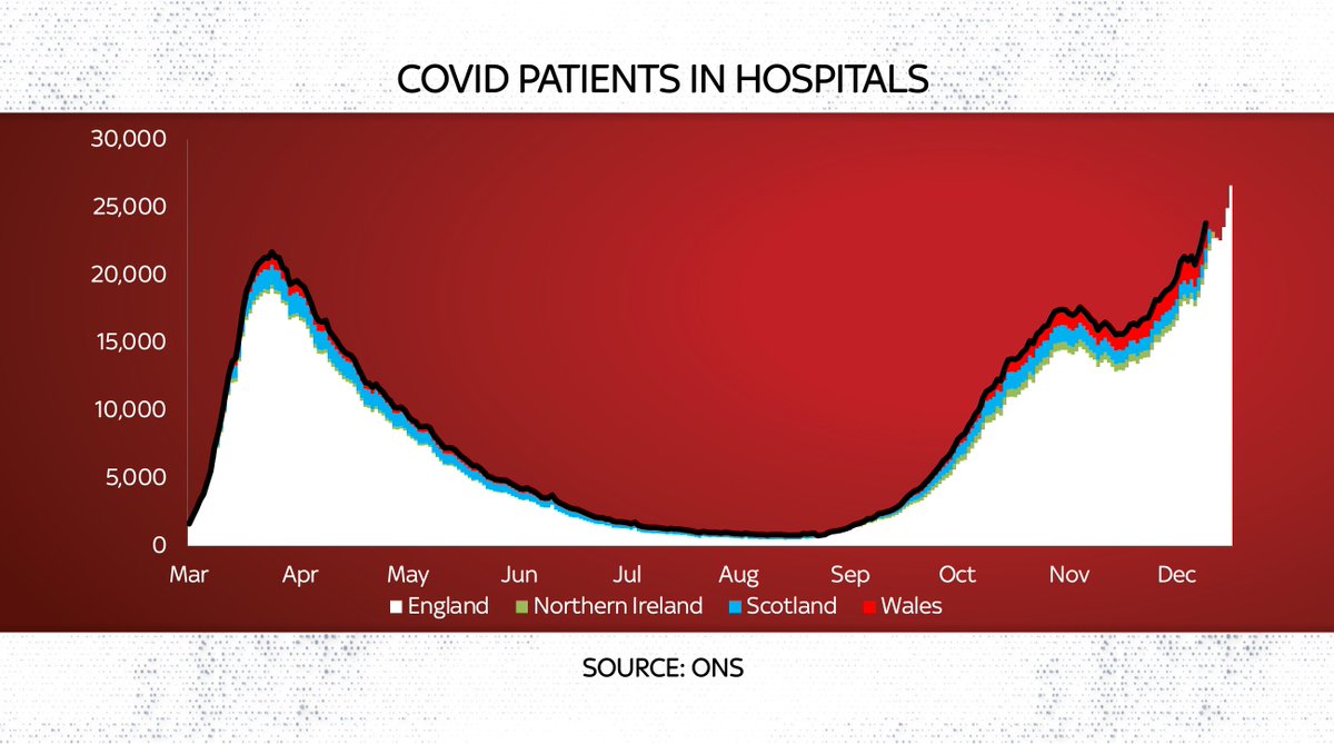
Hospital numbers higher than spring
Deaths still lowish BUT…
Hospital numbers higher than spring

Deaths still lowish BUT…
You wouldn’t expect to see deaths peak for some weeks, if the spring precedent repeats itself. So we’ll have to see. Either way, there aren’t all that many reasons for celebration in the data. Most numbers are flashing red. Tho maybe not quite as red as some wld have you believe.
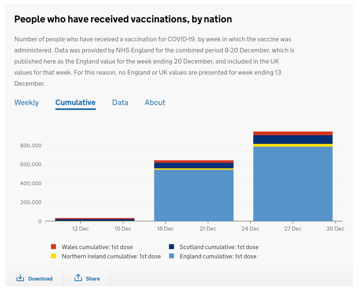
Another area, by the way, where context will be necessary (and I fear may be missing) is with vaccination stats. At the moment we get weekly numbers, with no breakdown by age or status. This is better than nothing, but not all that much better:
We’d ideally want data by age, by medical status (underlying health conditions etc), by whether they already had #COVID19 (is that even being checked for?). Then we can combine vaccinated population with those who have had the disease & get broad sense of likely immune population
What is the data on #COVID19 telling us? Are we facing a worse outbreak than last spring? Is it the worst in the world? Or something else…
My @skynews online analysis, reflecting some of the points above and adding one or two more https://news.sky.com/story/covid-19-a-complex-picture-but-what-does-the-latest-coronavirus-data-tell-us-right-now-12180101?dcmp=snt-sf-twitter
My @skynews online analysis, reflecting some of the points above
 and adding one or two more https://news.sky.com/story/covid-19-a-complex-picture-but-what-does-the-latest-coronavirus-data-tell-us-right-now-12180101?dcmp=snt-sf-twitter
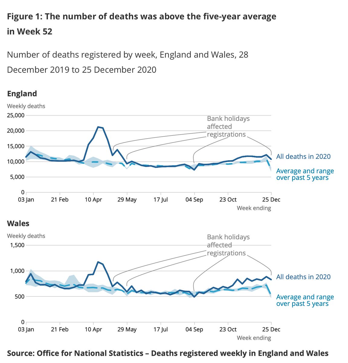
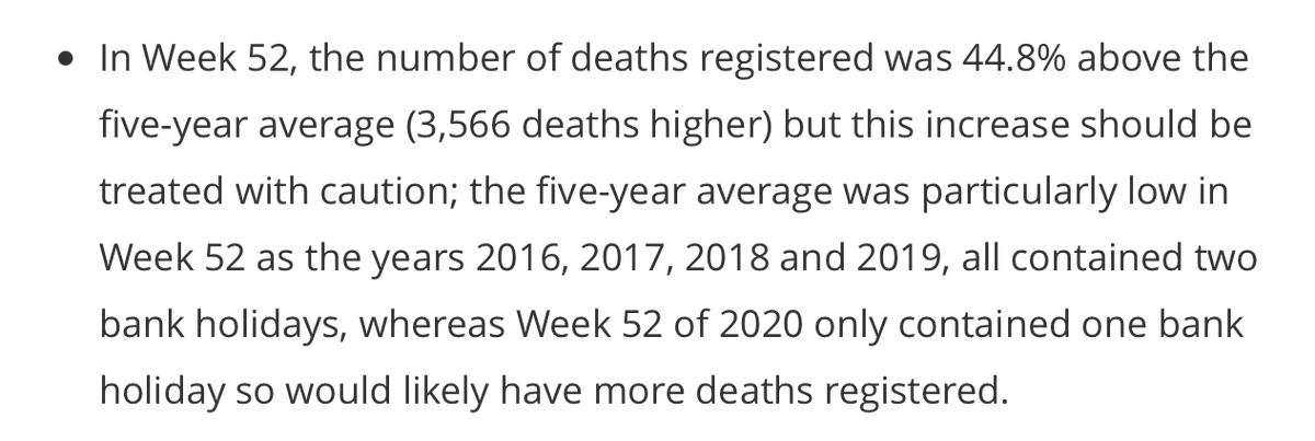
Remember the “bank holiday effect” I mentioned yday? Well it’s there in today’s weekly deaths numbers. Total deaths across England & Wales well in excess of the five year avg. But quite how much in excess is difficult to tell given week 52 included xmas https://www.ons.gov.uk/peoplepopulationandcommunity/birthsdeathsandmarriages/deaths/bulletins/deathsregisteredweeklyinenglandandwalesprovisional/weekending25december2020
Every previous week 52 had 2 bank holidays whereas this year’s week 52 had only one. All else equal that would push up this year’s numbers vs the avg. Making comparisons is fiendishly difficult. Deaths do look high but it’ll take a couple of weeks for the statistical fog to clear
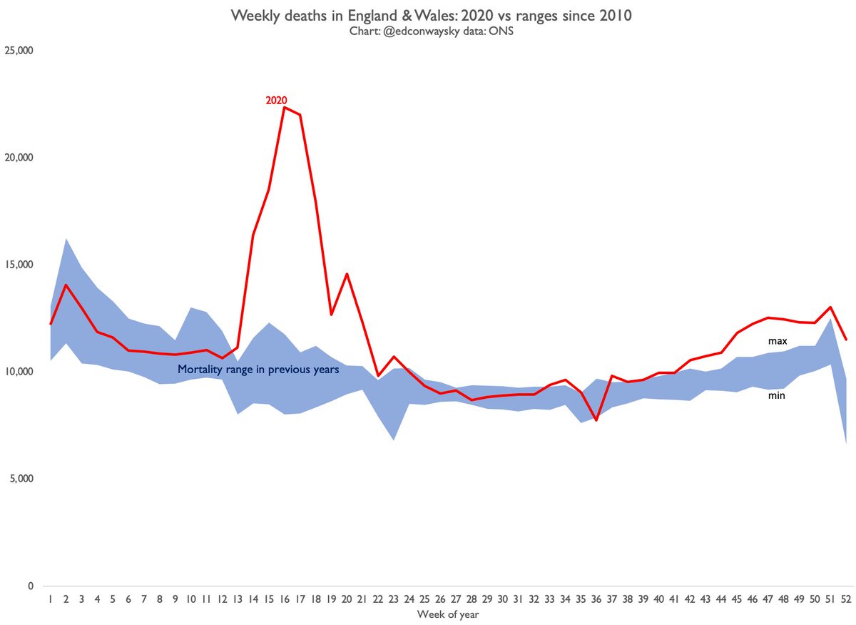
Here is the overall picture for deaths in England & Wales from all causes in 2020 vs the previous 10 years ( @ONS typically looks back 5yrs but I’ve dug out data going back a bit further for a bit more perspective).

 Read on Twitter