I don't think the scale is the issue here. These are sparklines, not line charts, meant to add context. The problem is there isn't anything to add context to. Start with a BAN. Then we could see 220 vs. 16,000, and then the sparklines would add context. https://twitter.com/artistjaneadams/status/1346153450262982659
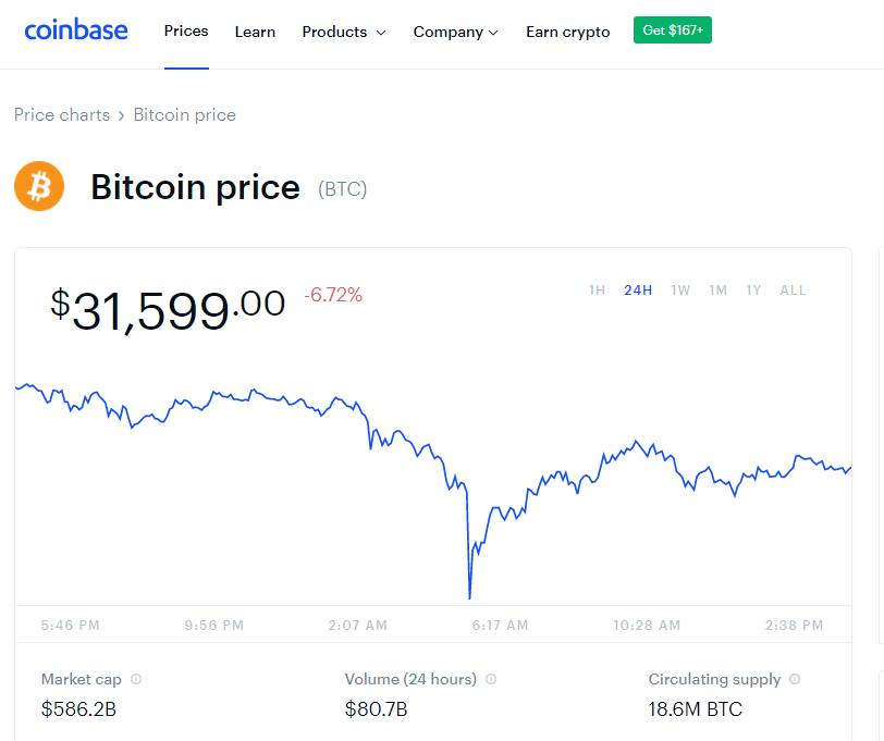
@coinbase does a great job with this. BAN for the current price, then additional context with the % change and 24hr trend (granted, the chart is pretty large in this case that an axis could easily be included).
@YahooFinance does a great job too. BANs across a wide range of values, with % change and sparkline trend (with shaded area).

 Read on Twitter


