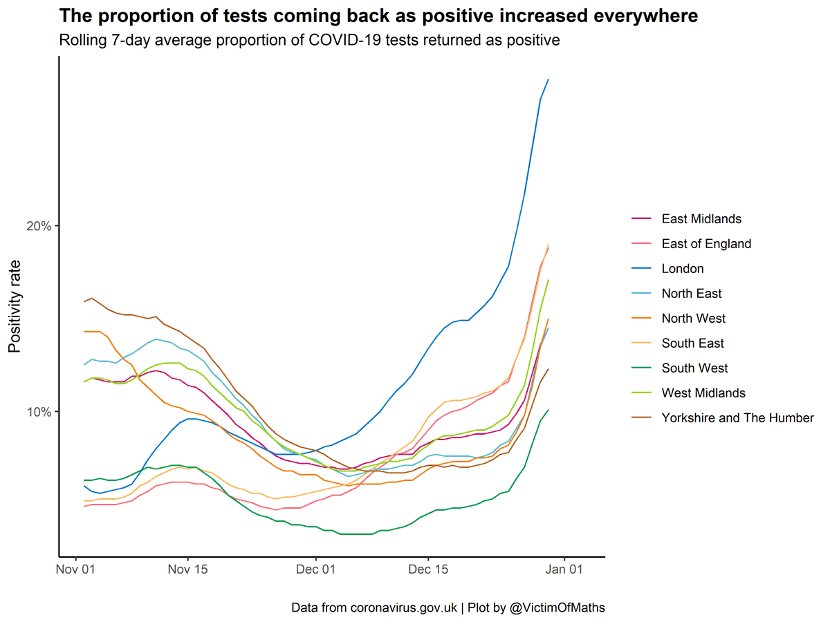
I've seen a few variations on this graph over the last few days. It seems pretty terrifying - the % of COVID-19 tests coming back as positive has shot up across the whole country.
But there's something a bit strange going on...
But there's something a bit strange going on...
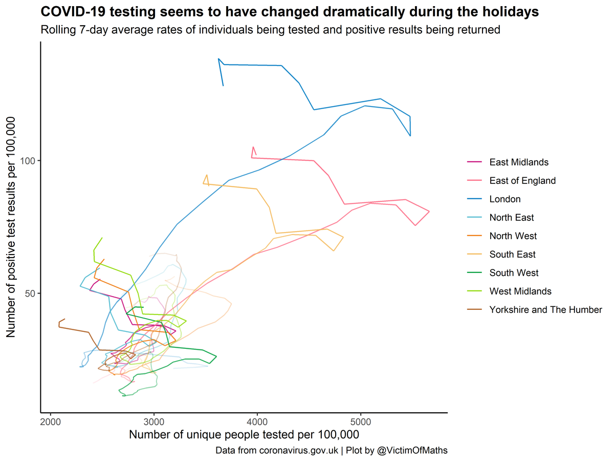
If you look at the number of tests being done, this fell sharply across the whole country at the same time.
I doubt many tests were done on Christmas Day, for example.
I doubt many tests were done on Christmas Day, for example.
One explanation for these patterns would be a genuine rise in cases across the whole country simultaneously at the same time as testing numbers fell because of the holidays. Which is definitely a possibility.
But another possibility is that this is at least partly a function of a change in people's approach to testing - if we were less likely to seek a test unless we had more severe symptoms, for example.
At this stage, it's almost impossible to distinguish between the two - we'll have to wait until the holiday period falls out of the 7-day average. But it's interesting to speculate about whether the change is driven by increased cases, or a change in behaviour. Or (probably) both
R code for these plots is here: https://github.com/VictimOfMaths/COVID-19/blob/master/Heatmaps/COVIDTestingData.R

 Read on Twitter


