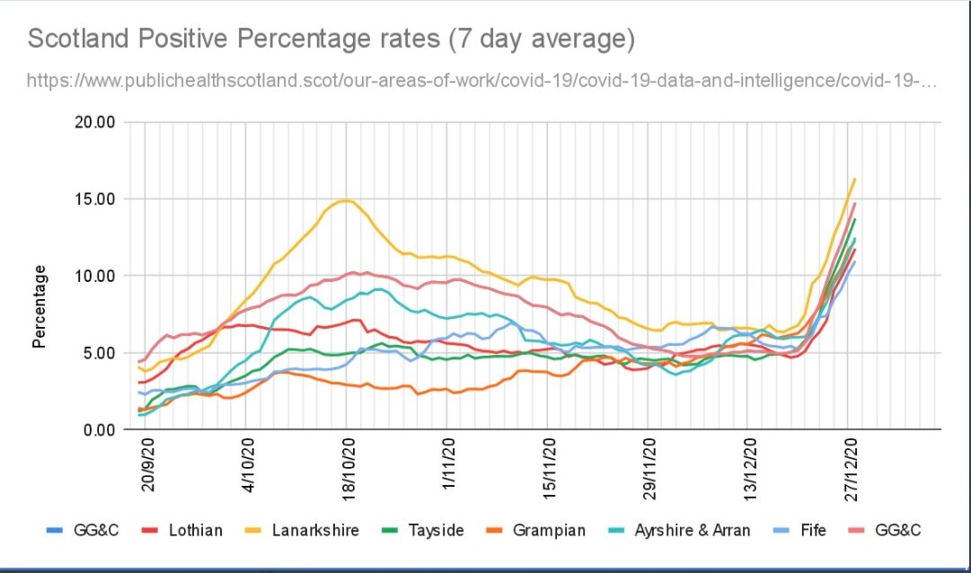
How about Scotland - this is data exactly as it is, NOT normalised:
Is there a biological explanation for this?
Is there a biological explanation for this?
Data anomalies such as the above have been a feature of the pandemic since June.
Given your de facto status as the institution responsible for oversight of diagnostics, it seems to be extraordinary that you are not investigating the quality of the testing.
Given your de facto status as the institution responsible for oversight of diagnostics, it seems to be extraordinary that you are not investigating the quality of the testing.
I knew there was something I had forgotten... https://twitter.com/jengleruk/status/1345291960567926784?s=20
For the sake of transparency I should add that someone pointed out to me that the Ireland graph shows cases found not positivity data, hence is subject to different volumes of testing.
However, I checked cases carried out and on a per 100k population measure the 2 areas are nowhere near different enough to account for the picture seen.
(Anyway, even if testing volume did explain the difference, that doesn’t say much about the ability of the testing system to accurately reflect reality in one of the areas. )

 Read on Twitter


