I don't really know much about hospital management ( @boriquagato seems to). But I do know when I am being manipulated, and when the manipulation is obvious I immediately go into skeptic mode. Let's look at this article: https://www.latimes.com/california/story/2020-12-31/l-a-county-hospital-hit-breaking-point-no-one-would-believe-this-is-in-the-united-states
Obviously the title is over the top. But also look at the subheadings. Here they are:
‘Unfortunate outcomes’
Patients gasping for breath
Dying in the ER hallway
Running out of oxygen and critical machines
‘It is so frightening’
L.A. County reporting 20% positive test rate
‘Unfortunate outcomes’
Patients gasping for breath
Dying in the ER hallway
Running out of oxygen and critical machines
‘It is so frightening’
L.A. County reporting 20% positive test rate
We wouldn't want the ones who just skim the article to walk away without panicking too!
Here are a few other things form the article that send my skeptical antennae quivering:
Here are a few other things form the article that send my skeptical antennae quivering:
1. The hospital data starts in April. Why pick April? I am always sensitive to end points. My memory is that back in April CA banned all non-emergency cases from hospitals. Could it be that this start point was chosen because it was a very low point?
2. There is no reference for the hospitalization data EXCEPT for that April start point. They have total patients, but what is the utilization %, ie how does this compare to capacity? Doesn't say.
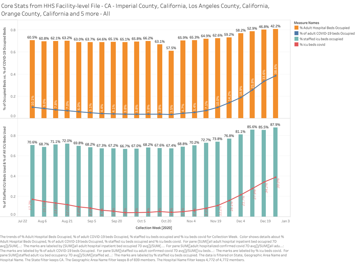
A quick internet search shows that there appear to be 30,000 bends in LA, vs 20,000 full in our article. 2/3 full does not sound bad (AZ has been running 80+% all summer and no one dying in halls). https://www.healthcaredive.com/news/how-hospital-capacity-varies-dramatically-across-the-country/574892/
Further, rather than just comparing hospital occupancy to April, how does this compare to other December flu seasons? Doesn't say.
This relates to one of my favorite themes about data analysis and the media -- things are constantly portrayed as abnormal without data on what & when normal was. If the same thing happens every year, is it abnormal?
3. Where is the counterpoint? Even articles excoriating Trump have some quote in graph 46 from a supporter with a countervailing viewpoint. But there is none here, no hospital executive saying that things are under control
Back in 2020 such stories about Texas and Florida hospitals were quickly met with responses from hospital executives explaining why patients were not going to die on the hallway floor. Is it really so bad in CA that no such opinions exist, or were they not allowed in the article?
4. I distrust articles that tell me the process is broken or outside of norms without adequately explaining the process. Pretty much zero articles on climate, for example, every really explain that most of the warming in climate models comes from assumptions of positive feedback
Thus the critical thing to understand is whether such net positive feedback exists & its magnitude. But this is never explained and never addressed, and thus the most important issue in climate science is absent from every mainstream article
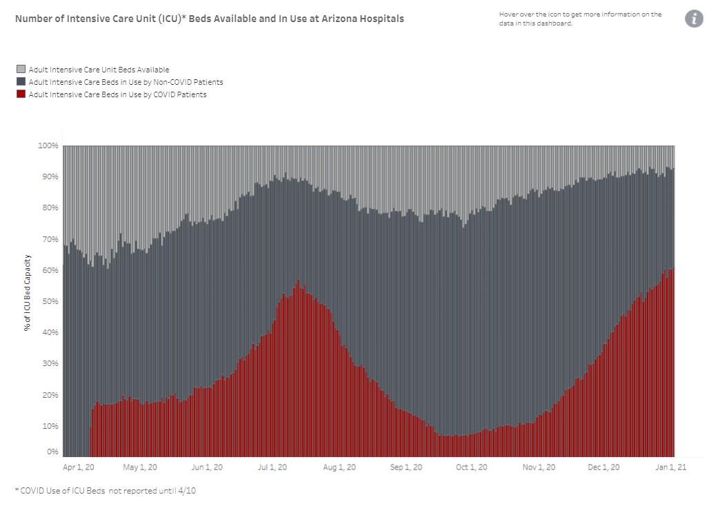
For hospitals, I have been watching this AZ ICU capacity chart for months. There apparently is a lot going on "under the hood" of ICU capacity management that would be interesting for readers to understand. The next article I read in the media delving into this will be the first.

 Read on Twitter


