1/11 I'm going to start doing a monthly #Bitcoin  market analysis based on on-chain & price-related data
In this 1st one, I'll walk through the price chart, BPT, MVRV Z-Score, Puell Multiple, Thermocap Multiple, S2FX model, SOPR, HODL waves & Reserve Risk
Thread time!
 market analysis based on on-chain & price-related data
In this 1st one, I'll walk through the price chart, BPT, MVRV Z-Score, Puell Multiple, Thermocap Multiple, S2FX model, SOPR, HODL waves & Reserve Risk

Thread time!

2/11 TA: Since breaking out of a huge trend-line in July and retesting it in September, #Bitcoin  has gone on a tear, resulting in one of the most beautiful technical setups in its history
To top it, the Dec. +$9277.30 candle was the largest absolute monthly price growth ever
 has gone on a tear, resulting in one of the most beautiful technical setups in its history
To top it, the Dec. +$9277.30 candle was the largest absolute monthly price growth ever

3/11 As discussed in my weekly #Bitcoin  Price Temperature (BPT) analysis, the current
  isn't close to that of previous tops but is increasing more rapidly than we saw in 2017
Are we up for a correction, or a growth pattern more like the 2013 cycle? https://twitter.com/dilutionproof/status/1343447487365963776?s=20
 Price Temperature (BPT) analysis, the current
  isn't close to that of previous tops but is increasing more rapidly than we saw in 2017
Are we up for a correction, or a growth pattern more like the 2013 cycle?
 https://twitter.com/dilutionproof/status/1343447487365963776?s=20
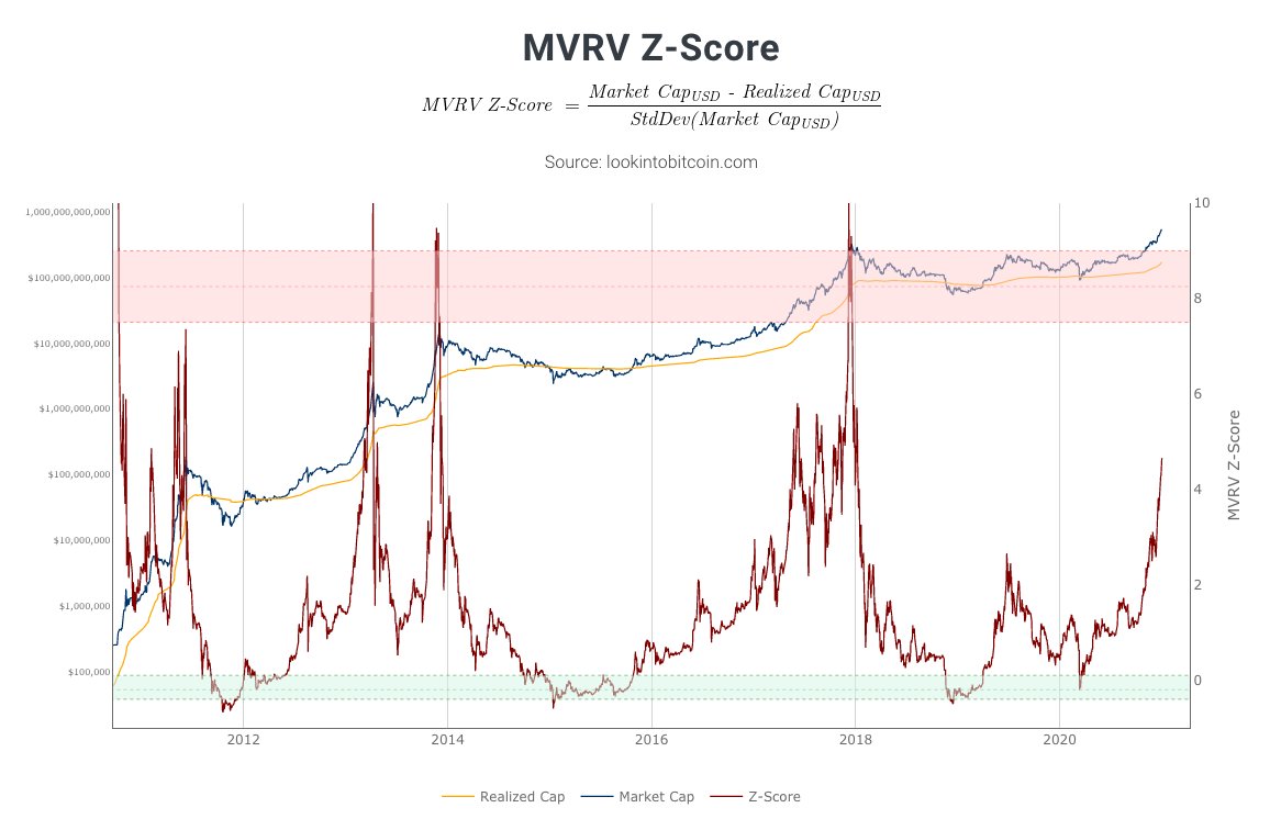
4/11 The relative distance between the market value and realized value (value of all #Bitcoin  UTXO's at the date they last moved) paints a similar picture
The realized value is starting to curl up ( !) but the MVRV isn't near previous peak levels yet
Chart by @PositiveCrypto
 UTXO's at the date they last moved) paints a similar picture
The realized value is starting to curl up (
 !) but the MVRV isn't near previous peak levels yet
Chart by @PositiveCrypto
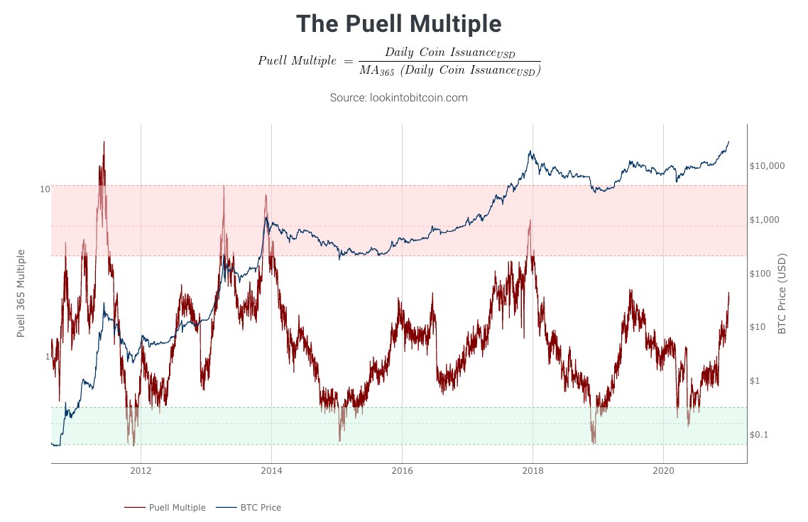
5/11 #Bitcoin  miner revenue was challenged twice in 2020; once after the flash-crash in March & again during the May halving
Since then, the daily coin issuance has been trending up & is now similar to the 2019 local top but to 2013 & 2017 peak levels
Chart by @PositiveCrypto
 miner revenue was challenged twice in 2020; once after the flash-crash in March & again during the May halving
Since then, the daily coin issuance has been trending up & is now similar to the 2019 local top but to 2013 & 2017 peak levels
Chart by @PositiveCrypto
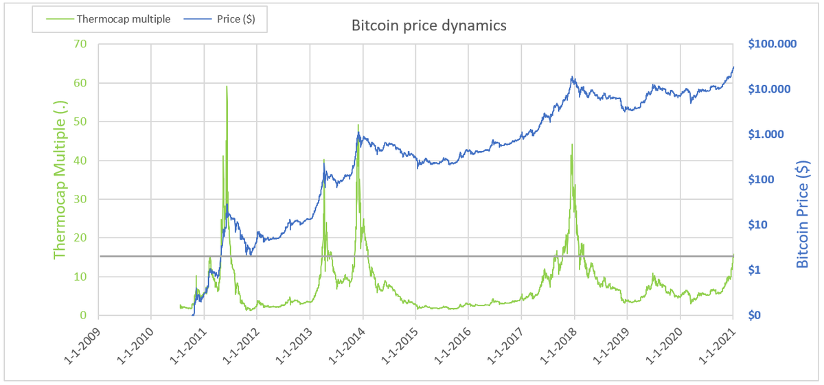
6/11 The relative difference between the #Bitcoin  price and the sum of all mining rewards is another way to assess historical miner profitability
This 'Thermocap Multiple' is also sloping up, but nowhere near previous cycle tops
Chart by @Geertjancap: https://twitter.com/Geertjancap/status/1344522961596907520?s=20
 price and the sum of all mining rewards is another way to assess historical miner profitability
This 'Thermocap Multiple' is also sloping up, but nowhere near previous cycle tops
Chart by @Geertjancap: https://twitter.com/Geertjancap/status/1344522961596907520?s=20
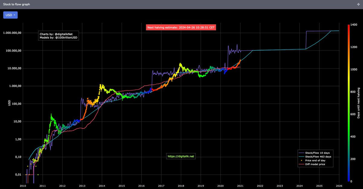
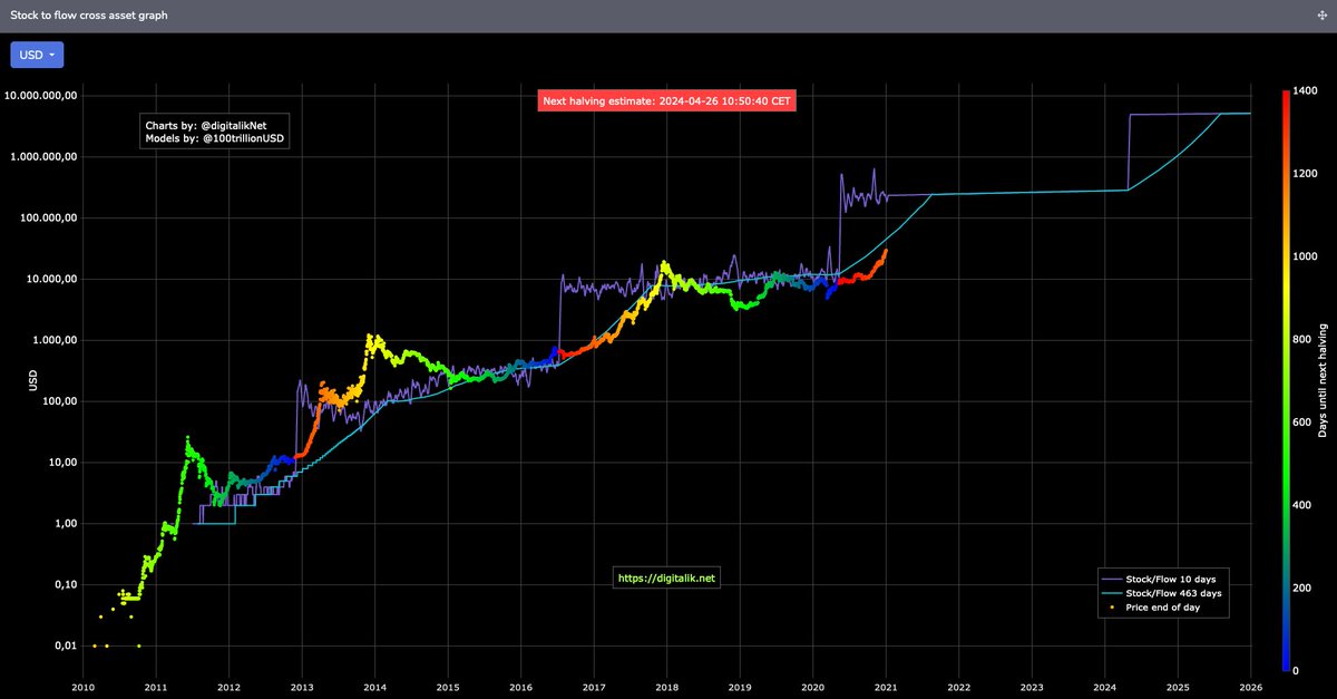
7/11 The recent price growth now places the #Bitcoin  price above the level predicted by the (365-day-window-smoothed version of the) S2F model
It is still below the S2FX model estimation, but catching up fast
More on S2F & S2FX: https://medium.com/swlh/modeling-value-based-on-scarcity-7fa7d754a58
Charts by @digitalikNet
 price above the level predicted by the (365-day-window-smoothed version of the) S2F model
It is still below the S2FX model estimation, but catching up fast
More on S2F & S2FX: https://medium.com/swlh/modeling-value-based-on-scarcity-7fa7d754a58
Charts by @digitalikNet
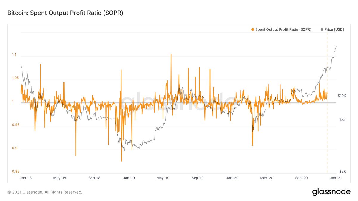
8/11 The SOPR can be used to gauge  vs
vs  market conditions:
- Levels above + support at 1 =
- Levels below + resistance at 1 =
Since the perfect $10k & SOPR=1 support check early Sep, both price & SOPR haven't looked back: we're in a bull market!
Chart by @glassnode
 vs
vs  market conditions:
- Levels above + support at 1 =

- Levels below + resistance at 1 =

Since the perfect $10k & SOPR=1 support check early Sep, both price & SOPR haven't looked back: we're in a bull market!

Chart by @glassnode
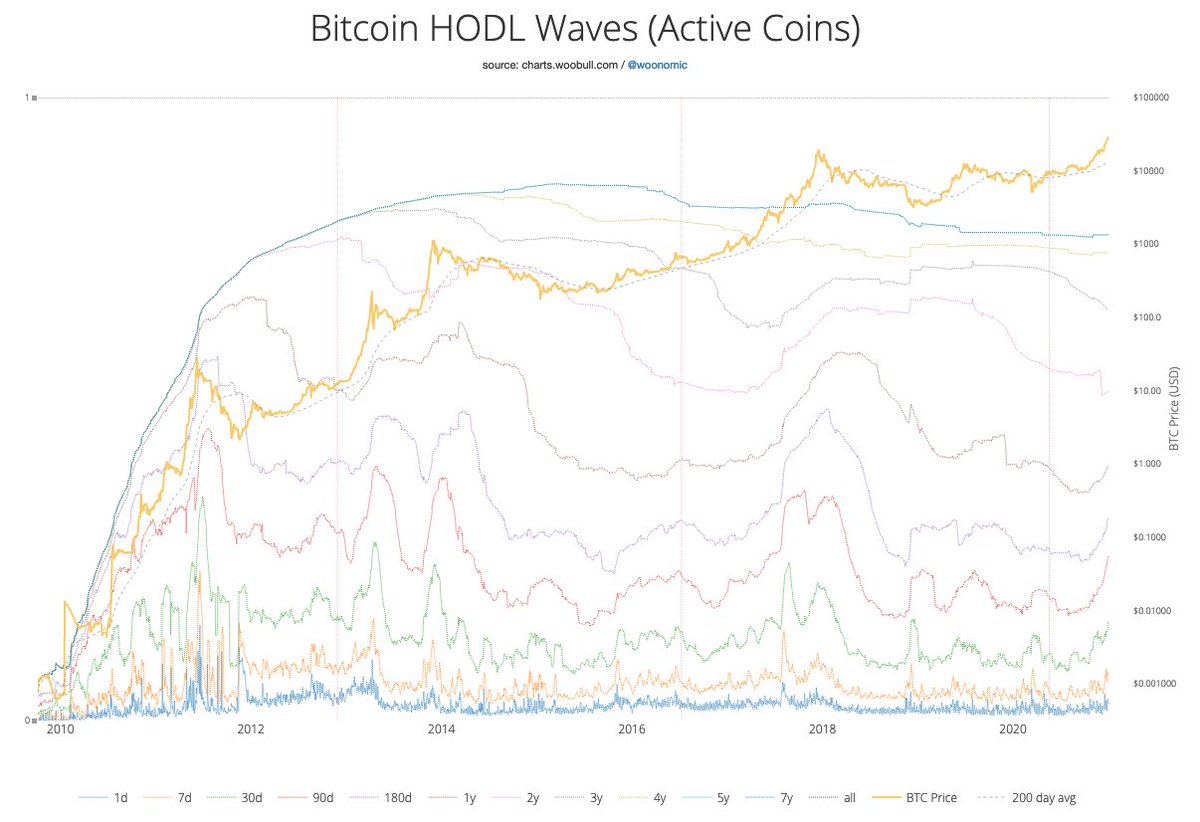
9/11 The recent price rise has woken up some HODL'ers, incentivizing them to part with some of their precious coins
This change is nicely visible in this version of the HODL waves, where the bands <1 year now slope up, while the bands >1 year slope down
Chart by @woonomic
This change is nicely visible in this version of the HODL waves, where the bands <1 year now slope up, while the bands >1 year slope down
Chart by @woonomic
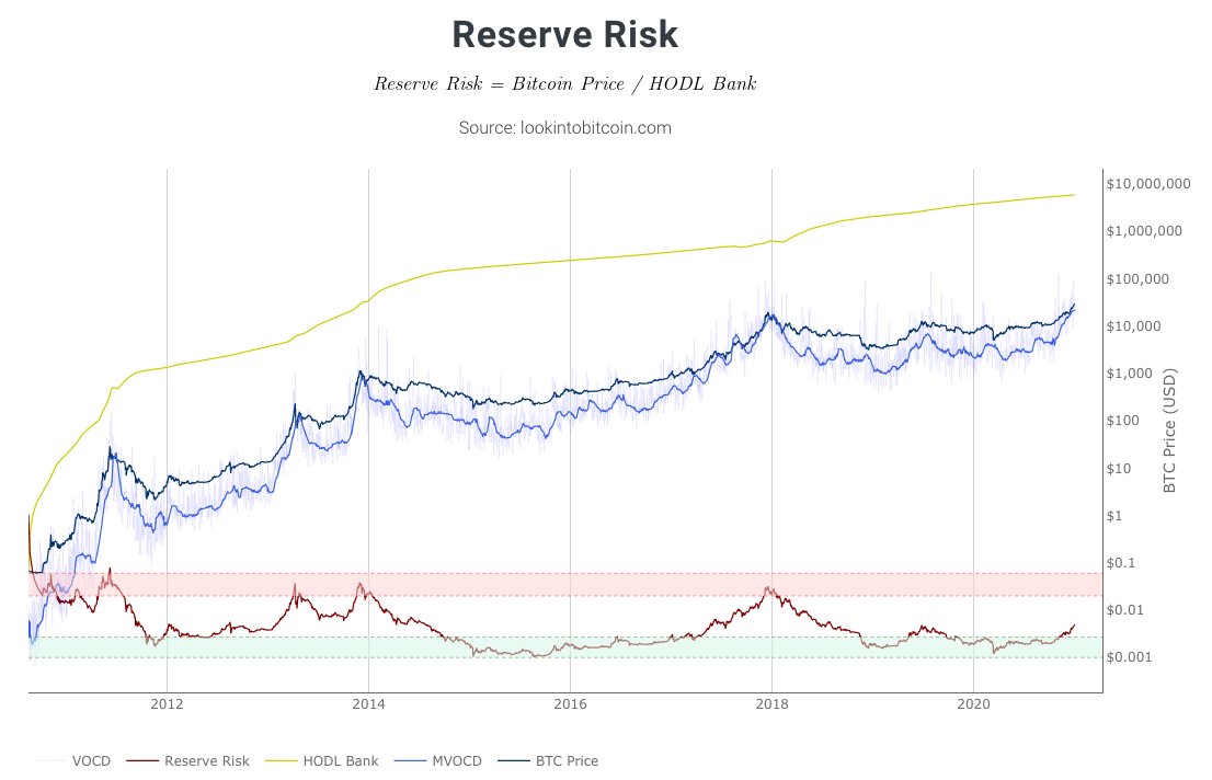
10/11 As a result of the awakened HODL'ers, @hansthered's Reserve Risk metric is starting to slope up and has left the green zone
Not to worry though; there is still a ways to go before it hits the red zone that is associated with previous cycle tops
Chart by @PositiveCrypto
Not to worry though; there is still a ways to go before it hits the red zone that is associated with previous cycle tops
Chart by @PositiveCrypto
11/11 Overall, I'd conclude that:
- we are now clearly in a #Bitcoin bull market
- the recent price rise was pure and could warrant a drawback
- but we are not at previous cycle top levels on any of these metrics
I personally am not going to bet against this bull though!
- we are now clearly in a #Bitcoin
 bull market
- the recent price rise was pure
 and could warrant a drawback
- but we are not at previous cycle top levels on any of these metrics
I personally am not going to bet against this bull though!

 Read on Twitter
