Here we plot daily bed occupancy in NHS hospitals in England in 2020 (yellow line) versus a 2017-19 average (pink line), and the number of beds occupied by Covid-19 positive patients (teal bars). You can interact with this graph on our website: http://www.coviddashboard.live/#beds
Bed occupancy is clearly below average for this time of year - and has been since the start of the pandemic - so why the crisis?
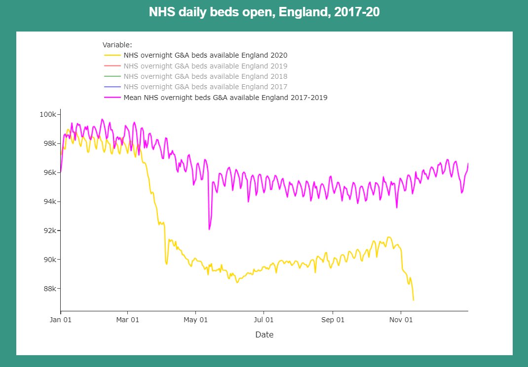
This chart shows 'beds open' (includes occupied and unoccupied beds) in the NHS this year vs. 2017-19 average. http://www.coviddashboard.live/#open
This chart shows 'beds open' (includes occupied and unoccupied beds) in the NHS this year vs. 2017-19 average. http://www.coviddashboard.live/#open
The data very clearly shows that the current crisis in hospitals is not driven by increased numbers of patients over the norm - they are lower this year than usual - but a capacity problem.
The daily data from previous years in these charts is not yet available anywhere else - we obtained it through a Freedom of Information request to NHS England. You can download the spreadsheet on our website - please credit us if you use it! http://www.coviddashboard.live/#beds
Here are some of the possible reasons for lower than usual NHS capacity. The data doesn't tell us how much each factor contributes to the problem. https://twitter.com/Covid19DataUK/status/1344625998898327552

 Read on Twitter


