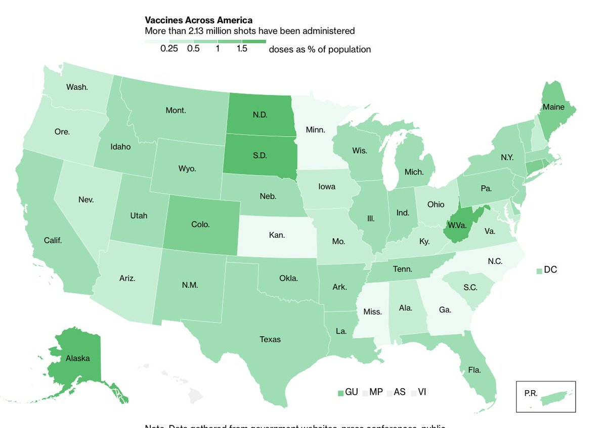
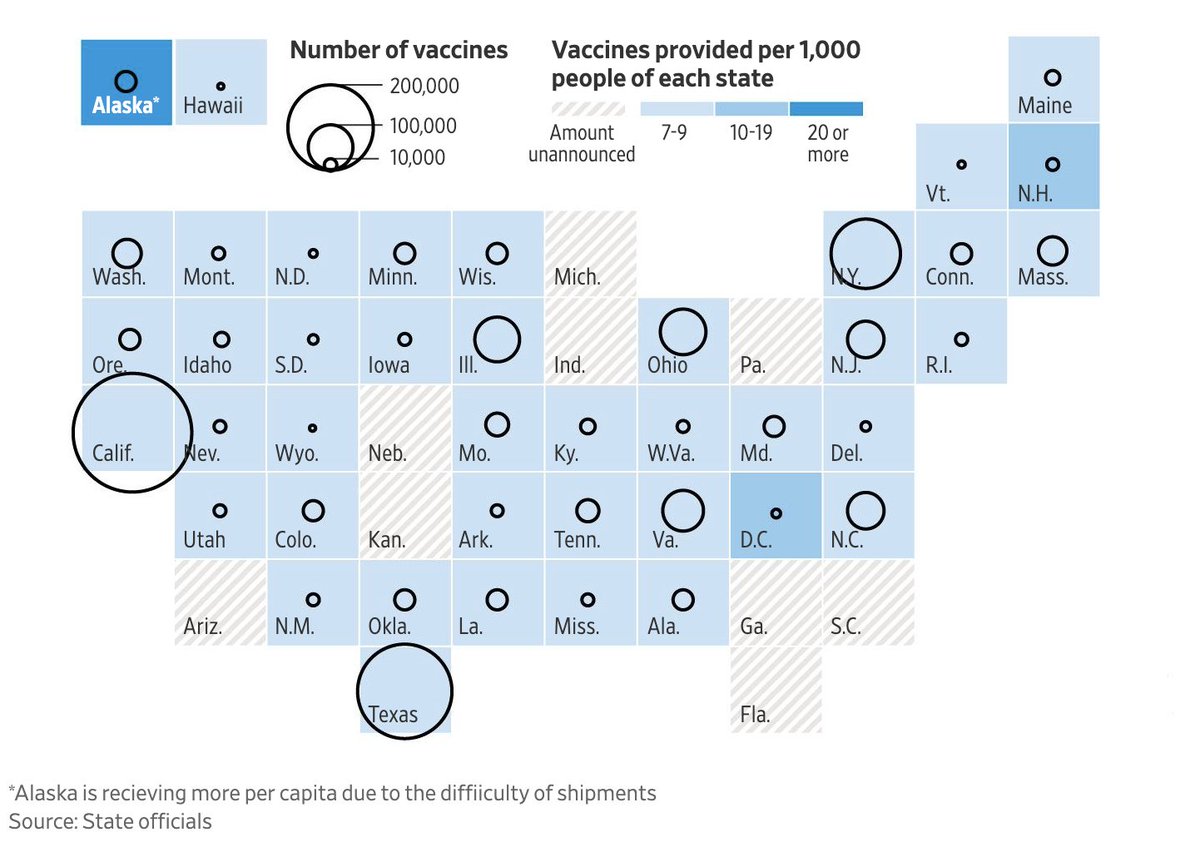
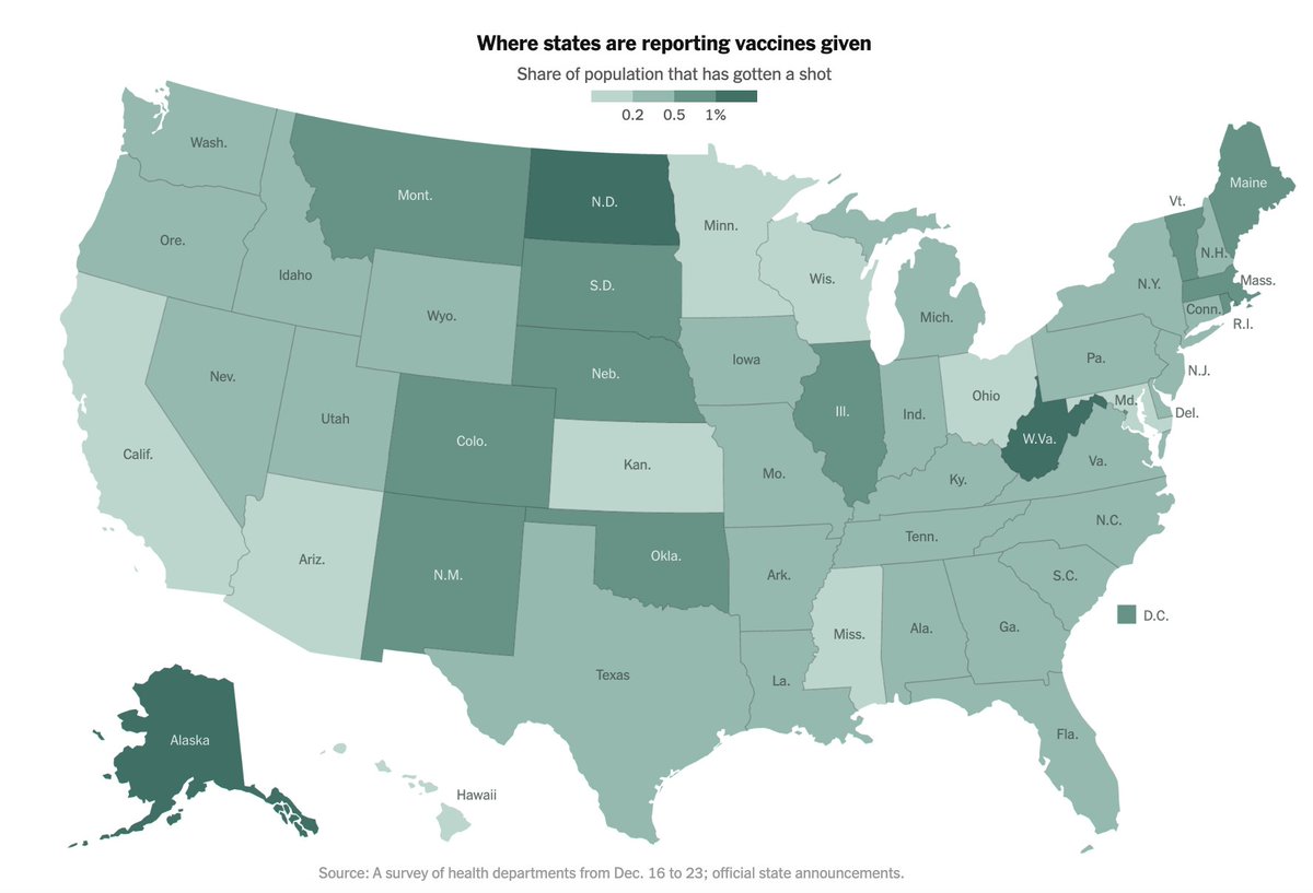
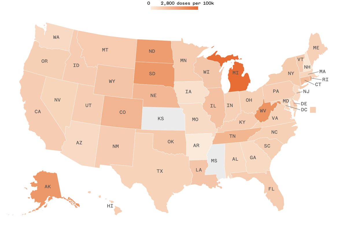
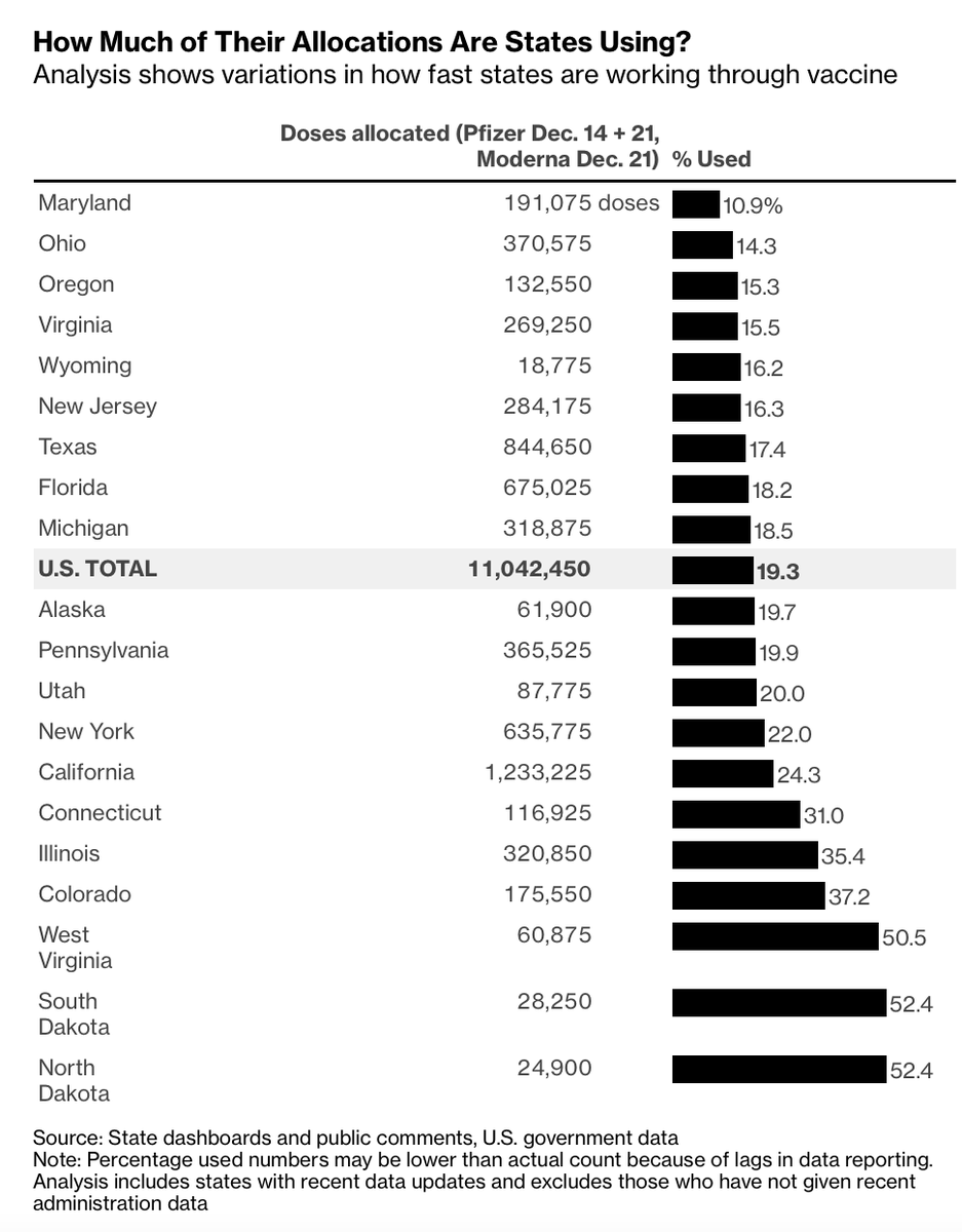
Most vaccine trackers by media outlets have been focusing on one metric: what percentage of the population has been vaccinated. However, the single-most important metric for us to currently watch is what percentage of doses distributed have been administered. Thread:
In the coming weeks and months, these numbers will prove to be important — Americans will want to see what percentage of their community has been vaccinated (ideally, fully vaccinated with two doses). However, we have been not focusing our attention on our last-mile issue.
It has only been within the previous few days that the public has turned its attention to the discrepancies between distribution and administration. This great piece by @NicholasFlorko and @OliviaGoldhill clearly shows the frustration from experts. https://www.statnews.com/2020/12/29/public-health-experts-grow-frustrated-with-pace-of-covid-19-vaccine-rollout/
Others have lamented this issue, including @jasonlschwartz, who co-authored a key paper on vaccine implementation.
https://www.healthaffairs.org/doi/10.1377/hlthaff.2020.02054 https://twitter.com/jasonlschwartz/status/1343956252947308545
https://www.healthaffairs.org/doi/10.1377/hlthaff.2020.02054 https://twitter.com/jasonlschwartz/status/1343956252947308545
Here's another thread from @CT_Bergstrom unpacking this issue. https://twitter.com/CT_Bergstrom/status/1343673909367906306
And an excellent discussion from @ashishkjha.
“Let’s set up field hospitals and tents everywhere and have the National Guard do this,” Jha said to @business. “That last mile has gotten very little investment. I think this is going to be a huge problem.” https://twitter.com/ashishkjha/status/1343768397084053505
“Let’s set up field hospitals and tents everywhere and have the National Guard do this,” Jha said to @business. “That last mile has gotten very little investment. I think this is going to be a huge problem.” https://twitter.com/ashishkjha/status/1343768397084053505
Coverage in the past few days (using recent CDC data) has finally drawn attention to this issue. @NBCNews called it "a jarring new analysis."
Launched on December 4, my Vaccine Allocation Dashboard has been tracking this metric starting weeks ago. https://twitter.com/bhrenton/status/1341156075781955586
Launched on December 4, my Vaccine Allocation Dashboard has been tracking this metric starting weeks ago. https://twitter.com/bhrenton/status/1341156075781955586
Let's remind ourselves of the four steps of vaccine distribution. @darakass lays it out here: https://twitter.com/darakass/status/1344079270247804929
The percentage administered (let's call it that for now) is calculated by taking the doses administered (in each state) and dividing it by either the doses allocated or doses distributed.
Ideally, all jurisdictions would report doses distributed, however only 16 have so far.
Ideally, all jurisdictions would report doses distributed, however only 16 have so far.
The CDC reports this metric nationally, updated three times per week. In the absence of doses distributed for many states, I currently use the number of doses allocated for each jurisdiction. https://twitter.com/bhrenton/status/1343671238762385408
The number of doses allocated comes from OWS and is updated once per week for the next week. Yes, it takes 1-3 days from doses being allocated to being able to be distributed (shipping time), however, we can neglect this difference for now, since we don't have better data.
Another factor which can dramatically alter the percentage administered is the lag time in doses being reported as administered. This is why the latest chart in the dashboard also reports the number of days elapsed since a state's last report. https://twitter.com/bhrenton/status/1343963997817761792
Our final result is this graph of the percentage administered in each state, which I started visualizing 8 days ago and Bloomberg posted a nearly identical version today.
https://twitter.com/bhrenton/status/1344071212679503873
https://twitter.com/bhrenton/status/1344071212679503873
So what are the bottlenecks here? @AnnieGrayerCNN, @SaraMurray and @EllieCKaufman have answers:
- Reporting lags
- FDA quality control
- Production
- State distribution (reaching communities and coordinating allocations) https://www.cnn.com/2020/12/23/health/vaccine-rollout-slow-data-lags/index.html
- Reporting lags
- FDA quality control
- Production
- State distribution (reaching communities and coordinating allocations) https://www.cnn.com/2020/12/23/health/vaccine-rollout-slow-data-lags/index.html
Why does this all matter? To make better policy decisions, we need to understand every step of the process and fix every issue along the way. We also need the public to understand the data being reported and engage with it on many levels, as this will foster transparency.
Finally, we need clear communication from government officials and for them to quit shifting blame. Communication will be key towards gaining trust in the vaccine process, and we look forward hopefully receiving answers at tomorrow's briefing. https://twitter.com/kaitlancollins/status/1344092373651959811
You can track all the data discussed here, and more, at the Vaccine Allocation Dashboard here, which is updated daily. https://twitter.com/bhrenton/status/1335306082693083137

 Read on Twitter