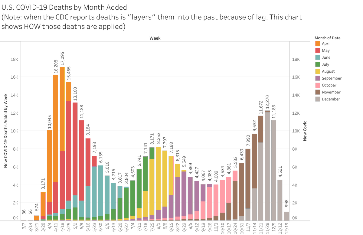
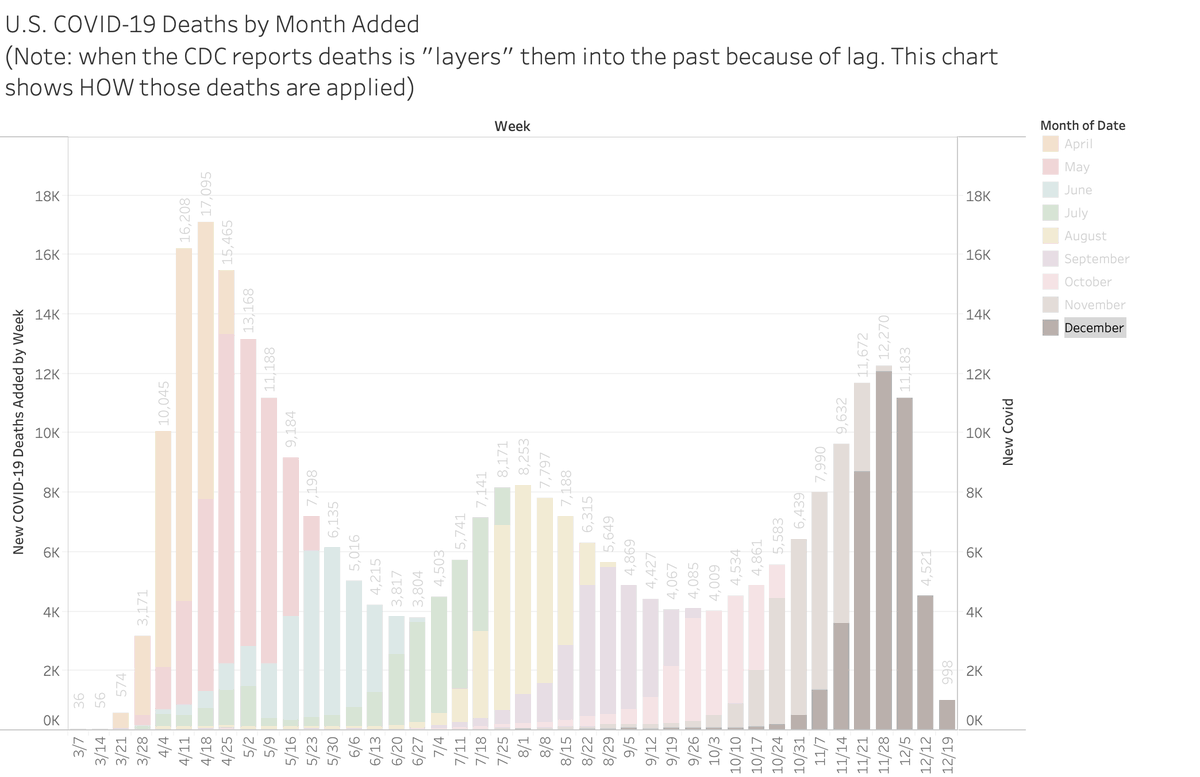
I know you've heard that we've witnessed 1000 deaths a day since mid-Sept and 3000 deaths a day every day in December reportedly. But that is NOT the case. The CDC adds deaths each day and we show you how they accumulate by month.
Here are #COVID19 deaths by week w/months
1/
Here are #COVID19 deaths by week w/months
1/
As you can see we started averaging 1000 deaths a day in November and we have yet to see a spike week averaging 3000 deaths/day EVER this pandemic. December has been averaging 1200 to 1700 deaths per day and will likely NOT hit the April peak of 17K deaths in a single week
2/
2/
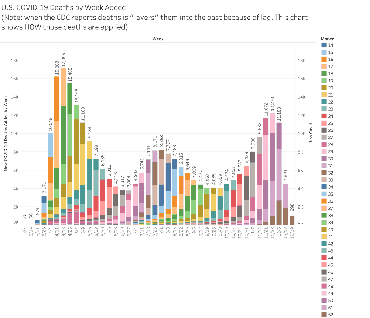
We can also show you what this looks like by week. Deaths lag but they show very strong epi curves up and down.
3/
3/
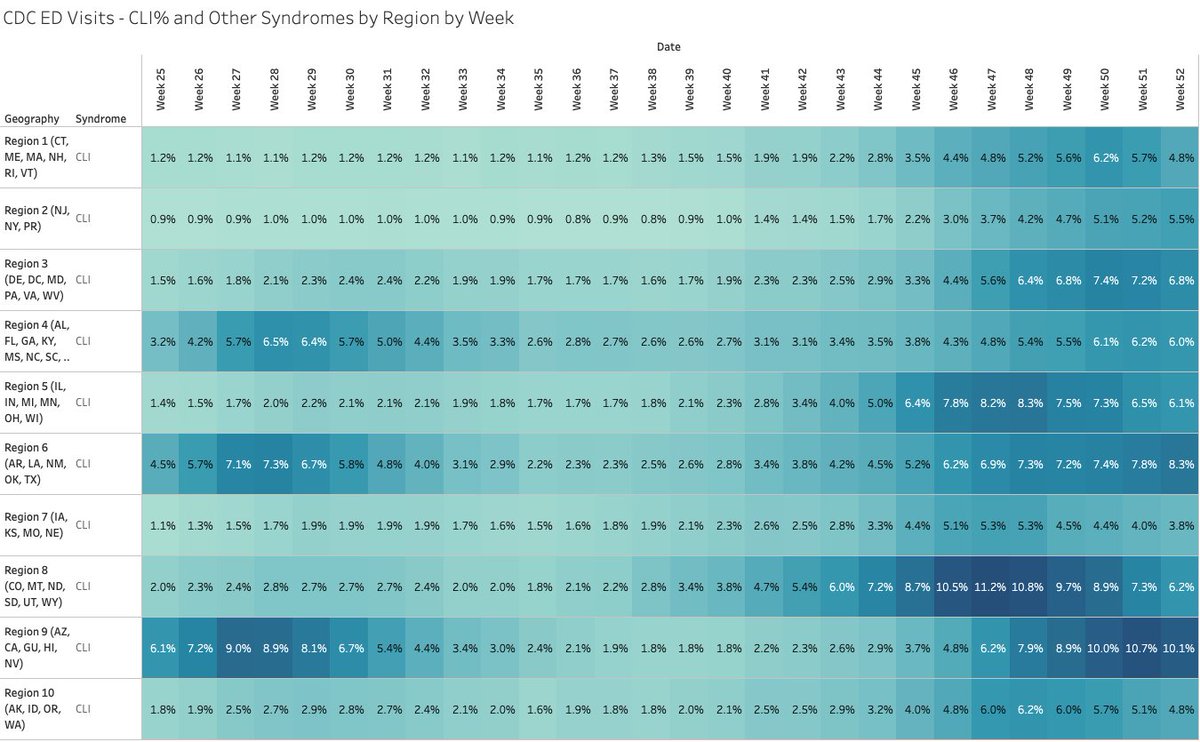
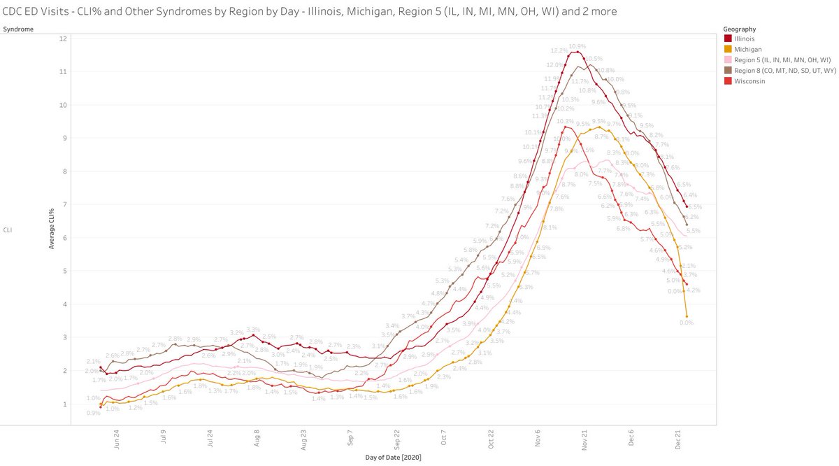
One other factor we look at is CLI% - the percentage of emergency room visits with covid-like-illness (CLI). We show that most regions have peaked after their fall burst.
4/
4/
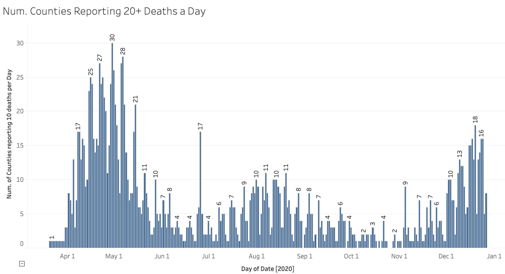
Here's another factor. These are the number of counties by reporting 20+ deaths. You can see that in April/May counties reporting 20 or more deaths per day were almost twice what we are seeing now.
5/
5/
These "waves" of #COVID 19seem to follow a seasonal rhythm and impact areas with like-minded climate patterns. As evidenced by the various and differing policies of each state... there is little you can do to stem the flood of the virus except protect the elderly.

 Read on Twitter