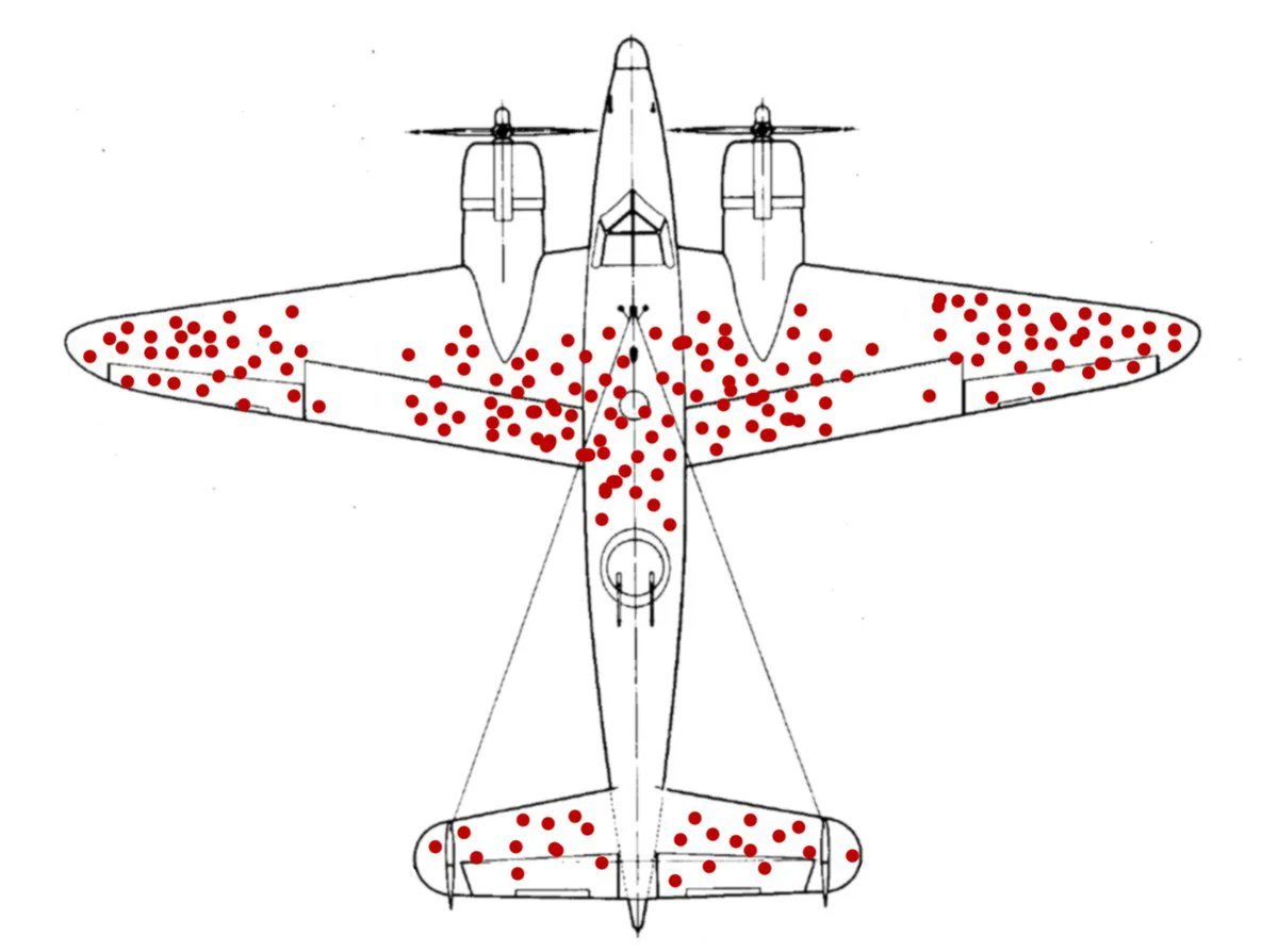
This image gets posted a lot lately, and not everyone knows what it means.
It's a reference to “survivor bias”: a statistical problem in which a sample is non-representative because some elements have been eliminated before the sample was taken. Here's a brief explainer.
It's a reference to “survivor bias”: a statistical problem in which a sample is non-representative because some elements have been eliminated before the sample was taken. Here's a brief explainer.
The story: You're Britain. It's WW2. Your planes are getting shot down. You want to reinforce them with armor. But you can't armor the whole plane (for weight among other reasons).
What parts of the plane do you prioritize for armor?
What parts of the plane do you prioritize for armor?
Your researchers collect data on where your planes are getting shot. Whenever a plane returns from a mission, they note where they found bullet holes. This diagram shows all the holes that were found across many missions.
Given this data, where do you put the armor?
Given this data, where do you put the armor?
The naive answer is: where the holes were found.
At this point, an astute observer, or one who cross-checks data with intuition, might notice that this does *not* include the engines or cockpit, which seem like pretty sensitive parts of the plane—more so than, say, the wingtips.
At this point, an astute observer, or one who cross-checks data with intuition, might notice that this does *not* include the engines or cockpit, which seem like pretty sensitive parts of the plane—more so than, say, the wingtips.
Why don't holes in the engine, for instance, show up on this diagram?
Go back to how the diagram was made, specifically the *process* that was used to generate the sample:
“Whenever a plane *returns from a mission*…”
Go back to how the diagram was made, specifically the *process* that was used to generate the sample:
“Whenever a plane *returns from a mission*…”
Planes that get shot in the engine *don't return from their mission*. They go down.
The sample is not *representative* of the true distribution of bullet holes. It is a biased sample, because it only includes the survivors. Hence, “survivor bias”, a form of selection bias.
The sample is not *representative* of the true distribution of bullet holes. It is a biased sample, because it only includes the survivors. Hence, “survivor bias”, a form of selection bias.
In this case, not only is the sample not representative, it's actually *inversely* correlated with what we want to decide.
The diagram doesn't show where planes get shot—it shows where planes get shot *and still survive*.
The diagram doesn't show where planes get shot—it shows where planes get shot *and still survive*.
In other words, the diagram shows specifically where we *don't* need to put armor (because planes are surviving without it).
The naive answer, then, was *exactly backwards*. We want to armor where we're *not* finding the holes.
The naive answer, then, was *exactly backwards*. We want to armor where we're *not* finding the holes.
Here's a longer article by @davidmcraney / @notsmartblog, I think this is the one I learned about the concept from: https://youarenotsosmart.com/2013/05/23/survivorship-bias/
Note: This concept/meme is starting to get popular enough that people are tossing it around pretty casually. Often when I see the image, I don't think the concept actually applies.
In particular, simply trying to learn from success is not, in and of itself, survivor bias!
In particular, simply trying to learn from success is not, in and of itself, survivor bias!
Another post telling this story, by @JSEllenberg (h/t @NeuroStats): https://medium.com/@penguinpress/an-excerpt-from-how-not-to-be-wrong-by-jordan-ellenberg-664e708cfc3d
Bonus: Where did this image come from?
It was created by Wikipedia user “McGeddon” in 2016. They put it on the page for “Survivorship bias”, and I guess everyone's been taking it from there: https://commons.wikimedia.org/wiki/File:Survivorship-bias.png
It was created by Wikipedia user “McGeddon” in 2016. They put it on the page for “Survivorship bias”, and I guess everyone's been taking it from there: https://commons.wikimedia.org/wiki/File:Survivorship-bias.png
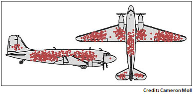
McGeddon took a public-domain diagram of a navy plane, and drew dots similar to the diagram here, which is credited to @cameronmoll: https://www.motherjones.com/kevin-drum/2010/09/counterintuitive-world/
@cameronmoll confirms he is the source.
Based on the link in the article, it *seems* to be from his talk “Good vs. Great Design” at @aneventapart Boston 2007? But the link is broken, and the only slides I can find for the talk don't contain this image. https://twitter.com/cameronmoll/status/1317661364631097345
Based on the link in the article, it *seems* to be from his talk “Good vs. Great Design” at @aneventapart Boston 2007? But the link is broken, and the only slides I can find for the talk don't contain this image. https://twitter.com/cameronmoll/status/1317661364631097345

 Read on Twitter


