Principles of Effective Data Visualization:
https://reader.elsevier.com/reader/sd/pii/S2666389920301896?token=A3034414F91EAE938010F5A5000904D0778E1E19A21AE10403B2AE049831DF933483F1381C952CEFFE681B7E58B43D20
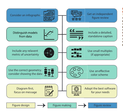
Nice article that provides a short list of elements to consider when creating data visualizations.
I am going to try and expand on each element from a sport science perspective (where possible).
THREAD:
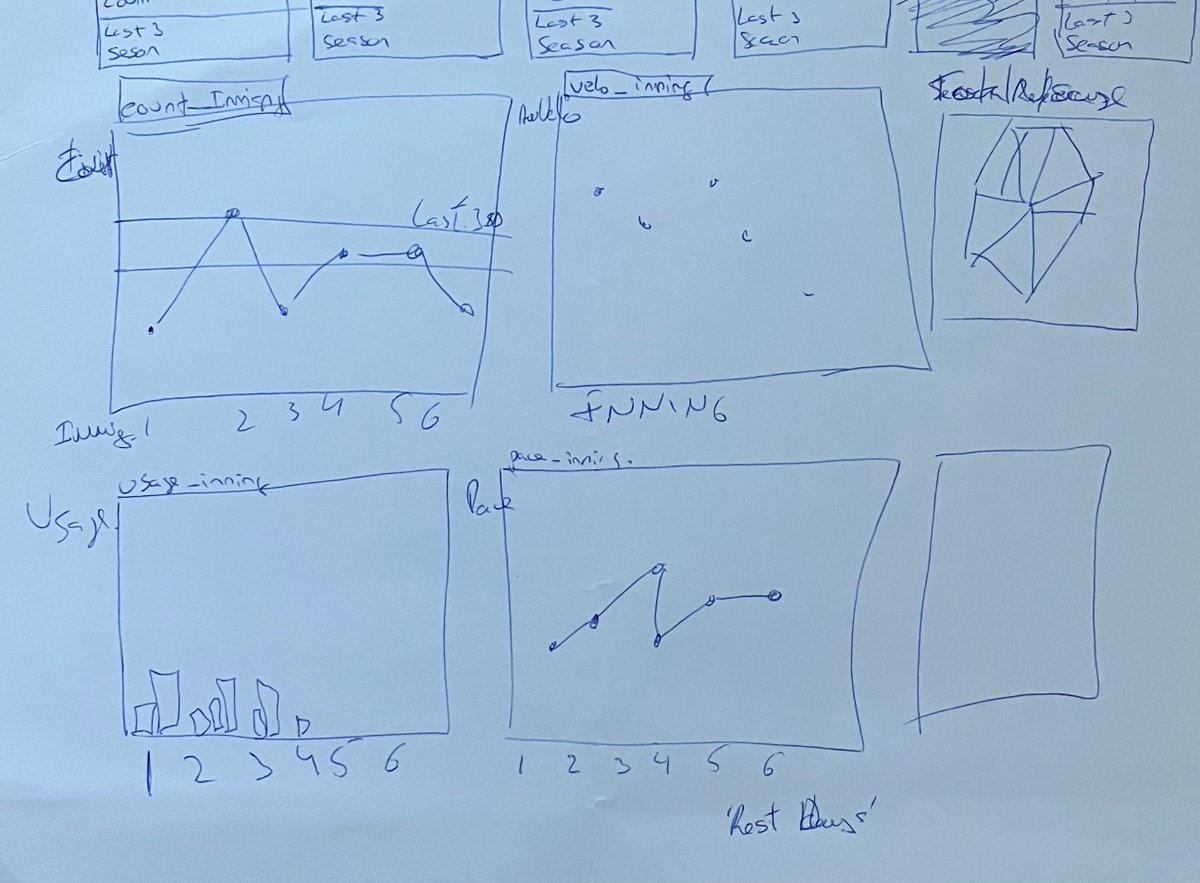
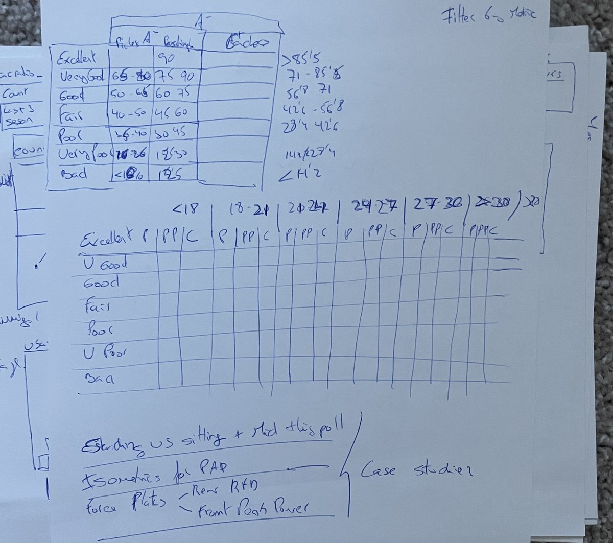
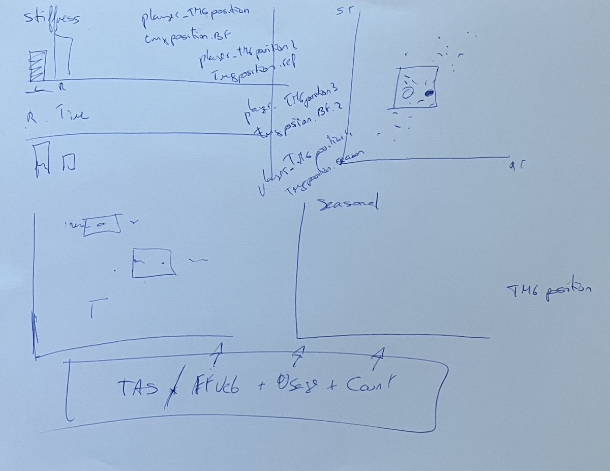
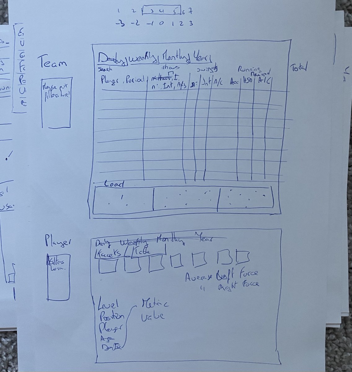
1. DIAGRAM FIRST:
Something I do a lot. Two reasons:
- Get a visual of what I am trying to create. It may save me time later, especially if I am hard coding a report.
- Macro view (how am I going to use the space) + Micro design (what do I want from each element).
Examples:
Something I do a lot. Two reasons:
- Get a visual of what I am trying to create. It may save me time later, especially if I am hard coding a report.
- Macro view (how am I going to use the space) + Micro design (what do I want from each element).
Examples:
2. USE THE RIGHT SOFTWARE:
1) Customization. Create whatever I need.
2) Open-source. I don't know how the report/visual is going to evolve over time, but the less limited I am by the software the better.
I'll mention R: #ggplot2 + many table options. https://rkabacoff.github.io/datavis/
1) Customization. Create whatever I need.
2) Open-source. I don't know how the report/visual is going to evolve over time, but the less limited I am by the software the better.
I'll mention R: #ggplot2 + many table options. https://rkabacoff.github.io/datavis/
3. EFFECTIVE GEOMETRIES
Understanding the nature of our data is key.
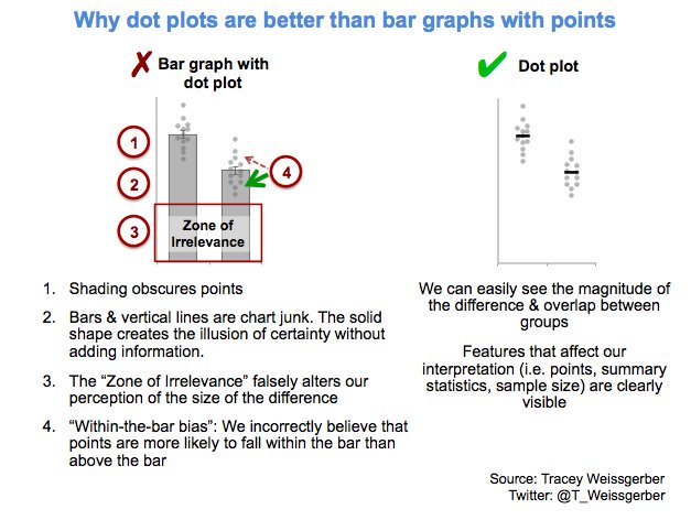
I can't link every article but wikipedia https://en.wikipedia.org/wiki/Misleading_graph shows some examples of misleading graphs & links to references.
Also, a great thread by @T_Weissgerber on bar graphs https://twitter.com/T_Weissgerber/status/1192694904603992064
3.1 GEOMETRIES (cont).
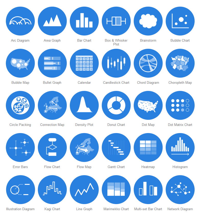
This gets tweeted a lot but just a reminder that when unsure, resources like the dataviz catalogue can be a good starting point.
https://datavizcatalogue.com/index.html
This gets tweeted a lot but just a reminder that when unsure, resources like the dataviz catalogue can be a good starting point.
https://datavizcatalogue.com/index.html
3.2 GEOMETRIES (cont).
The article brings up the point of showing of making and effort to show the raw data in meaningful ways as much and whenever possible and it is great to see this more in sport science.
Check out @Physical_Prep work:
 https://www.researchgate.net/profile/Mladen_Jovanovic5
The article brings up the point of showing of making and effort to show the raw data in meaningful ways as much and whenever possible and it is great to see this more in sport science.
Check out @Physical_Prep work:
 https://www.researchgate.net/profile/Mladen_Jovanovic5
4. INCLUDE UNCERTAINTY
Representing uncertainty in our reports is paramount for sport scientists. It helps understand the strength of our findings, and guide more applied aspects such as whether making changes to our programs are worth the effort or resources for example.
Representing uncertainty in our reports is paramount for sport scientists. It helps understand the strength of our findings, and guide more applied aspects such as whether making changes to our programs are worth the effort or resources for example.
4.1 UNCERTAINTY (cont.)
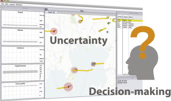
This is a fascinating research on the effect of uncertainty visualization on decision making with air traffic controllers.
https://www.sciencedirect.com/science/article/abs/pii/S0097849314000302
This is a fascinating research on the effect of uncertainty visualization on decision making with air traffic controllers.
https://www.sciencedirect.com/science/article/abs/pii/S0097849314000302
4.2 UNCERTAINTY (cont.)
The good news is that there are a lot more research and resources of effective ways to display uncertainty now.
This article by @flowingdata as well as the related links at the bottom are very comprehensive. https://flowingdata.com/2018/01/08/visualizing-the-uncertainty-in-data/
The good news is that there are a lot more research and resources of effective ways to display uncertainty now.
This article by @flowingdata as well as the related links at the bottom are very comprehensive. https://flowingdata.com/2018/01/08/visualizing-the-uncertainty-in-data/
4.3 UNCERTAINTY (cont.)
One more on uncertainty (trying keep things short!).
For those who work with #RStats , the package {ggdist} by @mjskay extremely helpful. Check it out if you haven't yet. https://github.com/mjskay/ggdist
One more on uncertainty (trying keep things short!).
For those who work with #RStats , the package {ggdist} by @mjskay extremely helpful. Check it out if you haven't yet. https://github.com/mjskay/ggdist
5. USE COLORS EFFECTIVELY
When reviewing sport science reports/dashboards I find this to be one of the more common challenges. Inconsistency and random use of colors.
The article highlights important aspects to improve the use of colors and when to do what.
When reviewing sport science reports/dashboards I find this to be one of the more common challenges. Inconsistency and random use of colors.
The article highlights important aspects to improve the use of colors and when to do what.
5.1 COLORS (cont.)
Less is more.
Some things I like to consider regarding colors:
1- How my reports are consumed. Digital vs paper.
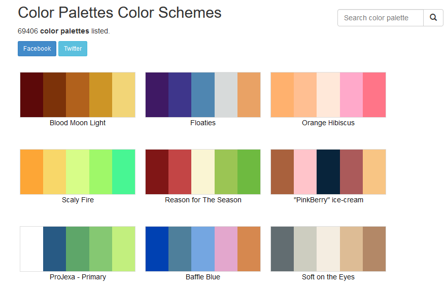
2 - Use a color palette to be consistent. I use https://www.color-hex.com/ for help.
3 - Use color to support significance, magnitude and direction.
Less is more.
Some things I like to consider regarding colors:
1- How my reports are consumed. Digital vs paper.
2 - Use a color palette to be consistent. I use https://www.color-hex.com/ for help.
3 - Use color to support significance, magnitude and direction.
5.2 COLORS (cont.)
There are many resources on colors and data visualization. I will leave this link here for interest: https://towardsdatascience.com/color-in-data-visualization-less-how-more-why-348514a3c4d8
There are many resources on colors and data visualization. I will leave this link here for interest: https://towardsdatascience.com/color-in-data-visualization-less-how-more-why-348514a3c4d8
6. SMALL MULTIPLES
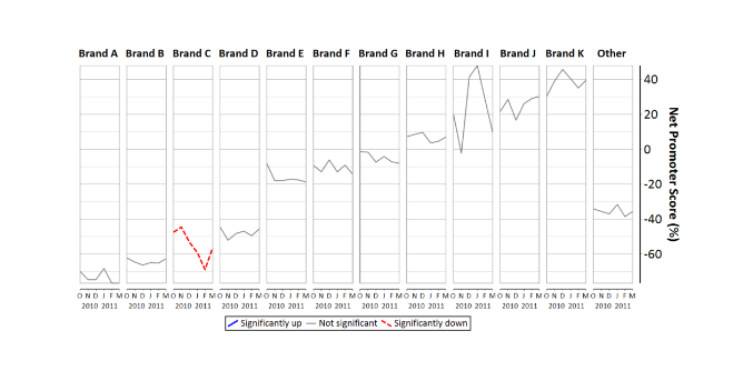
Small multiples are one of the reasons I started learning #ggplot2. This is also provided in other platforms such as tableau or more recently powerBI.
This is an interesting article on the psychology of small multiples https://www.displayr.com/the-psychology-of-small-multiples/
Small multiples are one of the reasons I started learning #ggplot2. This is also provided in other platforms such as tableau or more recently powerBI.
This is an interesting article on the psychology of small multiples https://www.displayr.com/the-psychology-of-small-multiples/
6.1 SMALL MULTIPLES (cont.)
There are many reasons to take advantage of smart multiples in sport science, for example:
- Facilitate pattern comparison/recognition
- Compare across multiple athletes
- Compare one athlete across multiple periods.
There are many reasons to take advantage of smart multiples in sport science, for example:
- Facilitate pattern comparison/recognition
- Compare across multiple athletes
- Compare one athlete across multiple periods.
6.2 SMALL MULTIPLES (cont.)
One more.
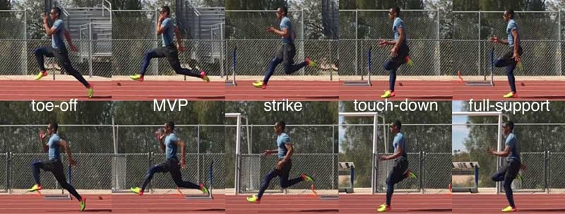
The famous Kinogram used by @ALTIS is a form of small multiple using video sources. Baseball (and I am sure other sports too) use this a lot as well.
This can also be automated. Googling "stromotion" brings up many examples.
One more.
The famous Kinogram used by @ALTIS is a form of small multiple using video sources. Baseball (and I am sure other sports too) use this a lot as well.
This can also be automated. Googling "stromotion" brings up many examples.
7. DATA & MODELS
This was a good reminder to be careful when relying only on model outputs. Some personal notes:
- Supplement with raw data (when possible)
- If only using model output ensure the process is reproducible, transparent and all involved understand the assumptions
This was a good reminder to be careful when relying only on model outputs. Some personal notes:
- Supplement with raw data (when possible)
- If only using model output ensure the process is reproducible, transparent and all involved understand the assumptions
7.1 DATA & MODELS (cont.)
A good example (and controversial) in sport science is the current hot topic of A:C ratios. Reflection...
Outside our Sport Science field but I found this article very useful to expand on this topic: https://link.springer.com/article/10.1007/s13194-018-0246-0
A good example (and controversial) in sport science is the current hot topic of A:C ratios. Reflection...
Outside our Sport Science field but I found this article very useful to expand on this topic: https://link.springer.com/article/10.1007/s13194-018-0246-0
8. CAPTIONS
This part probably more relevant for published research than applied reporting.
It is not really common to include thorough captions in our daily reports. Having said that, we should ensure the final users understand each element in our report.
This part probably more relevant for published research than applied reporting.
It is not really common to include thorough captions in our daily reports. Having said that, we should ensure the final users understand each element in our report.
9. INFOGRAPHICS
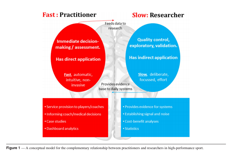
@HowellsDan and I touched on this briefly on a recent webinar. To summarise this part of the article I'll cite Coutts paper about "working fast and slow":
https://pubmed.ncbi.nlm.nih.gov/26752203/
- FAST = automated reports
- SLOW = infographics to summary findings
@HowellsDan and I touched on this briefly on a recent webinar. To summarise this part of the article I'll cite Coutts paper about "working fast and slow":
https://pubmed.ncbi.nlm.nih.gov/26752203/
- FAST = automated reports
- SLOW = infographics to summary findings
10. GET AN OPINION
For those working in bigger departments this is a good practice. Check with others before releasing something new.
For me this is a natural part of the reporting process, and we should constantly check with the final users.
For those working in bigger departments this is a good practice. Check with others before releasing something new.
For me this is a natural part of the reporting process, and we should constantly check with the final users.
11. WHAT ABOUT TABLES?
I am glad the author brought up this point at the end as I find myself integrating tables more and more as part of my reports.
Good reminder to consider whether we should use a graph or a table. To expand on this: https://blog.datawrapper.de/guide-what-to-consider-when-creating-tables/
I am glad the author brought up this point at the end as I find myself integrating tables more and more as part of my reports.
Good reminder to consider whether we should use a graph or a table. To expand on this: https://blog.datawrapper.de/guide-what-to-consider-when-creating-tables/
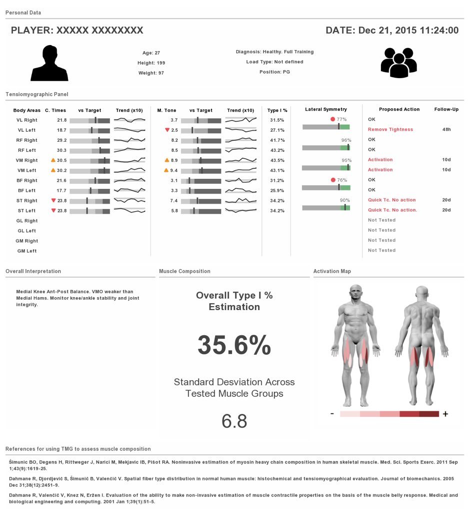
11.1 WHAT ABOUT TABLES? (cont.)
Graphical tables in particular can be very useful as part of our reports and there are quite a few tools currently available. This article was helpful for me:
https://www.researchgate.net/profile/Matthias_Templ/publication/282220150_SparkTable_Generating_graphical_tables_forwebsites_and_documents_with_R/links/5630cb3508aedf2d42beeba5/SparkTable-Generating-graphical-tables-forwebsites-and-documents-with-R.pdf
Few has always been a source of inspiration as well
Example:
11.2 WHAT ABOUT TABLES? (cont.)
Back to #RStats users. Some packages to create powerful tables, both static and interactive:
- {DT}
- {reactable}
- {gT}
- {formattable}
For more inspiration, check out the Rstudio Table Contest: https://blog.rstudio.com/2020/12/23/winners-of-the-2020-rstudio-table-contest/
Back to #RStats users. Some packages to create powerful tables, both static and interactive:
- {DT}
- {reactable}
- {gT}
- {formattable}
For more inspiration, check out the Rstudio Table Contest: https://blog.rstudio.com/2020/12/23/winners-of-the-2020-rstudio-table-contest/
FINAL THOUGHTS
Dataviz is an important skill for sport scientists. Thanks to those bring awareness to this area such as:
- @DocSoph / @JordanStrength
https://journals.humankinetics.com/view/journals/ijspp/15/10/article-p1353.xml
- @heidithornton09 / @jacedelaney
https://journals.humankinetics.com/view/journals/ijspp/14/6/article-p698.xml
An many more.
Also...
While I love this topic I am far from an expert, so appreciate anyone sharing other resources they found useful.
While I love this topic I am far from an expert, so appreciate anyone sharing other resources they found useful.

 Read on Twitter