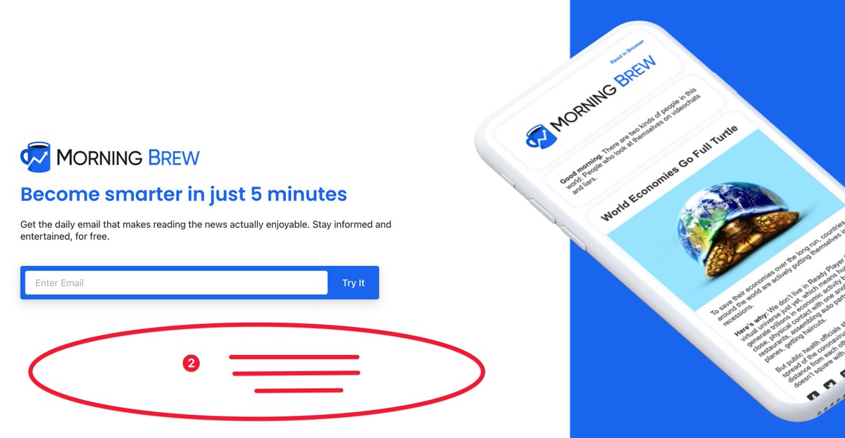
How does your landing page stack up with @MorningBrew's?
Let’s take a peak at 2 great things and 2 possible changes for the Brew’s home page.
Let’s take a peak at 2 great things and 2 possible changes for the Brew’s home page.
1 -
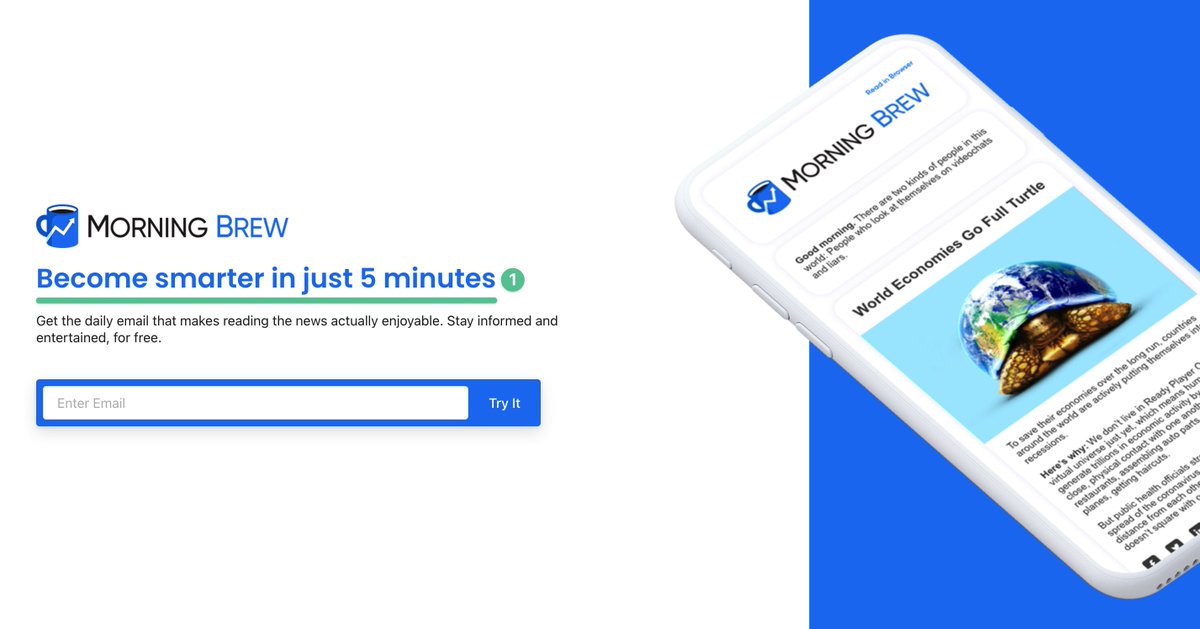
The headline talks about the benefit to the reader.
It does NOT talk about how great Morning Brew is.
The headline talks about the benefit to the reader.
It does NOT talk about how great Morning Brew is.
2 -
The graphic shows the newsletter in its natural habitat.
You don’t even have to sign up to know what it will look like or what to expect.
The graphic shows the newsletter in its natural habitat.
You don’t even have to sign up to know what it will look like or what to expect.
1 -
The CTA button has little personality.
Morning Brew is a brand that oozes with it.
There’s an opportunity to make people smile when they sign up.
The CTA button has little personality.
Morning Brew is a brand that oozes with it.
There’s an opportunity to make people smile when they sign up.
2 -
Morning Brew is well-known.
But adding some social proof here would still go a long way.
Quote from a reader, famous readers, etc.
Morning Brew is well-known.
But adding some social proof here would still go a long way.
Quote from a reader, famous readers, etc.
If you liked this, learned something, or even flat out hated it:
Please like and retweet the top tweet!
It will go a long way in helping more people see it.
Please like and retweet the top tweet!
It will go a long way in helping more people see it.

 Read on Twitter