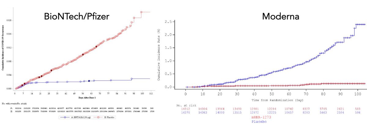
These graphs are on the effectiveness of the two mRNA vaccines and they are, in a word, incredible.
Going from left to right is days from the ‘first dose’ of the vaccine.
As you go up, you have more COVID cases. https://twitter.com/erictopol/status/1338918969642663937
Going from left to right is days from the ‘first dose’ of the vaccine.
As you go up, you have more COVID cases. https://twitter.com/erictopol/status/1338918969642663937
The red in the Pfizer vaccine is placebo and the blue is the vaccine group. It’s reversed in the Moderna for some reason.
By about day 14-ish after the first dose, the placebo group starts to get more COVID cases than the vaccine group... and then it’s not even close!
By about day 14-ish after the first dose, the placebo group starts to get more COVID cases than the vaccine group... and then it’s not even close!
By about 3.5 months in, the placebo group is getting pummeled.
I know most of my followers don’t look at graphs like that but I can tell you my exact reaction when I first saw them: Holy shit!
The Pfizer vaccine had about 44,000 people in their trial. Moderna had about 30,000. They’re split between the two groups. These are big samples.
The Pfizer vaccine had about 44,000 people in their trial. Moderna had about 30,000. They’re split between the two groups. These are big samples.

 Read on Twitter


