When it's all pretty grim on the Covid-19 front, here is a piece of relatively good news...
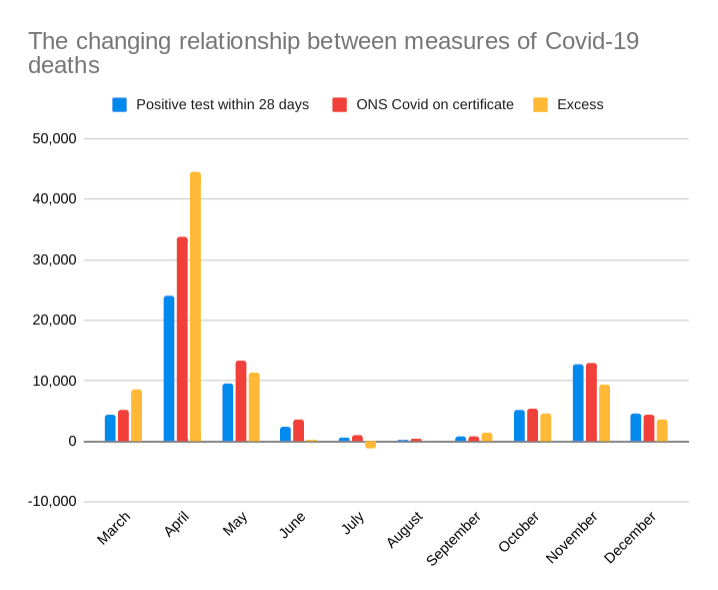
There are now fewer excess deaths in the second wave than we might have expected
1/
There are now fewer excess deaths in the second wave than we might have expected
1/
In March and April, there were regularly roughly twice the number to total excess deaths than those recorded by the government after a positive Covid-19 test
In October, November and December, there have been fewer - about 75 to 80% of the number from the daily totals
why?
2/
In October, November and December, there have been fewer - about 75 to 80% of the number from the daily totals
why?
2/
Obviously, we cannot know for sure, but here are some potential explanations
-It's a blip and excess deaths will start rising.
Unlikely, unless register offices have suddenly changed their practices
3/
-It's a blip and excess deaths will start rising.
Unlikely, unless register offices have suddenly changed their practices
3/
We're testing properly now
- Almost certainly true. This , I think, explains much of the difference compared with the spring when Covid deaths were not picked up at all, especially in care homes
4/
- Almost certainly true. This , I think, explains much of the difference compared with the spring when Covid deaths were not picked up at all, especially in care homes
4/
Some recorded Covid-19 deaths are people who would have died anyway in the same rough period of time
- Also now almost certainly true. This means they are in the Covid stats but do not count as an excess
5/
- Also now almost certainly true. This means they are in the Covid stats but do not count as an excess
5/
Some deaths (flu) we would expect normally are avoided due to social distancing and better hygene
- Again, almost certainly true, so the baseline of deaths is lower (there will be other deaths where the baseline is higher - eg people not going to hospital when they should)
6/
- Again, almost certainly true, so the baseline of deaths is lower (there will be other deaths where the baseline is higher - eg people not going to hospital when they should)
6/
The important thing is this:
The daily figures are now exagerating the deadliness of Covid-19. In the spring, they were understanting it
BUT - it is still deadly. It is still causing excess deaths.
Thankfully fewer than we might have feared
7/
The daily figures are now exagerating the deadliness of Covid-19. In the spring, they were understanting it
BUT - it is still deadly. It is still causing excess deaths.
Thankfully fewer than we might have feared
7/
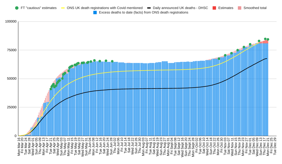
The much less important upshot is that I have revised down my estimates by a little to take account of the new relationships.
The best estimate of UK Covid-related excess deaths since mid March is now
84,400
ENDS
The best estimate of UK Covid-related excess deaths since mid March is now
84,400
ENDS
NB:
This is not an issue of better treatment - that should affect all measures of deaths equally - and probably does.
The issue here concerns why the relationship between different measures of deaths is changing
This is not an issue of better treatment - that should affect all measures of deaths equally - and probably does.
The issue here concerns why the relationship between different measures of deaths is changing
NB2 - the December figures in the first chart are for only a third of the month - I should have made that clear (it was the relatioship between the bars I was examining)- the epidemic is not receeding
Apologies
Apologies

 Read on Twitter


