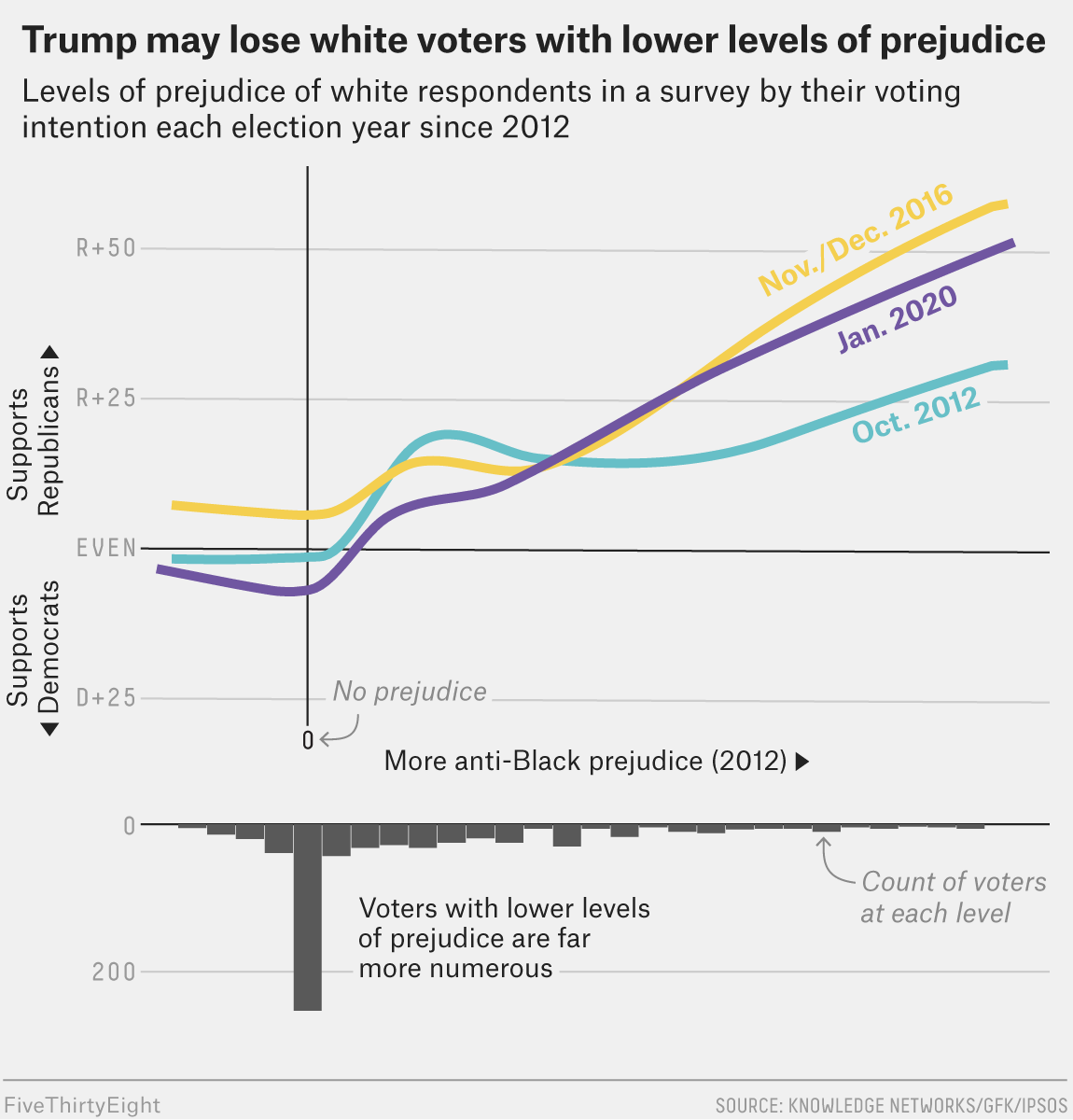
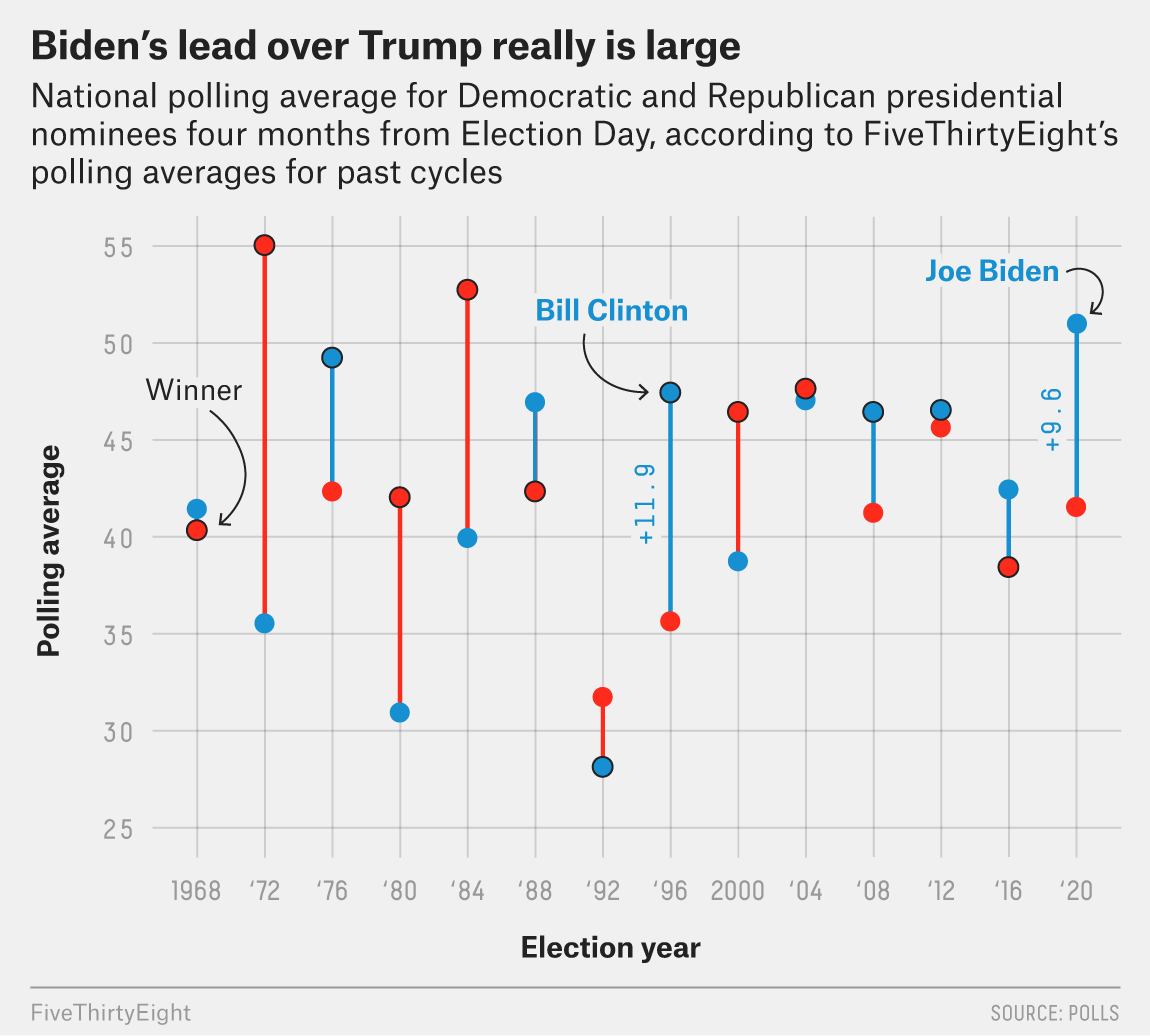
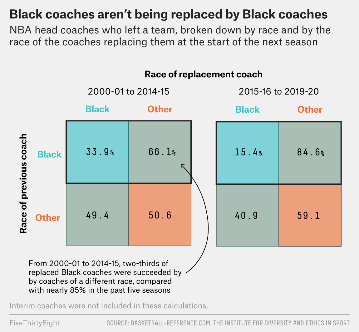
As academic scholars, we can learn a lot from the smart people at @FiveThirtyEight about great #dataviz.
(short thread) https://twitter.com/laurabronner/status/1341045777670545413
(short thread) https://twitter.com/laurabronner/status/1341045777670545413
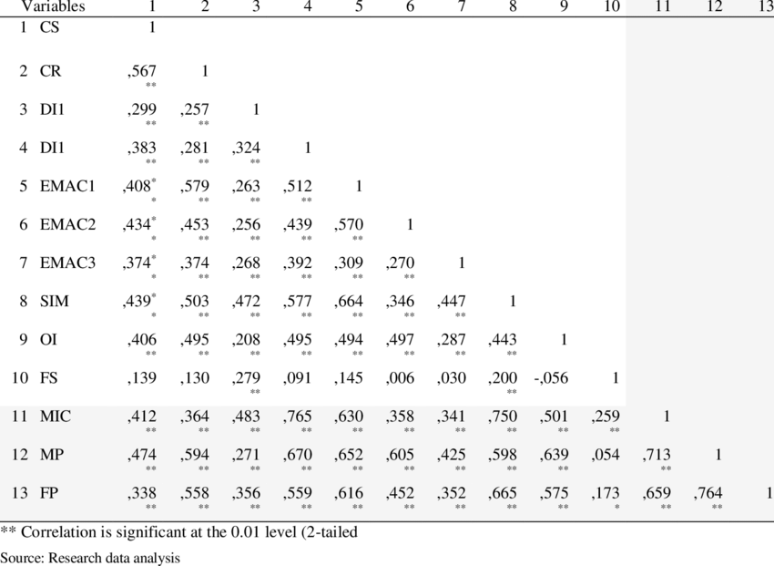
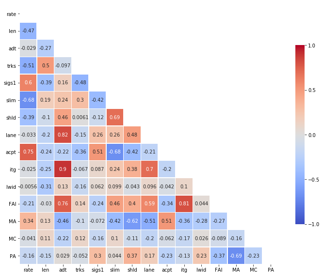
Correlation matrices which display how strongly variables correlate with other variables.
The table bshows how we mostly do it in academia.
The plot shows how many scholars have begun doing it in the past years, which is much better as it gives visual information at first glance.
The table bshows how we mostly do it in academia.
The plot shows how many scholars have begun doing it in the past years, which is much better as it gives visual information at first glance.
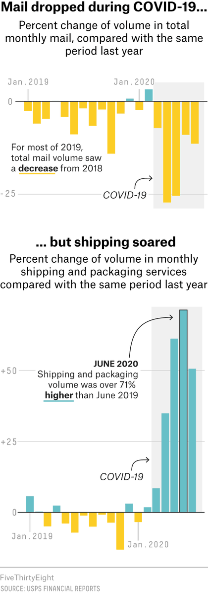
The way 538 does it:
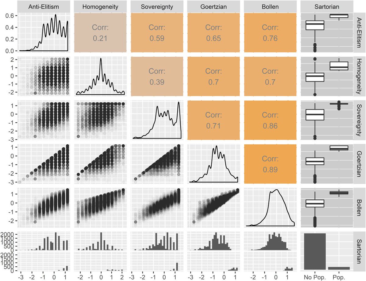
I have never seen this display of a correlation matrix before.
It is an excellent choice if you are interested in bivariate correlations with one or a few variables with a set of about a dozen other indicators
I have never seen this display of a correlation matrix before.
It is an excellent choice if you are interested in bivariate correlations with one or a few variables with a set of about a dozen other indicators
Aside:
If you have a small set of variables (<8) and want to present A LOT of descriptive Information, this might be an option
(It avoids the redundant mirroring at the diagonal which we see on many plots)
If you have a small set of variables (<8) and want to present A LOT of descriptive Information, this might be an option
(It avoids the redundant mirroring at the diagonal which we see on many plots)
538 plots excel in clear presentation that are tailored to deliver a take home message.
This is reflected in labelling and annotations.
On this, in academia we can still learn a lot and which we rarely employ as selectively (deliberately) as good data it journalists do.
This is reflected in labelling and annotations.
On this, in academia we can still learn a lot and which we rarely employ as selectively (deliberately) as good data it journalists do.

 Read on Twitter