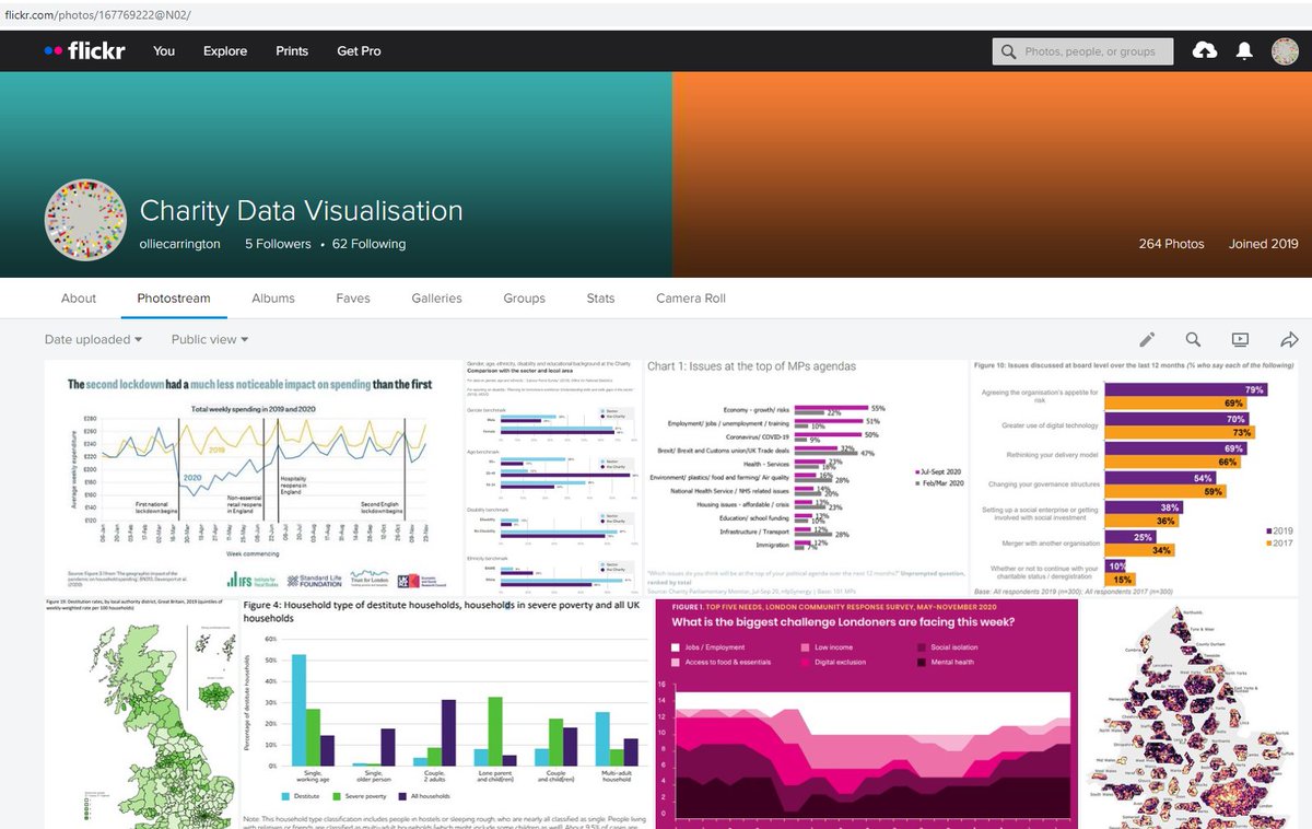
Distract yourself with the '12 #CharityCharts of Xmas', the best #volsec #dataviz I've come across in 2020
Featuring... @TheKingsFund @CitizensAdvice @RunnymedeTrust @TrussellTrust @nfpSynergy @LondonFunders @NPCthinks @360Giving @LBFEW @standardlifefdn @ProBonoEcon @NCVO
1/6
Featuring... @TheKingsFund @CitizensAdvice @RunnymedeTrust @TrussellTrust @nfpSynergy @LondonFunders @NPCthinks @360Giving @LBFEW @standardlifefdn @ProBonoEcon @NCVO
1/6
Obviously lots on #Covid_19...
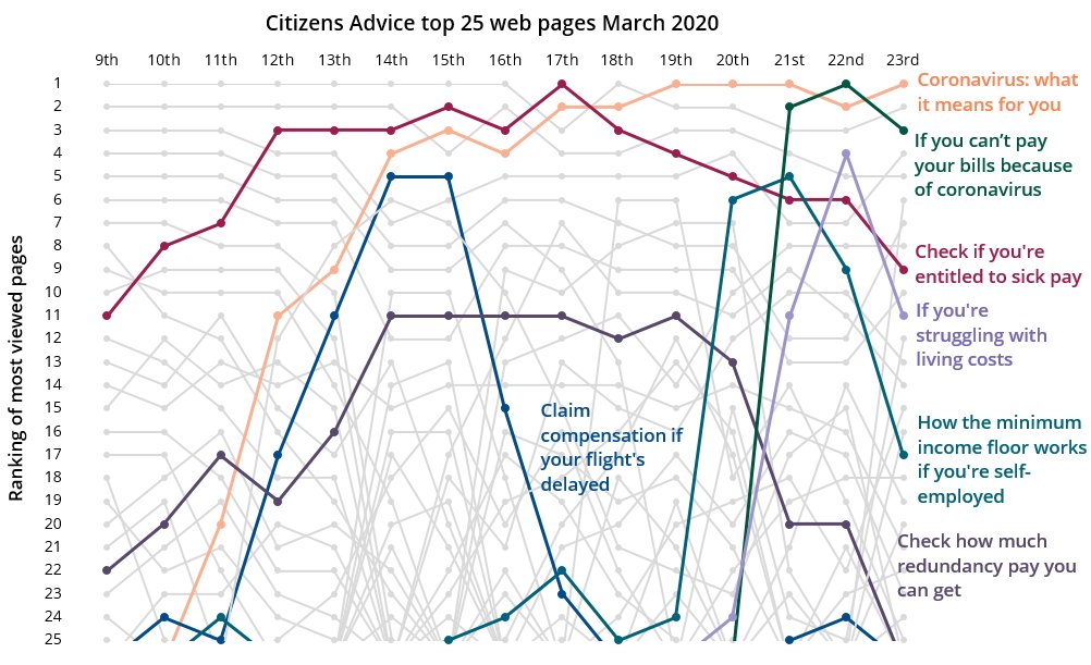
*12* @CitizensAdvice tracking webpage popularity when it 1st struck us in March
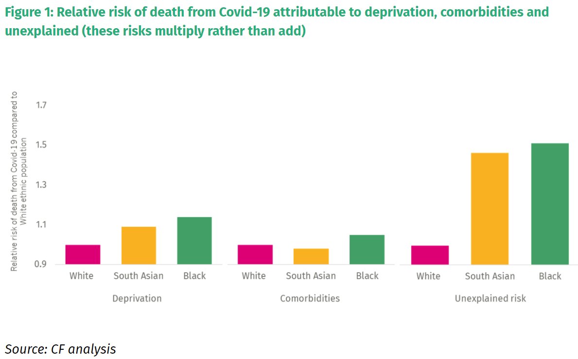
*11* @RunnymedeTrust highlighting the death disparity for people from minority ethnicities
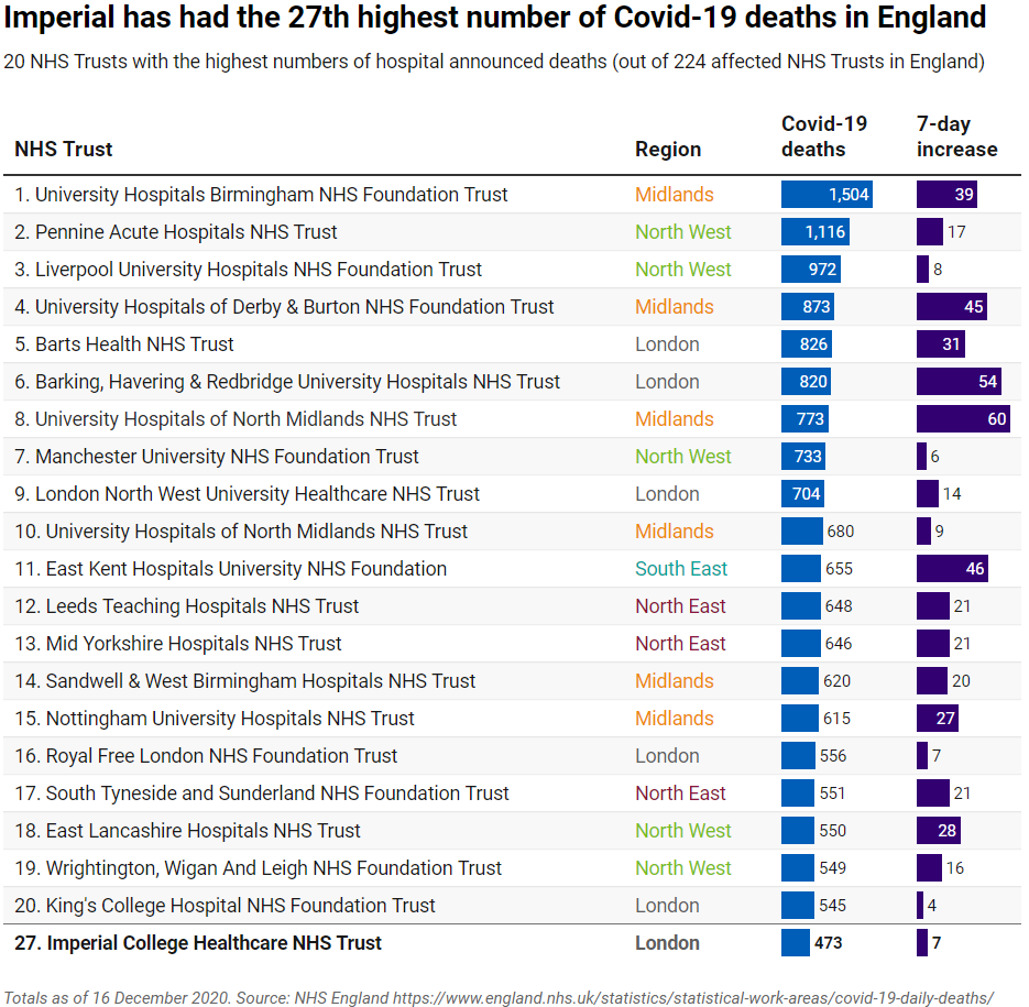
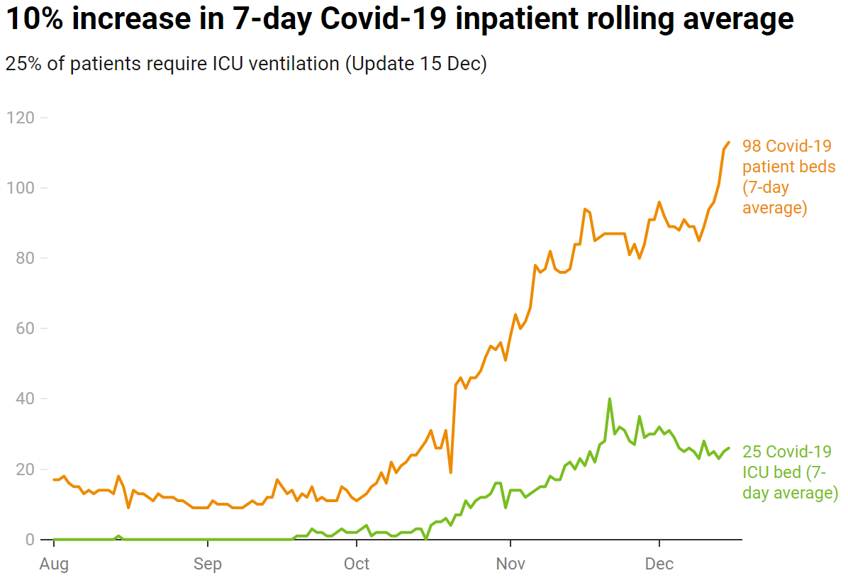
A bonus is my own charts for @ImperialCharity tracking our hospitals
2/5
*12* @CitizensAdvice tracking webpage popularity when it 1st struck us in March
*11* @RunnymedeTrust highlighting the death disparity for people from minority ethnicities
A bonus is my own charts for @ImperialCharity tracking our hospitals
2/5
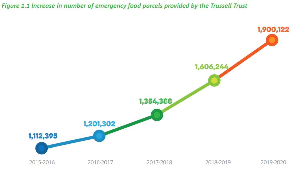
*10* @TrussellTrust's simple chart shows an increase in foodbank usage
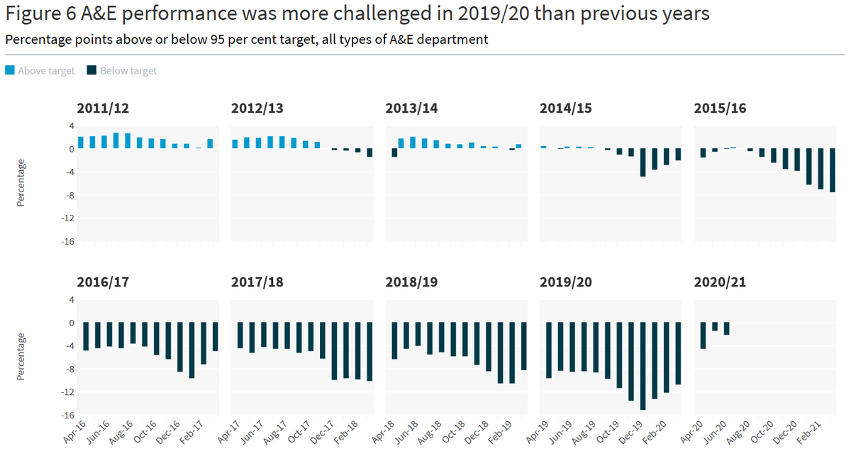
*9* @TheKingsFund uses 'small multiples' to highlight A&E challenges
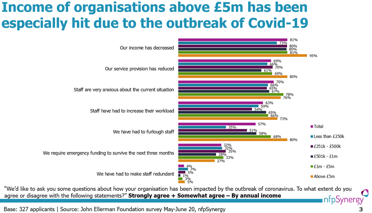
*8* @nfpSynergy looks at how #Covid hit grantees of @EllermanUK
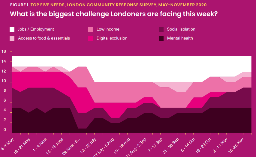
*7* While @LondonFunders tracks the biggest challenges of Londoners
3/5
*9* @TheKingsFund uses 'small multiples' to highlight A&E challenges
*8* @nfpSynergy looks at how #Covid hit grantees of @EllermanUK
*7* While @LondonFunders tracks the biggest challenges of Londoners
3/5
2020 was a BIG yr for dashboards & datasets...
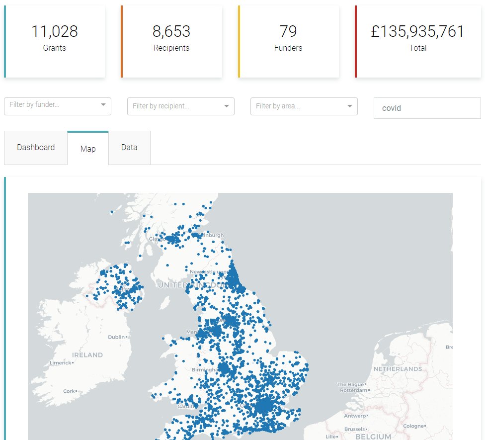
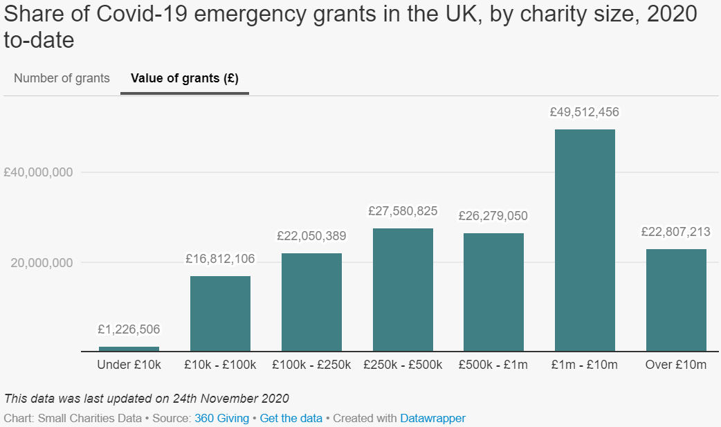
*6* @360Giving covid grant tracker visualising funder data
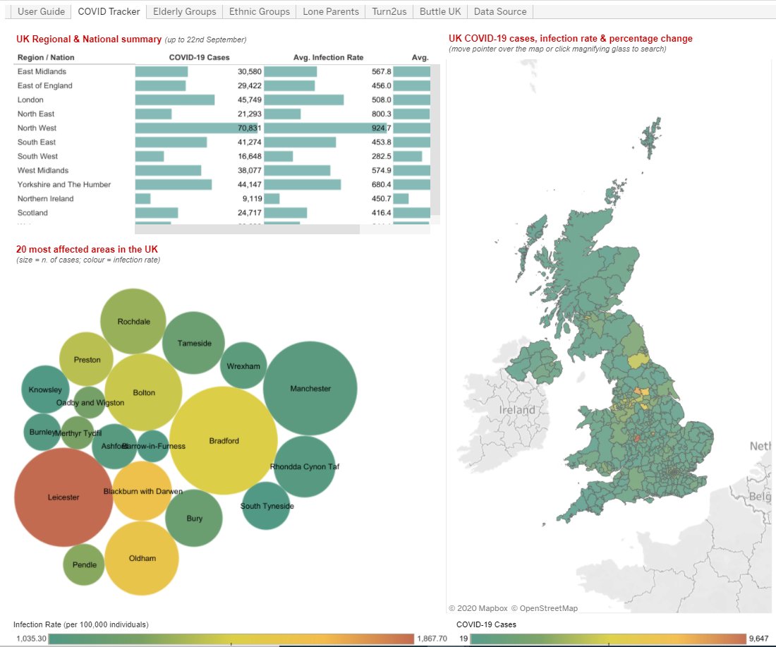
*5* @NPCthinks covid dashboard designed to assist charities
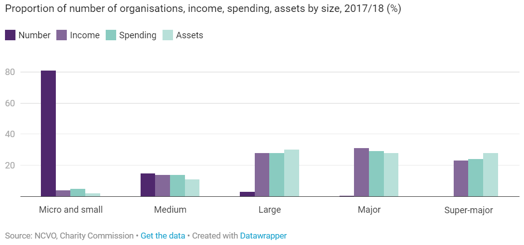
*4* annual @NCVO Almanac charts
*3* @LBFEW #SmallCharitiesData shining a light on this part of our sector
4/5
*6* @360Giving covid grant tracker visualising funder data
*5* @NPCthinks covid dashboard designed to assist charities
*4* annual @NCVO Almanac charts
*3* @LBFEW #SmallCharitiesData shining a light on this part of our sector
4/5
Finally I love these looking at the longer trends at work...
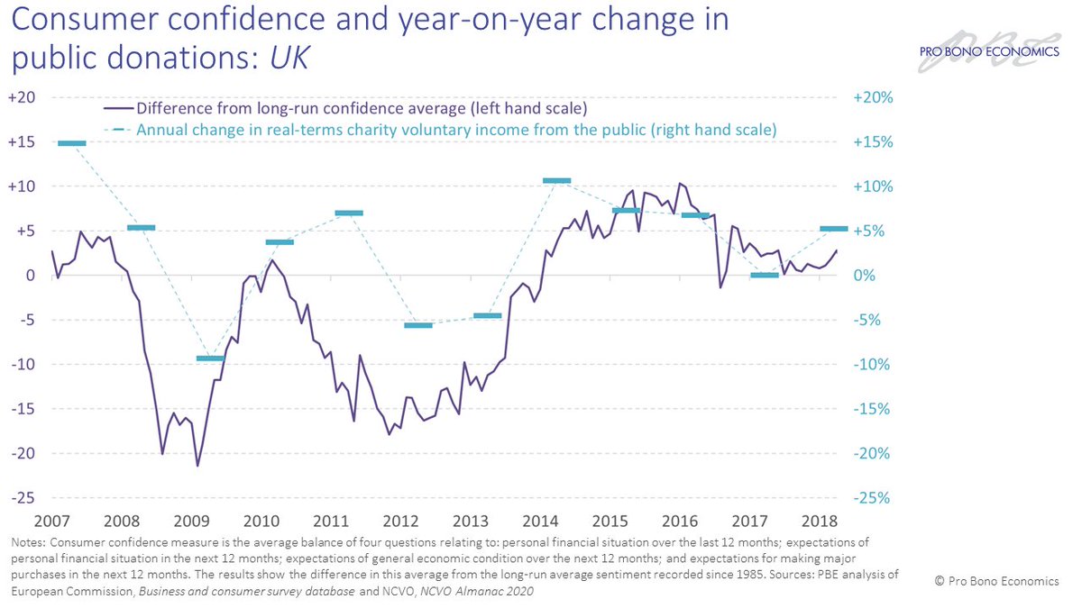
*2* @ProBonoEcon analysis matching consumer confidence to donation dips
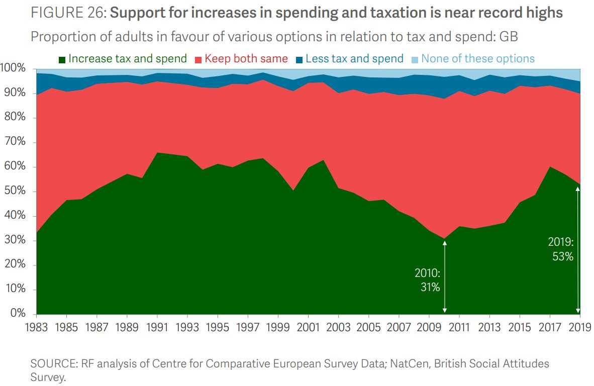
*1* @standardlifefdn following the trend of inc public support of tax
Be inspired by 250+ #CharityCharts on Flickr: https://www.flickr.com/photos/167769222@N02/
5/5
*2* @ProBonoEcon analysis matching consumer confidence to donation dips
*1* @standardlifefdn following the trend of inc public support of tax
Be inspired by 250+ #CharityCharts on Flickr: https://www.flickr.com/photos/167769222@N02/
5/5
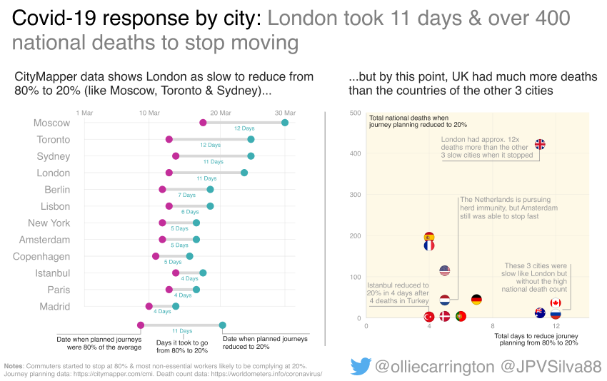
Another bonus, a trio of completely charity-unrelated #dataviz from myself & @JPVSilva88 on...
- Covid-19 impact on commuting
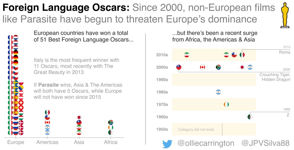
- Foreign Language film breakthrough
- & #DragRace Twitter popularity: https://twitter.com/olliecarrington/status/1264117758133968903
Enjoy the break & think of more #CharityCharts for 2021!
- Covid-19 impact on commuting
- Foreign Language film breakthrough
- & #DragRace Twitter popularity: https://twitter.com/olliecarrington/status/1264117758133968903
Enjoy the break & think of more #CharityCharts for 2021!

 Read on Twitter