A @threadapalooza on visual metaphors, my 5 top rules for visualising concepts and being prolific.
Let’s do a 100-tweet thread on how to make visuals that get noticed and get shared.
Let’s do a 100-tweet thread on how to make visuals that get noticed and get shared.
Before we discuss visual metaphors and how to make things cut through the noise, we need to talk about why.
Why do we want to cut through the noise?
Why do we want to simplify our visuals?
Why do we want to cut through the noise?
Why do we want to simplify our visuals?
When people make visuals for Twitter they assume that they are making something that will be viewed in an art gallery.
The assume their visual will be treated carefully and considered. That the viewer will sit back on a rocking chair and thoughtfully browse.
The assume their visual will be treated carefully and considered. That the viewer will sit back on a rocking chair and thoughtfully browse.
Twitter is not like an art gallery.
Your visuals are actually being displayed on a busy street with traffic going in both directions and the viewer is stood in the middle of the traffic trying to survive.
Your visuals are actually being displayed on a busy street with traffic going in both directions and the viewer is stood in the middle of the traffic trying to survive.
See your visuals as billboards (a concept we'll come back to later) at the side of a busy road.
On Twitter, we're all just driving past billboards. We're scrolling furiously. We're concentrating on driving and half-concentrating on the content.
(obviously not literally I hope)
On Twitter, we're all just driving past billboards. We're scrolling furiously. We're concentrating on driving and half-concentrating on the content.
(obviously not literally I hope)
So why do we want to cut through the noise and simplify?
Put simply, making somebody think on social means it will get ignored.
There's so much content available that any consideration will mean they move on.
Put simply, making somebody think on social means it will get ignored.
There's so much content available that any consideration will mean they move on.
Let ALONE the idea of distractions.
Anybody using Twitter is using it on a device that has email, text messages, notifications, Slack, chat apps, Facebook, Instagram and a million other things that can distract them away from your visual in a second.
Anybody using Twitter is using it on a device that has email, text messages, notifications, Slack, chat apps, Facebook, Instagram and a million other things that can distract them away from your visual in a second.
So to make sure our visuals don't get ignored we must simplify.
There's many ways to simplify but the way I want to focus on here is visual metaphors.
I.E. Using things that people already recognise to say other things.
There's many ways to simplify but the way I want to focus on here is visual metaphors.
I.E. Using things that people already recognise to say other things.
Let's start by clarifying what a metaphor is.
Dictionary definition:
A metaphor is a figure of speech that, for rhetorical effect, directly refers to one thing by mentioning another.
Dictionary definition:
A metaphor is a figure of speech that, for rhetorical effect, directly refers to one thing by mentioning another.
Metaphors are a powerful weapon when convincing somebody but they're also a powerful weapon to help people understand nearly anything.
They're shortcuts into somebody's brain.
I'm sure @robbiecrab would agree.
They're shortcuts into somebody's brain.
I'm sure @robbiecrab would agree.
Consider this statement for a second.
“Don’t spend too long in meetings.
You will have no opportunity to do your job.”
The phrase works. But you have to read it then understand it.
How about if I used another thing you already know to explain this?
“Don’t spend too long in meetings.
You will have no opportunity to do your job.”
The phrase works. But you have to read it then understand it.
How about if I used another thing you already know to explain this?
"Meetings are work vampires"
By using a concept of vampire to explain the fact that meetings suck out your opportunity for work you will instantly understand my intended point.
I didn't need to build a story. I didn't need to set a scene.
By using a concept of vampire to explain the fact that meetings suck out your opportunity for work you will instantly understand my intended point.
I didn't need to build a story. I didn't need to set a scene.
Metaphors work VERY well in fast-paced communication environments.
Ones exactly like Twitter where people are just driving past your concepts, half-paying attention to you.
And we can use visual metaphors in the same way.
Ones exactly like Twitter where people are just driving past your concepts, half-paying attention to you.
And we can use visual metaphors in the same way.
So what IS a visual metaphor then?
A visual metaphor is using common visual patterns that we're already familiar with to explain something else.
I make a lot of visuals on my @_unobvious account.
I like to think I'm quite good at using visual metaphors.
A visual metaphor is using common visual patterns that we're already familiar with to explain something else.
I make a lot of visuals on my @_unobvious account.
I like to think I'm quite good at using visual metaphors.
Let's imagine we wanted to help somebody understand the concept of disappointment. If we wanted to visualise this we might think of downward arrows, charts that show a decline etc.
But what simpler visual metaphor is there than the human face? https://twitter.com/_unobvious/status/1339974159145832453?s=20
But what simpler visual metaphor is there than the human face? https://twitter.com/_unobvious/status/1339974159145832453?s=20
This is why I use faces SO MUCH with Unobvious. Faces have a range of emotions and we almost instinctually understand what those emotions are saying. Happy, sad, angry are all simple emotions that can be conveyed with visual metaphors.
We use them daily ->
We use them daily ->

When I'm making visuals I'm using visual metaphors to shortcut an understanding of a concept or a quote.
An expected visual metaphor can be used in a powerful way if you unexpectedly interpret it.
An expected visual metaphor can be used in a powerful way if you unexpectedly interpret it.
Here the quotation was about "Half-assing" something. A concept that's familiar with most people. It's about not putting in a full effort.
But instead of visualising that woolly concept, I visualised the obvious one. The ass. https://twitter.com/_unobvious/status/1334898215565598720?s=20
But instead of visualising that woolly concept, I visualised the obvious one. The ass. https://twitter.com/_unobvious/status/1334898215565598720?s=20
And the "half-assing" concept can be interpreted in other ways too.
See here in the @waronweakness quote.
What about if we take the metaphor of a jackass and chop it in half? https://twitter.com/_unobvious/status/1294619543646674951?s=20
See here in the @waronweakness quote.
What about if we take the metaphor of a jackass and chop it in half? https://twitter.com/_unobvious/status/1294619543646674951?s=20
Let's talk about some rules then.
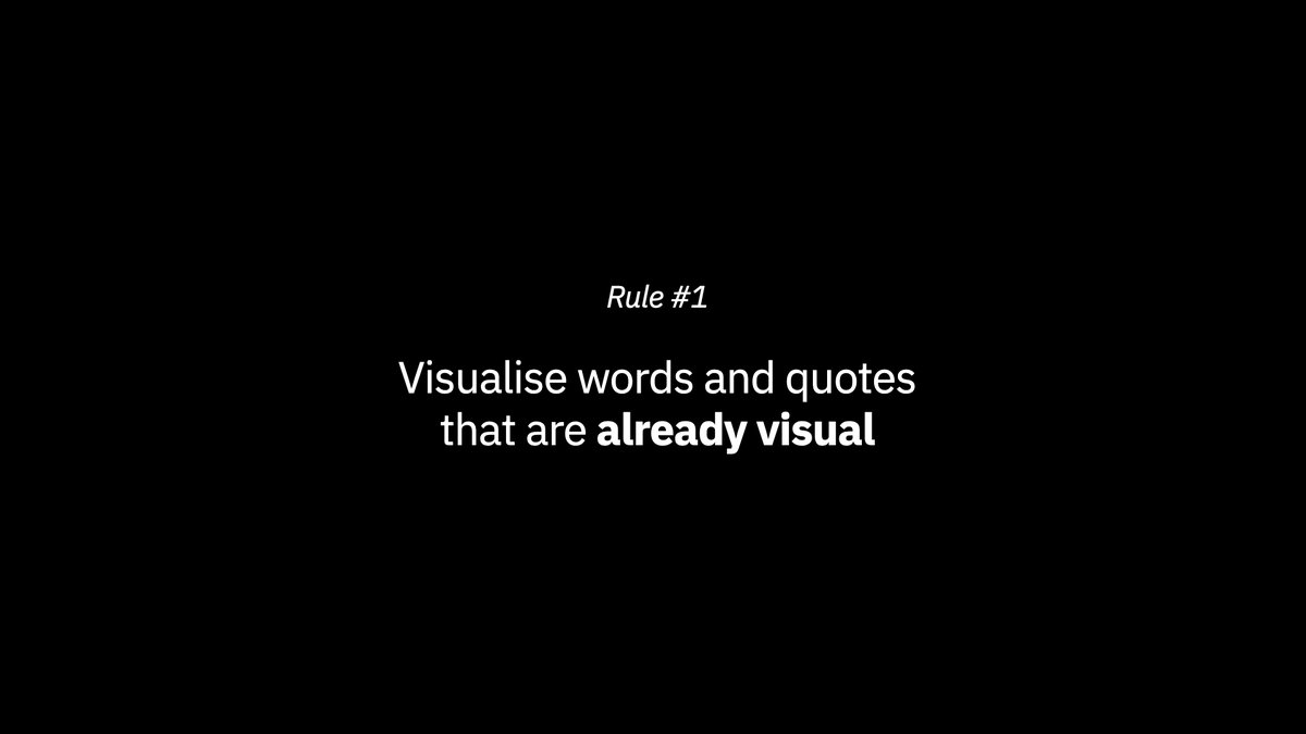
Rule Number One
"Visualise words and quotes that are already visual"
If you are struggling to visualise a concept it is likely because the concept isn't visual already.
Rule Number One
"Visualise words and quotes that are already visual"
If you are struggling to visualise a concept it is likely because the concept isn't visual already.
This tweet by @justinsua had one key visual concept in it: derailing a bad plan.
So I visualised that simple concept. It didn't need to be any more complicated. https://twitter.com/_unobvious/status/1332096419130449925?s=20
So I visualised that simple concept. It didn't need to be any more complicated. https://twitter.com/_unobvious/status/1332096419130449925?s=20
When we find the concepts and quotes that are already visual, creating the visuals and using the correct visual metaphor becomes easy. https://twitter.com/_unobvious/status/1337875016843747328?s=21
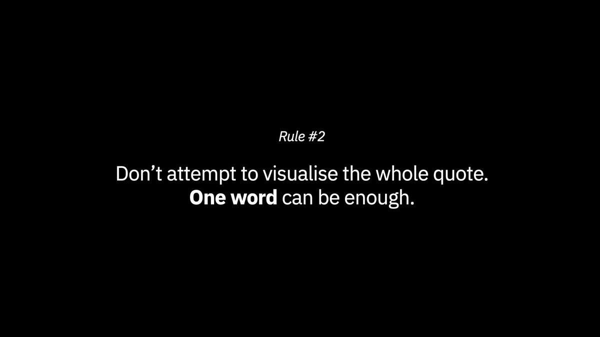
But to lead into Rule Number Two, sometimes the best visuals can be found from finding a visual metaphor inside a quote that has no metaphor.
In this one, I took one word: monopoly. https://twitter.com/_unobvious/status/1331363122481934340?s=21
In this one, I took one word: monopoly. https://twitter.com/_unobvious/status/1331363122481934340?s=21
This is the mistake I see most budding visual creators making.
They try to pack too much information into their visuals.
They feel like they need to visualise every single concept inside a quote.
Ya don't.
And ya shouldn't.
They try to pack too much information into their visuals.
They feel like they need to visualise every single concept inside a quote.
Ya don't.
And ya shouldn't.
Here in this visual I did for @oliviercantin
I visualised the word "scar" and combined the concept with a visual we're all familiar with: the success graph. https://twitter.com/_unobvious/status/1303013982454853632?s=21
I visualised the word "scar" and combined the concept with a visual we're all familiar with: the success graph. https://twitter.com/_unobvious/status/1303013982454853632?s=21
I didn't need to visualise the whole quotation. The quotation will be sat next to the visual so I don't need to fully represent it.
I'm enhancing a concept with a visual. NOT replacing it.
I'm enhancing a concept with a visual. NOT replacing it.
This concept is exactly the same as when we're preparing a presentation.
All of my slides won't include every single word I'd say.
The presentation slides are there to support the words that come out of my mouth. As is a visual.
All of my slides won't include every single word I'd say.
The presentation slides are there to support the words that come out of my mouth. As is a visual.
You can also use a visual metaphor to vaguely communicate an idea like I did with this @comedicbizman tweet.
This requires the viewer to connect the dots. A concept that can help break a scrolling pattern and pay attention. https://twitter.com/_unobvious/status/1321508973565141000?s=21
This requires the viewer to connect the dots. A concept that can help break a scrolling pattern and pay attention. https://twitter.com/_unobvious/status/1321508973565141000?s=21
Here's another smiley face.
I wanted to represent an overall idea of becoming happier by learning how to earn with your mind.
I didn't need to visualise the exact words or even the quote to connect the idea. https://twitter.com/_unobvious/status/1329214144751525889?s=21
I wanted to represent an overall idea of becoming happier by learning how to earn with your mind.
I didn't need to visualise the exact words or even the quote to connect the idea. https://twitter.com/_unobvious/status/1329214144751525889?s=21
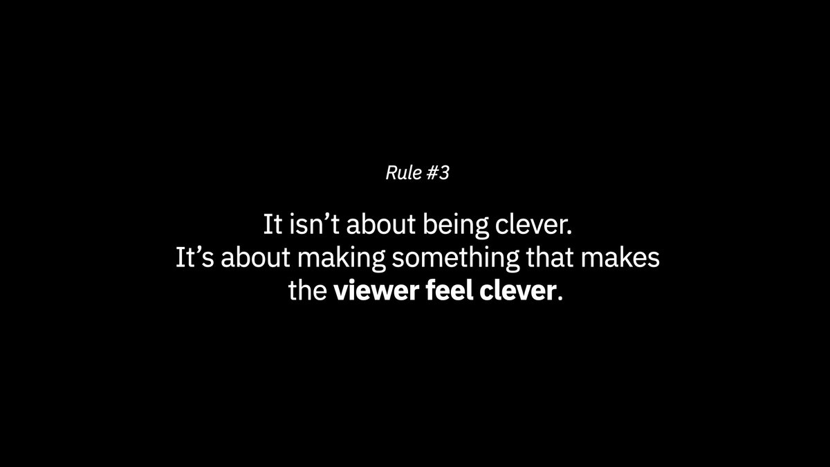
Rule Number Three
"It isn’t about being clever. It’s about making something that makes the viewer feel clever."
"It isn’t about being clever. It’s about making something that makes the viewer feel clever."
Let's sit with this thought for a while.
I talk a lot about ego in design, especially when it comes to making simple visuals.
Most bad design is created because of a big ego of a designer.
I talk a lot about ego in design, especially when it comes to making simple visuals.
Most bad design is created because of a big ego of a designer.
What do I mean?
Ego means they won't reduce, they won't remove elements that doesn't need to be there. They want to stamp their personality onto something.
They want to show how clever they are.
Ego means they won't reduce, they won't remove elements that doesn't need to be there. They want to stamp their personality onto something.
They want to show how clever they are.
If you want to show how clever you are hon a quiz show.
If you want to make visuals make things dumber.
Making things as simple as possible is the hardest thing you can do in a visual.
Boiling down a concept is TOUGH.
If you want to make visuals make things dumber.
Making things as simple as possible is the hardest thing you can do in a visual.
Boiling down a concept is TOUGH.
I'm not trying to be clever when I make a visual, but I AM trying to make the viewer feel clever.
This is a subtle mind-shift but a very important one.
It isn't about me. It's about you.
This is a subtle mind-shift but a very important one.
It isn't about me. It's about you.
I want you to enjoy what I made.
If you don't enjoy it, you won't share it.
If you don't enjoy it, you won't like it.
If I get none of those things I don't get other people to take notice.
If you don't enjoy it, you won't share it.
If you don't enjoy it, you won't like it.
If I get none of those things I don't get other people to take notice.
This is advanced theory I am discussing here and it isn't something you'll immediately be able to apply.
You have to make lots of over-complicated visuals and ideas before you learn how to boil to reduce.
You have to make lots of over-complicated visuals and ideas before you learn how to boil to reduce.
But I strongly believe if you take into account that you are making OTHERS feel clever and not showing how clever YOU are, you'll get closer to it quicker.
So how do we make people feel clever without overcomplicating things?
I've thought about this concept a lot.
It's a balance we're treading here.
I've thought about this concept a lot.
It's a balance we're treading here.
On one end of the spectrum we have our ego that's fighting to be noticed.
On the other end we have our thoughtful brain, fighting to be understood.
|---ego---------------------thoughtful---|
On the other end we have our thoughtful brain, fighting to be understood.
|---ego---------------------thoughtful---|
There has to be an element of ego otherwise you wouldn't push to be understood better. You wouldn't push to improve.
But our main goal is understanding. And making others feel clever.
But our main goal is understanding. And making others feel clever.
A good rule of thumb:
A good visual metaphor leaves something out to allow the viewer to connect the dots.
A good visual metaphor leaves something out to allow the viewer to connect the dots.
I described this a different way in an Office Hours with @daily__visual the other day.
I want to make a visual that looks like a puzzle, but can be solved in an instant.
This is important.
I want to make a visual that looks like a puzzle, but can be solved in an instant.
This is important.
The reason this is important is The Magic Moment.
If your visual doesn't have The Magic Moment, it won't get liked, shared, retweeted, bring you glory etc.
If your visual doesn't have The Magic Moment, it won't get liked, shared, retweeted, bring you glory etc.
The Magic Moment is simply this.
When somebody sees a visual you made and makes this noise:
"aaaaaaaahhhaaa"
Then they'll smile.
They figured it out. They feel clever. They'll want to show it to their friends to see if they're clever too.
You've got them.
When somebody sees a visual you made and makes this noise:
"aaaaaaaahhhaaa"
Then they'll smile.
They figured it out. They feel clever. They'll want to show it to their friends to see if they're clever too.
You've got them.
Sometimes I might make a visual that is literally a puzzle to solve.
These flow chart type visuals always do well on Twitter because it's a journey the viewer has to take through them.
I've utilised the concept many times on Twitter. https://twitter.com/seeingbars/status/1326931309638381572?s=21
These flow chart type visuals always do well on Twitter because it's a journey the viewer has to take through them.
I've utilised the concept many times on Twitter. https://twitter.com/seeingbars/status/1326931309638381572?s=21
In this visual I did for @zubymusic the part I have left out is what happens next. I've setup the scene for you to view, and you have an expectation of what might happen next. https://twitter.com/_unobvious/status/1339630455050612739?s=21
This is visual storytelling. And playing with this will allow you to make very effective visuals.
The key lesson here is what you choose to leave unsaid.
You don't need to spoon-feed the viewer.
I encourage you not to.
The key lesson here is what you choose to leave unsaid.
You don't need to spoon-feed the viewer.
I encourage you not to.
This next one I did followed the exact same idea.
What can I leave out of this that will allow you to fill in the blanks and "feel clever"?
In this case it was the action. What was going to happen next. https://twitter.com/_unobvious/status/1323316322088951808?s=21
What can I leave out of this that will allow you to fill in the blanks and "feel clever"?
In this case it was the action. What was going to happen next. https://twitter.com/_unobvious/status/1323316322088951808?s=21
Time Magazine is an excellent place to look to for an example of how to make their readers feel clever.
They have this recurring gag on their covers where they use the TIME logo to put horns on people.
They have this recurring gag on their covers where they use the TIME logo to put horns on people.
And here's another execution of the same idea, but by a disgruntled photographer this time.
He took a photo of Trump JUST RIGHT to give him horns from the light behind him.
Again, we are trying to make the viewer feel clever.
He took a photo of Trump JUST RIGHT to give him horns from the light behind him.
Again, we are trying to make the viewer feel clever.
But what do we do if we don't feel we can make people feel clever?
What do we do if we feel short of ideas, like nothing is working?
Let's talk about another rule.
What do we do if we feel short of ideas, like nothing is working?
Let's talk about another rule.
Interpreting something literally is a way to make things appear very clever when in truth it was the opposite.
I utilise this tactic VERY VERY often.
I haven't been clever. I've just been dumb.
I utilise this tactic VERY VERY often.
I haven't been clever. I've just been dumb.
In this visual I was really struggling to create a striking visual that followed all my rules.
It just seemed like a bit of a boring statement.
Then I thought: "well, what if I LITERALLY show time expanding?" https://twitter.com/_unobvious/status/1325050825392140288?s=21
It just seemed like a bit of a boring statement.
Then I thought: "well, what if I LITERALLY show time expanding?" https://twitter.com/_unobvious/status/1325050825392140288?s=21
And the dumber and more literally I take things the more it makes the viewer feel clever.
I literally interpreted "a very narrow field" https://twitter.com/_unobvious/status/1321073327369322496?s=21
I literally interpreted "a very narrow field" https://twitter.com/_unobvious/status/1321073327369322496?s=21
When you begin to look for these connections you will see the them everywhere. What's amazing about this frame of reference is that you and I won't interpret anything literally in the same way.
Which gives us both infinite opportunities to interpret things differently.
Which gives us both infinite opportunities to interpret things differently.
This @thedankoe quotation I visualised recently was as simple as they come but the same concept applied: how can I literally interpret this?
The quote talks about spending things. Maybe I just stack up 8 coins? https://twitter.com/_unobvious/status/1337179604688179200?s=21
The quote talks about spending things. Maybe I just stack up 8 coins? https://twitter.com/_unobvious/status/1337179604688179200?s=21
And then when you start to get really good at this idea of finding literal interpretations that nobody else spots there's another level for you to get good at.
Unexpected interpretations.
Unexpected interpretations.
Whenever we talk about measuring things the first thing that pops to my mind is rulers.
I took this concept and transformed it into something unexpected—which still stayed faithful to the concept. https://twitter.com/_unobvious/status/1333458877241827329?s=21
I took this concept and transformed it into something unexpected—which still stayed faithful to the concept. https://twitter.com/_unobvious/status/1333458877241827329?s=21
In another visual I made for @carvingthought about measuring things I followed the same rule.
I turned the concept of a measuring device—in this case a ruler—on its head by having unexpected units on it. https://twitter.com/_unobvious/status/1316411014485872640?s=21
I turned the concept of a measuring device—in this case a ruler—on its head by having unexpected units on it. https://twitter.com/_unobvious/status/1316411014485872640?s=21
This idea of finding the unexpected within an expected set of guidelines is the premise of what many jokes are built on.
1. You are setup to understand a situation.
2. You buy into the situation.
3. The punchline pulls out the rug from underneath you.
1. You are setup to understand a situation.
2. You buy into the situation.
3. The punchline pulls out the rug from underneath you.
This formula is VERY effective because if you do it right it promises a Magic Moment from the viewer.
They will feel very clever that they have worked out your little puzzle, and they'll want to share it with others.
They will feel very clever that they have worked out your little puzzle, and they'll want to share it with others.
Note: this is why you should study comedy. Comedy has many applications you can take and apply to visuals.
Maybe I should do that thread sometime.
Maybe I should do that thread sometime.
To achieve this idea you need to follow the formula of an expected set of guidelines that somebody already understands. This could be a visual metaphor that's already understood.
Then you skew the metaphor slightly in an unexpected way.
Then you skew the metaphor slightly in an unexpected way.
Note that these types of visuals are certainly the hardest to get right. They're a very advanced skill.
Not too clever, not too dumb, not too obvious.
Not too clever, not too dumb, not too obvious.
When I try these types of visuals they're often experimentations. Of all the styles of visuals I produce these are the ones I'm least sure about.
I don't know whether they'll work or not when I hit publish, so I don't do them very often.
I don't know whether they'll work or not when I hit publish, so I don't do them very often.
I tried this one earlier today to visualise a Dirty Harry quote. I took the expected—a revolver—and skewed it to make it look "lucky"
A four leaf revolver. https://twitter.com/_unobvious/status/1340276807438884864?s=21
A four leaf revolver. https://twitter.com/_unobvious/status/1340276807438884864?s=21
It's important to say here that these types of visuals should STILL work without understanding the joke. The joke, the skew, is an extra level that will please somebody even more if they work it out.
If you don't communicate anything you have failed.
If you don't communicate anything you have failed.
This one works on two levels. It is a simple graph to explain hard work. But it is also a magic wand, as the quote is about magic.
https://twitter.com/_unobvious/status/1315291543515942916?s=21
69/100
https://twitter.com/_unobvious/status/1315291543515942916?s=21
69/100
I've used this concept several times too. Spell out a word with another word.
It works well. You are taking something expected and adding an unexpected element. https://twitter.com/_unobvious/status/1290623119196028929?s=21
It works well. You are taking something expected and adding an unexpected element. https://twitter.com/_unobvious/status/1290623119196028929?s=21
This final rule is probably the most advanced rule to understand, the hardest for me to articulate and the most complicated to put into practice.
But it's where anything truly classic lies.
And you won't make them often.
But it's where anything truly classic lies.
And you won't make them often.
And whilst we're on the concept, let's have a little rap about making things often.
All of these rules I've discussed have only been realised through a relentless pursuit of production.
All of these rules I've discussed have only been realised through a relentless pursuit of production.
When I first started making visuals some time around May my goal was to get as many bad reps in as I could.
I was making 3-5 visuals every day for around 4-5 months.
I was making 3-5 visuals every day for around 4-5 months.
The goal of this wasn't to build followers quickly (as you can see I still don't have so many).
It was to build my understanding of what it takes to make visuals on Twitter.
It was to build my understanding of what it takes to make visuals on Twitter.
I wanted to understand:
• What people liked
• Why they liked it
• What I could make quickly
• What my style and voice was
• What people liked
• Why they liked it
• What I could make quickly
• What my style and voice was
I began very much like most people do on Twitter: I copied a lot of what was working for @visualizevalue, the god of Visual Twitter.
I started by making simple shape type visuals.
I started by making simple shape type visuals.
But through my relentless daily production I started to realise that I had a talent for spotting unexpected things inside quotes.
I also discovered that I had a hidden talent for visual wit, after spending so many years researching the medium.
I also discovered that I had a hidden talent for visual wit, after spending so many years researching the medium.
So my cross-section of visuals started to become clever/funny/happy/witty type visuals that kept a very simple style.
And that's where I started to think about the rules.
And that's where I started to think about the rules.
But NONE of that would have happened if I'd been making a single visual a day. NONE of that would have happened if I'd been making a visual every couple of days.
I'd still be waiting for these discoveries I'm now describing to you probably until 2023.
I'd still be waiting for these discoveries I'm now describing to you probably until 2023.
Being prolific has many advantages. But the main advantage I see is it speeds up your understanding of a craft. As you condense your experiences into daily practices you are understanding new parts of your medium on a daily basis.
And that's very exciting.
And that's very exciting.
Anyway. Tangent over.
Let us visit a final point I want to make before we cut off this ridiculously long thread.
If you're still reading by now, well, you're a masochist like me.
And I'm about to give you my best and most secret tip of them all.
Let us visit a final point I want to make before we cut off this ridiculously long thread.
If you're still reading by now, well, you're a masochist like me.
And I'm about to give you my best and most secret tip of them all.
What connects all great visuals? It isn't how beautiful they are.
It's how clever they make you feel.
And they do that by having The Big Idea embedded in them.
It's how clever they make you feel.
And they do that by having The Big Idea embedded in them.
Let's go over to advertising for a minute to explain this.
BTW: study advertising if you want to see many examples of The Big Idea.
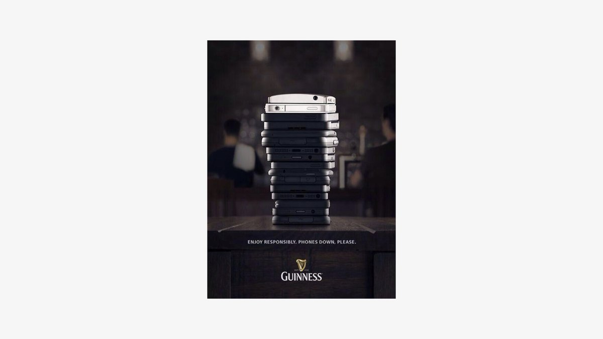
Here's one from Guinness.
BTW: study advertising if you want to see many examples of The Big Idea.
Here's one from Guinness.
The visual ruthlessly removes anything that isn't related to The Big Idea—telling people to put their phones down.
There's no need for anything else, and it's the same for your visuals.
Remove until all you have left is The Big Idea.
There's no need for anything else, and it's the same for your visuals.
Remove until all you have left is The Big Idea.
Imagine your visual is on a billboard.
It's at the side of a busy road, and people are driving past daily.
They're only half paying attention because they're driving.
This is Twitter.
It's at the side of a busy road, and people are driving past daily.
They're only half paying attention because they're driving.
This is Twitter.
To get noticed in this environment you need to understand one thing:
If your idea can’t be understood as somebody drives past it:
It’s too complicated.
If your idea can’t be understood as somebody drives past it:
It’s too complicated.
I call this Billboard Thinking. And it perfectly connects to The Big Idea.
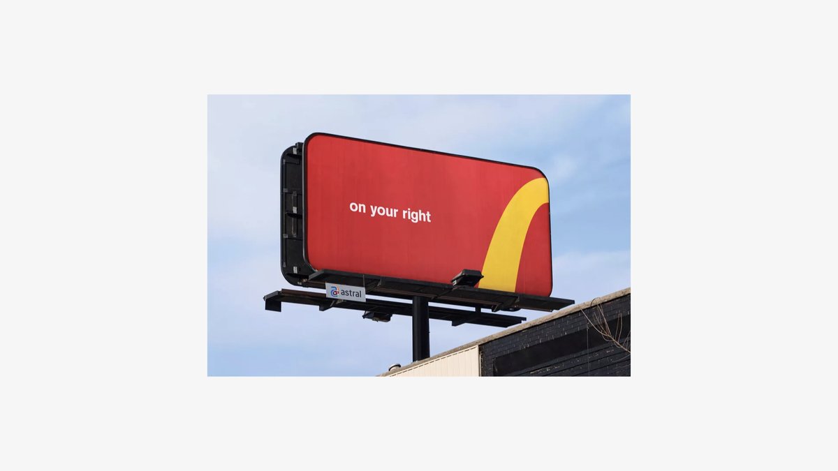
McDonald's are masters at this. They remove everything until all that is left is The Big Idea that can be understood in milliseconds.
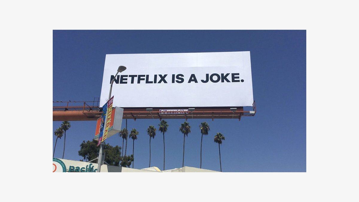
Netflix did the same when they printed a billboard that just said
NETFLIX IS A JOKE.
For days nobody knew what this billboard referred to. People were on Twitter asking Netflix if they'd created it. What did it mean?
NETFLIX IS A JOKE.
For days nobody knew what this billboard referred to. People were on Twitter asking Netflix if they'd created it. What did it mean?
Days later Netflix claimed the billboard.
After they let the internet speculate what it was about they simply said:
“It was to advertise our new range of stand-up shows and comedy shows on Netflix”
Brilliant.
After they let the internet speculate what it was about they simply said:
“It was to advertise our new range of stand-up shows and comedy shows on Netflix”
Brilliant.
Imagining your visuals are on a billboard will focus you to think as simple as possible.
If your idea can't be understood as somebody drives past, it will be lost and never understood.
If your idea can't be understood as somebody drives past, it will be lost and never understood.
And ultimately that's what this entire gigantic thread has been about.
Understanding.
Understanding.
Understanding is how we make visuals with better impact.
Understanding is how we make visuals that will be seen.
Helping others to understand us is how you'll make visuals that'll hit hard.
Understanding is how we make visuals that will be seen.
Helping others to understand us is how you'll make visuals that'll hit hard.
Remember:
Make dumb visuals that make people feel clever.
Every extra second you cause somebody to think is another person who won’t pay attention.
Make visuals that look like puzzles but can be solved instantly.
Make dumb visuals that make people feel clever.
Every extra second you cause somebody to think is another person who won’t pay attention.
Make visuals that look like puzzles but can be solved instantly.
Remember:
Take away your ego from your work.
It isn’t about you. It’s about them.
Think in Billboards.
Take away your ego from your work.
It isn’t about you. It’s about them.
Think in Billboards.
If you managed to get to the end of this I truly appreciate you.
If you enjoyed this thread it’d be amazing if you could retweet the first tweet.
Check out my visuals at @_unobvious
To get daily wisdom like this from me join @daily__visual
If you enjoyed this thread it’d be amazing if you could retweet the first tweet.
Check out my visuals at @_unobvious
To get daily wisdom like this from me join @daily__visual

 Read on Twitter