NEVER-BEFORE-SEEN COVID DATA:
Huge—HHS released new on **testing and positivity and surge by COUNTY** for the first time ever!!!
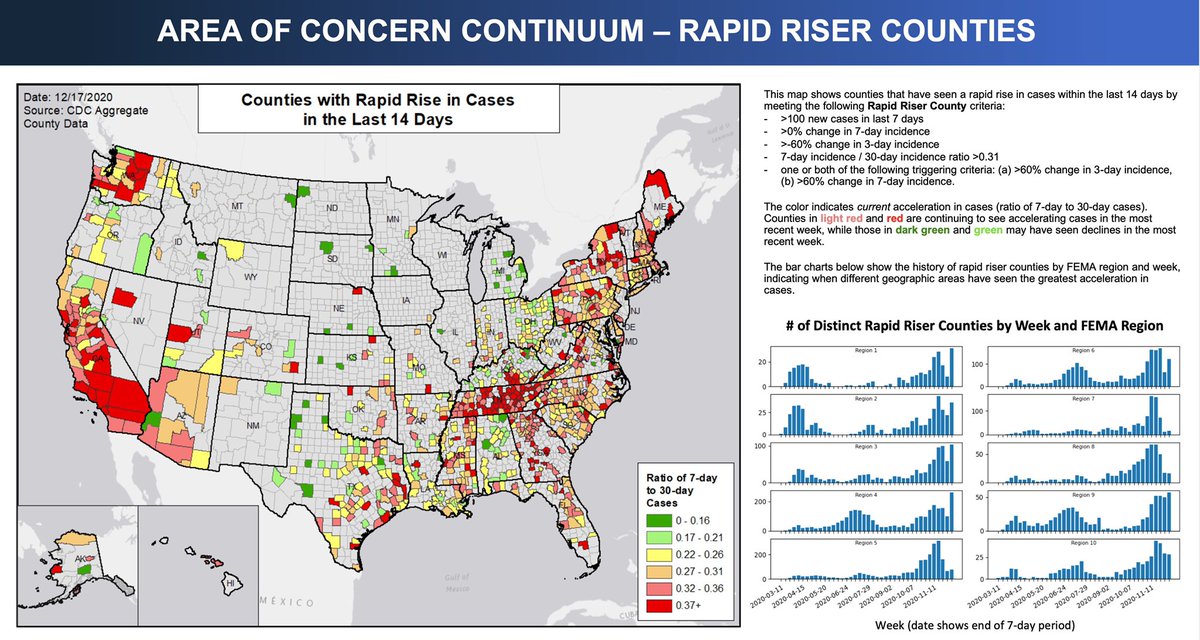
1) New “RAPID RISER COUNTIES” rating:
New data released show these countries have had the fastest rise in cases in the last 2 weeks. #COVID19
Huge—HHS released new on **testing and positivity and surge by COUNTY** for the first time ever!!!

1) New “RAPID RISER COUNTIES” rating:
New data released show these countries have had the fastest rise in cases in the last 2 weeks. #COVID19
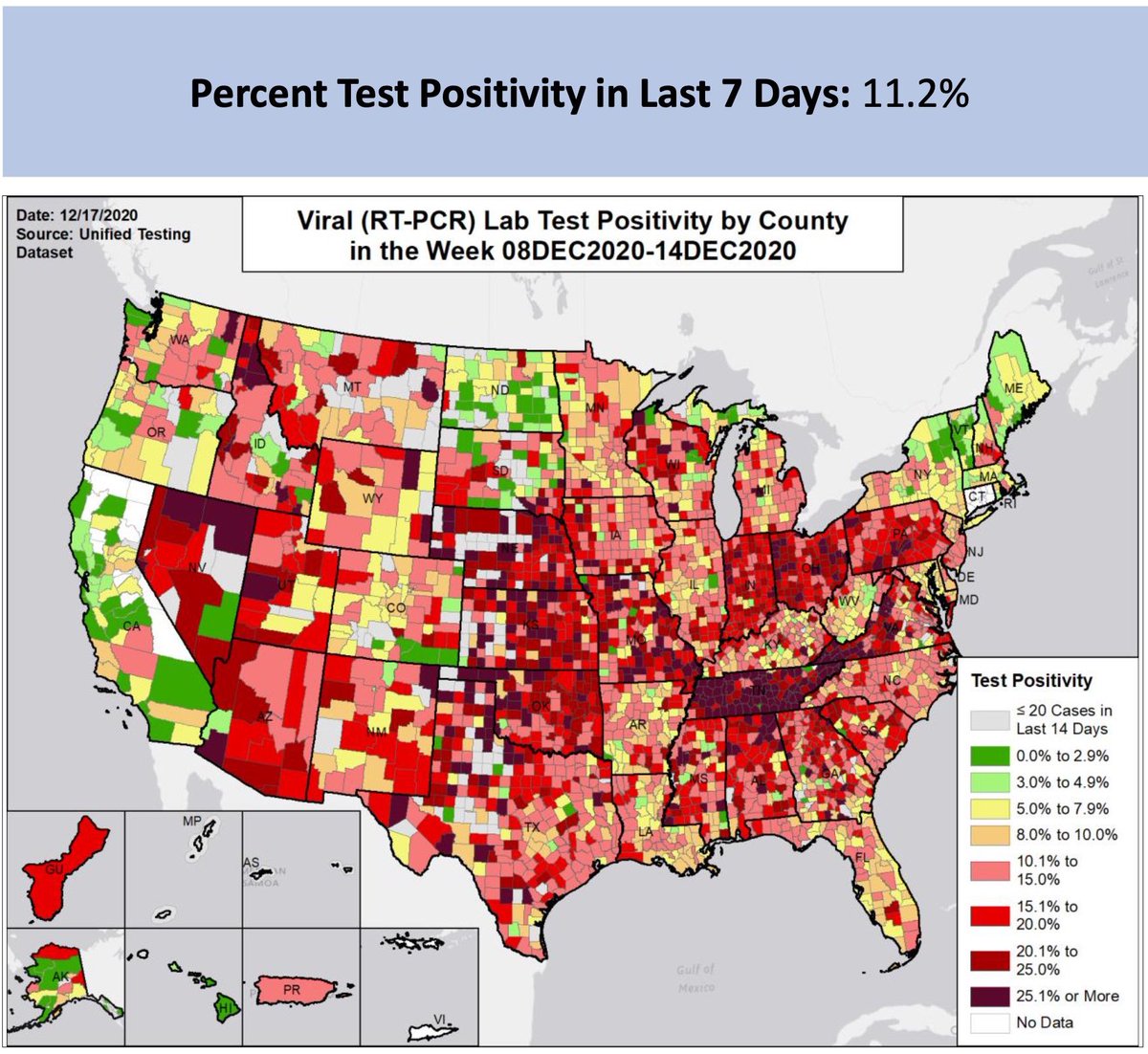
2) These are the counties with the highest testing positivity per county! Nobody has ever seen these data from HHS before!
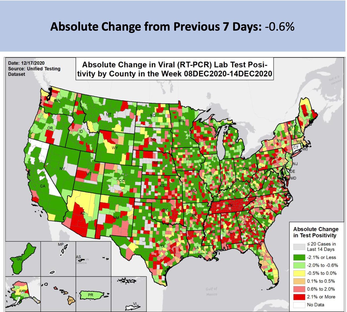
3) here are counties by the delta change of testing positivity! Wow, first I’ve ever seen this every by county before.
 holy crap Tennessee!
 holy crap Tennessee!
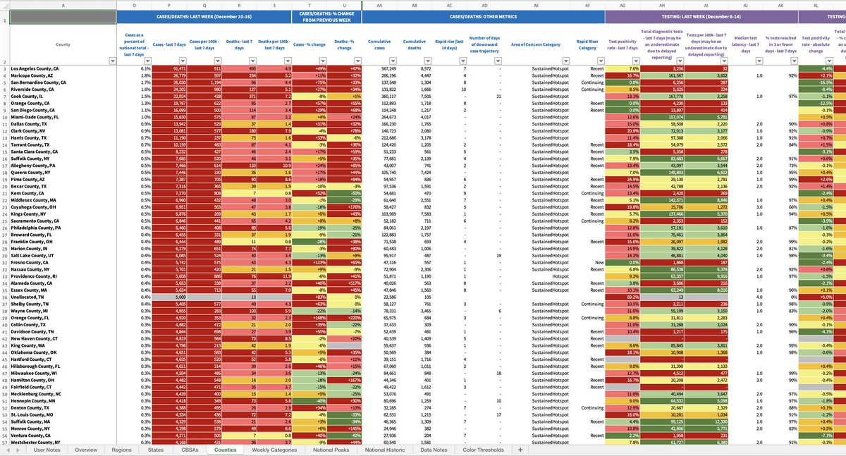
5) HHS has finally released the most comprehensive #COVID19 testing and case tracking by county now. Thank you. But damnit what took them so long? Many been working like mad trying to do this at state level for months. But HHS had county data all along??? https://healthdata.gov/blog/covid-19-open-data-%E2%80%93-our-data-your-data
6) “The Community Profile Report (CPR) is generated by the Data Strategy and Execution Workgroup in the Joint Coordination Cell, under the White House COVID-19 Task Force. The data in this report provides aggregate information on the overall status of areas across the country.”
7) “It is managed by an interagency team with representatives from multiple agencies and offices within HHS (including CDC, the Assistant Secretary for Preparedness and Response (ASPR), and the Indian Health Service (IHS)).
8) “The CPR provides easily interpretable information on key indicators for all regions, states, core-based statistical areas (CBSAs), and counties across the United States.
9) “It is a daily snapshot that:
•Focuses on recent COVID-19 outcomes in the last 7 days and changes relative to the week prior.
•Provides additional contextual information at the county, CBSA, state and regional level.
•Supports rapid visual interpretation of results
•Focuses on recent COVID-19 outcomes in the last 7 days and changes relative to the week prior.
•Provides additional contextual information at the county, CBSA, state and regional level.
•Supports rapid visual interpretation of results
10) here is the dataset. My god, what took them so long before they released on this?
(HT to @rypan for highlighting this)
https://beta.healthdata.gov/National/COVID-19-Community-Profile-Report/gqxm-d9w9
(HT to @rypan for highlighting this)
https://beta.healthdata.gov/National/COVID-19-Community-Profile-Report/gqxm-d9w9
11) Previously, all one could do ( @givingmap) was graph just the cases per capita over time. But we had no data on counties or testing or positivity by county. This is a vast improvement over cases alone. https://twitter.com/drericding/status/1336826290209480707
12) Robert Redfield: "For the next 60 to 90 days, we're going to have more deaths per day than we had in 9/11." #COVID19
 60*3000= 180,000 more dead
 90*3000= 270,000 more dead
We need bold solutions & we need it fast.
 60*3000= 180,000 more dead
 90*3000= 270,000 more dead
We need bold solutions & we need it fast.
13) Good analysis review of the new data. It checks out. If only we had it earlier than 11 months after the epidemic started! https://twitter.com/jasonsalemi/status/1340133998039724032

 Read on Twitter


