C19 and suicides
This topic was massively and mostly speculatively discussed with a heavy anti-lockdown leaning
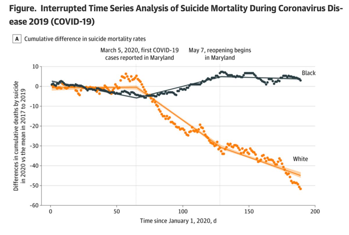
Now here is a new study in JAMA Psych with an impressive figure that hints towards a great race ineq in the effect
Wait!
Isn't there smth weird in the plot?
 1/
1/
This topic was massively and mostly speculatively discussed with a heavy anti-lockdown leaning
Now here is a new study in JAMA Psych with an impressive figure that hints towards a great race ineq in the effect
Wait!
Isn't there smth weird in the plot?
 1/
1/
The research letter in @JAMAPsych that brought this plot can be found here.
The lead authors are from @HopkinsMedicine
2/ https://jamanetwork.com/journals/jamapsychiatry/fullarticle/2774107
The lead authors are from @HopkinsMedicine
2/ https://jamanetwork.com/journals/jamapsychiatry/fullarticle/2774107
So, the plot is screaming 
suicides go:
 down for White
 up for Black
ouch!
(and who cares about the metric plotted anyways)
But let's have a look what is actually plotted...
3/

suicides go:
 down for White
 up for Black
ouch!
(and who cares about the metric plotted anyways)
But let's have a look what is actually plotted...
3/
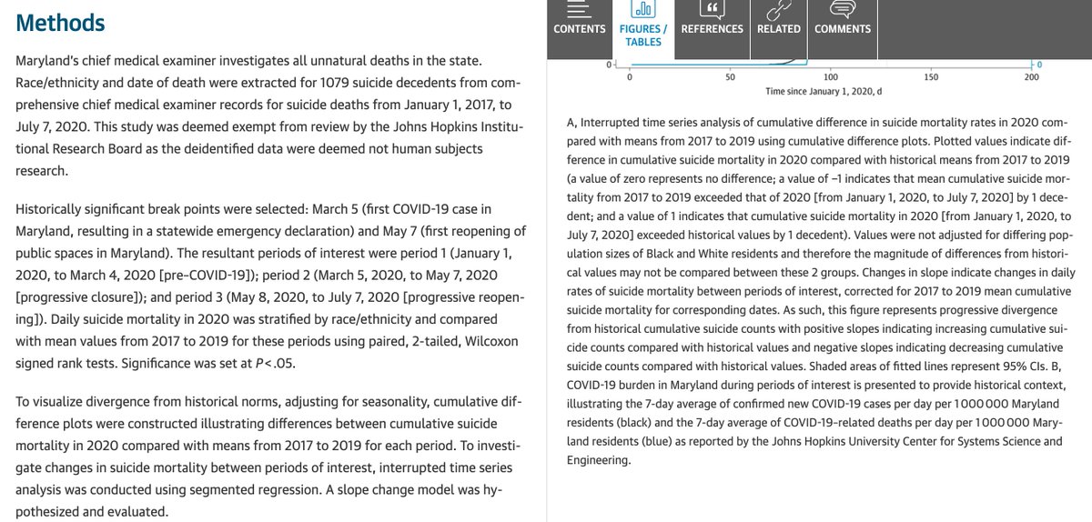
The figure caption says:
> Interrupted time series analysis of cumulative difference in suicide mortality rates in 2020 compared with means from 2017 to 2019 using cumulative difference plots
Full figure caption and the Methods section
4/
> Interrupted time series analysis of cumulative difference in suicide mortality rates in 2020 compared with means from 2017 to 2019 using cumulative difference plots
Full figure caption and the Methods section

4/
Doesn't it seem slightly weird to take the difference of a variable for two moments in time and then plot the *cumulative* sum of it?
5/
5/
The study reports that they collected data on 1079 suicide deaths that happened in Maryland from January 1, 2017, to July 7, 2020.
Hmm...
The smoothly drifting dots in the plot suggest at least ~200 days x 2 races x 2 periods. Death rates. Okay...
6/
Hmm...

The smoothly drifting dots in the plot suggest at least ~200 days x 2 races x 2 periods. Death rates. Okay...
6/
So, what actually happens once you start stacking differences between two even random variables?
To test my suspicions (and in full honesty I did this before diving deeper in the paper) I simulated random data structures similar to the ones that produced the plot.
7/
To test my suspicions (and in full honesty I did this before diving deeper in the paper) I simulated random data structures similar to the ones that produced the plot.
7/
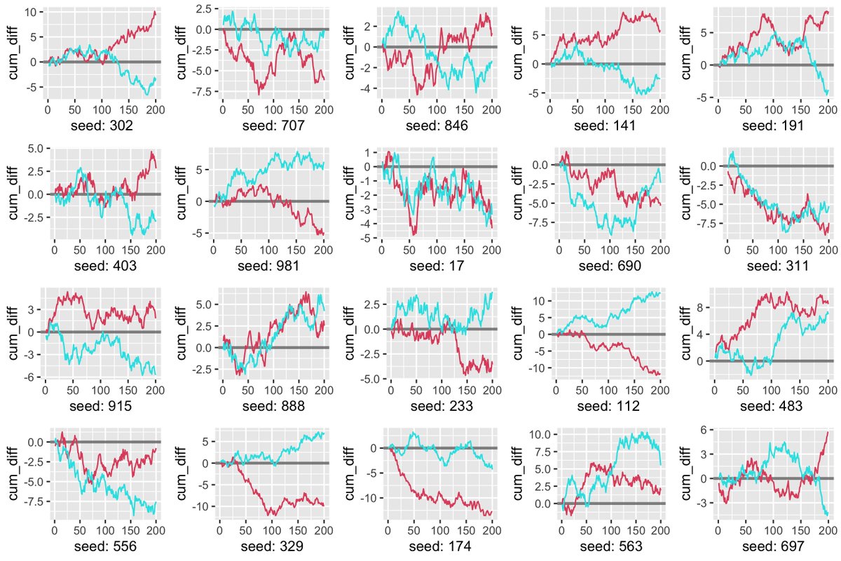
200 values sampled from random uniform distributions for each of the two races for two time stamps. Then take the diff within each race and cumsum.
You can play with my #rstats code, it's here:
8/ https://gist.github.com/ikashnitsky/e10ea5c5f107f80a3fa1ff88b8bcb7d4
You can play with my #rstats code, it's here:
8/ https://gist.github.com/ikashnitsky/e10ea5c5f107f80a3fa1ff88b8bcb7d4
Here are the corresponding plots for 20 random runs, seeds randomly sampled from values between 1 and 999.
Oops... Where are you all drifting? Aren't you just noise?
9/
Oops... Where are you all drifting? Aren't you just noise?
9/
Once I produced this plot I got really interested to give the paper a closer look.
Now, what do you think drive the terribly diverging lines in the plot?
(here is the plot again, in case you don't want to scroll upwards)
10/
Now, what do you think drive the terribly diverging lines in the plot?
(here is the plot again, in case you don't want to scroll upwards)
10/
From the table courteously provided in the same research letter we can learn that between March 5 and May 7 in Maryland there were 22 suicide deaths among Black in 2020 compared with 8, 14, and 12 in 2017, 2018, and 2019, correspondingly.
That's it. No joke.
11/
That's it. No joke.
11/
The numbers for White were slightly decreasing, which – against the early speculations on the topic – goes rather in line with the growing evidence from around the world.
See a great large overview of the topic by @GidMK
12/ https://twitter.com/GidMK/status/1336493616097681412
See a great large overview of the topic by @GidMK
12/ https://twitter.com/GidMK/status/1336493616097681412
Just to admire the plot again. Imagine, you have only a handful of events, not yet even data points, from just one not too big population.
How would you massage this dataset to provide an appearance of a serious comprehensive study on a topic?
13/
How would you massage this dataset to provide an appearance of a serious comprehensive study on a topic?
13/
I'm not sure if any particular summary message is needed to wrap up the post-pub peer review of this ridiculous paper.
If I'm still to formulate one, let it be:
Do pay attention to you #dataviz – it needs to be correct, informative, and beautiful (in this order)
14/ fin
If I'm still to formulate one, let it be:
Do pay attention to you #dataviz – it needs to be correct, informative, and beautiful (in this order)
14/ fin
PS. Make sure you don't miss the digitised and reverse-engineered re-analysis of this plot by @xangregg https://twitter.com/ThadMichaels/status/1339990393459503105?s=20

 Read on Twitter


