In case anyone wanted to see some examples of prevalence curves that do and do not “mirror what’s happening [in the general population] outside the school gates,” here’s a graph.
Hint: parents—same trend; kids—qualitatively different. 1/
Hint: parents—same trend; kids—qualitatively different. 1/
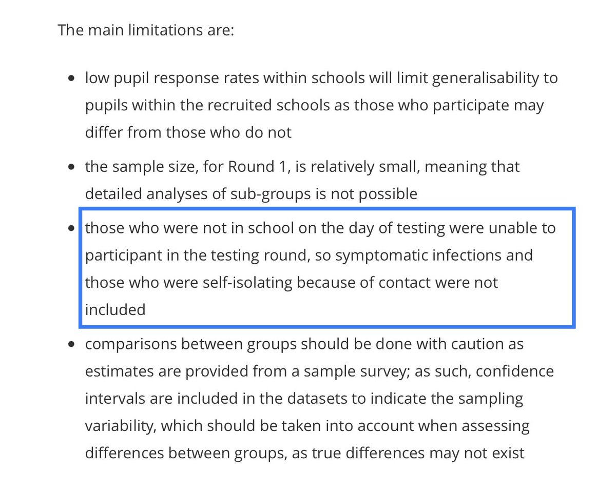
By contrast, the PHE/LSHTM/ONS School Infection Survey was never meant to be used as an estimate of overall infection prevalence among students or staff.
How do I know that? The ONS report told me so. 3/
https://www.ons.gov.uk/peoplepopulationandcommunity/healthandsocialcare/conditionsanddiseases/bulletins/covid19schoolsinfectionsurveyround1england/november2020
How do I know that? The ONS report told me so. 3/
https://www.ons.gov.uk/peoplepopulationandcommunity/healthandsocialcare/conditionsanddiseases/bulletins/covid19schoolsinfectionsurveyround1england/november2020
So if I were an @ONS or @LSHTM collaborator on this Schools Infection Survey project—which clearly represents a tremendous effort—then I’d be a bit annoyed with the take of the @PHE_uk press release, which misinterprets the data in ways the ONS report warns the reader against. 4/ https://twitter.com/phe_uk/status/1339517263729274887
To be clear: this is not dodgy data. The ONS Schools Infections Survey report did an admirable job with presenting the data and describing methodology, limitations, and uncertainties of the study.
It’s the @PHE_uk press release that misinterpreted it and presented it badly. 5/
It’s the @PHE_uk press release that misinterpreted it and presented it badly. 5/
What these data capture are the totally rogue infections that were neither suspected from symptoms nor from contacts with known/suspected cases.
So, much of what these high prevalences represent is a devastating failure of testing and contact tracing efforts. 7/
So, much of what these high prevalences represent is a devastating failure of testing and contact tracing efforts. 7/
We already knew from school attendance records that at any given time, only about .2% of the student population was staying home after testing positive, compared to the 1.5% and 2.2% prevalences of primary and secondary students then (mean for 3-19 Nov) according to ONS data. 8/
But given the significant fraction of students isolating at any given time, we could have hoped that most of the “missing” cases were isolating at home and simply hadn’t been tested.
According to this new data, that’s wrong: most of the “missing” cases were still at school. 9/
According to this new data, that’s wrong: most of the “missing” cases were still at school. 9/
As for staff, if we wanted to use this data to try to estimate the *total* prevalence of school staff infected (ie including those isolating at home due to symptoms or contact), then we’d need a handle on the ratio of rogue at-school infections to home-isolating infections. 10/
That’s a difficult ratio to estimate.
But that ratio is almost certainly smaller than the analogous ratio for primary school students (due to high proportion of asymptomatic/cold-like cases for young kids), and is likely at least as small as the ratio for secondary students. 11/
But that ratio is almost certainly smaller than the analogous ratio for primary school students (due to high proportion of asymptomatic/cold-like cases for young kids), and is likely at least as small as the ratio for secondary students. 11/
Since we need to multiply by 1+ the *inverse* of that ratio—ie (rogue+home)/rogue = 1+ home/rogue—we then need to multiply by a *larger* correction factor for staff than we would for the corresponding student groups (or at least as large, in the case of secondary students). 12/
So given this lower bound on correction factors, the closeness of student and staff prevalences in the Schools Infection Survey corresponds to an estimate that total staff prevalences are at least as high as student prevalences computed from community ONS *ISP* survey data. 13/
But many cautions should be applied to such an estimate, because there are so many sources of uncertainty, not just in the correction factor but also in the Schools Infection Survey data, which was unweighted, not representatively sampled, and very low sample size. 14/
Still, those limitations are okay, because the ONS very carefully spells them out in the report.
Also, this is a work in progress. They’re working on increasing sample size, getting weighted versions of the data, and generally doing what they can to conduct a useful survey. 15/
Also, this is a work in progress. They’re working on increasing sample size, getting weighted versions of the data, and generally doing what they can to conduct a useful survey. 15/
Ah, wait! I forgot to tell you the offending punchline from the press report. It was the *context* in which they placed Dr Ladhani’s “mirror” quote. 16/
https://www.gov.uk/government/news/covid-19-infection-rates-in-schools-mirror-rates-in-the-community
https://www.gov.uk/government/news/covid-19-infection-rates-in-schools-mirror-rates-in-the-community
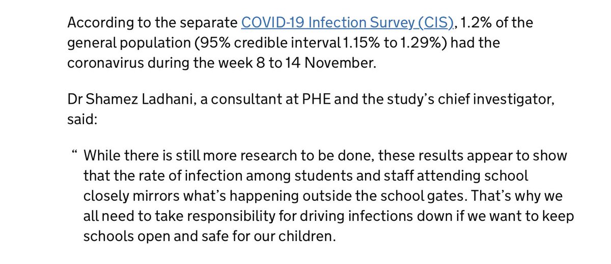
After reporting “rogue” in-schools prevalence figures, they reported a similar-looking percentage (1.2%) for the *actual*total* prevalence in the general population, followed by Ladhani’s quote that the school survey data mirrors what’s happening in the general population. 17/
Placing his quote in this context makes it look like the in-school prevalence data is somehow comparable to the general population total prevalence, when it isn’t at all, since the in-schools data only represents a fraction of total prevalence of school-related infection. 18/
Moreover, since far more children are asymptomatic or have infections indistinguishable from the colds so common for children, the rogue/circulating-vs-isolating ratio for the general population is much lower than that for children.
These data just aren’t comparable at all. 19/
These data just aren’t comparable at all. 19/
There’s one sentiment of the PHE press release that does ring true, and that’s that community infection levels do impact school infection levels. That impact is crucial.
But the use of the term “mirror” right after the mention of similar-sounding numbers is very misleading. 20/
But the use of the term “mirror” right after the mention of similar-sounding numbers is very misleading. 20/
Lastly, I wrote this thread in response to a number of followers who contacted me with concerns about the schools survey and particularly its press release.
I think the schools survey can be a positive, and hopefully future press releases will be written with more care. 21/21
I think the schools survey can be a positive, and hopefully future press releases will be written with more care. 21/21

 Read on Twitter
![In case anyone wanted to see some examples of prevalence curves that do and do not “mirror what’s happening [in the general population] outside the school gates,” here’s a graph.Hint: parents—same trend; kids—qualitatively different. 1/ In case anyone wanted to see some examples of prevalence curves that do and do not “mirror what’s happening [in the general population] outside the school gates,” here’s a graph.Hint: parents—same trend; kids—qualitatively different. 1/](https://pbs.twimg.com/media/Epe3W4dXMAIs4FT.jpg)


