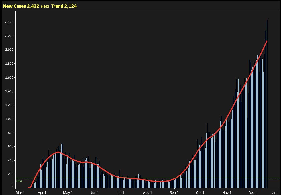
I have been writing this thread over the last few weeks, as I have been trying to understand what is going on with the trends observed for the core triad of community infection indicators in ON: positivity rates, test volume and new cases and I think I have an hypothesis.
I now updated the graphs and will share it as others may have ideas about what is going on:
First, the trends on these indicators in ON:
Cases - Non-stop growth since early September.
First, the trends on these indicators in ON:
Cases - Non-stop growth since early September.
Testing: Since testing strategy changed (Oct 5th), daily test volumes increased for about 1 week and then declined from ~43K to ~33K (7d averages).
Positivity: 7d average increased from 0.5% on Sept 1 to 3.9% on Nov 14th.
Positivity: 7d average increased from 0.5% on Sept 1 to 3.9% on Nov 14th.
As @ASPphysician said at the time “We're not flattening the curve. We’re hiding it.” https://www.thestar.com/news/gta/2020/10/09/ontarios-covid-19-testing-system-in-upheaval-as-volumes-drop-positivity-rates-rise-and-samples-get-shipped-out-of-province.html
It may not seem much, but the reduction in testing was dramatic, and at crucial moment. During those 4 weeks, our daily case counts increased ~80%.
But back to positivity... While testing volumes declined (~23%), positivity soared (~tripled), while cases kept rising (~doubled).
And when test volumes started increasing again (~43% increase), positivity declined minimally, and cases kept rising (~45% increase).
Not ashamed to say ON trends are puzzling. Under stable test criteria (fixed symptom severity threshold for testing) and equal availability of tests, positivity can only* go up when incidence goes up, as illustrated on @GoodRx by Dr. @SashaGuttentag, (recent PhD from NYU 
 ).
).

 ).
).
* Positivity could go up if you switch tests, to a more sensitive test, reducing false negatives. But that is not what happened here.
Will use this pause to link to @SashaGuttentag positivity blog that appeared at @GoodRx here: https://www.goodrx.com/blog/how-does-ramping-up-covid-19-testing-affect-positivity-rate/
Will use this pause to link to @SashaGuttentag positivity blog that appeared at @GoodRx here: https://www.goodrx.com/blog/how-does-ramping-up-covid-19-testing-affect-positivity-rate/
So lets talk positivity: Infected individuals in this imaginary population are divided in 7 levels of symptom severity, and in the illustration below, the tested individuals (meeting criteria for testing) are in the top 2 levels of symptom severity (most severe).
Remember in ON, cases continue increasing, daily tests have increased since Nov, and positivity decreased (although only barely). If we're testing more people under the same testing criteria and are finding more cases, the epidemic is surely growing. No questions here.
And this is what we see: Test volumes (yellow zone below) increase, positivity increases (4-5 days) and then declines minimally (from ~5% to ~4%), while cases continue their steady (and scary) climb.
Increasing case counts leave no doubt that infection rates in the community are increasing. Hospitalizations and ICU admissions confirm this. As do deaths.
But, there is something else to consider: on Sept 25 ON pharmacies started testing. Does it matter? You bet. How exactly? Good question. Or as you'll see soon, who knows... https://news.ontario.ca/en/release/58492/ontario-expands-covid-19-testing-to-pharmacies
Imagine this diagram represents Ontario during the period around Sept 25-Oct 5. People experiencing the top 3 of the 7 symptom severity levels are getting tested at testing centres (TCs), and we are finding a positivity rate of 1.5% in Ontario. (It's 20% in the diagram. I'm lazy)
Then TCs change criteria, require online scheduling and cap daily tests. At the same time, less symptomatic individuals, who'd not seek testing until then, start getting tested in pharmacies, while some ppl that meet testing centre criteria also switch to pharmacies.
And maybe pharmacies start testing the testing centres' orphans, individuals who do not meet TC criteria anymore. In addition, pharmacies may be testing an unknown number of ppl from lower severity levels, who did not seek tests anywhere earlier, but decided to get tested now.
And maybe the situation is as chaotic as below. Who knows? That's the issue: it is very hard to interpret pooled positivity rates that combine tests from TCs and pharmacies. Unless test volumes and results by source are known, it is close to impossible to interpret positivity.
Changing a denominator makes interpretation of any indicator almost impossible. While even consistently biased data can reveal trends, inconsistency makes it useless. Usable positivity data requires testing consistency. More detail (site type, symptoms) would help too.
Of course, dramatic increases in + are always bad, but the size of the problems is uncertain. Conversely, decreases in positivity can happen with a growing epidemic. Increase test volumes, and voila, + drops. See example below. Click image for @SashaGuttentag 's explanation.
The other key factor that changed dramatically since summer was the age distribution of individuals being tested. This is expected in part due to transmission dynamics, in part due to varying symptomatic % by age groups, but also because of this: https://twitter.com/katecornick/status/1305948500711157766?s=20
Anyway, not the point in this thread. Thanks @Billius27 for the plots, @SashaGuttentag and @GoodRx for original pictorial on positivity that I reused here (with her consent, of course).

 Read on Twitter


