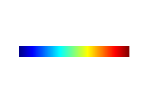
We have been thinking a lot this year about how we use color to tell our scientific stories because we work with collaborators who have color blindness. As engineers, we grow up indoctrinated in the virtues of the Jet (rainbow) colormap.
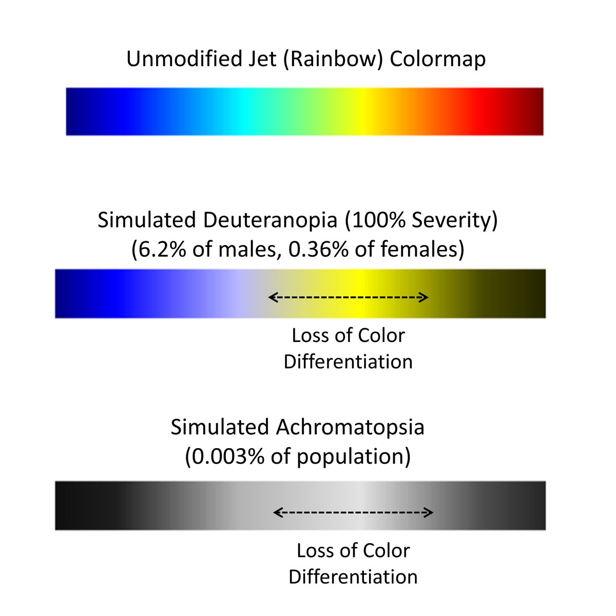
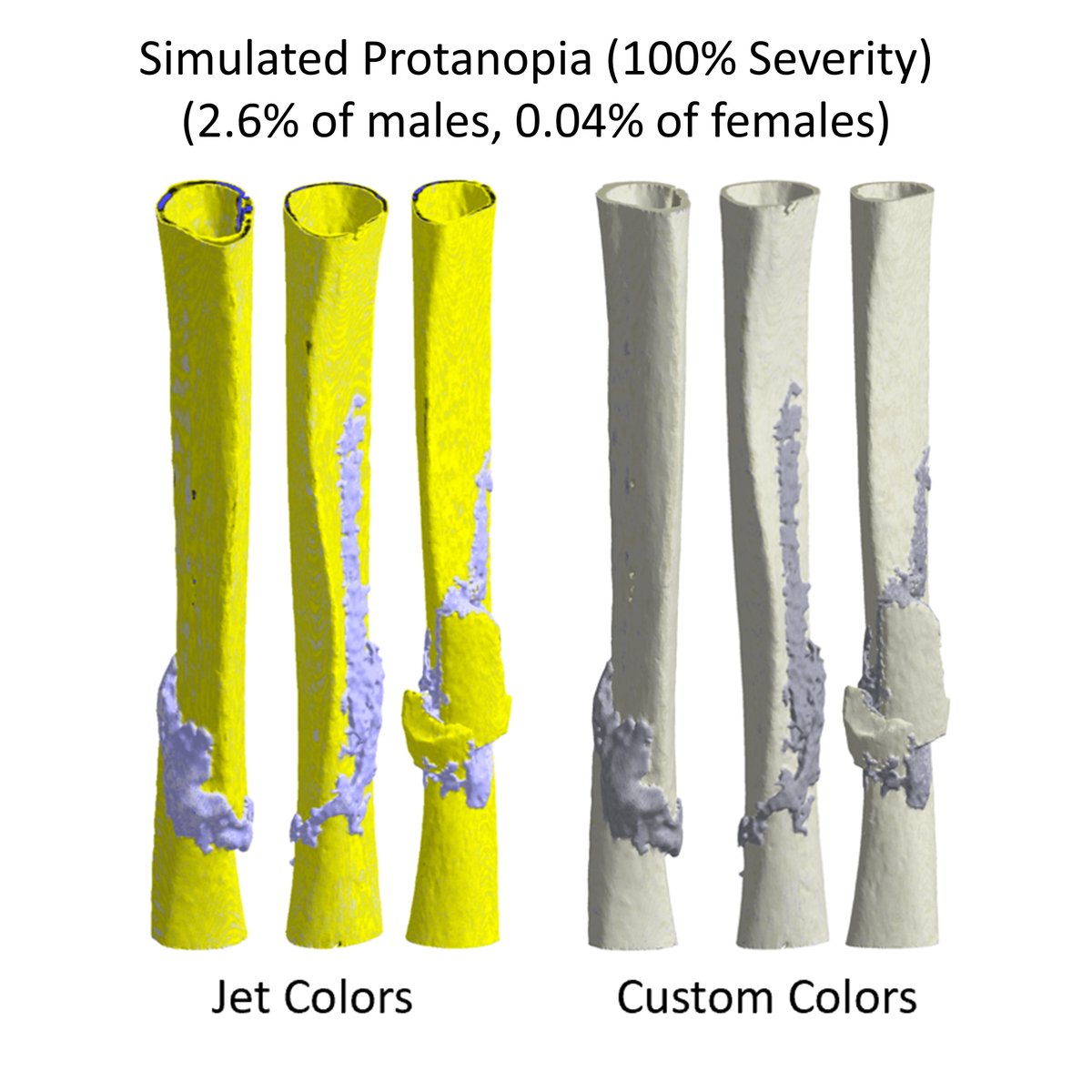
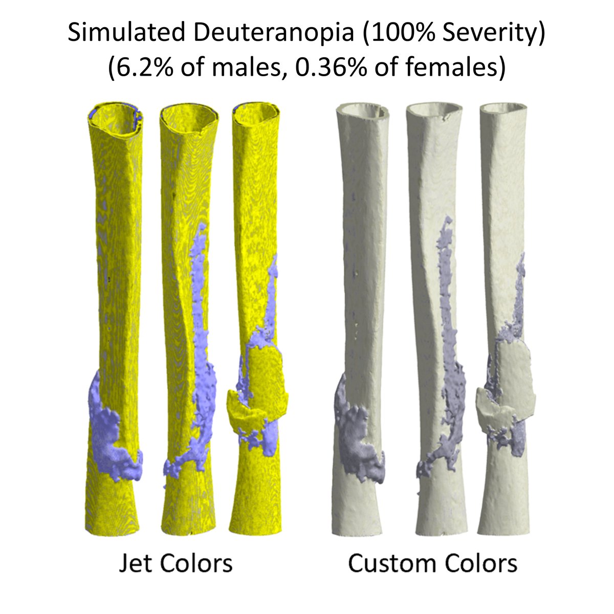
The problem with Jet is that viewers who see color differently lose differentiation in the central data region where we typically have a lot of interesting features in our images.
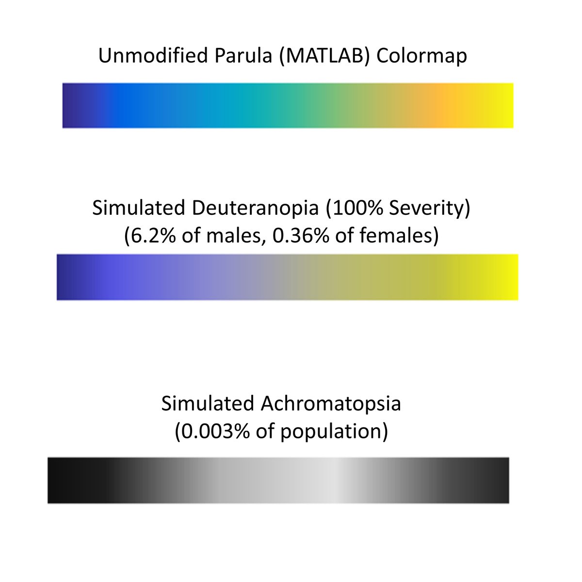
Increasingly, data visualization packages have introduced colorblindness-friendly colormaps, like Parula in MATLAB.
These new colormaps solve some but not all our problems, especially for us in #orthoresearch because selfishly, we would still like bone to look like bone. 

The colormaps we are developing now are specifically designed to tell each paper or presentation's scientific story in a way that looks intuitive regardless of the viewer's perceived color spectra. Here are a few examples:
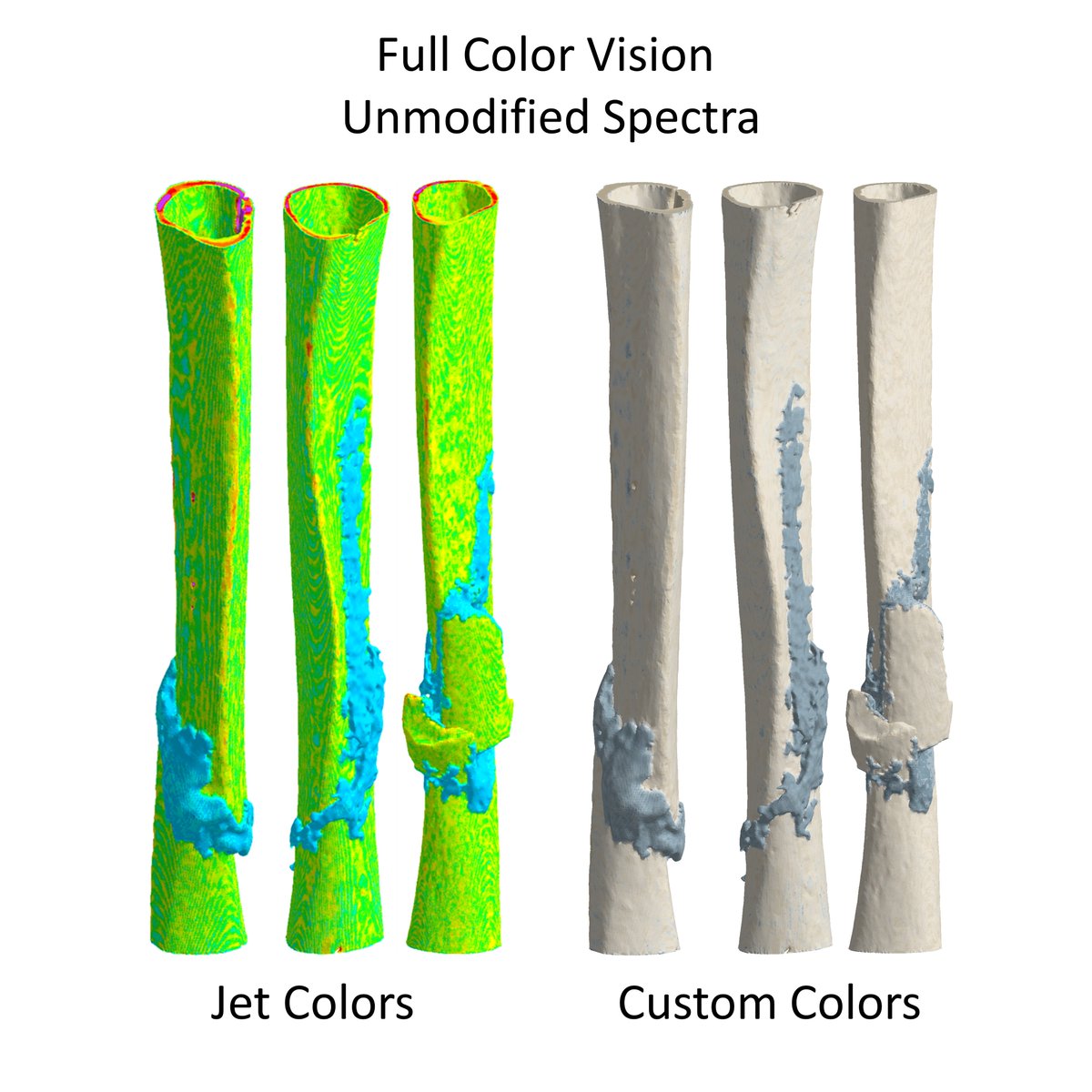
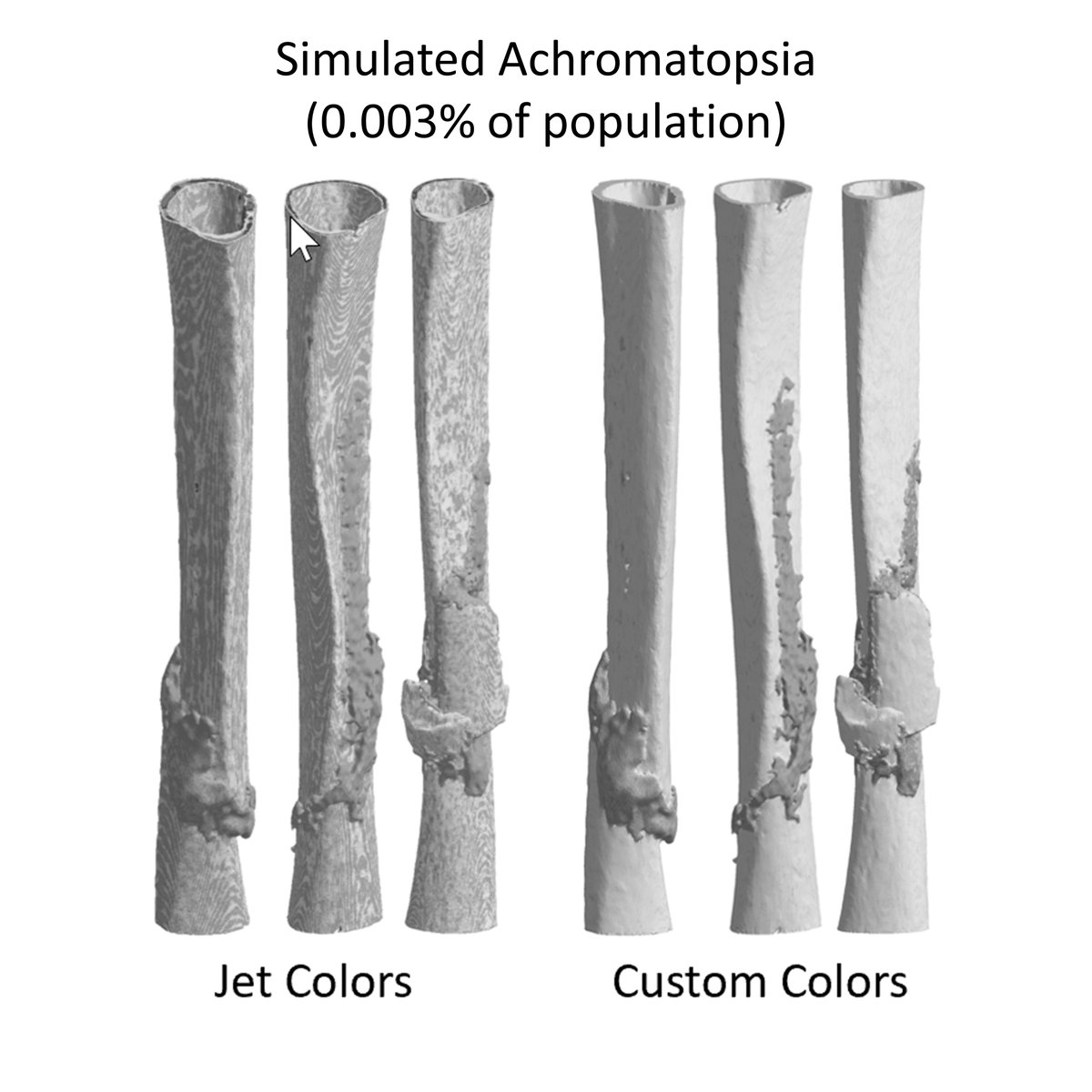
These models of human tibial fractures by @P_Schwarzenberg were reconstructed from CT scans. Color scales show tissue density. Jet reveals the callus, but is not visually appealing with colorblindness. The new colormap is more pleasing and intuitive, even in grayscale.
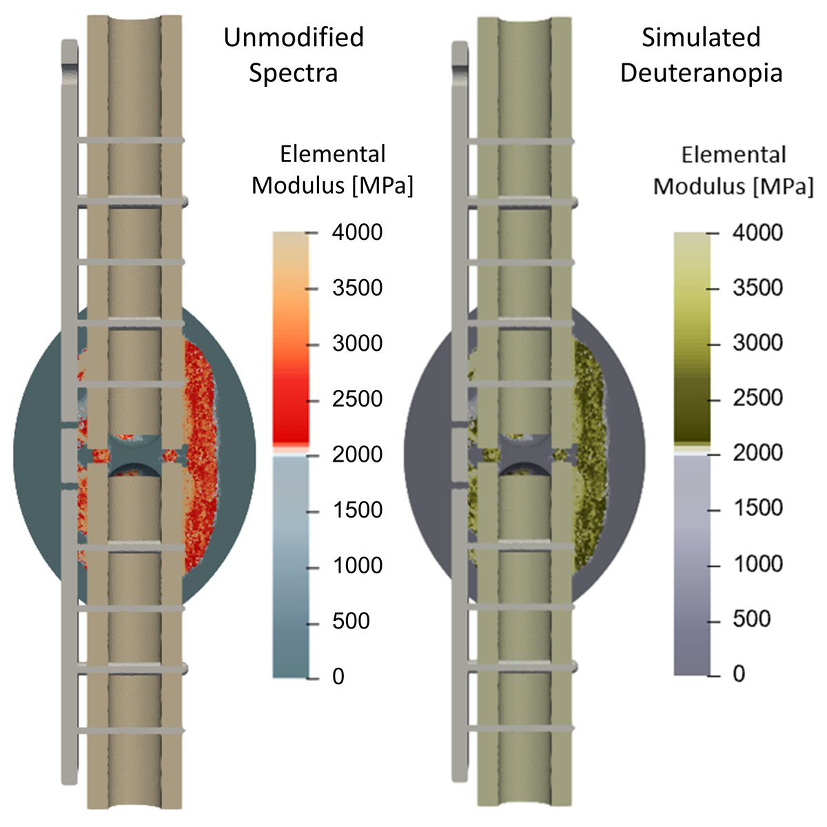
This simulation of bone healing by @Tianyi_R uses a blue-red-tan colormap that has a threshold cutoff tailored to show when finite elements in the model become bone.
With simulated colorblindness, we still have bone that looks like bone and visual differentiation between the simulated new callus formation and the larger simulation domain.
So, to everyone in #ORSnation, how are you thinking about your use of color and colorblindness inclusion as you get ready for @ORSsociety #ORS2021? Can't wait to see your good ideas! #ORSDEI

 Read on Twitter