2020 Election Map http://xkcd.com/2399
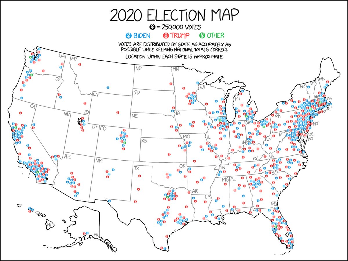
This map looks similar to some other election maps out there, but it’s a little unusual. It tries to address something that I find frustrating about election maps: Very few of them do a good job of showing where voters are. (Brief thread, because I am enthusiastic about maps!)
People often focus on the idea that election maps over-emphasize sparse rural areas with few people, but a deeper problem is that the maps imply that “areas” have political leanings at all. Spots on the map belong to many overlapping areas won by different sides.
You can be a Biden voter in a Trump household in a Biden precinct in a Trump county in a Biden district in a Trump state in a Biden country. Then what color is your land? Dirt-colored, I guess! Not only does land not vote, it doesn’t even have a preference.
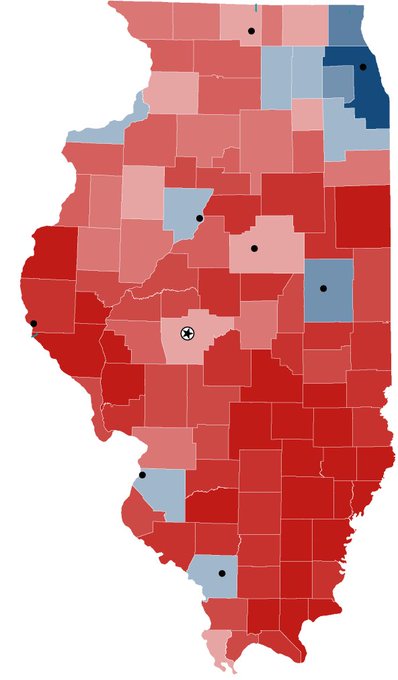
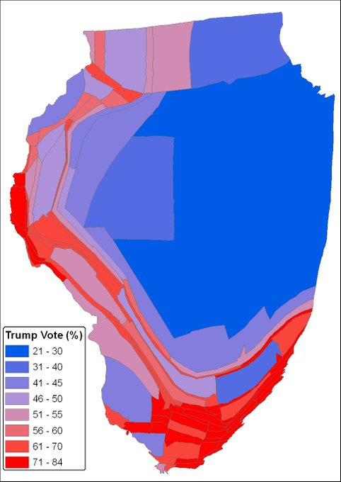
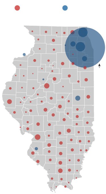
Maps are mostly for showing where things are. But think of a basic question like “Where do most Trump voters in Illinois live? The Chicago area, or the other parts of the state?” It’s almost impossible to answer it with typical election maps, or with common alternative designs.
My map isn’t great for telling at a glance who won a given state. But it’s one of the few that helps you answer questions like the Chicago one quickly. It also shows that many Democrats live in the South, many Republicans live in cities, and not a lot of people live in Wyoming.
There are more Trump voters in California than Texas, more Biden voters in Texas than NY, more Trump voters in NY than Ohio, more Biden voters in Ohio than Massachusetts, more Trump voters in Massachusetts than Mississippi, and more Biden voters in Mississippi than Vermont.

 Read on Twitter


