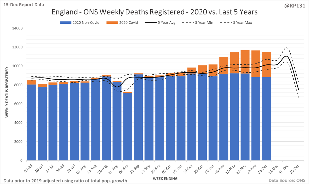
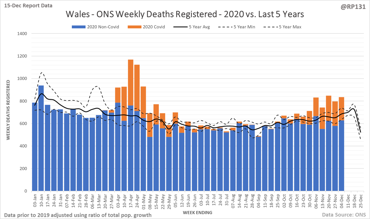
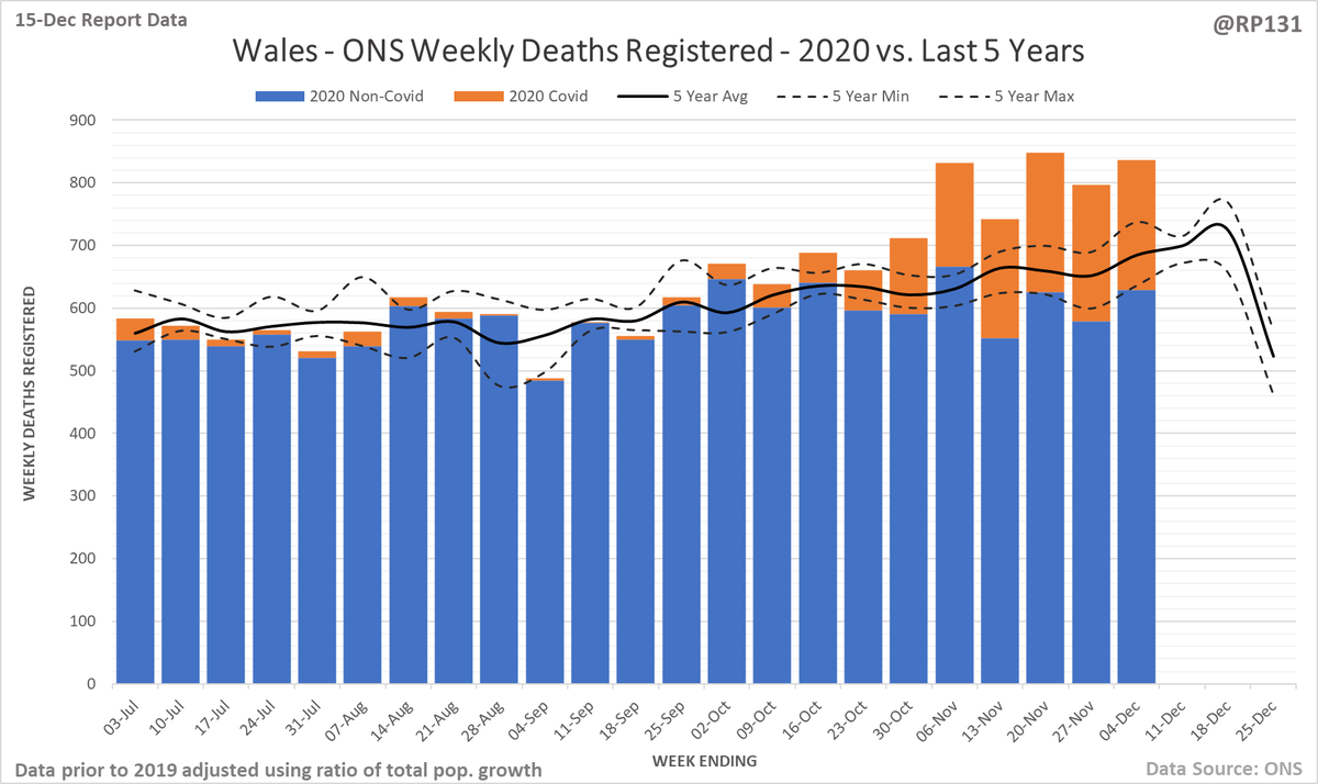
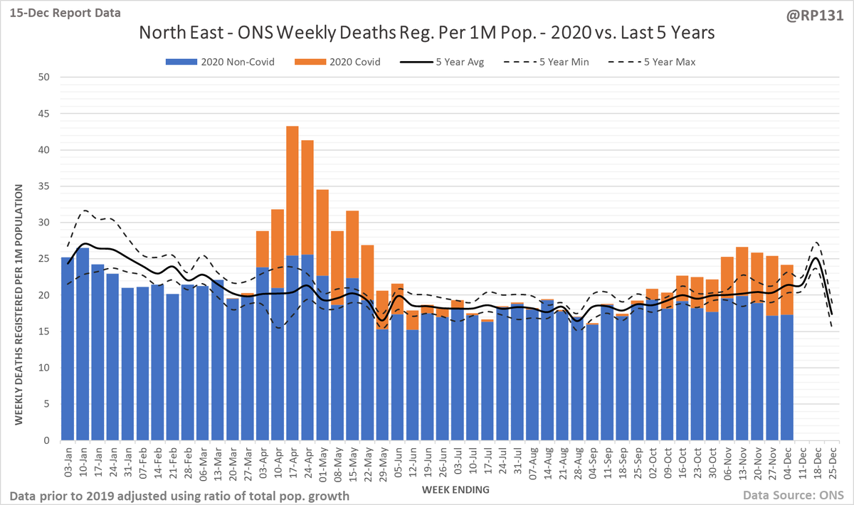
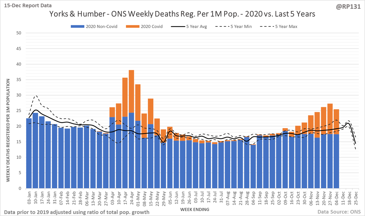
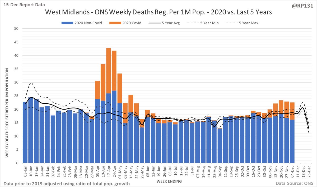
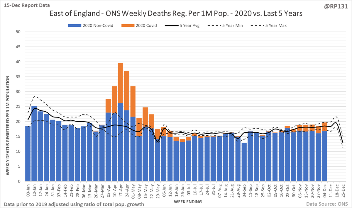
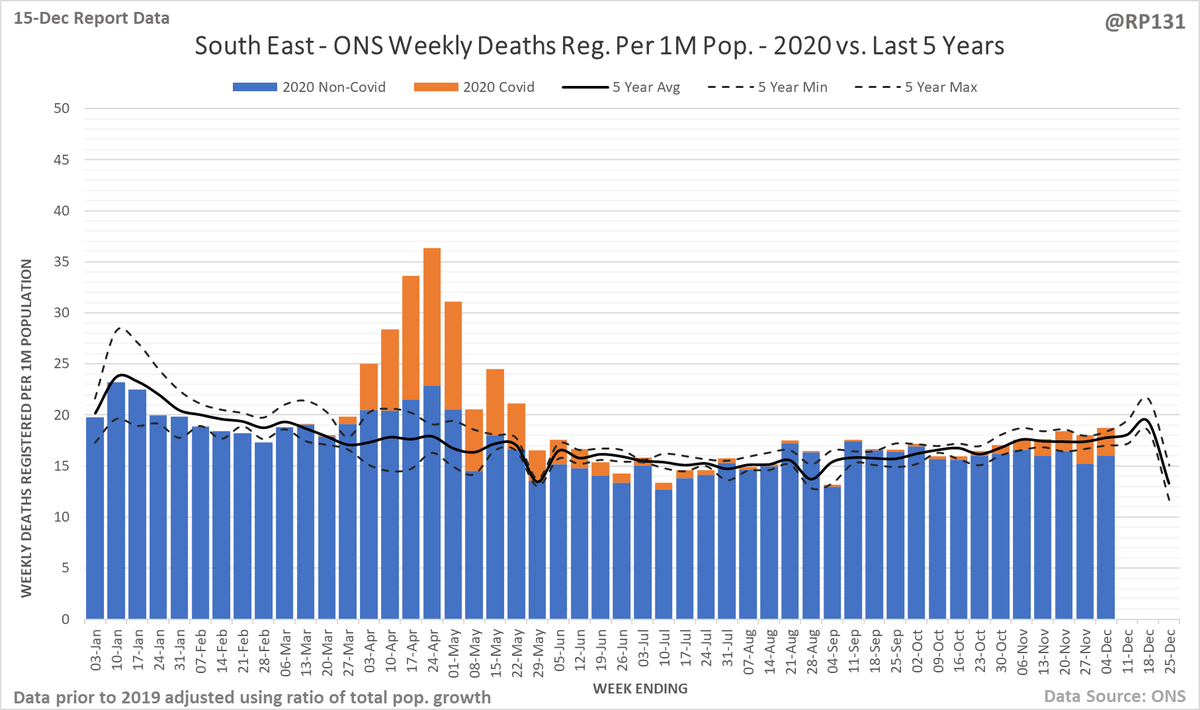
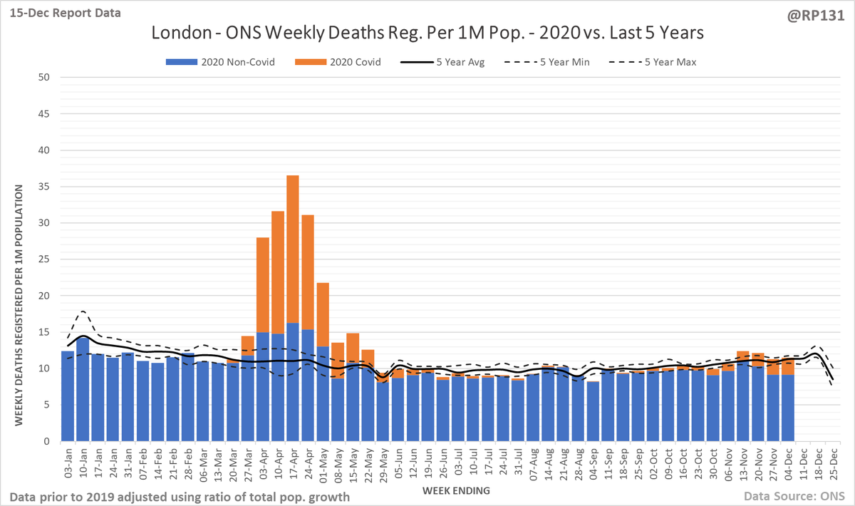
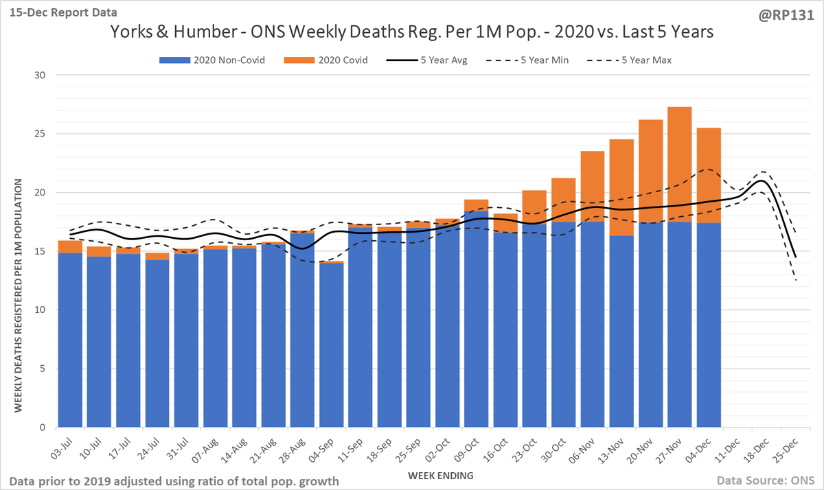
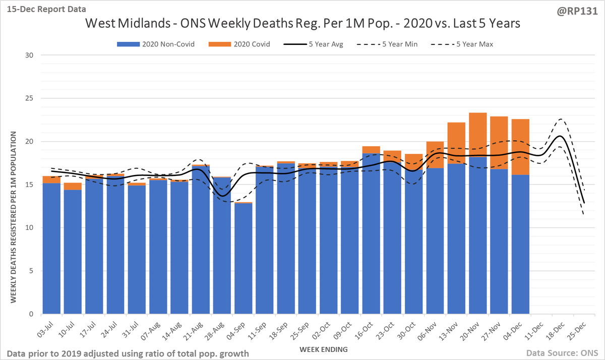
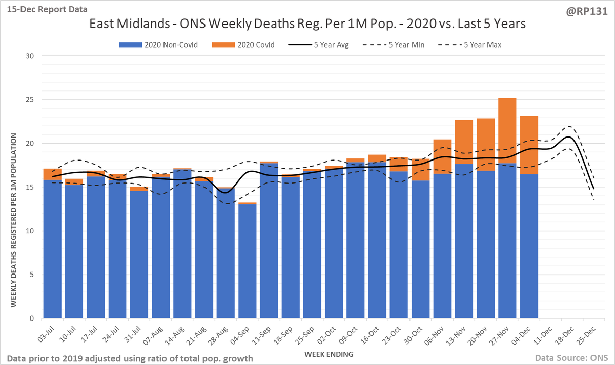
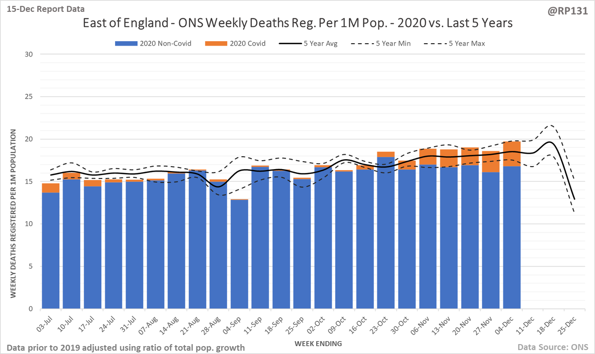
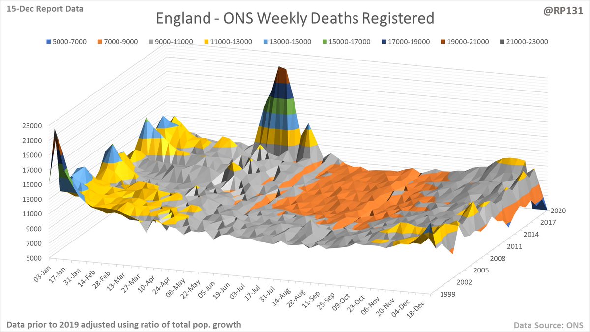
Updated set of my version of the excess death charts using today's latest ONS data. Now including some basic population adjustments for the data prior to 2019 for better comparison. England full year first. 1/
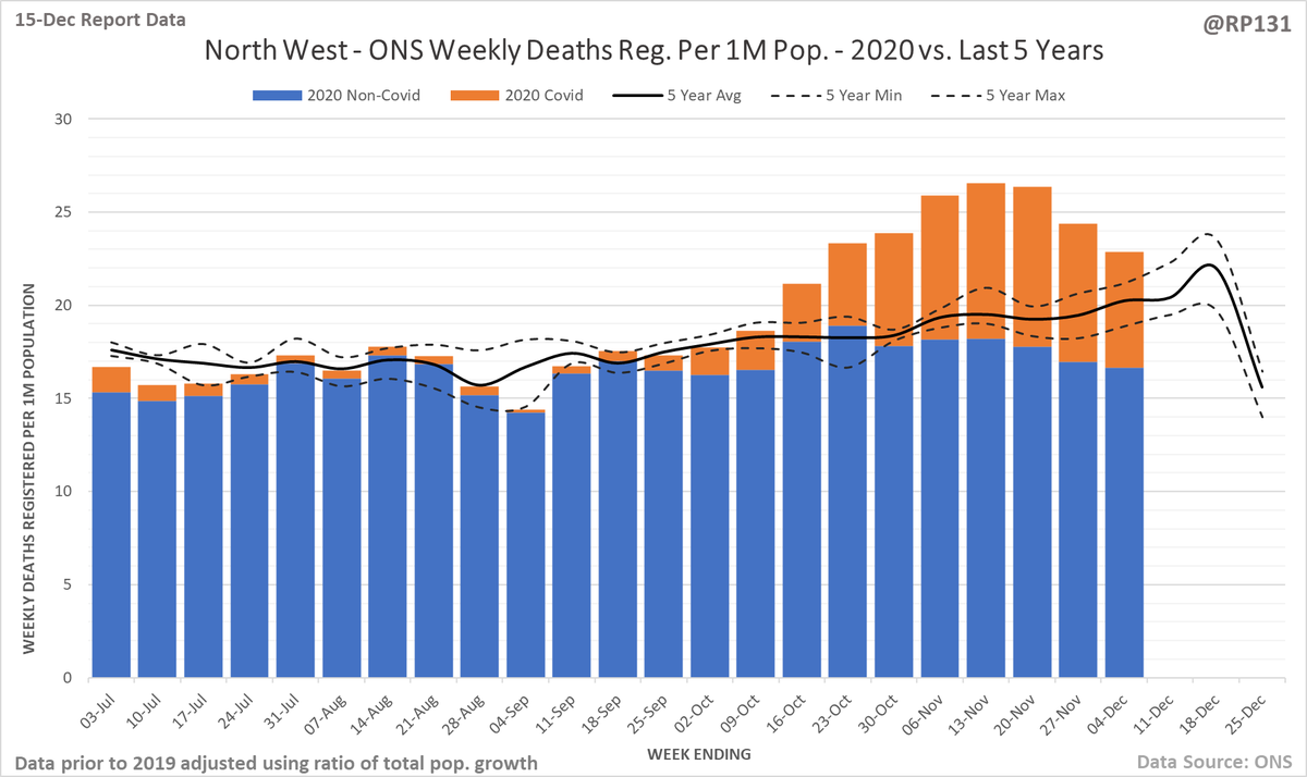
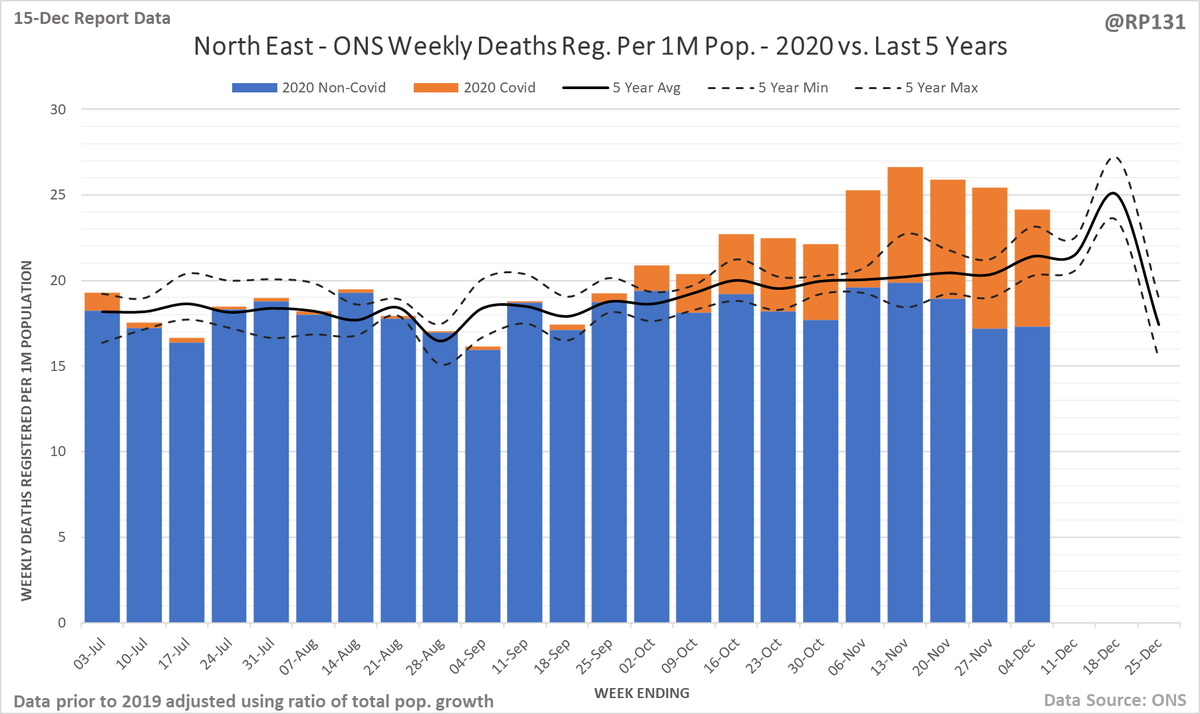
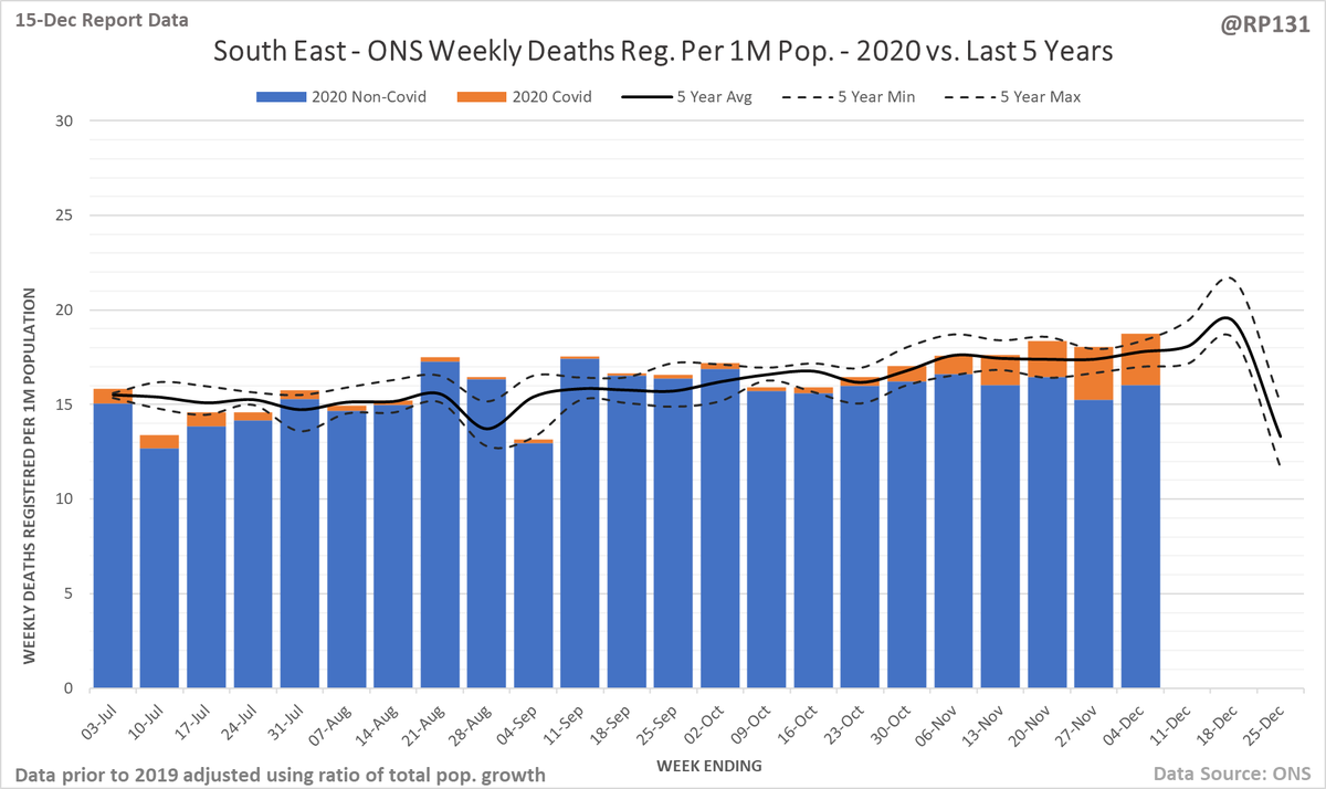
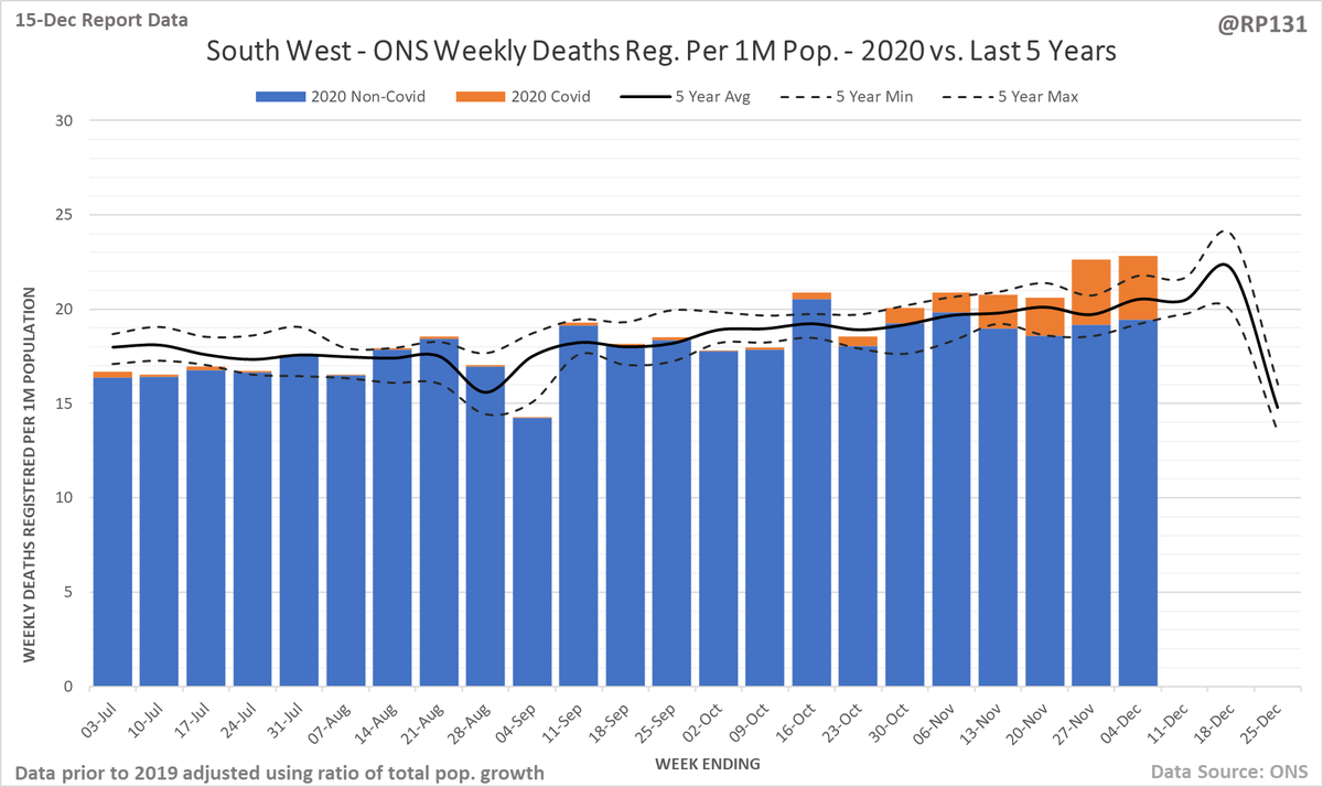
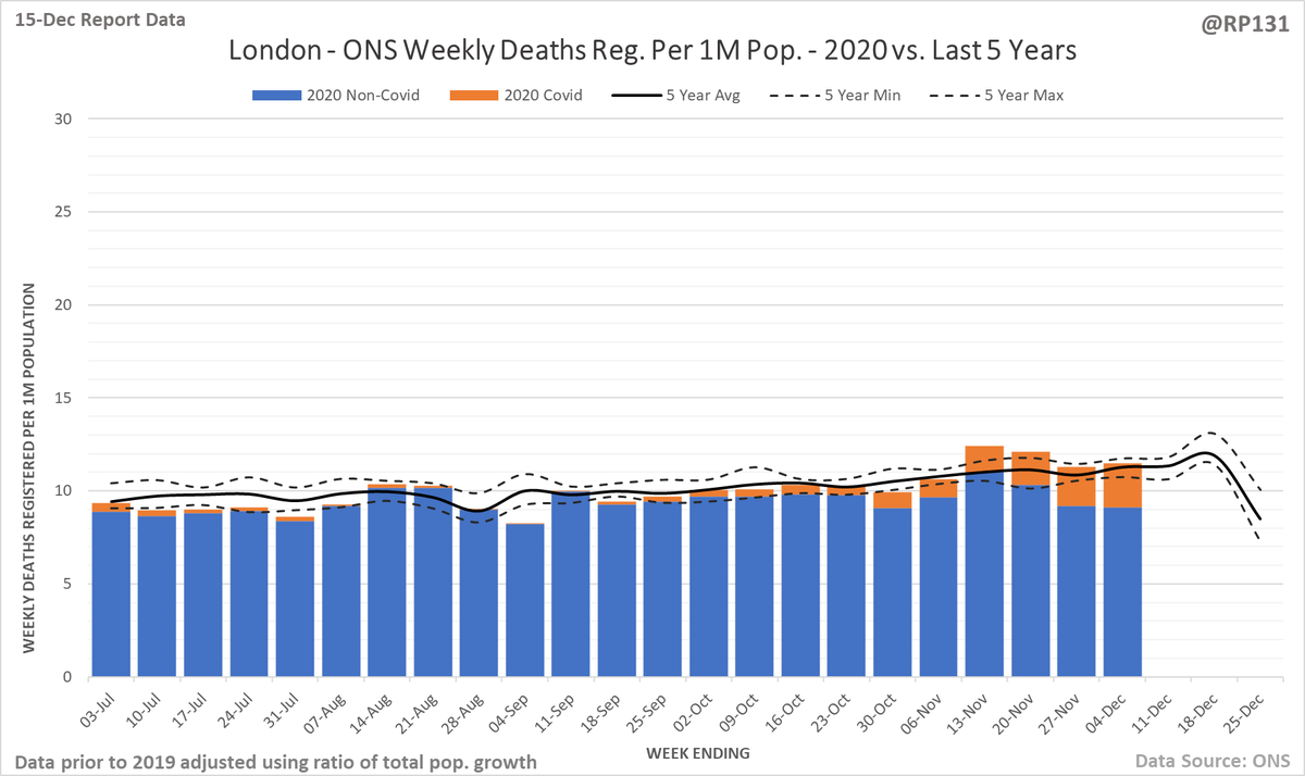
Same again but zoomed to 2nd half of year. The bit above the solid black line is what will often be referred to as 'excess mortality', i.e. where it's above the 5 year average. The dashed lines show how much it has varied over 5 years. 2/
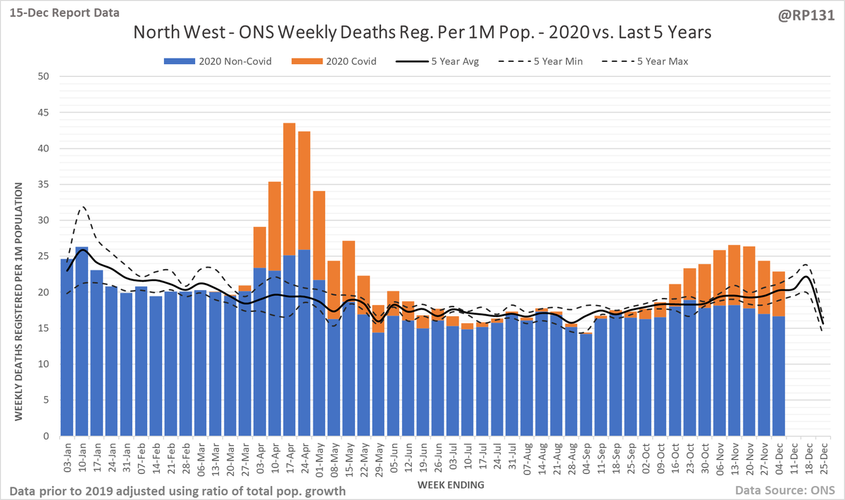
For the regions, I've normalised them to be per 1 million population to allow for easier comparison. North West, North East, Yorkshire + Humber and West Midlands first. 4/
For reference, these are the ratios I've applied to the historic numbers. As always, feedback very welcome on all of this. 10/
Line view of all England weekly deaths registered figures since 1999 with this year highlighted in blue. Individual years aren't intended to be easily readble - the idea is more to give an indication of trend patterns. 11/

 Read on Twitter
