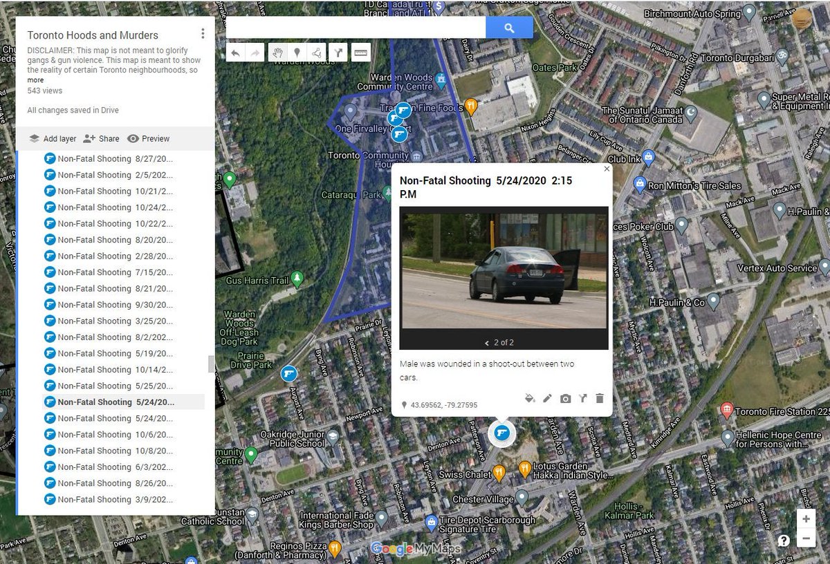
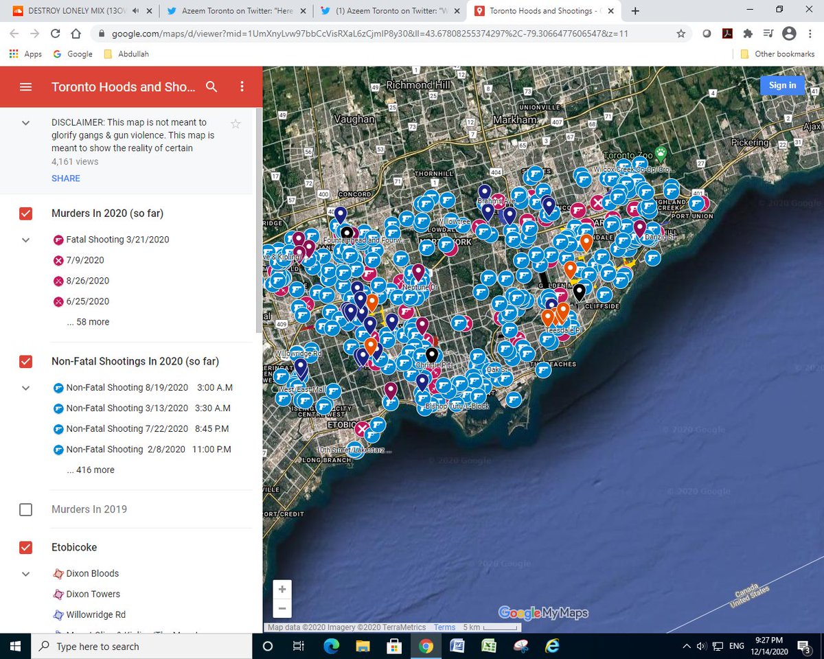
After a long wait, here it is! This is a map of the hoods & street gangs in Toronto. It is also a map of every single shooting in 2020. Information on this map is collected from reddit, youtube, and personal experiences.
This will be a thread. https://www.google.com/maps/d/edit?mid=1UmXnyLvw97bbCcVisRXaL6zCjmlP8y30&usp=sharing
This will be a thread. https://www.google.com/maps/d/edit?mid=1UmXnyLvw97bbCcVisRXaL6zCjmlP8y30&usp=sharing
I would like to give a big shout out to two friends of mine from Jane & Finch. It was their idea to make this map, so this project wouldn't have existed without them. My friends graphed the hoods while it was my idea to graph the shootings that happened.
My friends and I wrote the descriptions for the hoods, while it was me who specifically did the statistics about # of subsidized units, poverty, community design, and much more.
We put a lot of effort into making good descriptions, mapping out shootings/murders and making accurate and well designed shapes. I hope all of my followers enjoy the hard work we put into this map, and share this map to other Torontonians to gain awareness of gun violence.
DISCLAIMER: This map is not meant to glorify shootings or to stigmatize communities that are already stigmatized. Many Toronto hoods have a strong sense of community, and have other good things about them, but this map is meant to show the bad things
Shootings and murders will be updated on a weekly basis. If yall really like this map we might expand to the whole GTA and maybe even other major cities. If there is any sort of misinformation make sure to tell us about it in the comments. Feel free to crosspost this.
When you click on a shooting, it will give a description on what occurred, if media reported on it. Unfortunately, over 55% of the shootings weren't reported on by any news media, including @TPSOperations . If we exclude TPSOperations, the ration is even worse.
Use the legend on the left to turn on and off certain layers, since all the shootings can be very cluttering. It is recommended you access this map on a computer, using a phone will be painful as hell
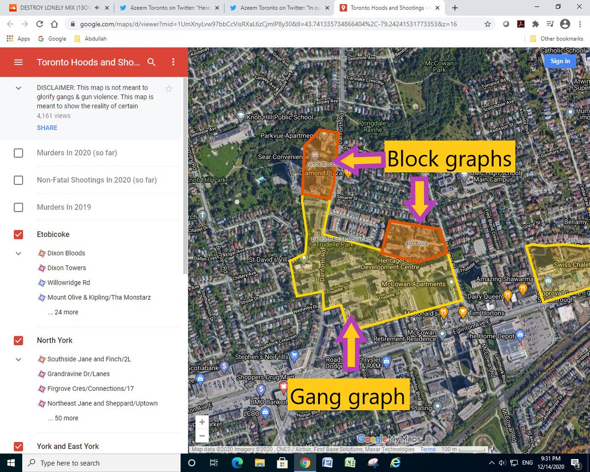
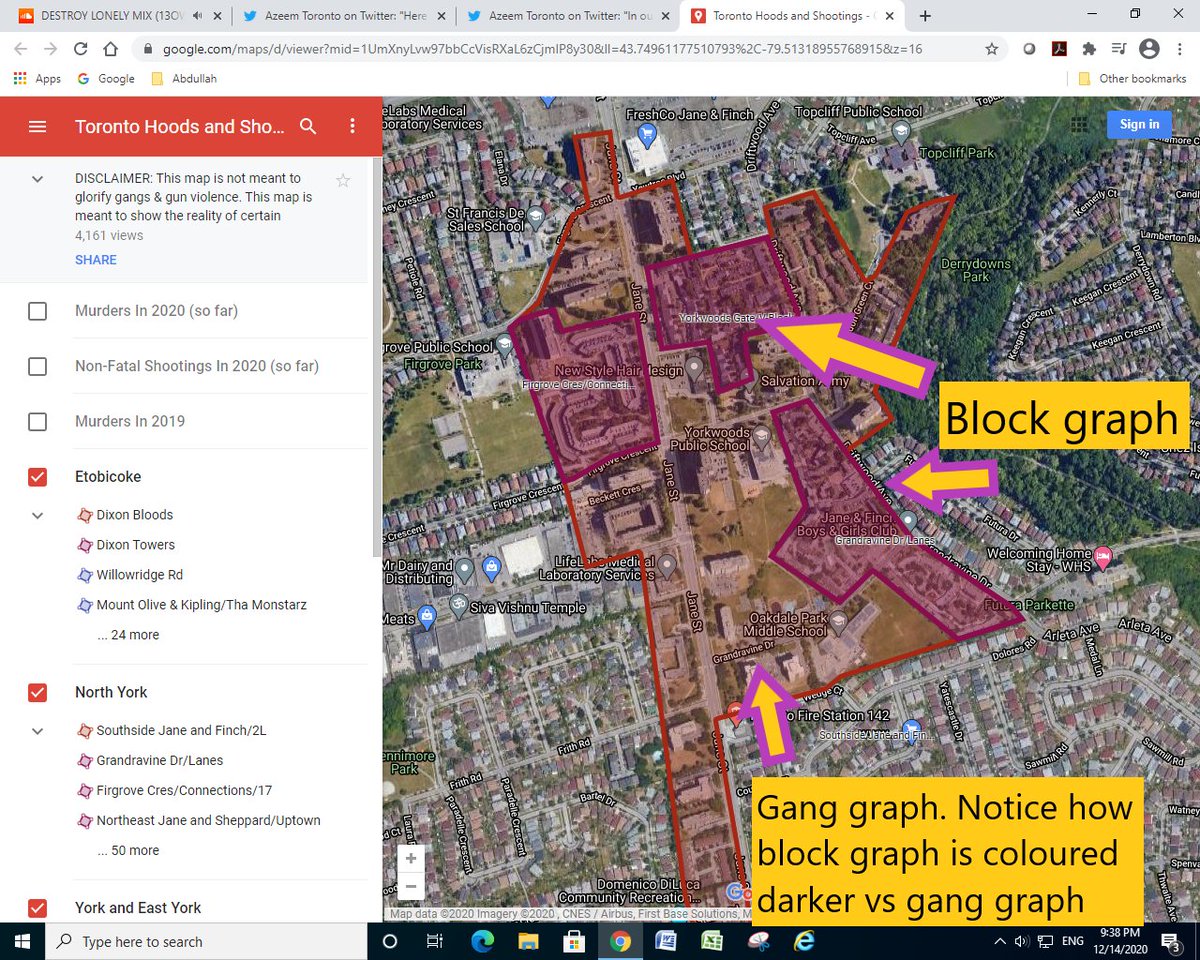
In our map, we have two types of territory graphs. One are gang territories, and the other are "block territories". Basically, gang territory graphs are places that the gangs are based in, while block territories are blocks in that neighbourhood that are important.
Block graphs will be coloured differently than gang graphs. Sometimes, instead of being coloured differently, the block graph will be a pin instead.
Click on the gang graph to learn stuff about the gang, like if they're a low-key gang, or very active gang. Clicking on the block graph will give you info on that block, like # of subsidized units, building design, etc.
P.S this isn't snitching cuz police already know this stuff
P.S this isn't snitching cuz police already know this stuff
The police literally have paid informants in these gangs so if anyone gets angry at this map then screw you, only reason it's on this map is because you put your business out on the public internet anyways.
I will probably have to change my twitter handle to protect my privacy!
I will probably have to change my twitter handle to protect my privacy!
Tags: @ilillilillliili @CZV416 @ZeroGunViolence @ajsomerset @michaelcust1 @Duboges @TheOneByOneMov1 @TWilsonOttawa @CivilAdvantage1
I hope that by releasing this map, people get more awareness about this issue and it doesn't get forgotten about. Too many neighbourhoods have experienced this bullshit for too long yet lots of people are blind about the fact of innocent ppl being pressured by violence constantly
This map can be used to collect important statistics that relate to gun violence. For example, this map has taught me that the neighbourhood Lawrence Heights has a gun violence rate that is 65% comparable to the Chicago hood Austin which is Top 5 for gun violence in Chicago
If you'd like me to explain how I figured out gun violence in Lawrence Heights in Toronto vs Austin in Chicago, then comment below.
BTW it's terrible for Canada's image how a Canadian neighbourhood has gun violence that can compete with an American hood
BTW it's terrible for Canada's image how a Canadian neighbourhood has gun violence that can compete with an American hood
Since I have pinned my map, which replaced my chart of Toronto's seized crime guns, here is that thread https://twitter.com/Hood_Map_Man/status/1264352972684869632?s=20

 Read on Twitter


