Musings on mortality data.
Just thought I'd take a peek as the government's latest "Weekly national Influenza and COVID-19 surveillance report".
The dry title belies the wealth of interesting data it contains.
https://assets.publishing.service.gov.uk/government/uploads/system/uploads/attachment_data/file/942969/Weekly_Flu_and_COVID-19_report_w50_FINAL.PDF
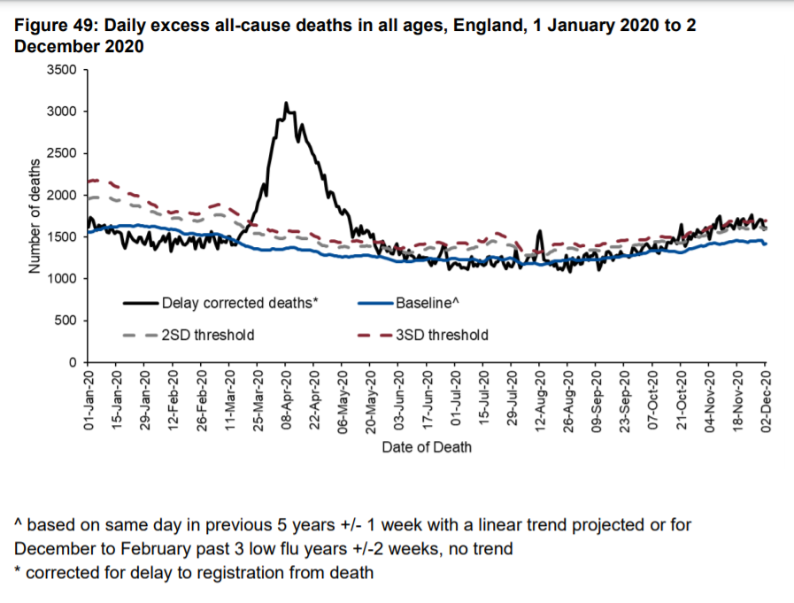
The interesting thing about this report is that it is the only government publication I can find which shows deaths by date they actually occurred, as opposed to when they were registered.
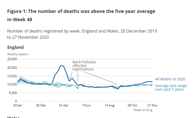
If you think it's odd to draw conclusions on the effect of something happening now using data where the dates aren't the dates of the actual deaths, you'd be right.
(Having said that, it is arguable whether that graph shows anything to be really concerned about.)
(Having said that, it is arguable whether that graph shows anything to be really concerned about.)
It's especially concerning when there's a significant difference in the times taken to register Covid v non-Covid deaths, as pointed out before: https://twitter.com/RealJoelSmalley/status/1329372021923459072?s=20
But by registration is the most "up to date" and by date of occurrence is old, with lots of missing deaths, isn't it?
And yes, that is true. But you can have the best of both worlds - by using known delays data to estimate an up to date picture of deaths by occurrence data.
And yes, that is true. But you can have the best of both worlds - by using known delays data to estimate an up to date picture of deaths by occurrence data.
Now, standing back from that - does it look like we are currently in a pandemic of a lethal virus?
Around 1400 people usually die every day in England. So when the government says there have been 400 - 500 Covid deaths, that would be around 1/3 of the usual deaths.
Hmmm....
Around 1400 people usually die every day in England. So when the government says there have been 400 - 500 Covid deaths, that would be around 1/3 of the usual deaths.
Hmmm....
In thinking about that graph - and most other mortality stats - bear in mind also:
- they aren't adjusted for population
- they aren't age-standardised (more very old people -> more deaths expected)
- the baseline is based on last 5 years, a historically low-mortality period
- they aren't adjusted for population
- they aren't age-standardised (more very old people -> more deaths expected)
- the baseline is based on last 5 years, a historically low-mortality period
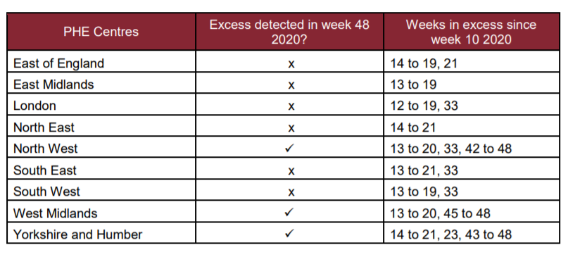
There's another really intriguing table in that report, showing this:
- excess deaths everywhere during Spring (real pandemic) and in some places in week 33 (heatwave)
- but only 3 regions - NW, West Mids and Yorkshire/Humber - with any other weeks of excess deaths
- excess deaths everywhere during Spring (real pandemic) and in some places in week 33 (heatwave)
- but only 3 regions - NW, West Mids and Yorkshire/Humber - with any other weeks of excess deaths
This is entirely inconsistent with a 2nd wave of a deadly pandemic sweeping indiscriminately through the whole country.
But think how bad it could have got without restrictions?
My answer is - prove it. Given the harms caused by lockdowns, it's up to proponents to prove their effectiveness, not us, as @RealJoelSmalley points out here: https://twitter.com/RealJoelSmalley/status/1337738112685002752?s=20
My answer is - prove it. Given the harms caused by lockdowns, it's up to proponents to prove their effectiveness, not us, as @RealJoelSmalley points out here: https://twitter.com/RealJoelSmalley/status/1337738112685002752?s=20
Also, ask yourself this question:
If you tell people to protect the NHS, massively reduce access to healthcare and frighten them into staying in their own homes, would that be likely to increase, or decrease mortality?
If you tell people to protect the NHS, massively reduce access to healthcare and frighten them into staying in their own homes, would that be likely to increase, or decrease mortality?
Well, I think it's safe to say it's unlikely to decrease it.
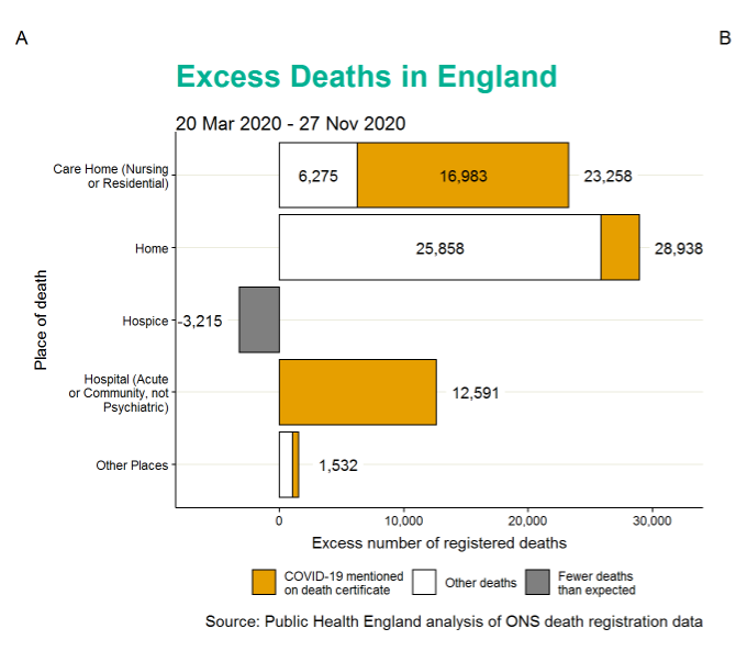
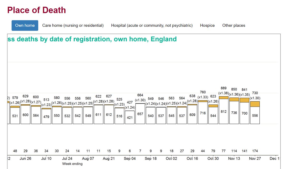
Next ask where you think you'd see extra people dying if they didn't seek healthcare? Yes, some would be in hospital - having sought help too late - but many would be in private homes.
Next ask where you think you'd see extra people dying if they didn't seek healthcare? Yes, some would be in hospital - having sought help too late - but many would be in private homes.
And that is what we do in fact see. ~29k of the ~60k excess deaths seen in 2020 to date were at home, and 90% of these were non-Covid.
Things must be getting better though?
Sadly not really, still running at around 100 / day (for England only):
Sadly not really, still running at around 100 / day (for England only):
A few weeks ago @ClareCraigPath tweeted a thread about non-Covid excess deaths. It is a matter of huge concern. https://twitter.com/ClareCraigPath/status/1327126149898645506?s=20

 Read on Twitter