It's death day.
And it's bad news.
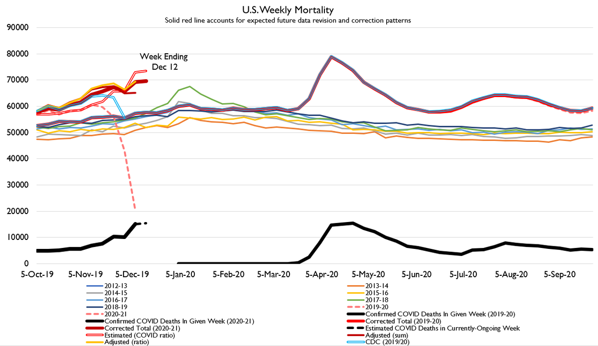
I didn't do death day the last two weeks because Thanksgiving interrupted reporting. Now that states have caught up, it's clear that deaths are trending upwards.
And it's bad news.
I didn't do death day the last two weeks because Thanksgiving interrupted reporting. Now that states have caught up, it's clear that deaths are trending upwards.
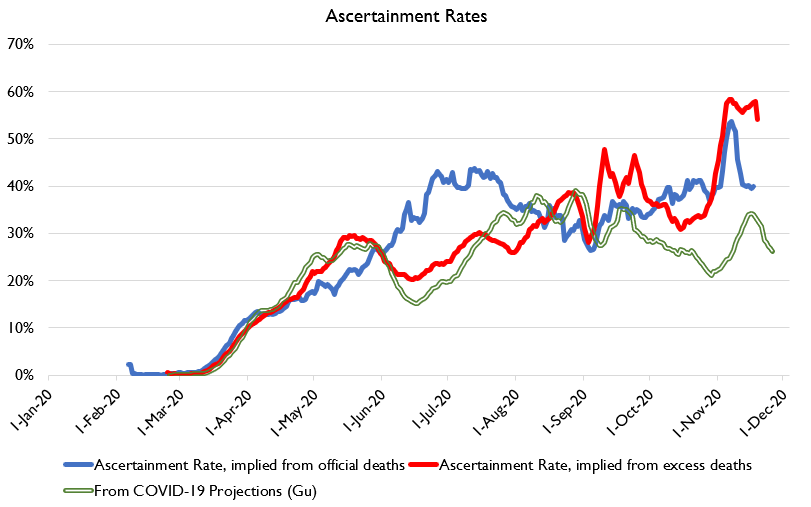
The good news is, official death counts are a much closer proxy for excess deaths in this wave than the last two. The health surveillance infrastructure is actually kinda-sorta keeping up this time at least for symptomatics, although ascertainment rates remain unimpressive.
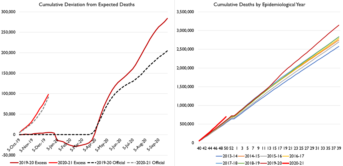
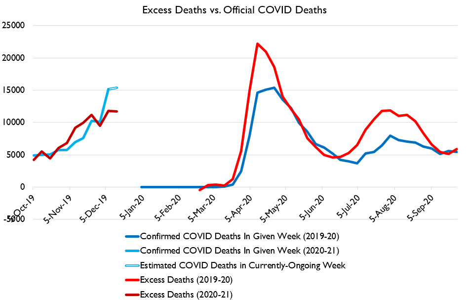
This chart is probably most useful. WHat you can see is official deaths and calculated excess deaths are very similar. They show death rates CONSIDERABLY in excess of the summer wave, and approaching the spring wave.
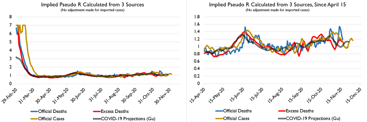
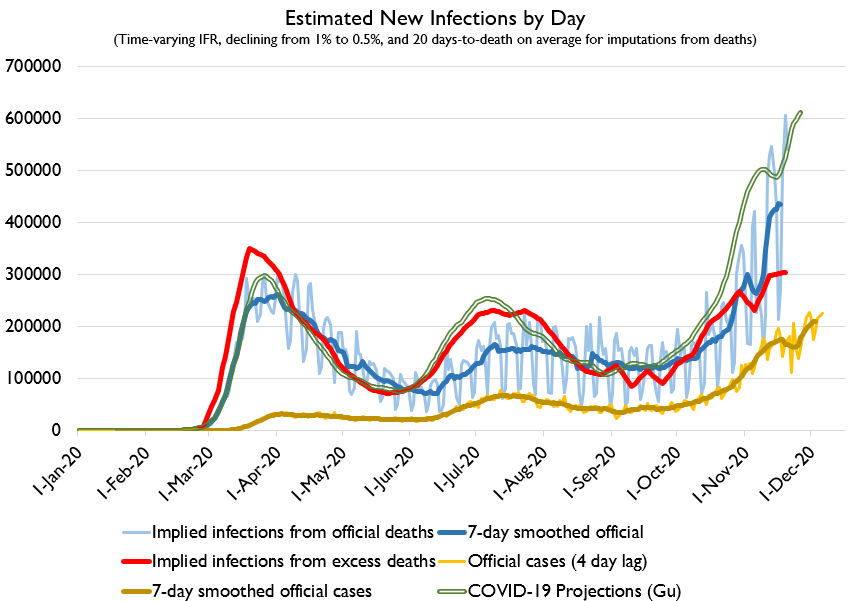
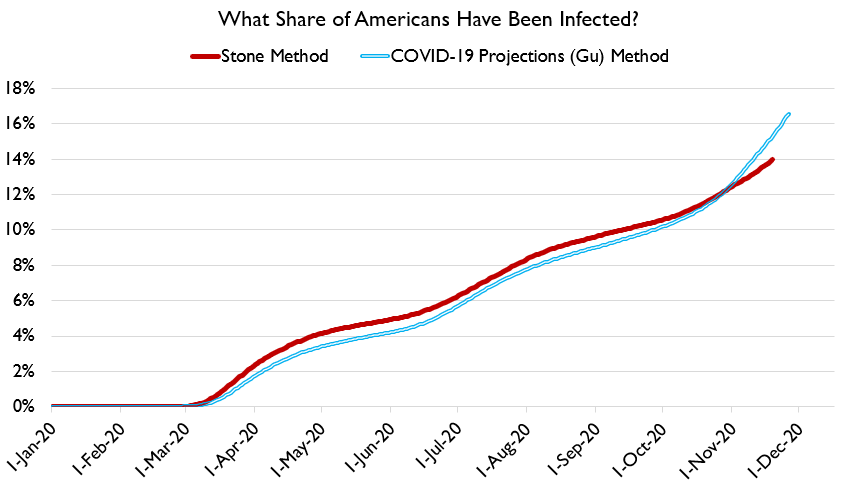
We've also got some ways to look at infections. Here's what that looks like. Something like 13-18% of Americans have been infected. Different estimation strategies yield different results but the broad trend is similar.
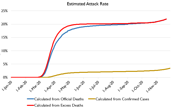
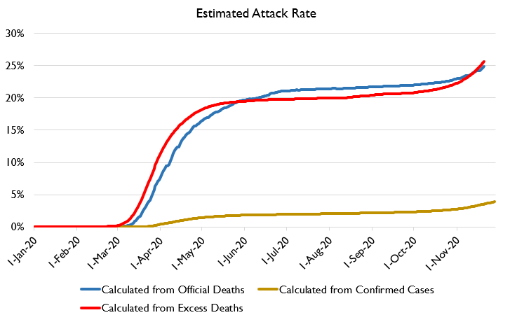
I've got attack rates by state but it's a bit cumbersome. So for example, here's plausible attack rates in New York. They are once again rising. "Herd immunity = 20%" was wrong.

 Read on Twitter