Ok, I’ll start the thread here. (1/XX)
First, some caveats.
• There are a *lot* of people on this website will forget more about football than I’ll ever learn. https://twitter.com/bphillips_sb/status/1336785994331222016
First, some caveats.
• There are a *lot* of people on this website will forget more about football than I’ll ever learn. https://twitter.com/bphillips_sb/status/1336785994331222016
(2/XX)
• This is not a “Cam is better/worse than Brady” exercise. It’s about investigating the validity of the current narratives.
• Tom’s 2019 season was used for two reasons:
- I already had it charted.
- It’s the most recent full season of #Patriots QB play.
• This is not a “Cam is better/worse than Brady” exercise. It’s about investigating the validity of the current narratives.
• Tom’s 2019 season was used for two reasons:
- I already had it charted.
- It’s the most recent full season of #Patriots QB play.
(3/XX)
“Why not just use SIS or PFF’s charting metrics?”
• Because watching football is fun.
• Learning and understand more about the game is fun.
• I wanted more context.
“Why not just use SIS or PFF’s charting metrics?”
• Because watching football is fun.
• Learning and understand more about the game is fun.
• I wanted more context.
(4/XX)
• I have far more contextual data in my 2019 charting (personnel, formations, pre/post-snap coverage structures, etc.), but I’ve been short on time this year.
Here’s what I’ve charted so far this year:
• I have far more contextual data in my 2019 charting (personnel, formations, pre/post-snap coverage structures, etc.), but I’ve been short on time this year.
Here’s what I’ve charted so far this year:
(5/XX)
Examples of ideal placement — some simple, some more difficult. Yes, a well-executed screen pass gets an “ideal” tag just like a well-thrown 45-yard skinny post.
Examples of ideal placement — some simple, some more difficult. Yes, a well-executed screen pass gets an “ideal” tag just like a well-thrown 45-yard skinny post.
(6/XX)
“Poor placement”.
“Poor placement”.
And then there’s the “egregiously bad throw/decision” category:
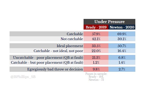
Ok, so here are some raw figures. Throwaways removed, plays w/penalties were still charted.
Keep in mind that these are not completion percentages.
Keep in mind that these are not completion percentages.
There are a million more things i want add to this thread, but it’s all I’ve got the time/energy for at the moment.

 Read on Twitter


