THE SIMPLE VISUAL GUIDE FOR A SOPHISTICATED PIERCE&PIERCE CARD
There is a lot of talk about what makes a card sophisticated"
And today we're going to clearly define and dissect what that is.

There is a lot of talk about what makes a card sophisticated"
And today we're going to clearly define and dissect what that is.
Let's begin by setting the right parameters for this analysis.
Pierce&Pierce is an investment firm, high-profile corporate shit. This is NOT your local bakery shop or car salesman card.
Tone matters.
A lot.
Pierce&Pierce is an investment firm, high-profile corporate shit. This is NOT your local bakery shop or car salesman card.
Tone matters.
A lot.
The year is 1989, so let's keep that in mind for the sake of consistency as historical context plays a huge role in dissecting masterpieces.
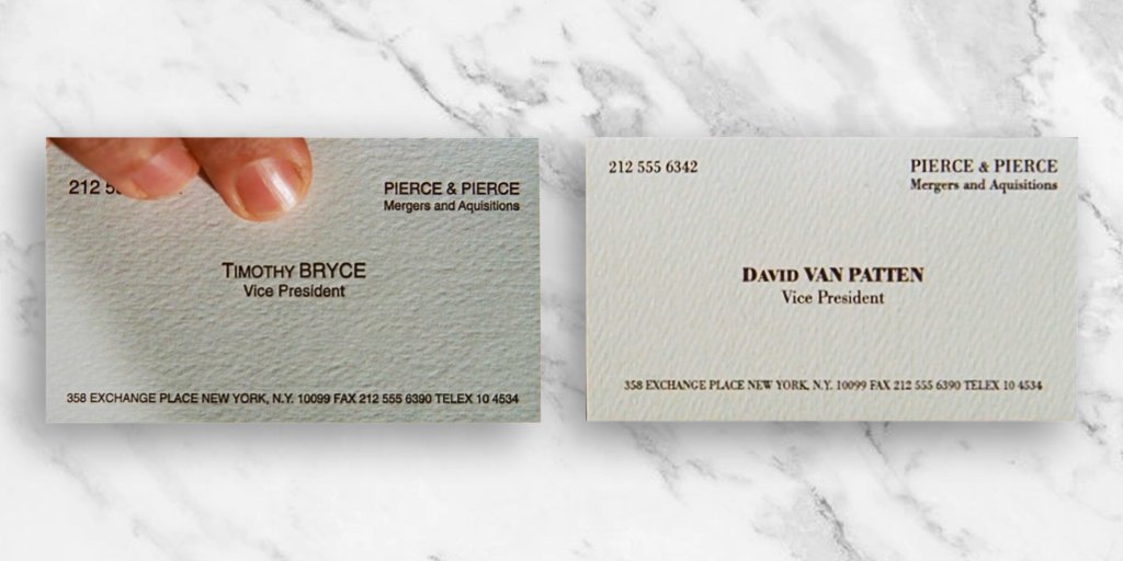
Shall we? We are going to start by analyzing each card, one by one, to figure out the strengths and weakness of each one
Shall we? We are going to start by analyzing each card, one by one, to figure out the strengths and weakness of each one
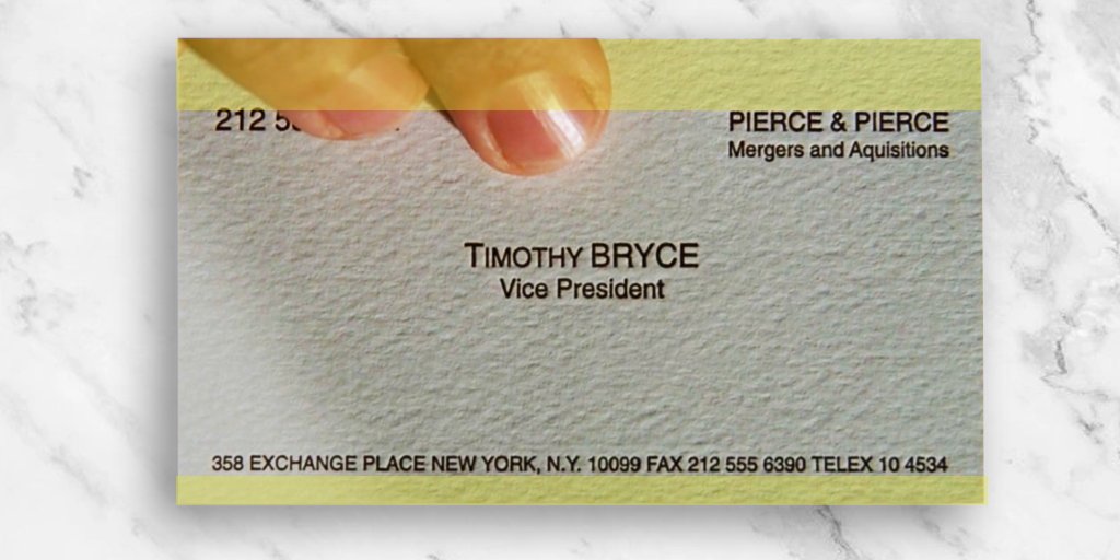
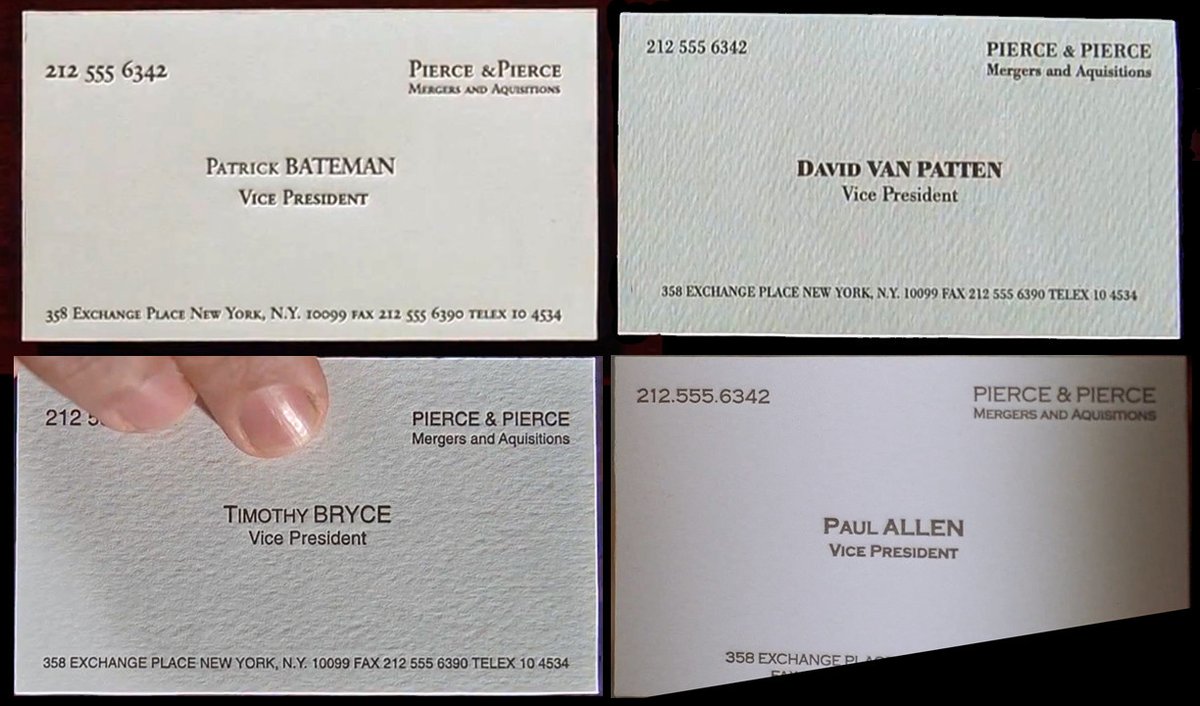
So here we have Timothy's. He chose to go with a Sans-Serif font, it's a bold yet intelligent move.
We are used to associate serifs with seniority, authority.
Yet, a sans-serif typeface is cleaner, direct.
However, sans-serifs have no novelty, souless one might say.
We are used to associate serifs with seniority, authority.
Yet, a sans-serif typeface is cleaner, direct.
However, sans-serifs have no novelty, souless one might say.
One of the problems with Bryce's bold attempt is that it falls short on boldness. All or nothing baby.
See how the squares are neatly aligned?
Orderly, yes, but boring nonetheless.
A soulless typeface with a boring composition won't get you far at Pierce&Pierce.
See how the squares are neatly aligned?
Orderly, yes, but boring nonetheless.
A soulless typeface with a boring composition won't get you far at Pierce&Pierce.
Another thing to notice, doesn't it feel like the whole card is pulling its weight down?
It's all about Gestalt
By moving the address line sightly upwards Timothy could've created the space within his canvas that he so desperately needs.
Like in Real State, space matters.
It's all about Gestalt
By moving the address line sightly upwards Timothy could've created the space within his canvas that he so desperately needs.
Like in Real State, space matters.
Now the MAIN issue here is contrast
Not the typeface, not the composition, but contrast.
By doing some simple tweaks Timothy could've been Bateman's target of jealousy, but he didn't.
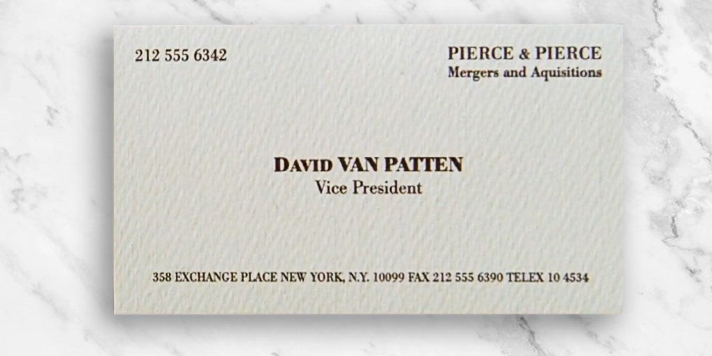
Notice how David achieved that nice visual hierarchy?
Get your shit together Timothy.
Not the typeface, not the composition, but contrast.
By doing some simple tweaks Timothy could've been Bateman's target of jealousy, but he didn't.
Notice how David achieved that nice visual hierarchy?
Get your shit together Timothy.
Let's move on.
Now this motherfucker went balls deep with the BOLD button on Canvas.
However, his serif typeface choice was poorly made. Notice how the bold part of his name almost makes invisible the thin verticals and horizontals?
Now this motherfucker went balls deep with the BOLD button on Canvas.
However, his serif typeface choice was poorly made. Notice how the bold part of his name almost makes invisible the thin verticals and horizontals?
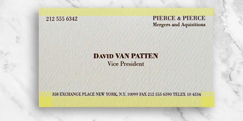
If you are going to play a visual gimmick like this, you want to use it more than once.
Whether is the 358 address or the 212 code, repeat your visual resources for consistency and to show intention.
Whether is the 358 address or the 212 code, repeat your visual resources for consistency and to show intention.
Notice how David's address line has the space required to support the other blocks of information.
And it's not bleeding through the bottom like that Timothy fagget
With a typeface that has the negative space to support the use of a bold weight at that size, this could be a win
And it's not bleeding through the bottom like that Timothy fagget
With a typeface that has the negative space to support the use of a bold weight at that size, this could be a win
Just kiddin, no way David's beating Paul with this lil cutie.
See how well this typeface breath at this scale?
How Pierce&Pierce interspace is tightly adjusted and yet it reads like a wonder?
You can see this clearly on his name, much more elegant than David's bold frenzy.
See how well this typeface breath at this scale?
How Pierce&Pierce interspace is tightly adjusted and yet it reads like a wonder?
You can see this clearly on his name, much more elegant than David's bold frenzy.
Now there's something odd here.
Notice how Paul's name is the tiniest typeblock in this card.
Again, visual hierarchy. Why would your company's phone number be more relevant than YOUR name?
After all, aren't you getting reservations at Dorsias on a Friday night?
Notice how Paul's name is the tiniest typeblock in this card.
Again, visual hierarchy. Why would your company's phone number be more relevant than YOUR name?
After all, aren't you getting reservations at Dorsias on a Friday night?
Part of this comes from the choice of making the address a two lines text instead of one
Yeah, it allows for better reading but it's also compressing the central issue - the NAME - into a little space.
You sure as fuck didn't get the Fisher account with that tiny little name.
Yeah, it allows for better reading but it's also compressing the central issue - the NAME - into a little space.
You sure as fuck didn't get the Fisher account with that tiny little name.
Here comes the real deal.
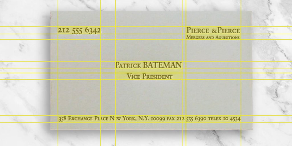
Patrick doesn't fuck around, he went straight for upper-lower case numbers. RETVRN shit right here.
That provides a good organic aristocratic tone for the phone and bottom line, which neatly contrasts with the tightly text box for the company name.
Patrick doesn't fuck around, he went straight for upper-lower case numbers. RETVRN shit right here.
That provides a good organic aristocratic tone for the phone and bottom line, which neatly contrasts with the tightly text box for the company name.
Pay attention to how Bate clearly knows his place in the hierarchy. Front and center baby.
He doesn't have the need to go bold for contrast.
Instead, he achieves that by scale and negative space, clearly a truly connoisseur of the Bauhaus philosophy.
He doesn't have the need to go bold for contrast.
Instead, he achieves that by scale and negative space, clearly a truly connoisseur of the Bauhaus philosophy.
A winners typeface.
With the angular serifs, high horizontals, and clear distinction between small-caps and uppercase makes for an excellent read at a small scale.
Nicely engraved too.
With the angular serifs, high horizontals, and clear distinction between small-caps and uppercase makes for an excellent read at a small scale.
Nicely engraved too.
Couple extra notes:
· Allen used dots to separate the phone number, clearly a pleb move when you can achieve just that with space
· Everyone but Bate has their title breathing under their neck. Patrick knows better, by giving it the negative space it needs to get relevance.
· Allen used dots to separate the phone number, clearly a pleb move when you can achieve just that with space
· Everyone but Bate has their title breathing under their neck. Patrick knows better, by giving it the negative space it needs to get relevance.
· David's vulgar use of boldness is better suited for a truck driver than a VP
· Timothy's blandness makes it clear he won't be moving the corporate ladder anytime soon
· Allen's loser mindset made him put his own identity at the bottom of the hierarchy
· Timothy's blandness makes it clear he won't be moving the corporate ladder anytime soon
· Allen's loser mindset made him put his own identity at the bottom of the hierarchy
I hope this thread gave you enough insight into why Bateman is the ultimate G when it comes to sophistication & taste.
Simple details can make or break an intention.
Whether the consumer can consciously see it or not, trust me, the subconscious will take care of it.

Simple details can make or break an intention.
Whether the consumer can consciously see it or not, trust me, the subconscious will take care of it.

@bannedvertising
Think you'd like this
Think you'd like this

 Read on Twitter

