A propos of absolutely nothing, here is my number 1 top tip for improving your use of graphs in presentations:
Hide the data, especially the interesting bits, at first.
THREAD/
Hide the data, especially the interesting bits, at first.
THREAD/
Unless you are presenting a very specific graph to an audience who will know what it means and how to interpret it (e.g. showing a survival curve to a load of health economists), your audience have to parse both *the idea of the graph* and *the actual data* simultaneously.
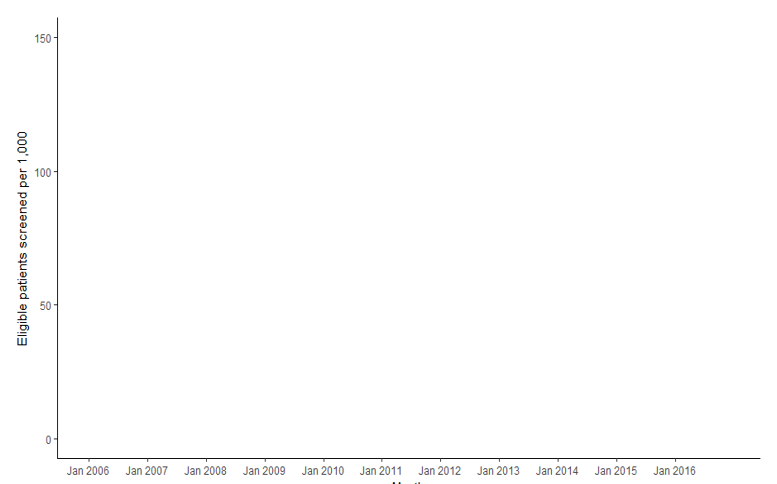
So instead, separate these tasks out. Show the blank axes first and explain what they mean.
Here I have time on the x-axis and the rate at which people registering with a new doctor's practice are screened for heavy drinking. So higher y-values mean more screening. Which is good
Here I have time on the x-axis and the rate at which people registering with a new doctor's practice are screened for heavy drinking. So higher y-values mean more screening. Which is good
A side benefit of this is that it automatically invites people to guess what the data is going to show. That is a great way of getting people to engage with the content - we can't help but want to know whether we are right.
Then you can decide whether to reveal it all, or bit by bit to really tell a story.
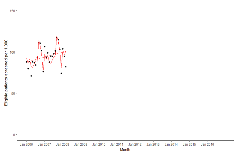
Here, in 2006-8 the rate of screening was rising - great, that's what we want to see...
Here, in 2006-8 the rate of screening was rising - great, that's what we want to see...
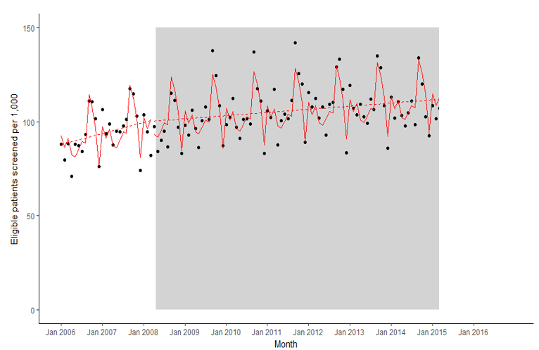
...then in 2008 a small financial incentive was introduced to encourage more screening. And actually, while rates did continue to rise, if anything, the rate of increase *slowed down*. Hmm. Not what you would expect.
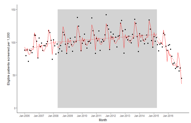
Then in 2015 the financial incentives were withdrawn...
Then in 2015 the financial incentives were withdrawn...
...and oh dear. Things ended up much, much worse than they were before we started offering the incentives.
(I managed to elicit an audible gasp from a room full of baronesses with this last reveal once, which was *excellent*)
(I managed to elicit an audible gasp from a room full of baronesses with this last reveal once, which was *excellent*)
And that's it.
I promise you this really works. By giving people time to think about what the data is going to show (and what different patterns in the data might mean) before you actually reveal it, you build anticipation and engagement.
I promise you this really works. By giving people time to think about what the data is going to show (and what different patterns in the data might mean) before you actually reveal it, you build anticipation and engagement.
(basically, getting people guessing what the graph *might* show and wanting to find out if they are right is a sneaky way of getting people to care about your graph. Mwahahahaha)
The advanced level trick is to do this, but build the graph into a wider narrative. Establish *why* your audience should care about whatever this graph is showing. And for more complex plots, set them up in advance.
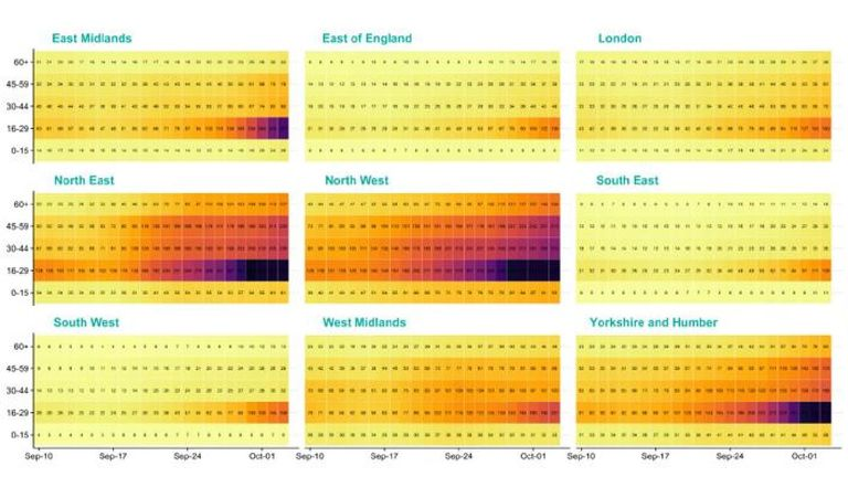
That was the *real* problem with this, much maligned, graph from the UK government. There is far too much going on to take in at once. Personally, I'd show a single, national, version of this plot (without data first), then move into this regional version.
There are some really great tips about this kind of storytelling in presentations (among other things) from @ClausWilke in this excellent talk:
And in the (unlikely) event that anyone is curious about the example graph in this thread, it comes from this *great* paper, led by @AmyJaneODonnell (I confess a conflict of interest in that I did the analysis and drew the graph) https://doi.org/10.1111/add.14778

 Read on Twitter