ONS model instability (THREAD)
This is more of an FYI thread, a little technical.
TL;DR: Although there’s no intentional problem, each week one should be cautious about reading much into ONS random sampling “modelled estimates” for the prior week, particularly for children. 1/
This is more of an FYI thread, a little technical.
TL;DR: Although there’s no intentional problem, each week one should be cautious about reading much into ONS random sampling “modelled estimates” for the prior week, particularly for children. 1/
Each week, the ONS publish a new Infection Survey Pilot. https://www.ons.gov.uk/peoplepopulationandcommunity/healthandsocialcare/conditionsanddiseases/bulletins/coronaviruscovid19infectionsurveypilot/4december2020
The parts that often receive the most attention are the “modelled estimates” for random sampling covid PCR-positivity by region and by age, as displayed by figures like these ones:
2/
The parts that often receive the most attention are the “modelled estimates” for random sampling covid PCR-positivity by region and by age, as displayed by figures like these ones:
2/
They also find “weighted fortnightly estimates” (WFE): the actual random sampling positivities for 14-day intervals, “weighted” by demographic data.
They display *total* weighted fortnightly estimates, but data by region or by age is usually relegated to their spreadsheets. 3/
They display *total* weighted fortnightly estimates, but data by region or by age is usually relegated to their spreadsheets. 3/
Unfortunately
(a) the “modelled” curves are unstable—over-sensitive to small changes in data, often substantially retroactively revised, &
(b) 14-day averages for the “modelled” curves don’t match the weighted WFEs, and the mismatch is different for different subpopulations. 4/
(a) the “modelled” curves are unstable—over-sensitive to small changes in data, often substantially retroactively revised, &
(b) 14-day averages for the “modelled” curves don’t match the weighted WFEs, and the mismatch is different for different subpopulations. 4/
To illustrate...
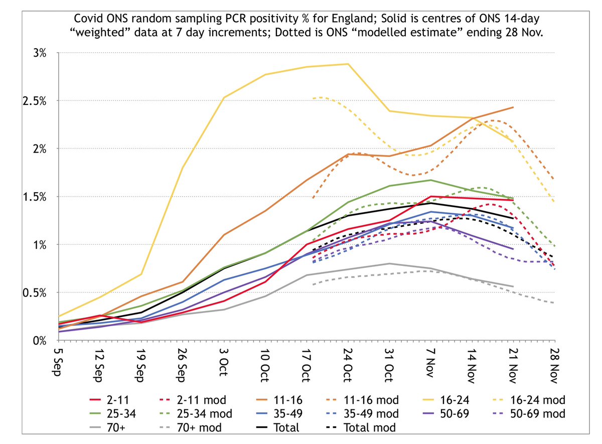
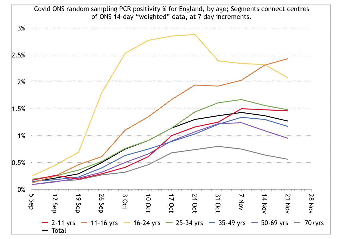
First, here is a graph of the WFEs—the weighted data—by age. There’s only one data point per week, so week-long segments connect these weekly dots, and each weekly dot represents the average positivity for the 14-day interval centred on that day. 5/
First, here is a graph of the WFEs—the weighted data—by age. There’s only one data point per week, so week-long segments connect these weekly dots, and each weekly dot represents the average positivity for the 14-day interval centred on that day. 5/
Note how each group substantially decreases near the end except 2-11 and 11-16. The 11-16s sharply increase, and 2-11s only decrease from 1.50% to 1.46% over 14 days.
Now, here’s the same graph, but with the most recent “modelled estimate” curves overlaid with dotted lines. 6/
Now, here’s the same graph, but with the most recent “modelled estimate” curves overlaid with dotted lines. 6/
Of course, the fortnightly estimates with segments connecting dots will necessarily be less “curvy” than the daily modelled estimates because the averaging smooths these curves out, but you would still expect the *averages* to obey the same trend, so let’s look closer. 7/
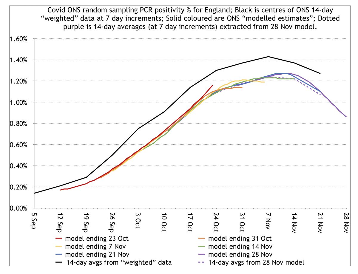
Here are sequential modelled curves in colour—a new one each week—compared to WFEs in black segments, for the Total population. Dotted purple is 14-day avg of latest model.
Pros: curves are approximately parallel.
Cons: right-hand ends of curves often dip slightly too low. 8/
Pros: curves are approximately parallel.
Cons: right-hand ends of curves often dip slightly too low. 8/
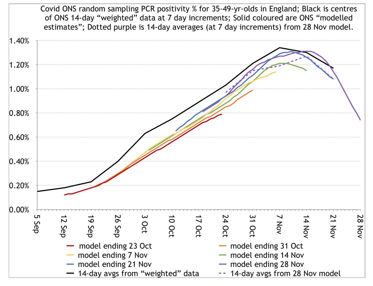
The 35-49yr group is a slightly closer match. (Note that median parents of school children lie in this group.)
There’s a slightly more pronounced problem of endpoints of curves dipping below and needing to be revised, but the curves are closer overall to the black WFE graph. 9/
There’s a slightly more pronounced problem of endpoints of curves dipping below and needing to be revised, but the curves are closer overall to the black WFE graph. 9/
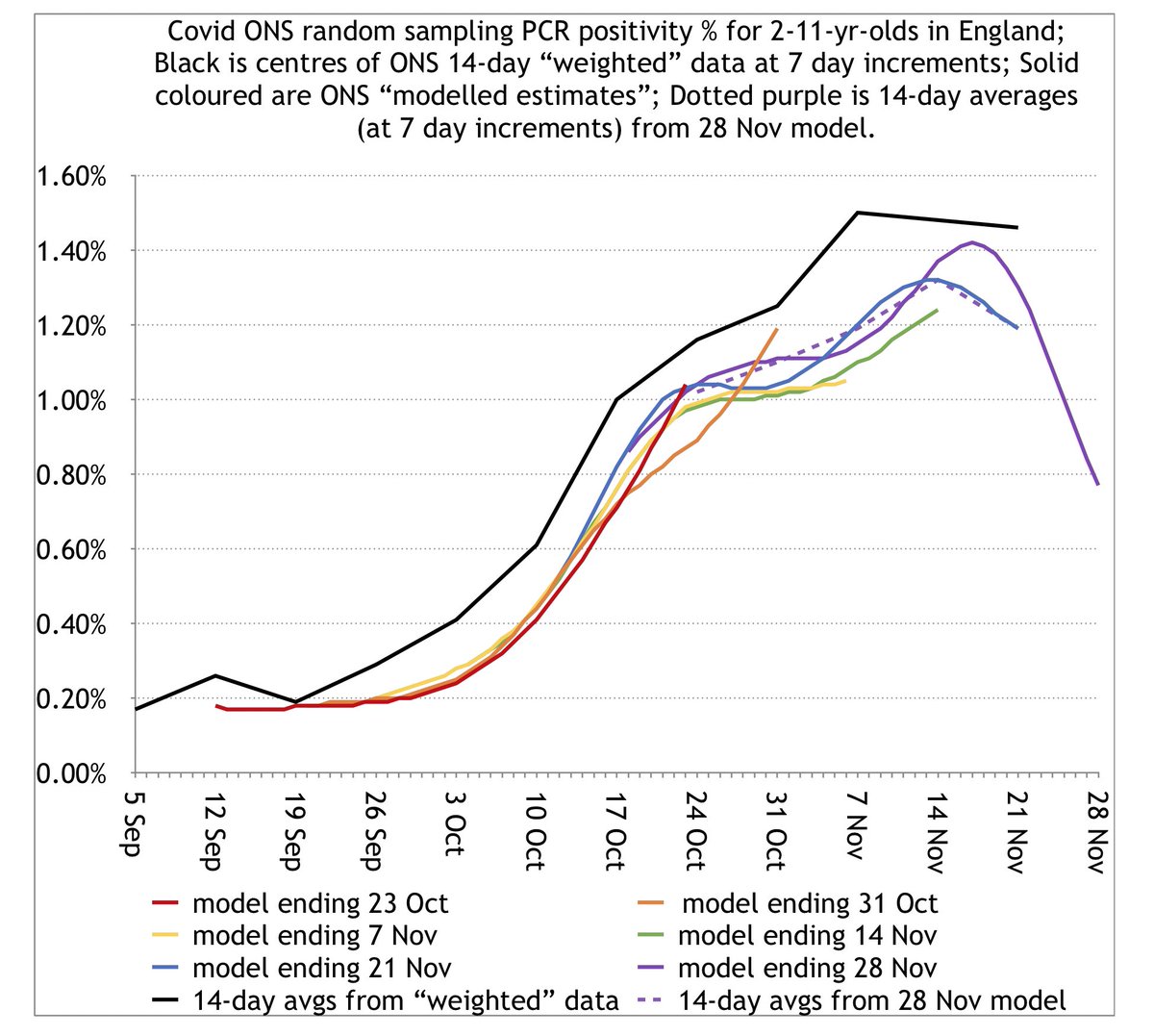
Next look at 2-11s, which includes primary school.
Here, we see the modelled curves have required much more drastic retroactive revision each week, despite later changes in actual data being relatively small. This looks like possible instability in the model. 10/
Here, we see the modelled curves have required much more drastic retroactive revision each week, despite later changes in actual data being relatively small. This looks like possible instability in the model. 10/
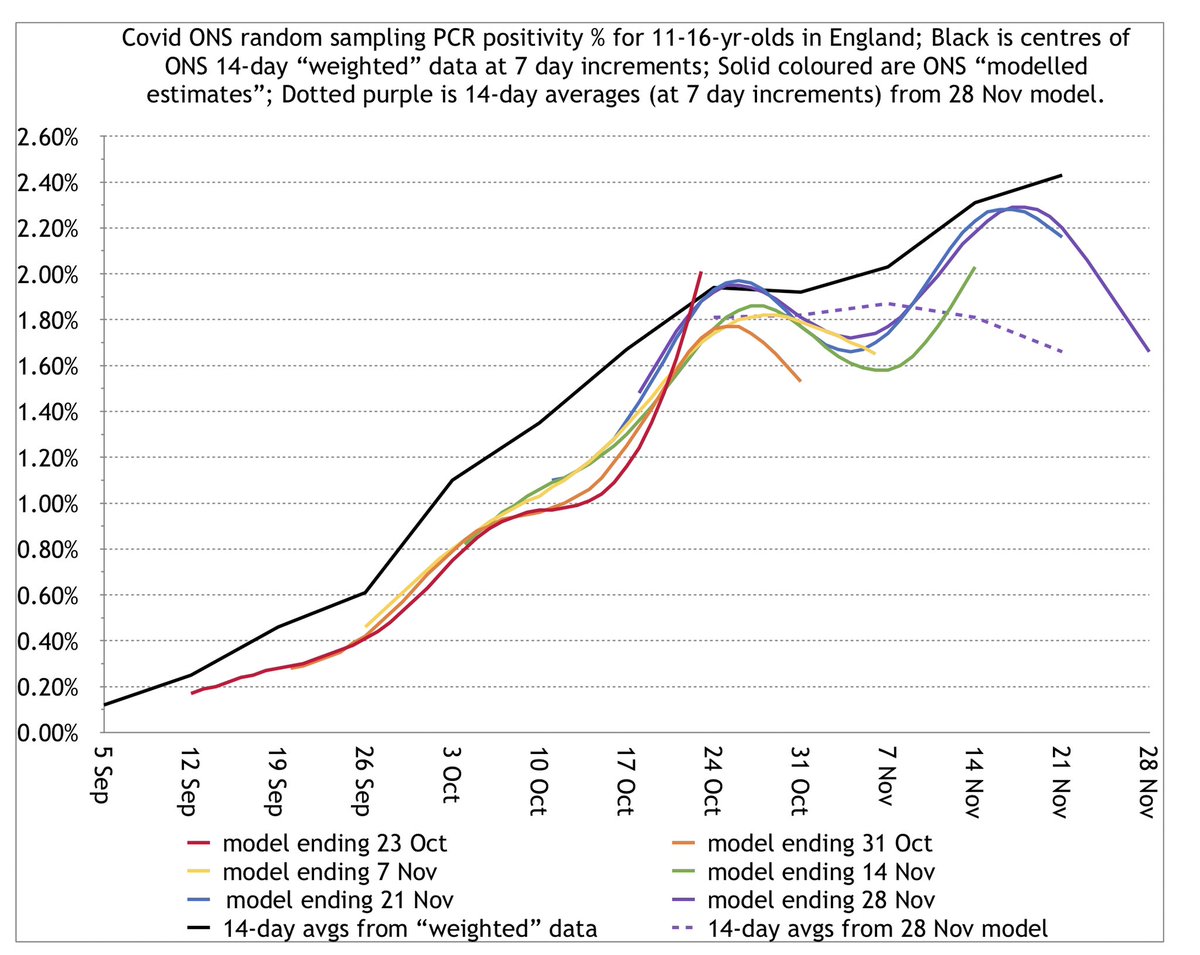
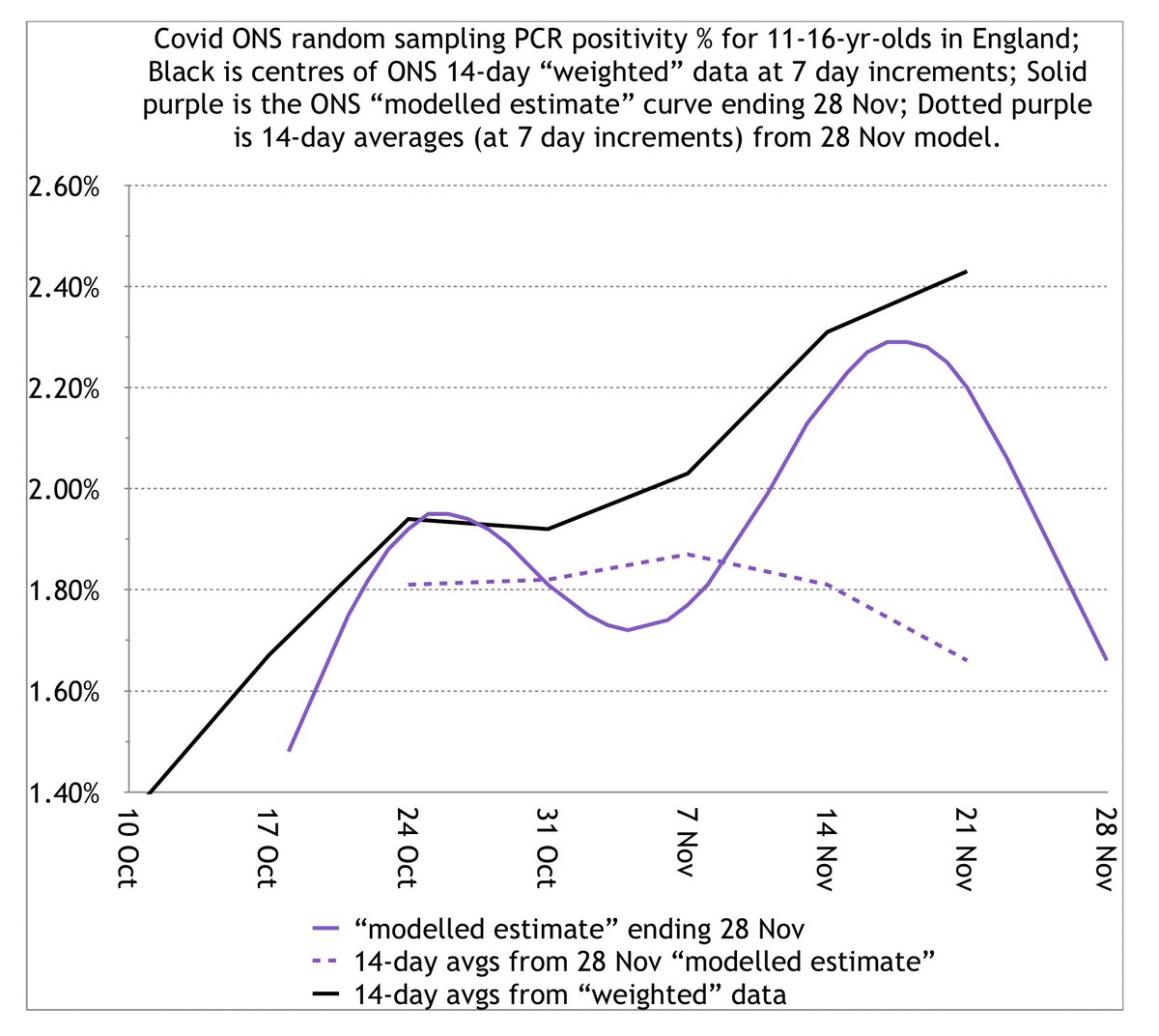
And for the kicker, here are 11-16s: secondary school kids. This age group involved substantial retroactive revisions for modelled estimate curves.
But pay particular attention to the right-hand ends of the blue and purple curves, versus the black WFE graph. 11/
But pay particular attention to the right-hand ends of the blue and purple curves, versus the black WFE graph. 11/
Again, WFEs smooth things out, so the right-hand ends of these modelled curves can decrease, but their 14-day *average* each week needs to increase like the black WFE graph.
The purple dotted is the weekly 14-day avg from the 28 Nov modelled curve from 4 Dec.
It decreases. 12/
The purple dotted is the weekly 14-day avg from the 28 Nov modelled curve from 4 Dec.
It decreases. 12/
What’s the general picture?
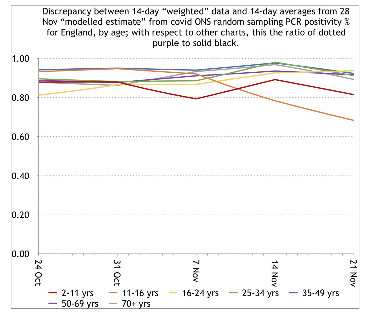
For each age, the below graph plots the ratio each week of the 14-day avg of the recent “modelling estimate” curve to the corresponding WFE value.
The further below 1, the more the model underestimates the WFE. Red is 2-11s. Orange is 11-16. 13/
For each age, the below graph plots the ratio each week of the 14-day avg of the recent “modelling estimate” curve to the corresponding WFE value.
The further below 1, the more the model underestimates the WFE. Red is 2-11s. Orange is 11-16. 13/
In other words, compared to other age groups, the recent ONS modelled curves substantially underestimated primary and secondary school student infection relative to what their 14-day weighted data estimated.
Again, here are the WFE graphs. 14/
Again, here are the WFE graphs. 14/
But to be very clear: THIS WAS NOT INTENTIONAL.
It’s just that the data trends from children have been qualitatively different to those from adults, and the model seems to have had a harder time coping with them. 15/
It’s just that the data trends from children have been qualitatively different to those from adults, and the model seems to have had a harder time coping with them. 15/
Of course, the other important question is: which estimate is more wrong—the model or the fortnightly WFEs?
All we’ve really shown is that the answers are different.
To consider this question, we can examine other sources from a similar time period. 16/
All we’ve really shown is that the answers are different.
To consider this question, we can examine other sources from a similar time period. 16/
The most recent REACT-1 report https://www.imperial.ac.uk/media/imperial-college/institute-of-global-health-innovation/imperial_react1_r7_interim.pdf
found primary + secondary students were the only age groups to increase.
Caveats:
-there’s still some uncertainty in this data.
-this was for 13-24 Nov, not 15-28 Nov like the 4 Dec ONS ISP latest WFE. 17/
found primary + secondary students were the only age groups to increase.
Caveats:
-there’s still some uncertainty in this data.
-this was for 13-24 Nov, not 15-28 Nov like the 4 Dec ONS ISP latest WFE. 17/
Next: school attendance.
…https://explore-education-statistics.service.gov.uk/find-statistics/attendance-in-education-and-early-years-settings-during-the-coronavirus-covid-19-outbreak
There are 3 primary contributors to covid-related school absence: isolation due to
(a) adult family/household member exposure/symptoms,
(b) school-related exposure/symptoms,
(c) non-school peer + (child) sibling exposures. 18/
Both types of ONS and REACT-1 data consistently show adult infection substantially decreased in the week preceding 26 Nov, so absence contribution from (a) *decreased.*
That means substantial *increase* in attendance unless there was substantial increase in child infection. 19/
That means substantial *increase* in attendance unless there was substantial increase in child infection. 19/
Up to rounding uncertainty, they found no change in secondary school attendance from 19 to 26 Nov.
Thus the overall decrease in absence contribution from adults that week likely requires an (overall) balancing *increase* in absence contribution from children that week. 20/
Thus the overall decrease in absence contribution from adults that week likely requires an (overall) balancing *increase* in absence contribution from children that week. 20/
For primary students, absence decreased from 13% to 12% over 19-26 Nov.
Beyond the scope of this thread to predict exactly how much the adult decrease contributed to drop in absence, but it’s potentially consistent with limited overall decrease in child infection that week. 21/
Beyond the scope of this thread to predict exactly how much the adult decrease contributed to drop in absence, but it’s potentially consistent with limited overall decrease in child infection that week. 21/
Of course, that’s from last week’s 1 Dec update, so only goes through 26 Nov, not 28 Nov. We were only looking at overall change from 19 to 26 Nov, and there could still have been some decrease from 26-28 Nov.
There will likely be a new attendance update today. 22/
There will likely be a new attendance update today. 22/
So whether or not the overall value is right, the trends in ONS weighted fortnightly estimates (WFE) for children seem potentially consistent with trends from other sources of data.
In either case, internal consistency of ONS weighted and modelled estimates would be a plus. 23/
In either case, internal consistency of ONS weighted and modelled estimates would be a plus. 23/
Lastly, I should say I’m not the only one to have noticed instability or retroactive revision for the ONS models.
@ChrisGiles_ raised concerns in October about the total population modelled estimate curves. 24/ https://twitter.com/chrisgiles_/status/1319620517796741120
@ChrisGiles_ raised concerns in October about the total population modelled estimate curves. 24/ https://twitter.com/chrisgiles_/status/1319620517796741120
And @jamesannan raised concerns earlier this week about the ONS incidence model (which is related to, but not the same as, the positivity model).
In the meantime, we should all exercise caution in interpreting these models. 25/ https://twitter.com/jamesannan/status/1334832288480243717
In the meantime, we should all exercise caution in interpreting these models. 25/ https://twitter.com/jamesannan/status/1334832288480243717
Looks like @Peston wrote a thread today on @ONS modelling instability as well, in this case for the incidence model. 26/ https://twitter.com/peston/status/1336246651799937024

 Read on Twitter


