A quick run-through of my favorite uranium charts and reasoning.
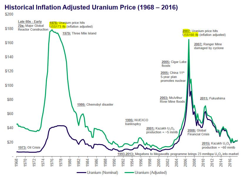
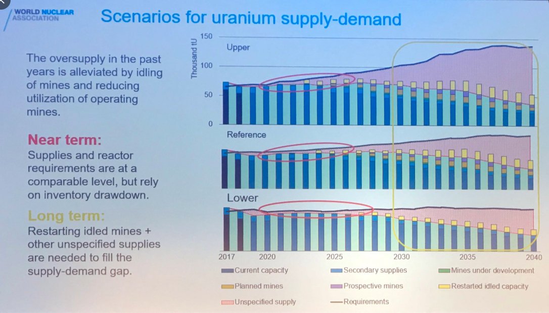
Big picture.
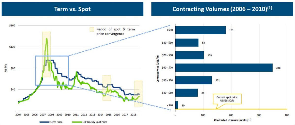
The #uranium market structure lends itself to boom and bust.
History will repeat itself again.
Big picture.
The #uranium market structure lends itself to boom and bust.
History will repeat itself again.
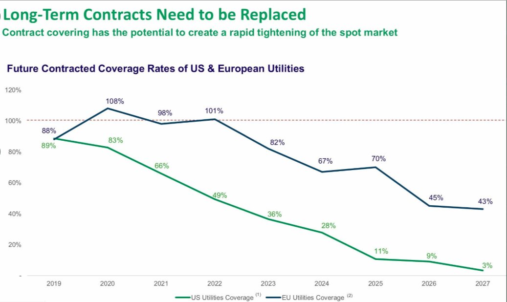
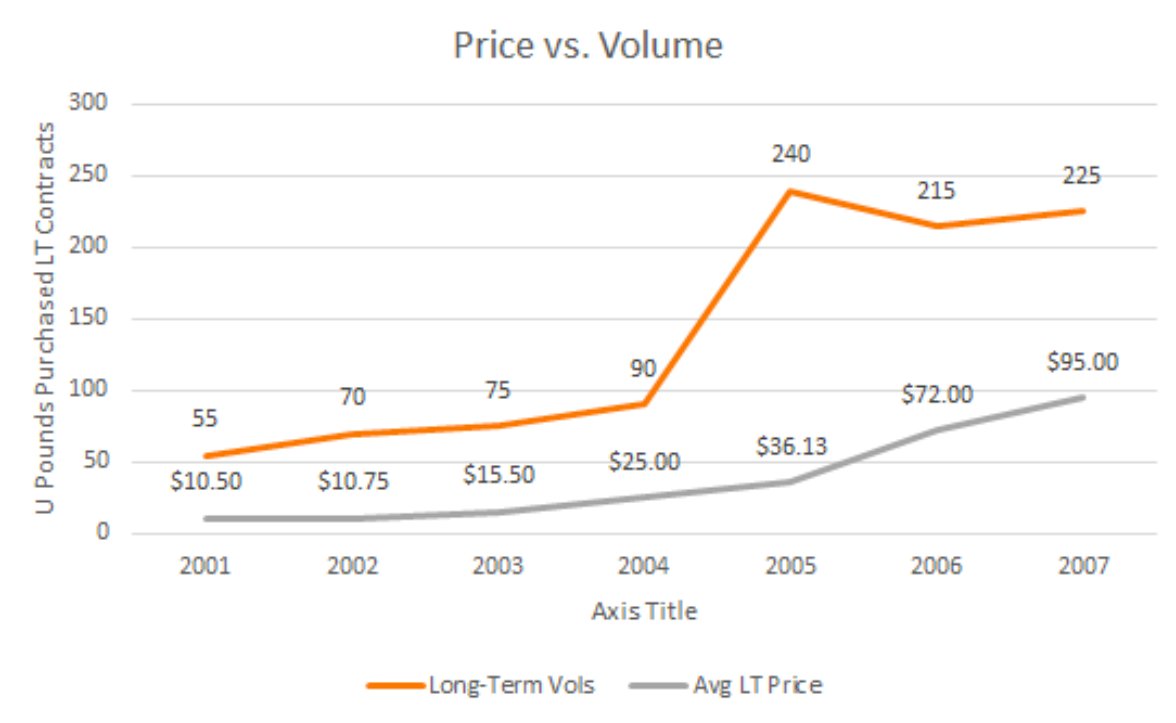
Following on from the above chart: "what if it takes another decade?"
It can't happen with utility contract coverage rolling off at a rapid rate.
Also need to add time for utilities to get yellow cake through the fuel cycle (18-24mths)
49% of US reactors are uncovered by 2022
It can't happen with utility contract coverage rolling off at a rapid rate.
Also need to add time for utilities to get yellow cake through the fuel cycle (18-24mths)
49% of US reactors are uncovered by 2022
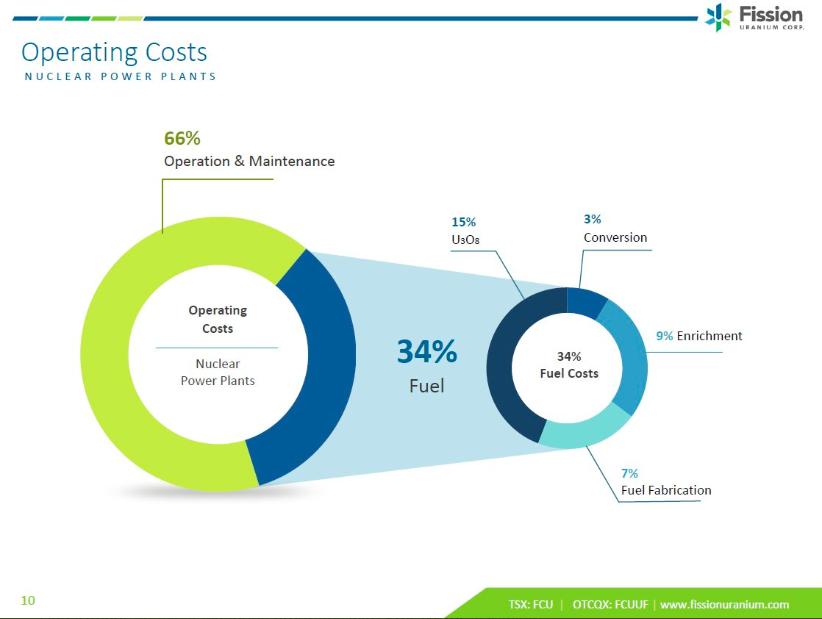
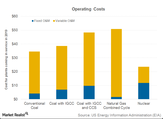
Actual U308 purchasing only represents 15% of operations and maintenance of a nuclear reactor.
This makes for price-insensitive buyers as fuel buyers are far more worried about the security of supply.
Natural gas is the opposite in that its all variable cost
This makes for price-insensitive buyers as fuel buyers are far more worried about the security of supply.
Natural gas is the opposite in that its all variable cost
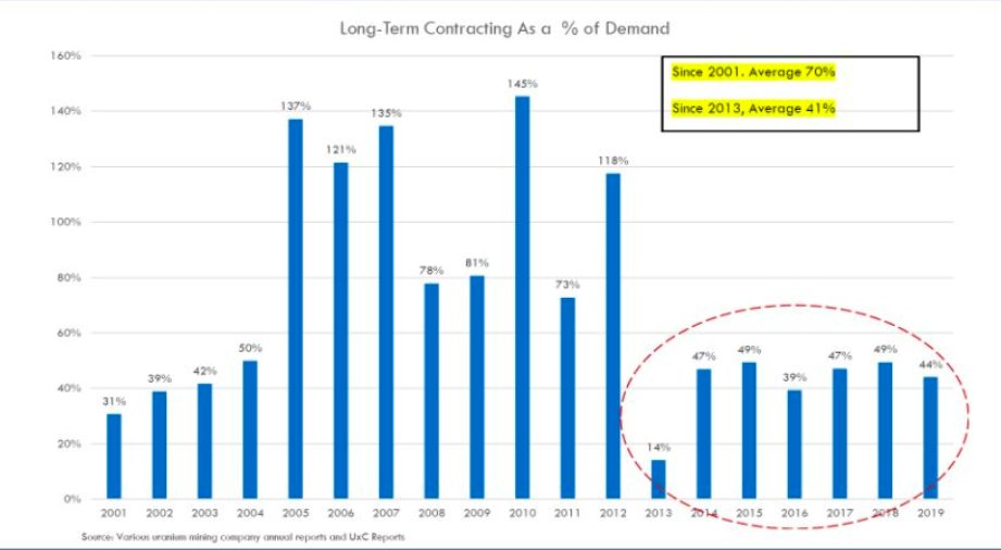
Long-term contracting as a percentage of demand
Under contracting to seriously over contracting.
This time around will be no different
Under contracting to seriously over contracting.
This time around will be no different
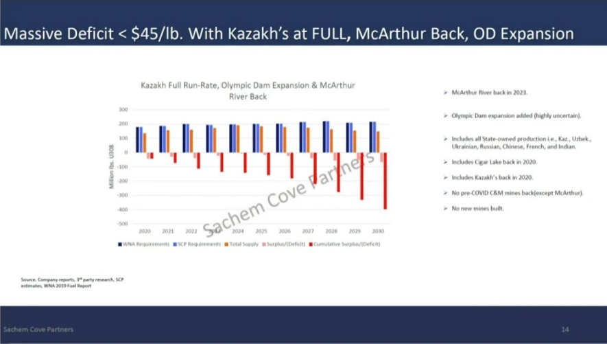
Even with Kazakhs at full production, Mcarthur restarted and Olympic Dam expansion there is a massive deficit.
We of course know now that none of the above has occurred.
If anything they have all disappointed to the downside (Kazakhs)
Source: @FootnotesFirst @timothychilleri
We of course know now that none of the above has occurred.
If anything they have all disappointed to the downside (Kazakhs)
Source: @FootnotesFirst @timothychilleri
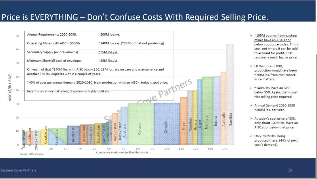
Annual demand = ~200mlbs
Operating mines with AISC <$50lb = 140mlbs(23mlbs not operating)
Secondary supply = 25mlbs
Minimum shortfalll = 35mlbs
~40% of average annual demand 2020-2030 from production with an AISC < today's spot price.
Source: @FootnotesFirst @timothychilleri
Operating mines with AISC <$50lb = 140mlbs(23mlbs not operating)
Secondary supply = 25mlbs
Minimum shortfalll = 35mlbs
~40% of average annual demand 2020-2030 from production with an AISC < today's spot price.
Source: @FootnotesFirst @timothychilleri
Feel free to add any uranium charts you think others may benefit from below.

 Read on Twitter