1/13 Thread. Demographics and labour market dynamics.
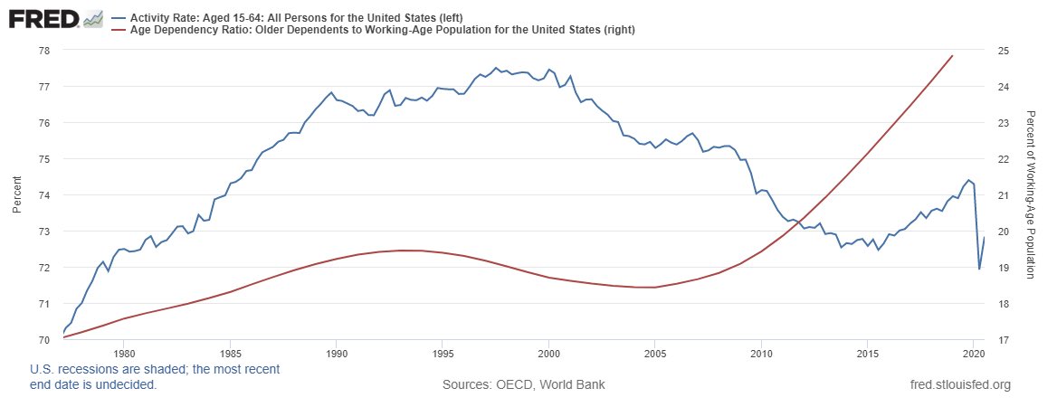
Prelude: the scariest chart for the US eq market, and the reason I believe the upcoming top will be a secular one. Chart shows the collapsing activity rate (peak Q3 97!!) combined with the soaring dependency ratio (bottom 05)
Prelude: the scariest chart for the US eq market, and the reason I believe the upcoming top will be a secular one. Chart shows the collapsing activity rate (peak Q3 97!!) combined with the soaring dependency ratio (bottom 05)
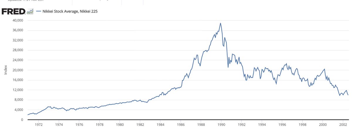
2/13 I read a lot of historic fractal analysis trying to predict the market today based on the past. I don’t like these approaches, but I do think that the precedent of Japan in the 90s is important to understand today’s equity, FX and rates markets. Below the Nikkei. Peak 1989
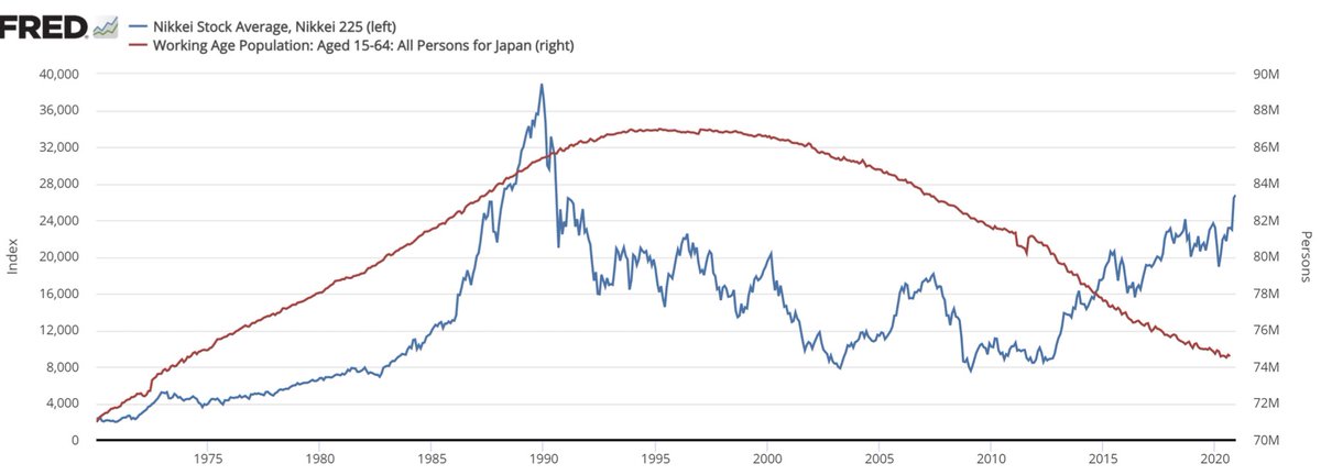
3/13 it is now widely accepted that both the speculative frenzy that preceded it and the collapse that followed were driven, partly, by demographics. So let’s look at the working age population from 1970 to today. You can see that Nikkei anticipated the peak, quite accurately
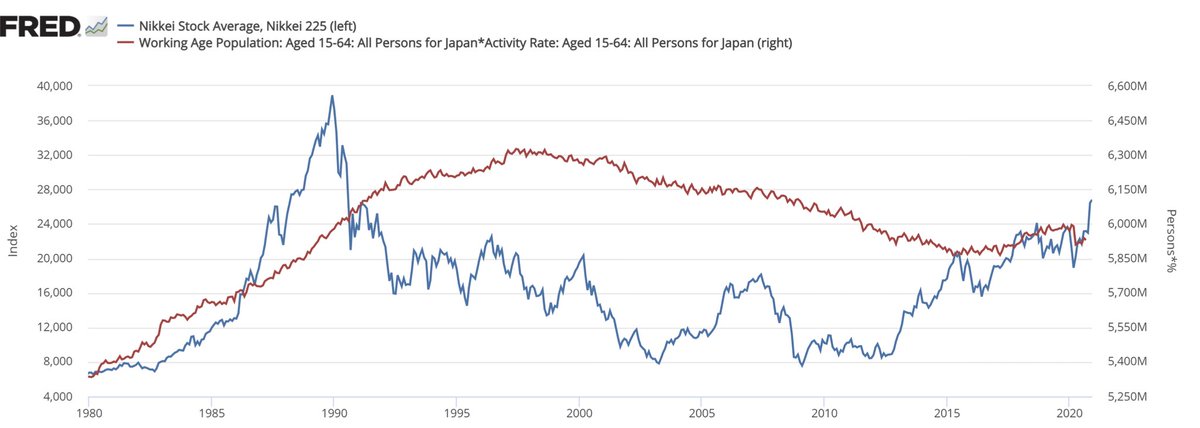
4/13 Nikkei troughed in 2012 while demographics headwinds continued. That shows us that there is another factor at play: the activity rate (ratio of labour force to working pop). And you can see that the bounce in Nikkei anticipated a rebound in the AWP (Active Working Pop)
5/13 Let’s see if this high level macro data could explain the US outperformance against Japan after the bubble bursted, so pretty much since 1990. It looks like the US AWP (red) has done much better than Japan’s AWP. So it definitely justifies the US outperformance.
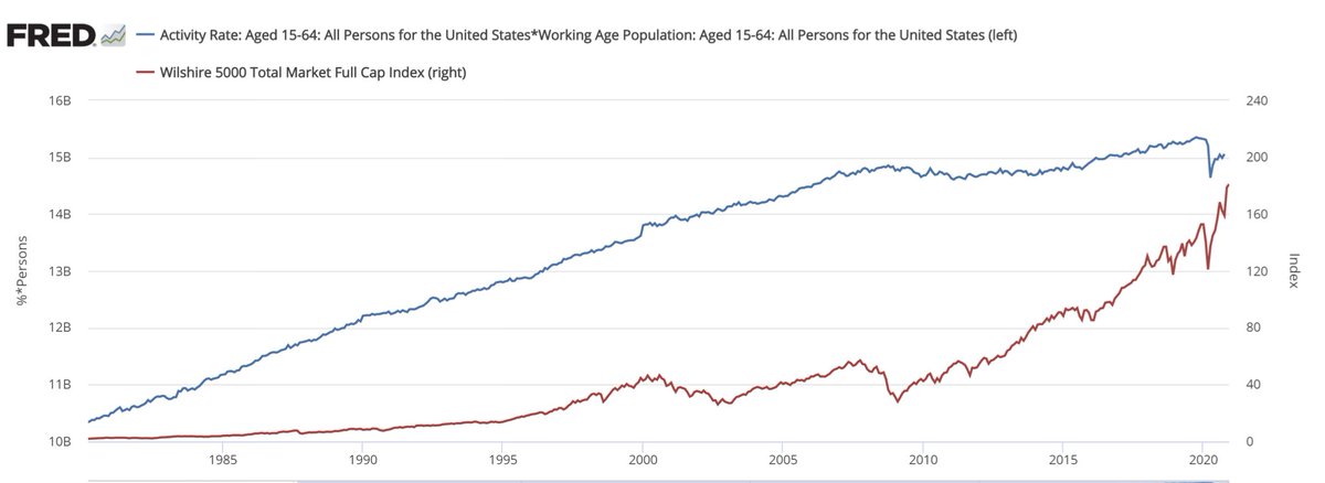
6/13 Below Wiltshire (broadest US index with 5000 stocks) against the AWP. It’s been a consistant relationship (up mostly with a flatlining for both between 07 and 2011). But the really troubling fact, is that AWP is now at 2016 levels while W5K has doubled since. Levitation
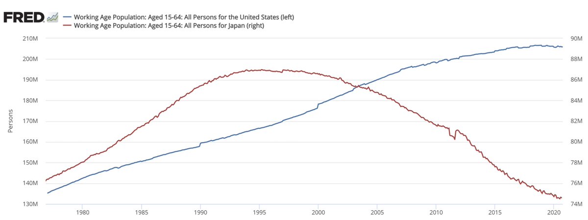
7/13 Let’s look closely at the component of the AWP: Working Age Pop and Activity Rate. Let’s start with WAP and compare US to Japan. While the US had much better demographics, it looks like it is today exactly where Jap found itself in the mid-90s: a plateau.
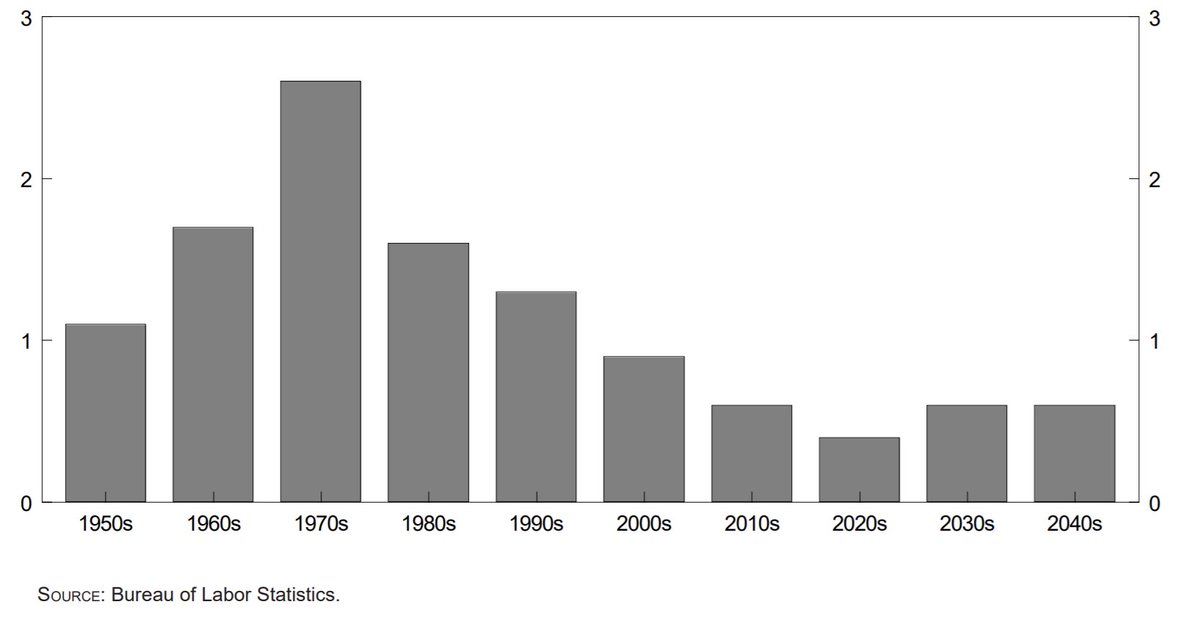
8/13 What’s going to happen to WAP? Bureau of Labour statistics show a trough in growth during the 2020s and a small pick-up in the following 2 decades. So it should be a plateau with slight up bias. The growth of 70/80/90s is firmly behind in the US.
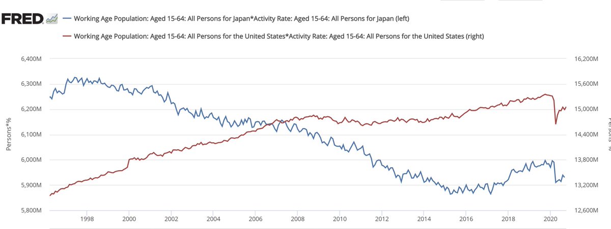
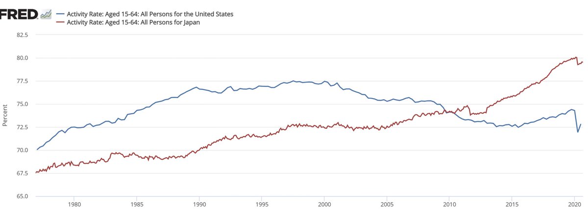
9/13 if WAP is hitting a plateau, that puts even more importance on the Activity Rate in order to support the dependency that an aging population faces. Japan vs US comparison is troubling. US AR has been collapsing since 97. Japan managed to counteract bad demographics better
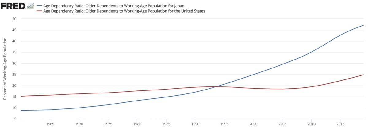
10/13 Dependency. Specifically older dependents to WAP. You can see that the golden years for Japan were when it had a lower dependency ratio than the US. 95 was the year when Japan’s dependency went parabolic. US enjoyed relative stability to 2010. DR will almost double by 2050
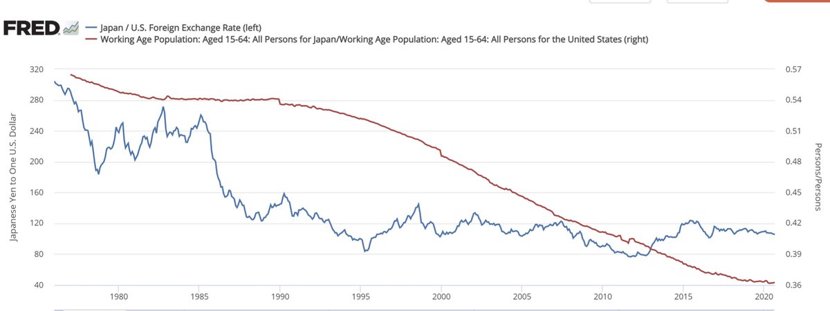
11/13 Now that we established the importance of these demographic trends to equities, let’s look at some other markets. You can see below that WAP ratio between Japan and US gave the overall direction of the $/¥.
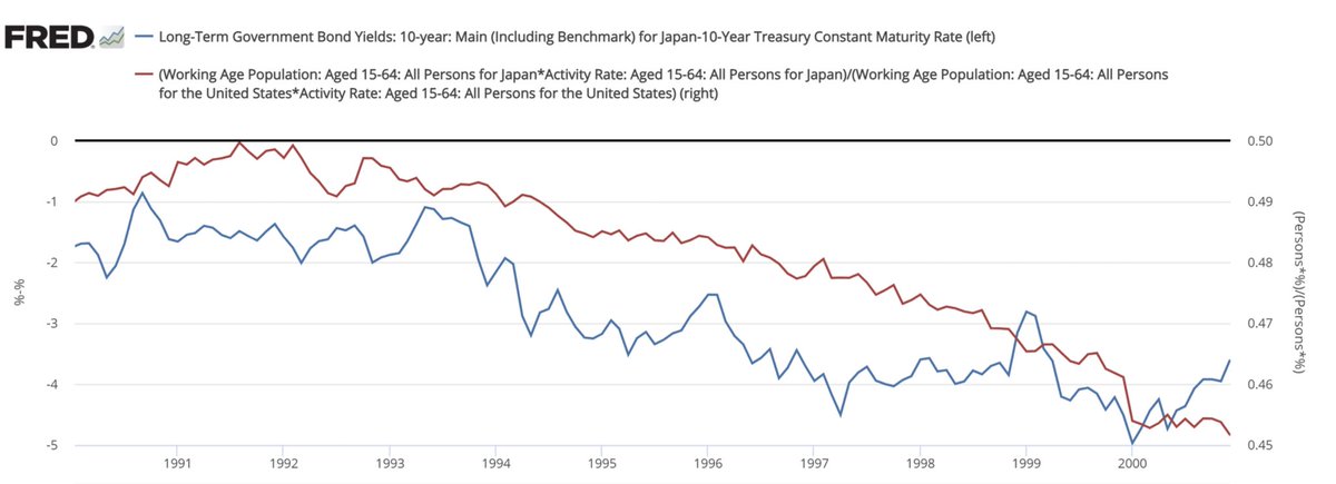
12/13 Next you can see that the 10 Y rate differential between Jap/US correlated extremely well with the relative AWP. 10 Y rates peaked in 9/1990 in Japan and only went downhill all the way to negative from there
13/13 While WAP should remain in a plateau going into 2050, the collapsing AR (since 2010) is very bearish for US Equities, $DXY and long rates. Unless this trend is reversed. But the fall is accelerating, not reversing, so far. I will leave II with the same chart we started with

 Read on Twitter
