The content no one asked for: RANKING THE 30 CITY EDITION NBA JERSEYS FROM BEST TO WORST... Let’s go 

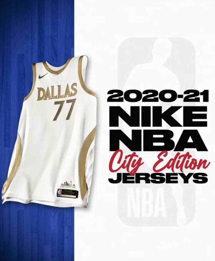
28 - Dallas Mavericks
Rating - 4.5/10
Real Madrid is that you? Dislike the font. Overall lacks anything special.
Rating - 4.5/10
Real Madrid is that you? Dislike the font. Overall lacks anything special.
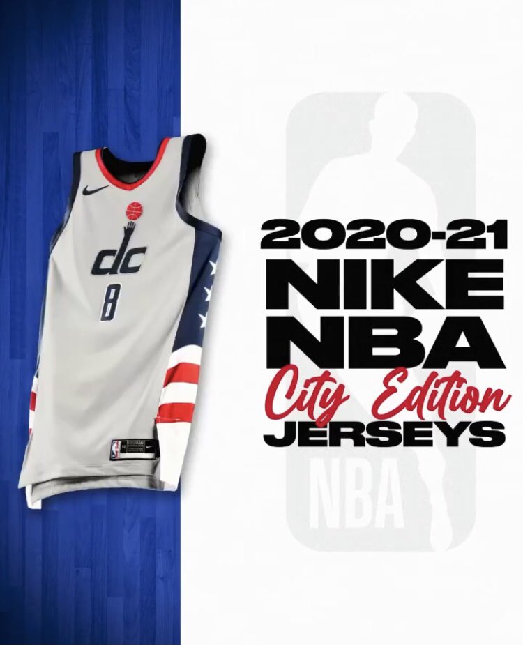
27 - Washington Wizards
Rating - 4.5/10
It’s just kinda not cool. (Nothing to do with my hate for Westbrook )
)
Rating - 4.5/10
It’s just kinda not cool. (Nothing to do with my hate for Westbrook
 )
)
25 - Indiana Pacers
Rating - 5/10
Modern take on a classic. No one is getting excited for this really.
Rating - 5/10
Modern take on a classic. No one is getting excited for this really.
24 - Oklahoma City Thunder
Rating - 5.5/10
This jersey feels like it’s a few changes away from being great, not sure what they are though, but it doesn’t look right to me.
Rating - 5.5/10
This jersey feels like it’s a few changes away from being great, not sure what they are though, but it doesn’t look right to me.
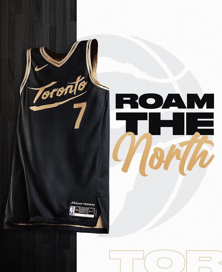
21 - Toronto Raptors
Rating - 5.5/10
It’s just so OVO. Too Drake-y. May as well put his face on the front.
Rating - 5.5/10
It’s just so OVO. Too Drake-y. May as well put his face on the front.
20 - Cleveland Cavaliers
Rating - 6/10
This alright. Bit plain still, I guess the feature is the font. Would’ve hoped for more use of colour maybe a side stripe.
Rating - 6/10
This alright. Bit plain still, I guess the feature is the font. Would’ve hoped for more use of colour maybe a side stripe.
19 - Boston Celtics
Rating - 6/10
I quite like this one, very classic looking. Not enough wow factor though to be higher than a 6.
Rating - 6/10
I quite like this one, very classic looking. Not enough wow factor though to be higher than a 6.
18 - Minnesota Timberwolves
Rating - 6/10
Not sure why this is this high up. Sides of jersey don’t look good. ‘MINN’ just looks weird. The green is ok.
Rating - 6/10
Not sure why this is this high up. Sides of jersey don’t look good. ‘MINN’ just looks weird. The green is ok.
17 - Sacramento Kings
Rating - 6/10
This is alright. The blue feels a bit strange with the black, hurts my eyes a bit.
Rating - 6/10
This is alright. The blue feels a bit strange with the black, hurts my eyes a bit.
16 - Golden State Warriors
Rating - 6.5/10
I like the throwback. Bit weird having Oakland on the front when they’ve just moved to San Fran...
Rating - 6.5/10
I like the throwback. Bit weird having Oakland on the front when they’ve just moved to San Fran...
14 - Atlanta Hawks
Rating - 7/10
Mid-writing this, this jersey kept on growing on me, started at 20th and it kept moving up to here at 14th. Love the gold and white trims.
Rating - 7/10
Mid-writing this, this jersey kept on growing on me, started at 20th and it kept moving up to here at 14th. Love the gold and white trims.
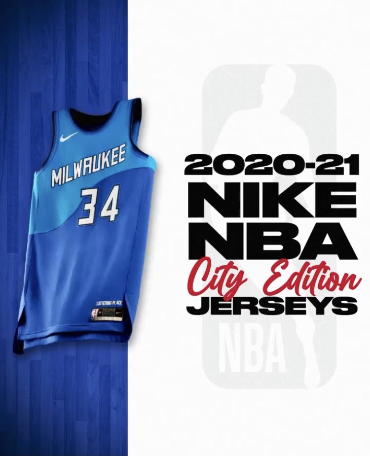
13 - Milwaukee Bucks
Rating - 7.5/10
Okay now we’re getting into the top tier of jerseys. Really like this those blues work so well.
Rating - 7.5/10
Okay now we’re getting into the top tier of jerseys. Really like this those blues work so well.
12 - Los Angeles Clippers
Rating - 7.5/10
Reverse colour of last year’s, and I like it more. The subtle one red, one blue arm trims are the coolest feature, as well as the font. Nice uni.
Rating - 7.5/10
Reverse colour of last year’s, and I like it more. The subtle one red, one blue arm trims are the coolest feature, as well as the font. Nice uni.
11 - Portland Trail Blazers
Rating - 7.5/10
Here we are. And here we have a very interesting jersey. It’s either going to be in people’s worst or favourites. Much like Marmite. Oh yeh... its Marmite coloured too....
Overall, I’m a fan
Rating - 7.5/10
Here we are. And here we have a very interesting jersey. It’s either going to be in people’s worst or favourites. Much like Marmite. Oh yeh... its Marmite coloured too....
Overall, I’m a fan

10 - Miami Heat
Rating - 7.5/10
Social media has been flooded with Miami’s new jersey, its bold and very ‘Miami Vice’. Would’ve preferred the shorts in a different colour.
Rating - 7.5/10
Social media has been flooded with Miami’s new jersey, its bold and very ‘Miami Vice’. Would’ve preferred the shorts in a different colour.
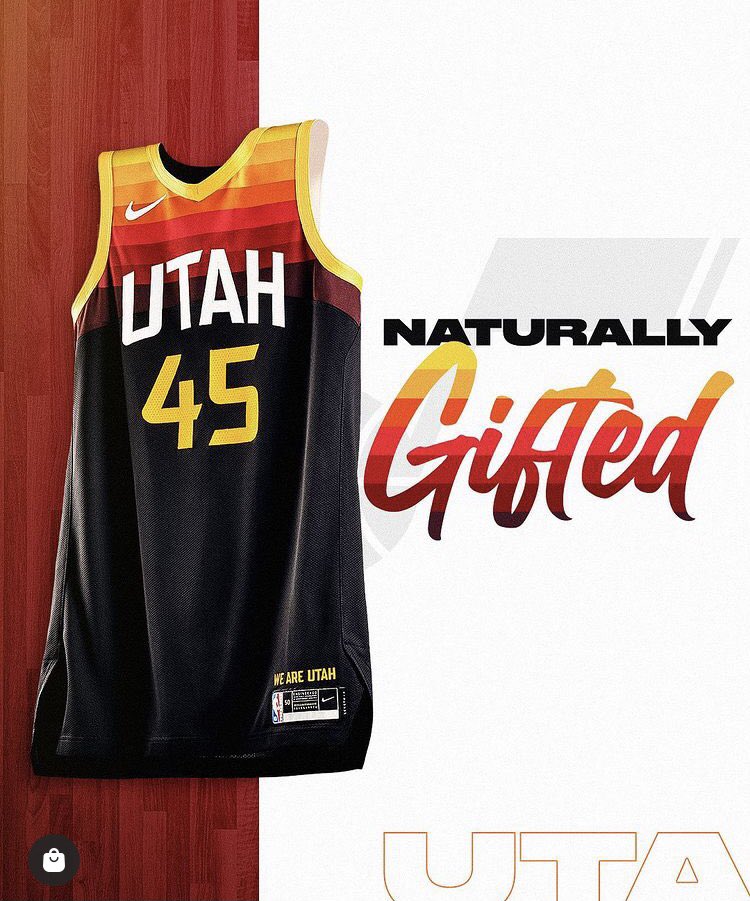
9 - Utah Jazz
Rating - 8/10
Basically it’s last year’s jersey, but toned down. Probably prefer this one.
Rating - 8/10
Basically it’s last year’s jersey, but toned down. Probably prefer this one.
7 - Philadelphia 76ers
Rating - 8/10
This is a nice jersey, can’t remember the last time I thought that about a Philly jersey. Impressed.
Rating - 8/10
This is a nice jersey, can’t remember the last time I thought that about a Philly jersey. Impressed.
5 - Brooklyn Nets
Rating - 8/10
Slick jersey with insane Basquiat features. The Nike tick is so underrated here
Rating - 8/10
Slick jersey with insane Basquiat features. The Nike tick is so underrated here

3 - San Antonio Spurs
Rating - 9/10
Was so surprised to see this was a Spurs uni when it came out. Simple, yet different and well designed .
.
Rating - 9/10
Was so surprised to see this was a Spurs uni when it came out. Simple, yet different and well designed
 .
.
2 - Memphis Grizzlies
Rating - 9/10
This is a thing of beauty. So much right here. Can’t believe i haven’t got it at number 1.
Rating - 9/10
This is a thing of beauty. So much right here. Can’t believe i haven’t got it at number 1.

 Read on Twitter

