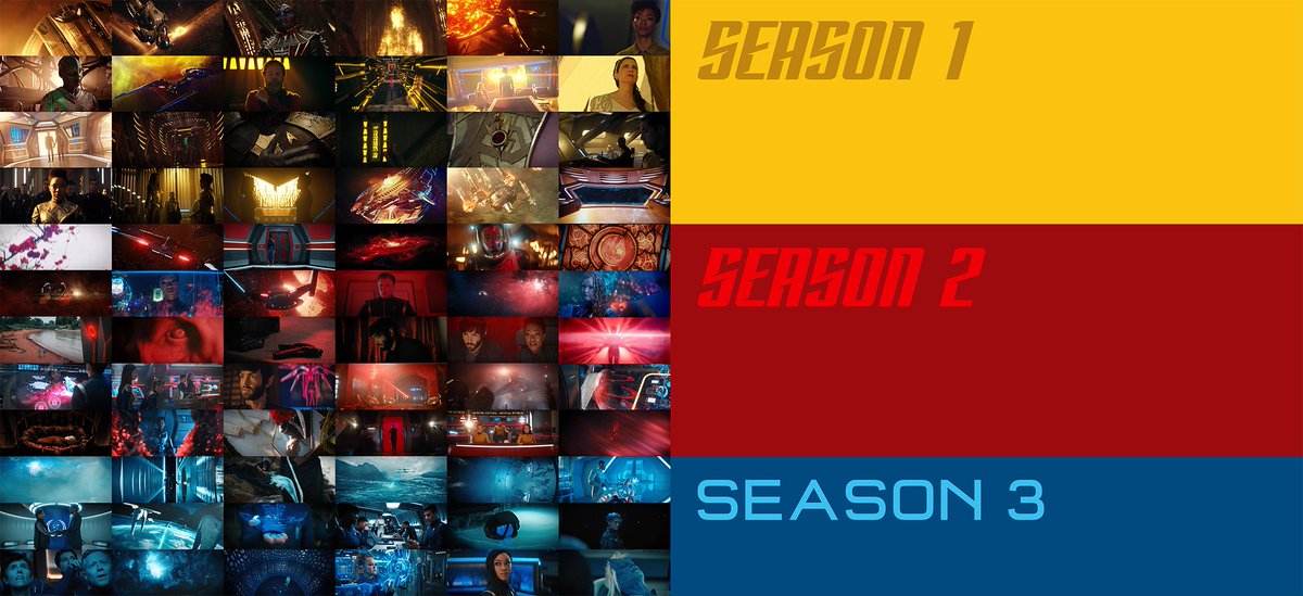
Random observation: whether by accident or design, each season of #StarTrekDiscovery  is visually distinguished by a signature colour connected to the plot of each arc
 is visually distinguished by a signature colour connected to the plot of each arc
If I had to assign thematic meanings, I'd guess yellow/gold=conflict, red=mystery/the unknown, blue=the future(???)
To respond to some of the replies, I just want to break this down a little more:
1. Yes, the overall palette of each season is generally a cold sci-fi blue. The stills aren't meant to represent the full season, just the recurring nature of each signature colour. (A big indicator of each season's signature colour is its *lack* of prominence in other seasons.)
2. I'm not saying that the producers mapped out some grand plan imposing strict colour-coding each season (the high turnover of showrunners makes it very unlikely). I'm just pointing out that choices in the production design & VFX contribute to a cohesive palette for each season.
3. This emphasis on colour design is more common in feature films (think Guillermo del Toro or Wes Anderson) than past Star Trek series and invites a deeper reading of the visual language in Discovery, whether or not directorial (producorial?) intent exists.
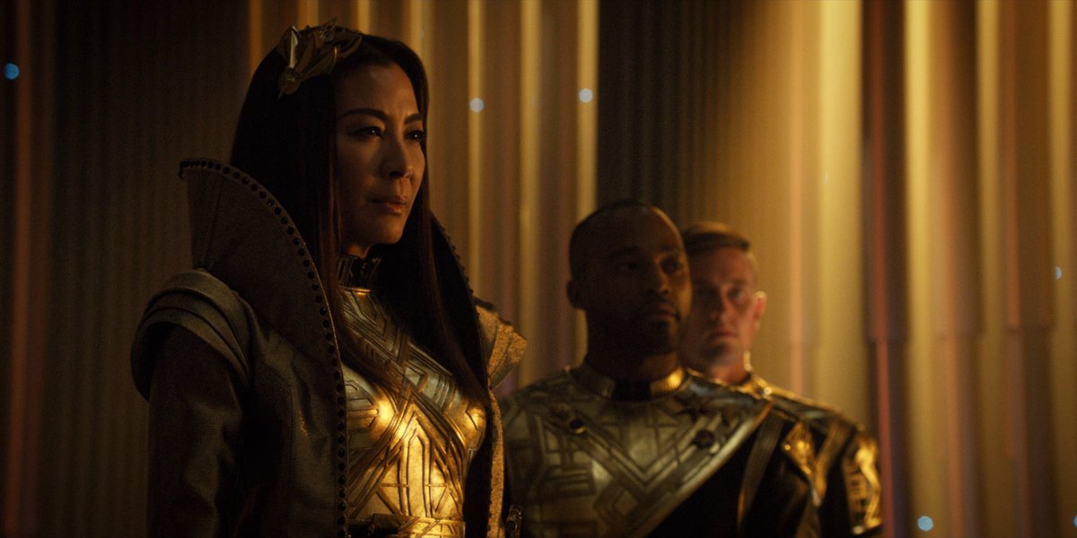
4. For example, the Klingon and Terran empires share a lot of gold/yellow accent colours, which contrasts with the blue of the Discovery's corridors and uniforms. In design language terms, this serves the plot by visually unifying the season's antagonists against the Discovery.
5. We also see gold/yellow in the Binary Stars (site of the first skirmish in the Federation-Klingon war), Burnham's graduation flashback is bathed in yellow (the resolution of her conflict with Sarek), even Burnham's prison uniform is yellow.
6. So, when colours recur in ways that support the plot (in this case, yellow=conflict), it means storytelling is happening on a design level as well as through dialogue and action. This is pure visual storytelling, which past Star Trek series haven't always had the budget for.
7. And yes, the three colours above match the Starfleet division colours, which as I said is less likely a master plan on the producers' part than just a pure coincidence (though a very delightful one).

 Read on Twitter


