Most silent films had some form of color, most often tinting or toning.
Pre-tinted film was available or sections of the prints could be custom tinted chemically.
Tinting colored the light areas of the film, toning colored the shadows.
Pre-tinted film was available or sections of the prints could be custom tinted chemically.
Tinting colored the light areas of the film, toning colored the shadows.
Even though it was extremely common (up to 90% of releases by 1920), tinting is often dismissed by modern people, even historians, as vulgar and garish and is sometimes stripped from home media releases.
Fortunately, there is a pro-tinting movement and tints are being restored.
Fortunately, there is a pro-tinting movement and tints are being restored.
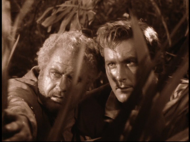
Tinting lost some popularity later in the silent era but did not entirely disappear. The sepia tinting of THE WIZARD OF OZ (1939) was no outlier. Tinting can be seen in THE SEA HAWK (1940) and THE GIRL OF THE GOLDEN WEST (1938), just to name a few examples.
Higher budget silent films would boast elaborate tinting and toning schemes and the two techniques could be combined in the same frame. Blue toning and gold tinting creates a rich nighttime scene in THE DRAGON PAINTER.
Day-for-night shoots were extremely common in the silent era and so blue tinting is actually essential for some scenes to look convincing.
Tinting could be literal (blue for night, red for fire, yellow for bright sunlight) or metaphorical. Rose was very popular for romantic scenes, for example.
Tinting could also be combined with other color techniques. For example, hand-painted torches accent this night scene in the 1924 version of THE SEA HAWK.
The Handschiegl process, stamped color, was used to add realism to the flames in JOAN THE WOMAN (1916).
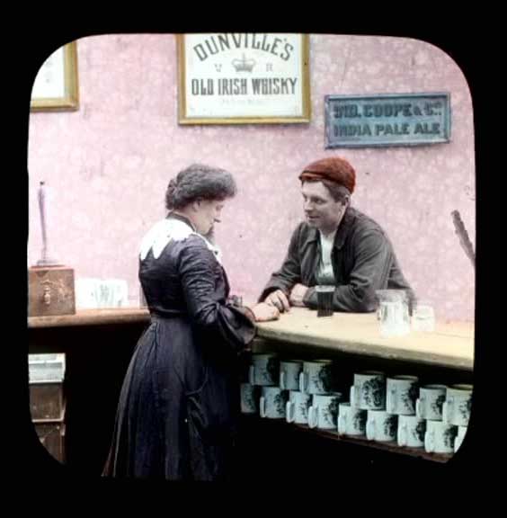
Americans dabbled in applied color but the French were the undisputed mistresses. All-woman color teams would select and apply color by hand with tiny brushes, a technique pioneered in magic lantern slides and then transferred to the movies.
Later, stencil color was introduced. It was usually limited to sequences in the film due to the time and expense involved in creating and replicating it. CYRANO DE BERGERAC (1925) is one of the few 100% stencil-colored features.
Color movie film existed but did not capture the full spectrum. It had a lovely, watercolor-like look but it could not match the range of applied color. So, obviously, stencil and hand-color had to be applied to each and every print.
Features like THE TOLL OF THE SEA showcased the natural color film technology but they also exposed the hassles of dealing with it. Color film was fussy to shoot, fussy to project and expensive.
In general, natural color film (e.g. Technicolor) was limited to short films and sequences, such as the masque ball in THE PHANTOM OF THE OPERA.
In the leadup to the release of the all-Technicolor epic THE BLACK PIRATE (1926), United Artists had to assure their potential audience that there was no risk of eye strain associated with color movies.
A great many color sequences have been lost because silents were transferred to black and white safety film.
The problem has been exacerbated by friendly fire. People who correctly oppose the colorization of, say, CASABLANCA feel that ANY color in ANY old film is bad.
The problem has been exacerbated by friendly fire. People who correctly oppose the colorization of, say, CASABLANCA feel that ANY color in ANY old film is bad.
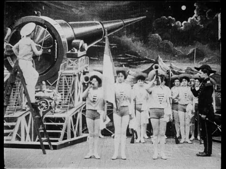
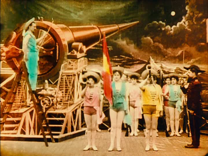
For example, every time I post that color GIF from A TRIP TO THE MOON, I regularly get demands to take it down and post "the original black and white."
Even though this IS the original, as colored by Madame Thuillier in 1902.
Even though this IS the original, as colored by Madame Thuillier in 1902.
In fact, I would say that in the case of many early films, color is essential.
Méliès films look cluttered but once the original color is shown, they immediately become easier to read and focus the eye very well.
Méliès films look cluttered but once the original color is shown, they immediately become easier to read and focus the eye very well.
Remember, silent films were not just based on the stage. They also used techniques and technology from magic lantern slideshows, which were enormously entertaining and beautifully colored. Movies had to match them.
Of course, it was a lot more work to color individual frames of individual prints. Something as elaborate as THE KINGDOM OF THE FAIRIES commanded *double* the price for a full-color print vs. a tinted one.
(Oh, and before we laugh at the old-timers fearing color movies, remember that we have people today who think 5G causes COVID. The more things change...)
Tinting struck the balance between cost and artistry for most silent film releases. When used correctly, like this inferno sequence in HELL'S HINGES, it would enhance the picture and build the mood.
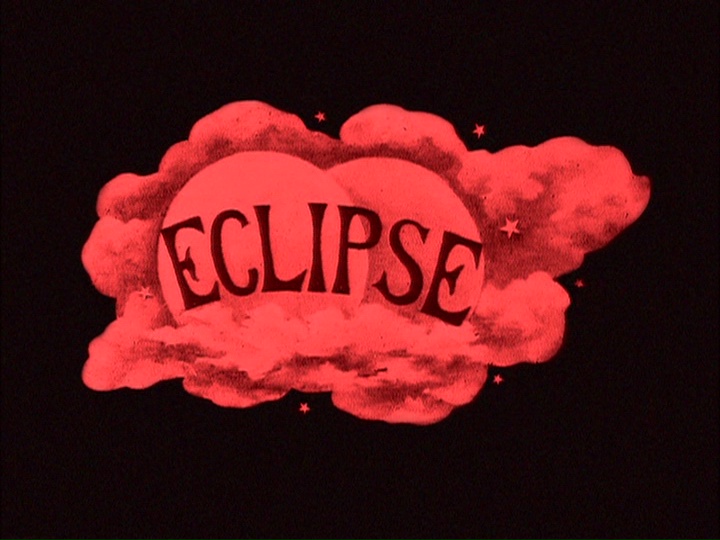
Tinting was also used for copyright purposes in Europe. Obviously, different sequences were tinted and then glued together and it would be a pain to replicate that tinting in a duped print. So, some companies would tint the titles a different, signature color like blue or red.
If you were in a theater and your Eclipse print didn't have those distinct red title cards, you knew immediately that piracy was afoot.
Oh, and tinting in the popular silhouette animation technique... essential. It just makes those movies pop.
Black and white became more common near the end of the silent era but when I see a 1910s movie that I *know* had tints and they're not included in the release...
Tints would vary by country of release. The tinting scheme in the USA might not match that of the Italian or Czech release. If the only surviving print is a European release of a US film (like the 1916 SHERLOCK HOLMES), it is *an* original scheme but maybe not *the* original.
Also, time and preservation (or lack thereof) can do funky things to colors. And what looks garish on the print is much less so once projected. Reds tend to fare the worst. You can't judge a tint by a vintage print.
So, in conclusion:
 Color was both common and expected during the silent era. More so than during the Hollywood Golden Age, in fact.
 There were many ways to achieve color but tinting and toning were the most common.
 Stripping tints is just as bad as colorizing CASABLANCA.
 Color was both common and expected during the silent era. More so than during the Hollywood Golden Age, in fact.
 There were many ways to achieve color but tinting and toning were the most common.
 Stripping tints is just as bad as colorizing CASABLANCA.

 Read on Twitter