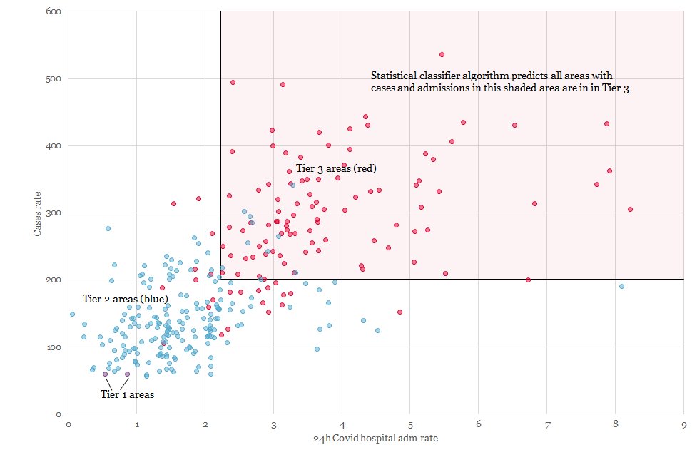
We know which tier each local area is in, the data Gov used to decide but not the algorithm. Using a statistical classifer we can deduce this. If hospital adm rate > 2.231 and case rate > 200.912 an area is in tier 3. This explains 90% of the results - other metrics don't help.
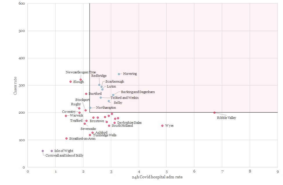
This chart shows the anamolies - the areas the algorithm doesn't correctly predict. The other metrics set out by Gov don't help in explaining. Proximity to populous areas in other tiers seems to be the common factor.
Thanks to @jburnmurdoch for the inspiration (and compiled data) in his excellent thread https://twitter.com/jburnmurdoch/status/1332233679704383488?s=20

 Read on Twitter


