1/n
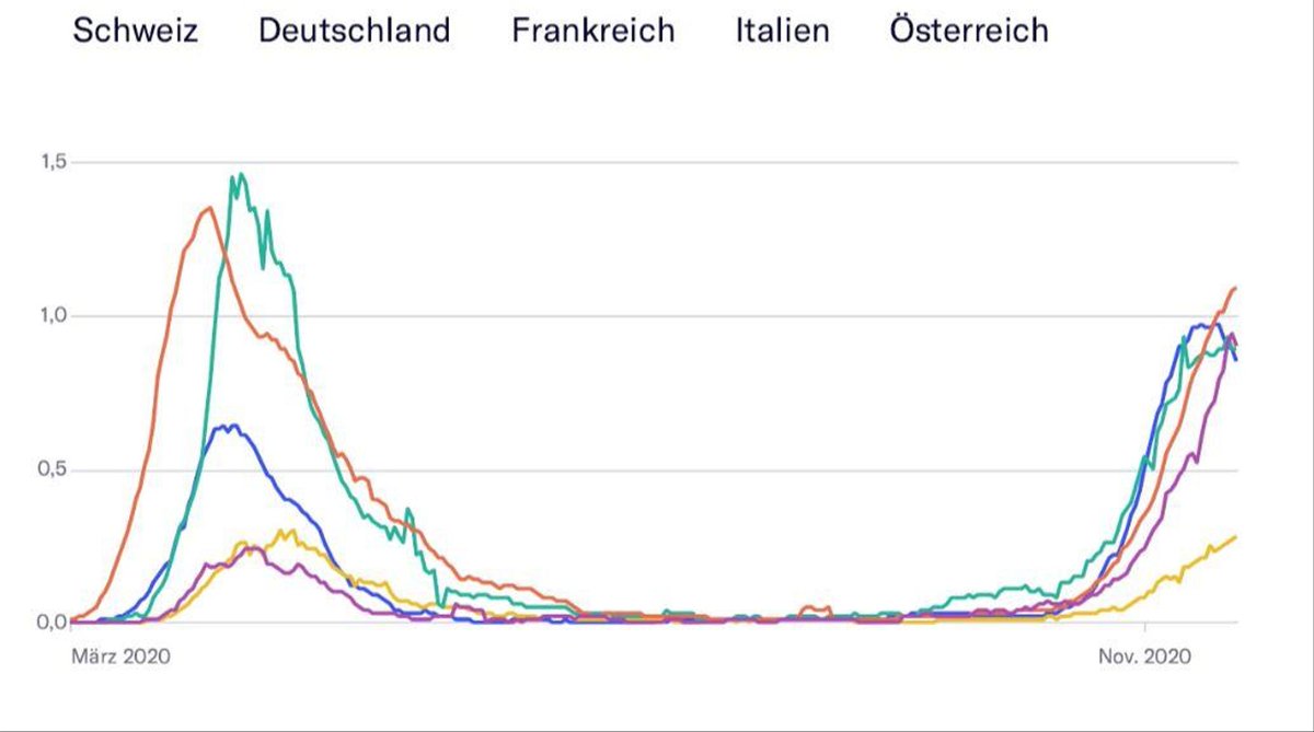
Never Mind the Bollocks: A major-ish Swiss newspaper published the following plot comparing Swiss COVID numbers to neighbouring countries yesterday. A short thread looking at how bad this plot is (I won't comment the machiavellian content of the article)
Never Mind the Bollocks: A major-ish Swiss newspaper published the following plot comparing Swiss COVID numbers to neighbouring countries yesterday. A short thread looking at how bad this plot is (I won't comment the machiavellian content of the article)
2/n
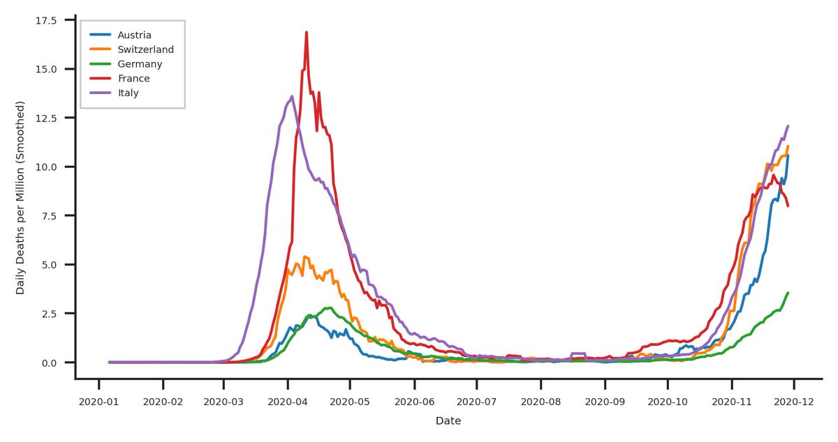
So first, let's talk about the big, fat elephant in the room: The legend (and the missing axis labels...). This plot is useless, as there is no way to associate the countries with the plotted lines but let's not stop here. A fixed version would look something like this.
So first, let's talk about the big, fat elephant in the room: The legend (and the missing axis labels...). This plot is useless, as there is no way to associate the countries with the plotted lines but let's not stop here. A fixed version would look something like this.
3/n
The plot in the article seems (can't be sure, as there are no useful labels) to show Swiss numbers plateauing and even falling. This is not the case as can be seen in the plot, why the difference? Who knows, the data source, according to the article is ...
The plot in the article seems (can't be sure, as there are no useful labels) to show Swiss numbers plateauing and even falling. This is not the case as can be seen in the plot, why the difference? Who knows, the data source, according to the article is ...
4/n
... "Johns-Hopkins-Universität, Bundesamt für Gesundheit (BAG)/NZZ" no idea why so many are needed, I used @OurWorldInData as a source ( https://raw.githubusercontent.com/owid/covid-19-data/master/public/data/owid-covid-data.csv). In addition, it's all about the second wave now... so let's fix that as well and "enhance!":
... "Johns-Hopkins-Universität, Bundesamt für Gesundheit (BAG)/NZZ" no idea why so many are needed, I used @OurWorldInData as a source ( https://raw.githubusercontent.com/owid/covid-19-data/master/public/data/owid-covid-data.csv). In addition, it's all about the second wave now... so let's fix that as well and "enhance!":
5/n
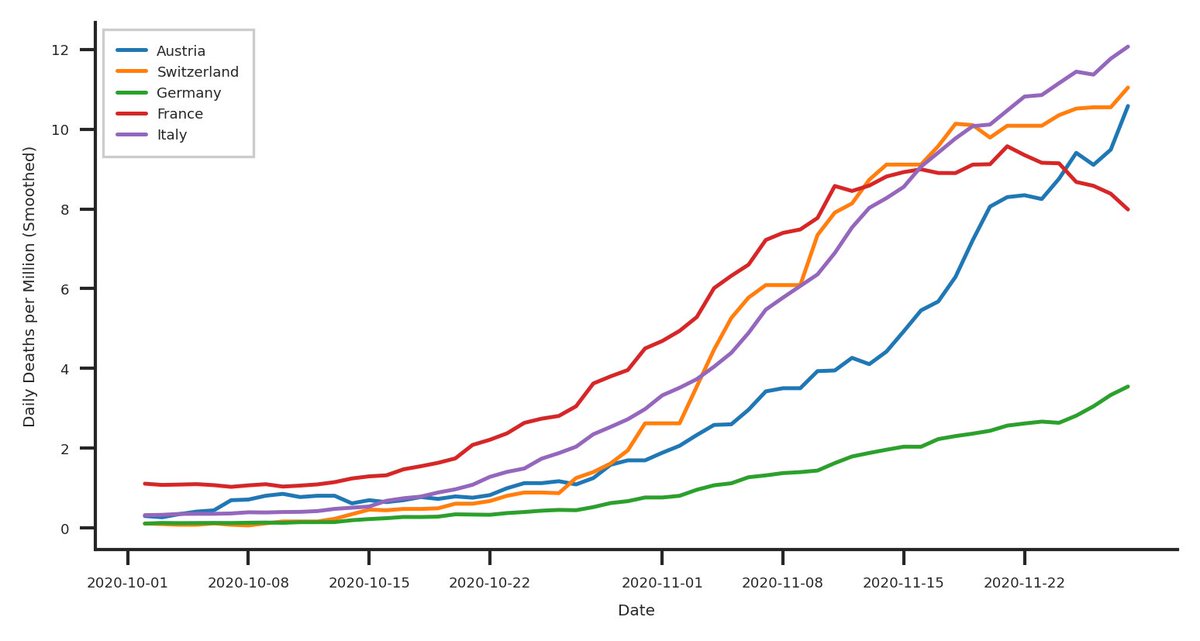
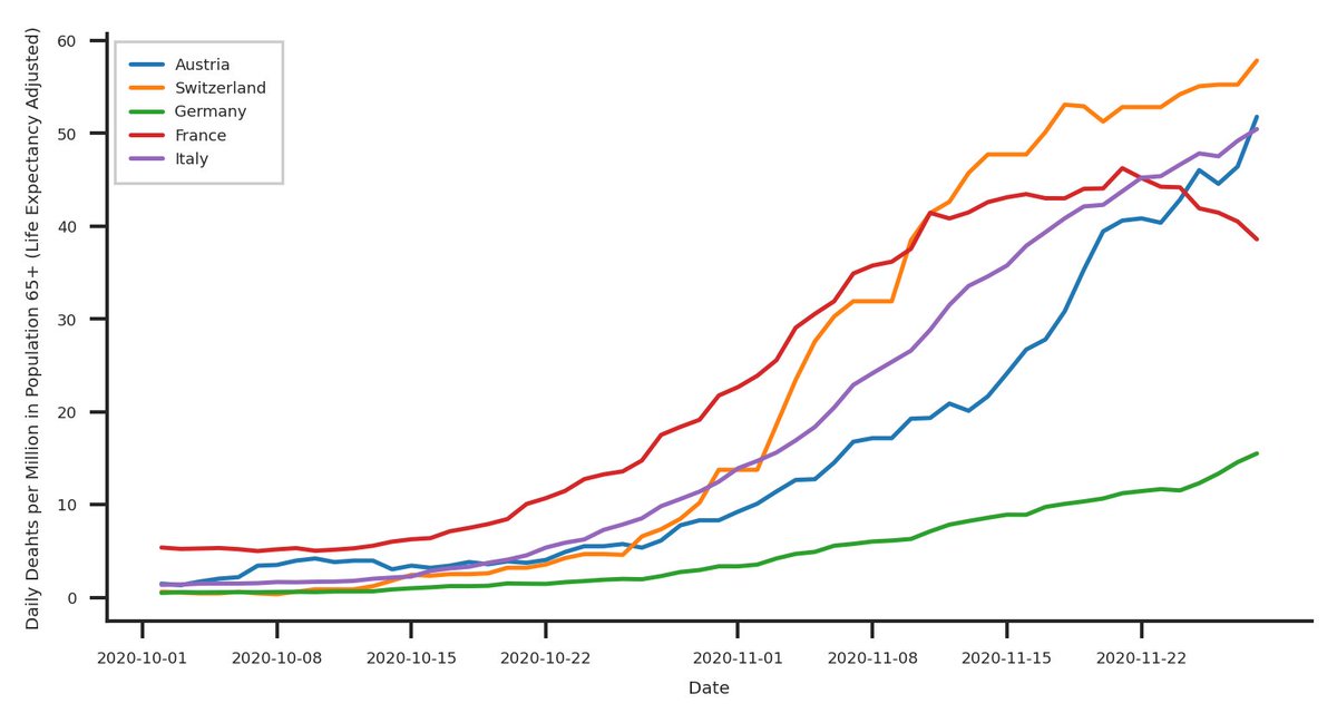
Now that's better. We can now see three things here:
- France is doing well (downwards trend), their measures are beginning to have an effect on the number of daily deaths (très bien mes amis)
- The measures in Italy, Germany, and Austria don't work and aren't taking effect
Now that's better. We can now see three things here:
- France is doing well (downwards trend), their measures are beginning to have an effect on the number of daily deaths (très bien mes amis)
- The measures in Italy, Germany, and Austria don't work and aren't taking effect
6/n
- The Swiss measures seem to slow down the increase in daily deaths.
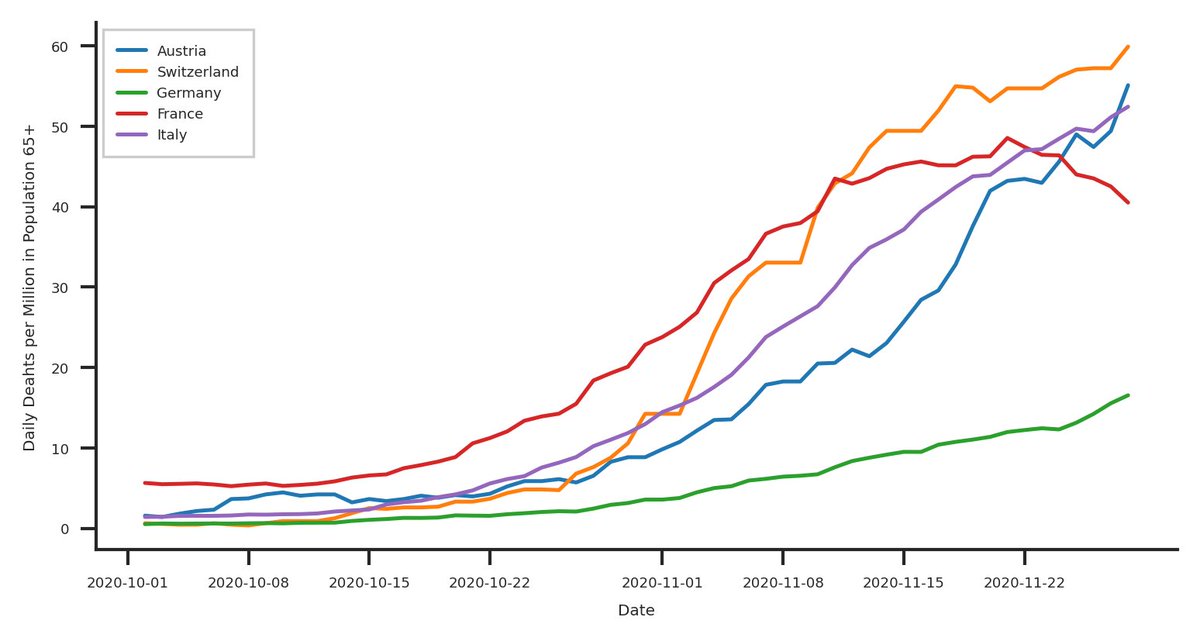
However, there is one thing bothering me: We are comparing bananas, oranges, tomatoes, cherry's, and mettwurst. As 65+ year olds are the main demographic when it comes to severe cases, let's look at them
- The Swiss measures seem to slow down the increase in daily deaths.
However, there is one thing bothering me: We are comparing bananas, oranges, tomatoes, cherry's, and mettwurst. As 65+ year olds are the main demographic when it comes to severe cases, let's look at them
7/n
Turns out that Italy's population is quite old and obviously, this means that the population overall is more likely to fall severely ill with COVID. Adjusting for that takes some of the visual burden away from them. But what about general health of (elderly people)?
Turns out that Italy's population is quite old and obviously, this means that the population overall is more likely to fall severely ill with COVID. Adjusting for that takes some of the visual burden away from them. But what about general health of (elderly people)?
8/n
For this, let's look at life expectancy and include this as a weight (number of deaths * life expectancy in years / max(life expectancy in years)). This means that we control for countries with lower life expectancy having more daily due to low health expectancy.
For this, let's look at life expectancy and include this as a weight (number of deaths * life expectancy in years / max(life expectancy in years)). This means that we control for countries with lower life expectancy having more daily due to low health expectancy.
9/n
Not much is happening here, as those countries have similarly (high) life expectancies. But you get the point: It is not as simple as the pure number when it comes to comparing countries.
Not much is happening here, as those countries have similarly (high) life expectancies. But you get the point: It is not as simple as the pure number when it comes to comparing countries.
10/n
The main issue I have with the comparison to those countries is, that we compare ourselves with countries that are doing bad (maybe with the exception of Germany): Congrats, we almost won the 100 m race against the 90 year old grandmother and the 9 year old kid!
The main issue I have with the comparison to those countries is, that we compare ourselves with countries that are doing bad (maybe with the exception of Germany): Congrats, we almost won the 100 m race against the 90 year old grandmother and the 9 year old kid!
11/n
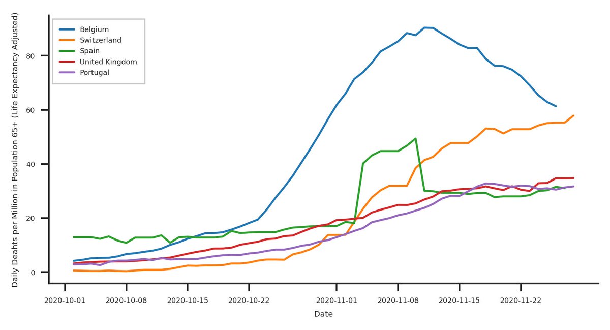
What about other countries? Let's look at a few other European countries... Belgium fucked up big time, but what about the others? Doing relatively well compared to Switzerland, all at a around 50%, and that's without Norway, Denmark, or Finland...
What about other countries? Let's look at a few other European countries... Belgium fucked up big time, but what about the others? Doing relatively well compared to Switzerland, all at a around 50%, and that's without Norway, Denmark, or Finland...
12/n
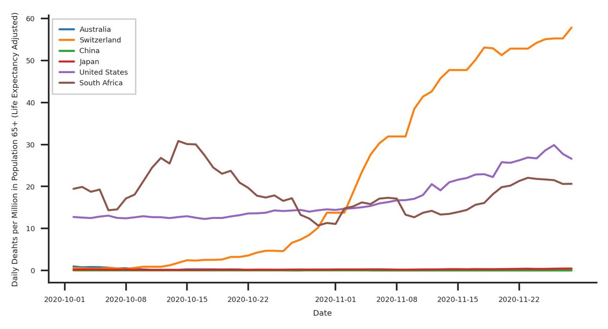
What about big industrialised countries outside of Europe? Well, oopsie, looks like we're not doing well, even when we're racing overweight, orange people in wigs...
What about big industrialised countries outside of Europe? Well, oopsie, looks like we're not doing well, even when we're racing overweight, orange people in wigs...
13/n
By now, I am fully aware that there is a major spelling mistake in my plots, but I don't want to redo them--they at least have a useful legend and won't be published in a newspaper. But I hope you get the point.
Have a nice weekend and stay safe everyone.
By now, I am fully aware that there is a major spelling mistake in my plots, but I don't want to redo them--they at least have a useful legend and won't be published in a newspaper. But I hope you get the point.
Have a nice weekend and stay safe everyone.
14/n
After this sad topic, here's something cool:
A year on Mars, upscaled to 4k!
After this sad topic, here's something cool:
A year on Mars, upscaled to 4k!

 Read on Twitter